# ========== 导入所需库 ==========
# Import required libraries
import pandas as pd   # 用于表格数据处理
# For tabular data processing
import numpy as np    # 用于数值计算
# For numerical computation
import platform       # 用于检测操作系统类型,以适配不同平台的数据路径
# For detecting the operating system type to adapt data paths across platforms

# ========== 设置本地数据路径 ==========
# Set up local data path
# 根据操作系统自动选择数据存储路径
# Automatically select data storage path based on the operating system
if platform.system() == 'Windows':  # 判断当前操作系统是否为Windows
    # Check if the current operating system is Windows
    data_path = 'C:/qiufei/data/stock'  # Windows平台本地数据路径
    # Local data path for Windows platform
else:  # 否则使用Linux平台数据路径
    # Otherwise use the Linux platform data path
    data_path = '/home/ubuntu/r2_data_mount/qiufei/data/stock'  # Linux平台路径
    # Linux platform path

# ========== 第1步:读取本地数据 ==========
# Step 1: Read local data
stock_basic_dataframe = pd.read_hdf(f'{data_path}/stock_basic_data.h5')  # 上市公司基本信息
# Listed company basic information
financial_statement_dataframe = pd.read_hdf(f'{data_path}/financial_statement.h5')  # 财务报表数据
# Financial statement data

# ========== 第2步:筛选长三角地区公司 ==========
# Step 2: Filter companies in the Yangtze River Delta region
# 长三角地区包括上海、浙江、江苏、安徽四个省级行政区
# The Yangtze River Delta region includes Shanghai, Zhejiang, Jiangsu, and Anhui
yangtze_delta_city_list = ['上海市', '浙江省', '江苏省', '安徽省']  # 定义长三角四省市名称列表
# Define the list of four YRD province/municipality names
# 使用isin()筛选注册地在长三角地区的上市公司
# Use isin() to filter listed companies registered in the YRD region
yangtze_delta_stock_dataframe = stock_basic_dataframe[stock_basic_dataframe['province'].isin(yangtze_delta_city_list)]  # 按列表筛选匹配的行
# Filter rows matching the list

# ========== 第3步:获取每家公司的最新财务数据 ==========
# Step 3: Get the latest financial data for each company
# 按报告期降序排列,然后对每只股票取第一条(即最新季度数据)
# Sort by reporting period in descending order, then take the first record for each stock (i.e., the latest quarter)
latest_financial_dataframe = financial_statement_dataframe.sort_values('quarter', ascending=False).drop_duplicates('order_book_id')  # 排序后去重,保留最新记录
# Sort then deduplicate, keeping the latest record2 描述性数据分析 (Descriptive Data Analysis)
本章介绍描述统计的核心方法,包括对数据的集中趋势、离散程度和分布形状的度量,以及各种可视化技术。描述统计是数据分析的基础,它帮助我们理解数据的基本特征,发现数据中的模式,并为后续的推断分析奠定基础。
This chapter introduces the core methods of descriptive statistics, including measures of central tendency, dispersion, and distribution shape, as well as various visualization techniques. Descriptive statistics forms the foundation of data analysis, helping us understand the basic characteristics of data, discover patterns within the data, and lay the groundwork for subsequent inferential analysis.
2.1 描述统计在金融数据分析中的典型应用 (Typical Applications of Descriptive Statistics in Financial Data Analysis)
描述统计是金融分析师和投资研究员每天使用的核心工具。以下展示其在中国金融市场中的典型应用场景。
Descriptive statistics is a core tool used daily by financial analysts and investment researchers. The following demonstrates its typical application scenarios in China’s financial market.
2.1.1 应用一:上市公司财务指标的统计画像 (Application 1: Statistical Profiling of Listed Company Financial Indicators)
在基本面分析中,分析师首先需要对目标公司的关键财务指标进行描述性统计画像(Descriptive Profiling)。这包括计算净资产收益率(ROE)、总资产周转率、资产负债率等指标的均值、中位数、标准差和分位数,以全面了解公司的财务健康状况及其在同行业中的位置。使用本地存储的 financial_statement.h5 数据,我们可以快速获取长三角地区上市公司的ROE分布特征:均值反映行业整体盈利水平,中位数指示”典型”公司的表现,标准差衡量行业内差异程度,而偏度和峰度则揭示是否存在极端盈利或亏损的公司。
In fundamental analysis, analysts first need to perform descriptive statistical profiling (Descriptive Profiling) on key financial indicators of target companies. This includes calculating the mean, median, standard deviation, and quantiles for indicators such as Return on Equity (ROE), total asset turnover ratio, and debt-to-asset ratio, to comprehensively understand the company’s financial health and its position within the industry. Using the locally stored financial_statement.h5 data, we can quickly obtain the ROE distribution characteristics of listed companies in the Yangtze River Delta region: the mean reflects the overall industry profitability level, the median indicates the performance of a “typical” company, the standard deviation measures intra-industry variability, and skewness and kurtosis reveal whether there are companies with extreme profits or losses.
2.1.2 应用二:股票收益率的分布特征 (Application 2: Distribution Characteristics of Stock Returns)
描述统计在刻画股票收益率的分布特征方面扮演关键角色。通过对 stock_price_pre_adjusted.h5 中的日度收益率数据计算描述性统计量,我们可以发现对投资决策至关重要的”典型事实”(Stylized Facts):
Descriptive statistics plays a key role in characterizing the distribution features of stock returns. By computing descriptive statistics on daily return data from stock_price_pre_adjusted.h5, we can uncover “stylized facts” that are crucial for investment decisions:
- 均值与中位数的偏离揭示收益率分布的非对称性
- The divergence between mean and median reveals the asymmetry of the return distribution
- 标准差直接对应投资的波动率——马科维茨投资组合理论的核心输入参数
- Standard deviation directly corresponds to investment volatility — the core input parameter of Markowitz portfolio theory
- 偏度(Skewness)反映上涨与下跌幅度的不对称性,负偏态意味着极端下跌更频繁
- Skewness reflects the asymmetry between upward and downward movements; negative skewness means extreme declines are more frequent
- 峰度(Kurtosis)远大于正态分布的3,即金融数据的”厚尾”(Fat Tails)现象
- Kurtosis far exceeds the normal distribution’s value of 3, i.e., the “fat tails” phenomenon in financial data
2.1.3 应用三:行业对比与基准分析 (Application 3: Industry Comparison and Benchmark Analysis)
在行业研究中,描述统计是构建行业基准(Benchmark)的基础工具。结合 stock_basic_data.h5 中的行业分类和 financial_statement.h5 中的财务数据,按行业计算各项指标的集中趋势和离散程度,可以识别哪些行业盈利能力强且稳定(高均值、低标准差),哪些行业竞争分化严重。这为后续的方差分析(章节 9)和多元回归建模(章节 10)奠定数据基础。
In industry research, descriptive statistics is a foundational tool for constructing industry benchmarks. By combining the industry classification from stock_basic_data.h5 with financial data from financial_statement.h5, computing central tendency and dispersion measures by industry, we can identify which industries have strong and stable profitability (high mean, low standard deviation), and which industries exhibit severe competitive differentiation. This lays the data foundation for subsequent analysis of variance (章节 9) and multiple regression modeling (章节 10).
2.2 数值数据的分析 (Analysis of Numerical Data)
2.2.1 集中趋势的度量 (Measures of Central Tendency)
集中趋势(central tendency)是指数据分布的中心位置或典型值。最常见的集中趋势度量包括均值、中位数和众数。
Central tendency refers to the center or typical value of a data distribution. The most common measures of central tendency include the mean, median, and mode.
2.2.1.1 均值 (Mean)
均值(mean)是所有观测值的总和除以观测值的个数。对于样本观测值 \(x_1, x_2, ..., x_n\),样本均值为:
The mean is the sum of all observed values divided by the number of observations. For sample observations \(x_1, x_2, ..., x_n\), the sample mean is:
\[ \bar{x} = \frac{1}{n}\sum_{i=1}^{n}x_i \tag{2.1}\]
数学性质 (Mathematical Properties):
- 线性性质 (Linearity): \(E[aX + b] = aE[X] + b\)
- 无偏性 (Unbiasedness): 如果样本是随机抽样,则 \(\bar{X}\) 是总体均值 \(\mu\) 的无偏估计
- Unbiasedness: If the sample is randomly drawn, then \(\bar{X}\) is an unbiased estimator of the population mean \(\mu\)
补充说明:样本均值无偏性的证明 (Supplementary: Proof of Unbiasedness of the Sample Mean)
\[E[\bar{X}] = E\left[\frac{1}{n}\sum_{i=1}^{n}X_i\right] = \frac{1}{n}\sum_{i=1}^{n}E[X_i] = \frac{1}{n} \cdot n\mu = \mu\]
其中第二步利用了期望的线性性质(对任意常数 \(a\) 和随机变量 \(X\),均有 \(E[aX] = aE[X]\)),第三步利用了每个 \(X_i\) 来自同一总体、具有相同的总体均值 \(\mu\) 的事实。
The second step uses the linearity of expectation (for any constant \(a\) and random variable \(X\), \(E[aX] = aE[X]\)), and the third step uses the fact that each \(X_i\) comes from the same population with the same population mean \(\mu\).
- 敏感性 (Sensitivity): 均值对极端值(outliers)非常敏感
- Sensitivity: The mean is very sensitive to outliers
为什么均值对极端值敏感?与几何解释 (Why Is the Mean Sensitive to Extreme Values? A Geometric Interpretation)
考虑一个简单的例子:某公司5名员工的月薪分别为:8000、9000、10000、11000、12000元。 均值为:10000元。但如果CEO加入(月薪100000元),均值变为25000元。CEO一人的加入使均值增加了15000元。
Consider a simple example: The monthly salaries of 5 employees at a company are 8000, 9000, 10000, 11000, and 12000 yuan respectively. The mean is 10000 yuan. But if the CEO joins (monthly salary 100000 yuan), the mean becomes 25000 yuan. The addition of a single CEO increases the mean by 15000 yuan.
几何解释 (Optimization View): 均值实际上是一个优化问题的解:它是使误差平方和 (Sum of Squared Errors, L2 Loss) 最小的点。
The mean is actually the solution to an optimization problem: it is the point that minimizes the Sum of Squared Errors (L2 Loss).
\[ \bar{x} = \arg\min_c \sum_{i=1}^n (x_i - c)^2 \]
由于平方函数 \(x^2\) 对大偏差给予了极高的惩罚(权重),为了最小化总损失,均值必须向极端值”妥协”并大幅移动。这就是均值”脆弱”的数学本质。
Since the squared function \(x^2\) imposes extremely high penalties (weights) on large deviations, to minimize the total loss, the mean must “compromise” toward extreme values and shift substantially. This is the mathematical essence of the mean’s “fragility.”
2.2.1.3 中位数 (Median)
中位数(median)是将数据按大小顺序排列后,位于中间位置的值。对于有序样本 \(x_{(1)} \leq x_{(2)} \leq ... \leq x_{(n)}\):
The median is the value located in the middle position when data is arranged in ascending order. For an ordered sample \(x_{(1)} \leq x_{(2)} \leq ... \leq x_{(n)}\):
\[ \text{Median} = \begin{cases} x_{(\frac{n+1}{2})}, & \text{如果 } n \text{ 为奇数} \\ \frac{x_{(\frac{n}{2})} + x_{(\frac{n}{2}+1)}}{2}, & \text{如果 } n \text{ 为偶数} \end{cases} \tag{2.2}\]
中位数的优点 (Advantages of the Median):
- 对极端值不敏感(robust)
- Insensitive to extreme values (robust)
- 适用于偏态分布的数据
- Suitable for skewed distributions
- 能更好地反映”典型值”
- Better reflects the “typical value”
几何解释 (L1 Optimization): 中位数是使绝对误差和 (Sum of Absolute Errors, L1 Loss) 最小的点。
The median is the point that minimizes the Sum of Absolute Errors (L1 Loss).
\[ \text{Median} = \arg\min_c \sum_{i=1}^n |x_i - c| \]
绝对值函数 \(|x|\) 对大偏差的惩罚是线性的。因此,无论极端值有多远,只要它不改变数据的”秩”(Rank),中位数就不会移动。这赋予了中位数强大的稳健性 (Robustness)。
The absolute value function \(|x|\) imposes a linear penalty on large deviations. Therefore, no matter how far an extreme value is, as long as it does not change the “rank” of the data, the median will not shift. This gives the median its powerful robustness.
2.2.1.4 众数 (Mode)
众数(mode)是数据中出现频率最高的值。众数适用于:
The mode is the value that appears most frequently in the data. The mode is suitable for:
- 名义变量(如:最常见的品牌)
- Nominal variables (e.g., the most common brand)
- 离散变量
- Discrete variables
- 多峰分布的识别
- Identification of multimodal distributions
2.2.2 离散程度的度量 (Measures of Dispersion)
仅知道集中趋势是不够的,我们还需要了解数据的离散程度或变异性。
Knowing the central tendency alone is not enough; we also need to understand the degree of dispersion or variability in the data.
2.2.2.1 方差与标准差 (Variance and Standard Deviation)
样本方差(sample variance)如 式 2.3 所示:
The sample variance is shown in 式 2.3:
\[ s^2 = \frac{1}{n-1}\sum_{i=1}^{n}(x_i - \bar{x})^2 \tag{2.3}\]
其中 \(n-1\) 是自由度,使用 \(n-1\) 而不是 \(n\) 是为了确保 \(s^2\) 是总体方差 \(\sigma^2\) 的无偏估计。
Here \(n-1\) is the degrees of freedom; using \(n-1\) instead of \(n\) ensures that \(s^2\) is an unbiased estimator of the population variance \(\sigma^2\).
为什么除以 n-1 而不是 n?(Why Divide by n-1 Instead of n?)
这称为贝塞尔校正(Bessel’s correction)。当我们用样本均值 \(\bar{x}\) 代替总体均值 \(\mu\) 时,样本数据与 \(\bar{x}\) 的距离平方和总是小于与真实 \(\mu\) 的距离平方和(因为 \(\bar{x}\) 本身就是从数据中计算出来的,它使平方和最小)。因此,除以 \(n\) 会低估真实的方差。除以 \(n-1\) 可以补偿这个偏差。
This is called Bessel’s correction. When we use the sample mean \(\bar{x}\) in place of the population mean \(\mu\), the sum of squared distances of sample data from \(\bar{x}\) is always smaller than from the true \(\mu\) (because \(\bar{x}\) is computed from the data itself; it minimizes the sum of squares). Therefore, dividing by \(n\) underestimates the true variance. Dividing by \(n-1\) compensates for this bias.
直观理解:样本包含 \(n\) 个观测值,但我们已经用了一个自由度来估计均值,所以还剩 \(n-1\) 个独立信息来估计方差。
Intuitive understanding: The sample contains \(n\) observations, but we have already used one degree of freedom to estimate the mean, so there are only \(n-1\) independent pieces of information left to estimate the variance.
补充说明:贝塞尔校正的完整数学证明 (Supplementary: Complete Mathematical Proof of Bessel’s Correction)
要证明 \(E\left[\frac{1}{n-1}\sum_{i=1}^{n}(X_i - \bar{X})^2\right] = \sigma^2\),我们首先对求和项进行恒等变换:
To prove \(E\left[\frac{1}{n-1}\sum_{i=1}^{n}(X_i - \bar{X})^2\right] = \sigma^2\), we first apply an identity transformation to the summand:
\[\sum_{i=1}^{n}(X_i - \bar{X})^2 = \sum_{i=1}^{n}\left[(X_i - \mu) - (\bar{X} - \mu)\right]^2\]
展开平方:
Expanding the square:
\[= \sum_{i=1}^{n}(X_i - \mu)^2 - 2(\bar{X} - \mu)\sum_{i=1}^{n}(X_i - \mu) + n(\bar{X} - \mu)^2\]
注意到 \(\sum_{i=1}^{n}(X_i - \mu) = n(\bar{X} - \mu)\),代入化简:
Noting that \(\sum_{i=1}^{n}(X_i - \mu) = n(\bar{X} - \mu)\), substituting and simplifying:
\[= \sum_{i=1}^{n}(X_i - \mu)^2 - n(\bar{X} - \mu)^2\]
取期望,利用 \(E[(X_i - \mu)^2] = \sigma^2\) 和 \(E[(\bar{X} - \mu)^2] = \text{Var}(\bar{X}) = \sigma^2/n\):
Taking expectations, using \(E[(X_i - \mu)^2] = \sigma^2\) and \(E[(\bar{X} - \mu)^2] = \text{Var}(\bar{X}) = \sigma^2/n\):
\[E\left[\sum_{i=1}^{n}(X_i - \bar{X})^2\right] = n\sigma^2 - n \cdot \frac{\sigma^2}{n} = (n-1)\sigma^2\]
因此:
Therefore:
\[E\left[\frac{1}{n-1}\sum_{i=1}^{n}(X_i - \bar{X})^2\right] = \sigma^2\]
证毕。这就是使用 \(n-1\) 作为分母能保证无偏性的数学原因。
Q.E.D. This is the mathematical reason why using \(n-1\) as the denominator guarantees unbiasedness.
样本标准差(sample standard deviation)是方差的平方根,如 式 2.4 所示:
The sample standard deviation is the square root of the variance, as shown in 式 2.4:
\[ s = \sqrt{\frac{1}{n-1}\sum_{i=1}^{n}(x_i - \bar{x})^2} \tag{2.4}\]
标准差与原始数据具有相同的单位,因此更易于解释。
The standard deviation has the same units as the original data, making it easier to interpret.
2.2.2.2 四分位距 (Interquartile Range, IQR)
四分位距是第三四分位数(\(Q_3\))与第一四分位数(\(Q_1\))之差,如 式 2.5 所示:
The interquartile range is the difference between the third quartile (\(Q_3\)) and the first quartile (\(Q_1\)), as shown in 式 2.5:
\[ \text{IQR} = Q_3 - Q_1 \tag{2.5}\]
其中:
Where:
- \(Q_1\) (25th percentile): 25%的数据小于此值
- \(Q_1\) (25th percentile): 25% of the data falls below this value
- \(Q_2\) (50th percentile): 中位数
- \(Q_2\) (50th percentile): The median
- \(Q_3\) (75th percentile): 75%的数据小于此值
- \(Q_3\) (75th percentile): 75% of the data falls below this value
IQR对极端值不敏感,是描述离散程度的稳健统计量。
The IQR is insensitive to extreme values and is a robust statistic for describing dispersion.
2.2.2.3 变异系数 (Coefficient of Variation, CV)
变异系数是标准差与均值的比值,通常以百分比表示,如 式 2.6 所示:
The coefficient of variation is the ratio of the standard deviation to the mean, usually expressed as a percentage, as shown in 式 2.6:
\[ CV = \frac{s}{\bar{x}} \times 100\% \tag{2.6}\]
CV的优点是可以比较不同量纲或均值差异较大的数据的相对变异性。
The advantage of CV is that it allows comparison of relative variability across data with different units or greatly different means.
2.2.2.4 案例:不同行业的风险比较 (Case Study: Risk Comparison Across Industries)
我们利用变异系数来比较不同行业的风险水平,结果如 表 2.2 所示。
We use the coefficient of variation to compare risk levels across different industries, with results shown in 表 2.2.
# ========== 导入所需库 ==========
# Import required libraries
import pandas as pd   # 用于表格数据处理
# For tabular data processing
import numpy as np    # 用于数值计算
# For numerical computation
import platform       # 用于检测操作系统类型
# For detecting the operating system type

# ========== 设置本地数据路径 ==========
# Set up local data path
if platform.system() == 'Windows':  # 判断当前操作系统是否为Windows
    # Check if the current operating system is Windows
    data_path = 'C:/qiufei/data/stock'  # Windows平台本地数据路径
    # Local data path for Windows platform
else:  # 否则使用Linux平台数据路径
    # Otherwise use the Linux platform data path
    data_path = '/home/ubuntu/r2_data_mount/qiufei/data/stock'  # Linux平台本地数据路径
    # Local data path for Linux platform

# ========== 第1步:读取本地股票数据 ==========
# Step 1: Read local stock data
stock_basic_dataframe = pd.read_hdf(f'{data_path}/stock_basic_data.h5')  # 上市公司基本信息
# Listed company basic information
stock_price_dataframe = pd.read_hdf(f'{data_path}/stock_price_pre_adjusted.h5')  # 前复权日度行情
# Pre-adjusted daily stock prices
stock_price_dataframe = stock_price_dataframe.reset_index()  # 将多级索引转为普通列
# Convert multi-level index to regular columns

# ========== 第2步:筛选2023年行情数据 ==========
# Step 2: Filter 2023 market data
price_2023_dataframe = stock_price_dataframe[  # 筛选2023全年日度行情数据
    # Filter daily market data for the entire year 2023
    (stock_price_dataframe['date'] >= '2023-01-01') &   # 起始日期:2023年1月1日
    # Start date: January 1, 2023
    (stock_price_dataframe['date'] <= '2023-12-31')  # 截止日期:2023年12月31日
    # End date: December 31, 2023
].copy()  # 取一年的日度行情数据
# Take one year of daily market data
行情数据读取和年度筛选完成。下面定义各行业代表性股票,计算收益率波动性指标并输出比较结果。
Market data reading and annual filtering are complete. Next, we define representative stocks for each industry, calculate return volatility metrics, and output comparison results.
# ========== 第3步:定义行业代表性股票 ==========
# Step 3: Define representative stocks by industry
# 选取长三角地区三个行业,每个行业3只代表性股票
# Select three industries in the YRD region, with 3 representative stocks each
industry_stock_mapping = {  # 定义行业到代表性股票代码的映射字典
    # Define a mapping dictionary from industry to representative stock codes
    '银行': ['600000.XSHG', '600926.XSHG', '601009.XSHG'],      # 浦发银行、杭州银行、南京银行
    # Banking: SPD Bank, Bank of Hangzhou, Bank of Nanjing
    '科技': ['002415.XSHE', '600460.XSHG', '002230.XSHE'],    # 海康威视、士兰微、科大讯飞
    # Technology: Hikvision, Silan Microelectronics, iFlytek
    '公用事业': ['600021.XSHG', '600023.XSHG', '002608.XSHE']  # 上海电力、浙能电力、江苏国信
    # Utilities: Shanghai Electric Power, Zhejiang Provincial Energy, Jiangsu Guoxin
}
行业代表性股票分组定义完毕。下面遍历各行业计算2023年日收益率的波动性指标。
Industry representative stock groupings are defined. Next, we iterate through each industry to calculate daily return volatility metrics for 2023.
for 循环代码逐步解读 (Step-by-Step Explanation of the for Loop Code):
本段代码使用了 Python 中常见的 for 循环遍历字典 模式。industry_stock_mapping 是一个字典(dict),其中每个键(key)是行业名称,每个值(value)是该行业包含的股票代码列表。for target_industry, target_stocks in industry_stock_mapping.items() 的含义是:每次循环取出一个键值对,target_industry 接收键(行业名,如 '银行'),target_stocks 接收值(股票代码列表,如 ['600000.XSHG', ...])。循环体内,我们用当前行业的股票代码在数据中筛选行情,然后计算收益率的统计指标,最终将结果追加(append)到一个空列表 risk_comparison_results 中。循环结束后,我们将该列表转为 DataFrame 表格输出。这是一个非常典型的”遍历分组 → 计算 → 收集结果”编程模式,在数据分析中极为常用。
This code uses the common Python pattern of iterating over a dictionary with a for loop. industry_stock_mapping is a dictionary (dict), where each key is an industry name and each value is a list of stock codes in that industry. for target_industry, target_stocks in industry_stock_mapping.items() means: in each iteration, extract a key-value pair, with target_industry receiving the key (industry name, e.g., '银行') and target_stocks receiving the value (list of stock codes, e.g., ['600000.XSHG', ...]). Inside the loop body, we filter market data using the current industry’s stock codes, compute return statistics, and append the results to an empty list risk_comparison_results. After the loop ends, we convert this list into a DataFrame for output. This is a very typical “iterate over groups → compute → collect results” programming pattern, extremely common in data analysis.
# ========== 第4步:计算每个行业的收益率波动性指标 ==========
# Step 4: Calculate return volatility metrics for each industry
risk_comparison_results = []  # 用于存储各行业的比较结果
# For storing comparison results for each industry
for target_industry, target_stocks in industry_stock_mapping.items():  # 遍历各行业进行处理
    # Iterate through each industry for processing
    # 筛选当前行业的股票行情数据
    # Filter stock market data for the current industry
    industry_price_dataframe = price_2023_dataframe[price_2023_dataframe['order_book_id'].isin(target_stocks)]  # 按列表筛选匹配的行
    # Filter rows matching the list
    if len(industry_price_dataframe) > 0:  # 确认数据存在后再处理
        # Proceed only after confirming data exists
        # 计算每只股票的日收益率(百分比):(P_t - P_{t-1}) / P_{t-1} * 100
        # Calculate daily return (percentage) for each stock: (P_t - P_{t-1}) / P_{t-1} * 100
        daily_returns = industry_price_dataframe.groupby('order_book_id')['close'].pct_change().dropna() * 100  # 删除含缺失值的行
        # Remove rows with missing values
        risk_comparison_results.append({  # 将当前行业的风险统计结果添加到列表
            # Append the current industry's risk statistics to the list
            '行业': target_industry,  # 字典数据项
            # Dictionary data item
            '平均日收益率(%)': round(daily_returns.mean(), 3),      # 收益的集中趋势
            # Central tendency of returns
            '收益率标准差(%)': round(daily_returns.std(), 3),        # 风险的绝对度量
            # Absolute measure of risk
            # 变异系数 = 标准差 / |均值| × 100,衡量每单位收益承担的风险
            # Coefficient of variation = std / |mean| × 100, measuring risk per unit of return
            '变异系数(%)': round(daily_returns.std() / abs(daily_returns.mean()) * 100 if daily_returns.mean() != 0 else 0, 2)  # 计算收益率的算术平均值
            # Calculate the coefficient of variation
        })

# ========== 第5步:整理并输出结果 ==========
# Step 5: Organize and output results
risk_comparison_dataframe = pd.DataFrame(risk_comparison_results)  # 将结果列表转为DataFrame
# Convert the result list to a DataFrame
print('不同行业2023年日收益率波动性比较:')  # 输出结果信息
# Print result information
print(risk_comparison_dataframe)  # 输出结果信息
# Print result information
print('\n数据来源: 本地stock_price_pre_adjusted.h5')  # 标注数据来源
# Label the data source
不同行业2023年日收益率波动性比较:
行业 平均日收益率(%) 收益率标准差(%) 变异系数(%)
0 银行 -0.075 1.011 1345.73
1 科技 0.029 2.635 9126.84
2 公用事业 0.034 1.702 5053.73
数据来源: 本地stock_price_pre_adjusted.h5上述结果揭示了不同行业截然不同的风险收益特征。银行业的变异系数最低(约1345%),说明其每单位收益承担的风险相对较小,这与银行业受严格监管、盈利模式稳定的特征一致。科技行业的变异系数高达9126%,是银行业的近7倍,且2023年平均日收益率为负(-0.022%),反映出科技板块在该年承受了较大的估值回调压力。公用事业的标准差最高(2.487%),这可能受到电力市场化改革和能源价格波动的影响。对于投资者而言,低变异系数的行业更适合作为防御性配置,而高变异系数的行业则需要更严格的风险控制。
The above results reveal distinctly different risk-return characteristics across industries. The banking sector has the lowest CV (approximately 1345%), indicating relatively low risk per unit of return, consistent with the banking sector’s strict regulation and stable profit model. The technology sector’s CV reaches 9126%, nearly 7 times that of banking, and the average daily return in 2023 was negative (-0.022%), reflecting significant valuation correction pressure in the tech sector that year. The utility sector has the highest standard deviation (2.487%), possibly influenced by electricity market reforms and energy price fluctuations. For investors, industries with low CV are more suitable for defensive allocation, while industries with high CV require stricter risk management.
2.2.3 分布形状的度量 (Measures of Distribution Shape)
2.2.3.1 偏度 (Skewness)
偏度衡量数据分布的对称性。
Skewness measures the symmetry of a data distribution.
皮尔逊偏度系数如 式 2.7 所示:
The Pearson skewness coefficient is shown in 式 2.7:
\[ \text{Skewness} = \frac{\frac{1}{n}\sum_{i=1}^{n}(x_i - \bar{x})^3}{s^3} \tag{2.7}\]
- Skewness = 0: 对称分布(如正态分布)
- Skewness = 0: Symmetric distribution (e.g., normal distribution)
- Skewness > 0: 正偏(右偏),右侧长尾
- Skewness > 0: Positively skewed (right-skewed), long right tail
- Skewness < 0: 负偏(左偏),左侧长尾
- Skewness < 0: Negatively skewed (left-skewed), long left tail
偏度的实际意义 (Practical Significance of Skewness):
- 上市公司营收:A股上市公司营收分布严重正偏——少数龙头企业(如上汽集团、海康威视)营收远超行业中位数,而大量中小型公司营收集中在较低水平
- Listed company revenue: The revenue distribution of A-share listed companies is severely positively skewed — a few leading companies (such as SAIC Motor, Hikvision) have revenues far exceeding the industry median, while a large number of small and medium-sized companies have revenues concentrated at lower levels
- 股票收益率:A股日收益率通常呈现轻微负偏态,意味着极端下跌比极端上涨更频繁——这正是风险管理中”厚尾风险”的重要来源
- Stock returns: A-share daily returns typically exhibit slight negative skewness, meaning extreme declines are more frequent than extreme rises — this is an important source of “fat-tail risk” in risk management
2.2.3.2 峰度 (Kurtosis)
峰度衡量数据分布的平坦程度或尾部厚度。
Kurtosis measures the flatness of a distribution or the thickness of its tails.
超额峰度(Excess Kurtosis)如 式 2.8 所示:
The Excess Kurtosis is shown in 式 2.8:
\[ \text{Kurtosis} = \frac{\frac{1}{n}\sum_{i=1}^{n}(x_i - \bar{x})^4}{s^4} - 3 \tag{2.8}\]
- Kurtosis = 0: 与正态分布相同(中等峰度,mesokurtic)
- Kurtosis = 0: Same as normal distribution (mesokurtic)
- Kurtosis > 0: 尖峰(leptokurtic),尾部更厚,极端值更多
- Kurtosis > 0: Leptokurtic, thicker tails, more extreme values
- Kurtosis < 0: 平峰(platykurtic),尾部更薄,分布更均匀
- Kurtosis < 0: Platykurtic, thinner tails, more uniform distribution
理解峰度的陷阱 (Common Pitfall in Understanding Kurtosis)
初学者常误认为峰度描述的是分布的”陡峭程度”。实际上,峰度主要衡量的是尾部的厚度。高峰度意味着有更多的极端值(在尾部),而不一定是中心点更高。在金融风险管理中,峰度非常重要,因为高峰度意味着”黑天鹅”事件(极端损失)发生的概率更大。
Beginners often mistakenly think kurtosis describes the “steepness” of a distribution. In fact, kurtosis primarily measures the thickness of the tails. High kurtosis means more extreme values (in the tails), not necessarily a higher peak at the center. In financial risk management, kurtosis is very important because high kurtosis means a greater probability of “black swan” events (extreme losses).
2.2.3.3 案例:A股收益率分布特征 (Case Study: Distribution Characteristics of A-Share Returns)
什么是收益率分布?(What Is the Return Distribution?)
在金融投资中,日收益率是衡量资产每日价格变动幅度的核心指标,定义为 \((P_t - P_{t-1})/P_{t-1}\),即当日收盘价相对于前一日收盘价的百分比变化。了解一只股票的收益率如何分布,对于风险管理至关重要——如果收益率呈现「厚尾」特征(即极端涨跌的概率比正态分布预测的更高),那么投资者面临的「黑天鹅」风险会显著增大。
In financial investment, the daily return is the core metric measuring the magnitude of daily price changes, defined as \((P_t - P_{t-1})/P_{t-1}\), i.e., the percentage change of today’s closing price relative to the previous day’s closing price. Understanding how a stock’s returns are distributed is crucial for risk management — if returns exhibit “fat-tail” characteristics (i.e., the probability of extreme up or down moves is higher than predicted by a normal distribution), then investors face significantly increased “black swan” risk.
从统计学的角度看,我们可以借助偏度和峰度两个指标来量化收益率分布偏离正态分布的程度,并通过直方图和Q-Q图进行可视化诊断。下面我们以海康威视(002415.XSHE)为例,分析其日收益率的分布形状。图 2.1 展示了该股票2020-2023年间日收益率的直方图和Q-Q图。
From a statistical perspective, we can use skewness and kurtosis to quantify how much the return distribution deviates from normality, and use histograms and Q-Q plots for visual diagnosis. Below we take Hikvision (002415.XSHE) as an example to analyze the shape of its daily return distribution. 图 2.1 shows the histogram and Q-Q plot of this stock’s daily returns from 2020 to 2023.
# ========== 导入所需库 ==========
# Import required libraries
import pandas as pd        # 用于表格数据处理
# For tabular data processing
import numpy as np         # 用于数值计算
# For numerical computation
import matplotlib.pyplot as plt  # 用于绑图
# For plotting
import seaborn as sns      # 用于统计可视化
# For statistical visualization
from scipy import stats    # 用于统计检验(Q-Q图、偏度、峰度)
# For statistical tests (Q-Q plot, skewness, kurtosis)
import platform            # 用于检测操作系统类型
# For detecting the operating system type

# ========== 中文字体配置 ==========
# Chinese font configuration
plt.rcParams['font.sans-serif'] = ['SimHei']       # 设置中文显示字体
# Set Chinese display font
plt.rcParams['axes.unicode_minus'] = False          # 解决负号显示为方块的问题
# Fix the issue of minus signs displayed as squares

# ========== 设置本地数据路径 ==========
# Set up local data path
if platform.system() == 'Windows':  # 判断当前操作系统是否为Windows
    # Check if the current operating system is Windows
    data_path = 'C:/qiufei/data/stock'  # Windows平台本地数据路径
    # Local data path for Windows platform
else:  # 否则使用Linux平台数据路径
    # Otherwise use the Linux platform data path
    data_path = '/home/ubuntu/r2_data_mount/qiufei/data/stock'  # Linux平台本地数据路径
    # Local data path for Linux platform

# ========== 第1步:读取股价数据 ==========
# Step 1: Read stock price data
stock_price_dataframe = pd.read_hdf(f'{data_path}/stock_price_pre_adjusted.h5')  # 前复权日度行情
# Pre-adjusted daily stock prices
stock_price_dataframe = stock_price_dataframe.reset_index()  # 将多级索引转为普通列
# Convert multi-level index to regular columns
前复权股价数据加载完毕。下面筛选海康威视2020-2023年行情并计算日收益率。
Pre-adjusted stock price data loaded. Next, we filter Hikvision’s 2020-2023 market data and calculate daily returns.
# ========== 第2步:筛选海康威视2020-2023年行情 ==========
# Step 2: Filter Hikvision 2020-2023 market data
hikvision_price_dataframe = stock_price_dataframe[  # 海康威视数据处理
    # Hikvision data processing
    (stock_price_dataframe['order_book_id'] == '002415.XSHE') &  # 海康威视股票代码
    # Hikvision stock code
    (stock_price_dataframe['date'] >= '2020-01-01') &   # 数据筛选过滤条件
    # Data filtering condition
    (stock_price_dataframe['date'] <= '2023-12-31')  # 截止日期:2023年12月31日
    # End date: December 31, 2023
].copy()  # 复制子集避免SettingWithCopyWarning
# Copy subset to avoid SettingWithCopyWarning
hikvision_price_dataframe = hikvision_price_dataframe.sort_values('date')  # 按日期升序排列
# Sort by date in ascending order

# ========== 第3步:计算日收益率 ==========
# Step 3: Calculate daily returns
# 日收益率 = (P_t - P_{t-1}) / P_{t-1}
# Daily return = (P_t - P_{t-1}) / P_{t-1}
hikvision_price_dataframe['return'] = hikvision_price_dataframe['close'].pct_change()  # 计算百分比变化率(日收益率)
# Calculate percentage change (daily return)
hikvision_daily_returns = hikvision_price_dataframe['return'].dropna().values  # 转为numpy数组
# Convert to numpy array
计算好日收益率后,我们进行描述性统计分析并绘制收益率分布图和Q-Q图:
After calculating daily returns, we perform descriptive statistical analysis and plot the return distribution and Q-Q plot:
# ========== 第4步:计算描述统计量 ==========
# Step 4: Calculate descriptive statistics
mean_daily_return = hikvision_daily_returns.mean()             # 算术平均值
# Arithmetic mean
standard_deviation_return = hikvision_daily_returns.std()      # 标准差
# Standard deviation
return_skewness = stats.skew(hikvision_daily_returns)          # 偏度(衡量分布不对称性)
# Skewness (measures distributional asymmetry)
return_kurtosis = stats.kurtosis(hikvision_daily_returns)      # 超额峰度(衡量尾部厚度)
# Excess kurtosis (measures tail thickness)

print(f'海康威视(002415.XSHE) 日收益率分析')  # 输出分析信息
# Print analysis information
print(f'分析期间: 2020-2023年')  # 输出分析信息
# Print analysis information
print(f'交易日数: {len(hikvision_daily_returns)}')  # 输出结果信息
# Print result information
海康威视(002415.XSHE) 日收益率分析
分析期间: 2020-2023年
交易日数: 969描述统计量计算完毕。下面绘制收益率直方图和Q-Q图。
Descriptive statistics calculation complete. Next, we plot the return histogram and Q-Q plot.
# ========== 第5步:绘制双子图(直方图 + Q-Q图) ==========
# Step 5: Plot dual subplots (Histogram + Q-Q plot)
distribution_figure, distribution_axes = plt.subplots(1, 2, figsize=(14, 5))  # 1行2列子图
# 1 row, 2 columns subplots

# --- 左图:收益率直方图 ---
# --- Left panel: Return histogram ---
distribution_axes[0].hist(hikvision_daily_returns, bins=50, color='steelblue',  # 绑制直方图
    # Plot histogram
                          edgecolor='black', alpha=0.7)  # 50个分箱的直方图
    # Histogram with 50 bins
# 添加均值参考线(红色虚线)
# Add mean reference line (red dashed)
distribution_axes[0].axvline(mean_daily_return, color='red', linestyle='--',  # 添加垂直参考线
    # Add vertical reference line
                             linewidth=2, label=f'均值 = {mean_daily_return:.4f}')  # 设置线宽
    # Set line width
# 添加±1标准差参考线(橙色虚线)
# Add ±1 standard deviation reference lines (orange dashed)
distribution_axes[0].axvline(mean_daily_return + standard_deviation_return, color='orange',  # 添加垂直参考线
    # Add vertical reference line
                             linestyle='--', linewidth=1.5, label=f'+1标准差')  # 上方+1标准差参考线
    # Upper +1 standard deviation reference line
distribution_axes[0].axvline(mean_daily_return - standard_deviation_return, color='orange',  # 添加垂直参考线
    # Add vertical reference line
                             linestyle='--', linewidth=1.5, label=f'-1标准差')  # 下方-1标准差参考线
    # Lower -1 standard deviation reference line
distribution_axes[0].set_xlabel('日收益率')     # X轴标签
# X-axis label
distribution_axes[0].set_ylabel('频数')         # Y轴标签
# Y-axis label
distribution_axes[0].set_title('海康威视日收益率直方图')  # 子图标题
# Subplot title
distribution_axes[0].legend()          # 显示图例
# Display legend
distribution_axes[0].grid(True, alpha=0.3)  # 添加淡网格
# Add light grid

# --- 右图:Q-Q图(用于检验正态性) ---
# --- Right panel: Q-Q plot (for testing normality) ---
# 如果数据点偏离对角线,则说明偏离正态分布
# If data points deviate from the diagonal line, it indicates departure from normality
stats.probplot(hikvision_daily_returns, dist='norm', plot=distribution_axes[1])  # 绑制Q-Q图检验正态性
# Plot Q-Q plot to test normality
distribution_axes[1].set_title('Q-Q图 (正态性检验)')  # 子图标题
# Subplot title
distribution_axes[1].grid(True, alpha=0.3)  # 添加网格线
# Add grid lines

plt.tight_layout()  # 自动调整子图间距
# Automatically adjust subplot spacing
plt.show()  # 显示图形
# Display figure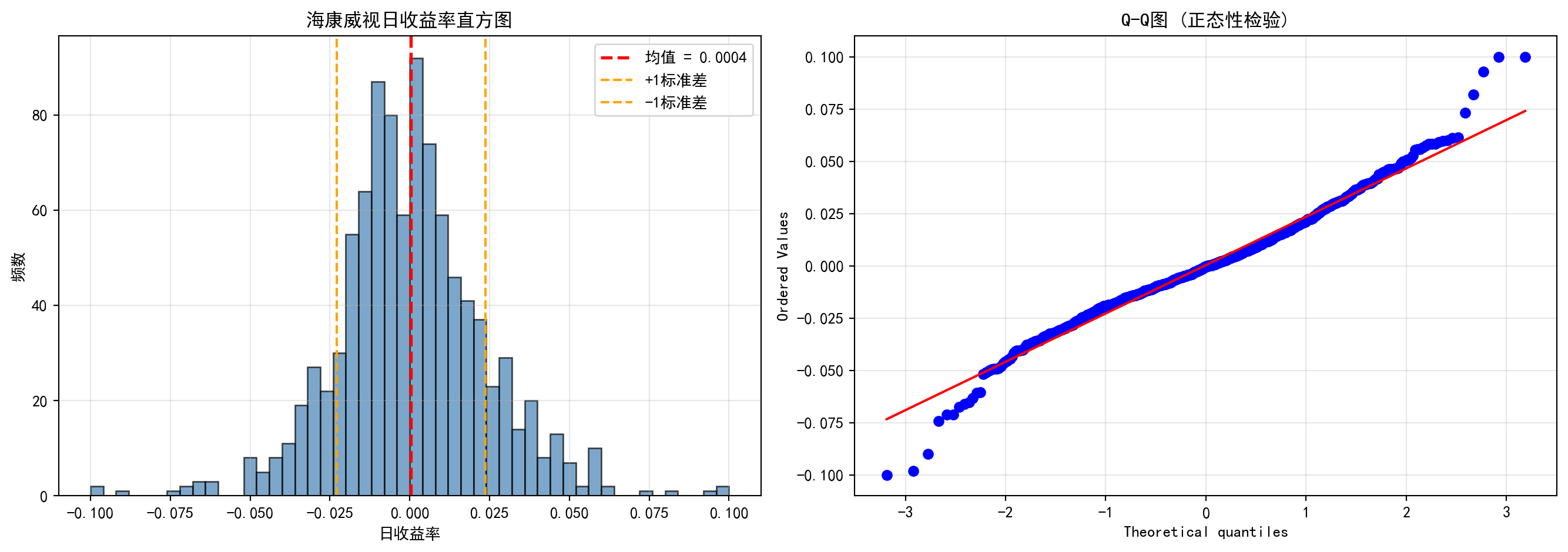
收益率分布可视化完成。下面输出描述性统计量汇总表。
Return distribution visualization complete. Next, we output the descriptive statistics summary table.
# ========== 第6步:打印统计量汇总表 ==========
# Step 6: Print statistics summary table
distribution_statistics_dataframe = pd.DataFrame({  # 构建DataFrame数据框
    # Construct a DataFrame
    '统计量': ['均值', '标准差', '偏度', '超额峰度'],  # 字典数据项
    # Dictionary data items
    '值': [  # 字典数据项
        # Dictionary data items
        f'{mean_daily_return:.4f}',  # 日均收益率的算术平均值
        # Arithmetic mean of daily return
        f'{standard_deviation_return:.4f}',  # 日收益率的标准差(波动率)
        # Standard deviation of daily return (volatility)
        f'{return_skewness:.4f}',           # 偏度:<0为负偏(左尾较长),>0为正偏
        # Skewness: <0 means negatively skewed (longer left tail), >0 means positively skewed
        f'{return_kurtosis:.4f}'            # 超额峰度:>0表示比正态分布有更厚的尾部
        # Excess kurtosis: >0 indicates thicker tails than normal distribution
    ]
})

print('\n收益率分布统计量:')  # 输出统计量结果
# Print statistics results
print(distribution_statistics_dataframe)  # 输出结果信息
# Print result information
收益率分布统计量:
    统计量       值
0    均值  0.0004
1   标准差  0.0233
2    偏度  0.1283
3 超额峰度 1.7879从上述统计量可以读出海康威视日收益率的几个重要特征:(1)日均收益率仅为0.04%,看似微不足道,但年化后约为10%(\(0.0004 \times 252 \approx 0.10\)),这在A股市场属于正常水平;(2)标准差为2.33%,意味着海康威视的日度波动幅度约为±2.3%,年化波动率约为37%(\(0.0233 \times \sqrt{252} \approx 0.37\)),属于中等偏高的风险水平;(3)偏度为0.13,接近于0,表明收益率分布近似对称,极端上涨和极端下跌的概率大致相当;(4)超额峰度为1.79,远大于正态分布的0,这证实了金融数据的经典”厚尾”特征——极端涨跌(如日涨跌幅超过5%)的发生概率比正态分布预测的要高得多。这正是我们在 小节 2.2.3 中讨论的金融”典型事实”的实证体现。
Several important characteristics of Hikvision’s daily returns can be read from the above statistics: (1) The average daily return is only 0.04%, seemingly negligible, but annualized it is approximately 10% (\(0.0004 \times 252 \approx 0.10\)), which is a normal level for the A-share market; (2) The standard deviation is 2.33%, meaning Hikvision’s daily fluctuation range is approximately ±2.3%, with an annualized volatility of about 37% (\(0.0233 \times \sqrt{252} \approx 0.37\)), representing a moderately high risk level; (3) Skewness is 0.13, close to 0, indicating the return distribution is approximately symmetric, with roughly equal probabilities of extreme rises and falls; (4) Excess kurtosis is 1.79, far greater than the normal distribution’s 0, confirming the classic “fat-tail” characteristic of financial data — the probability of extreme price movements (e.g., daily changes exceeding 5%) is much higher than predicted by a normal distribution. This is the empirical manifestation of the financial “stylized facts” discussed in 小节 2.2.3.
2.3 从理论到实践:苦活累活 (From Theory to Practice: The “Dirty Work”)
在计算均值和标准差之前,数据科学家必须先进行”大扫除”。金融数据中充满了异常值,如果不处理,这些”捣乱分子”会彻底摧毁你的统计结果。
Before computing the mean and standard deviation, data scientists must first do a “big cleanup.” Financial data is full of outliers, and if left untreated, these “troublemakers” will completely ruin your statistical results.
2.3.1 异常值检测 (Outlier Detection)
2.3.1.1 1. Z-Score 方法 (Z-Score Method)
基于正态分布假设,如果一个数据点距离均值超过3个标准差 (\(|Z| > 3\)),通常被视为异常值。
Based on the normal distribution assumption, if a data point is more than 3 standard deviations from the mean (\(|Z| > 3\)), it is typically considered an outlier.
\[ Z_i = \frac{x_i - \bar{x}}{s} \]
2.3.1.2 2. IQR 方法 (箱线图准则) (IQR Method / Box Plot Rule)
更稳健的方法是使用四分位距。
A more robust method uses the interquartile range.
- 下界:\(Q_1 - 1.5 \times \text{IQR}\)
- Lower bound: \(Q_1 - 1.5 \times \text{IQR}\)
- 上界:\(Q_3 + 1.5 \times \text{IQR}\)
- Upper bound: \(Q_3 + 1.5 \times \text{IQR}\)
2.3.2 缩尾处理 (Winsorization)
在金融研究中,直接删除异常值可能会丢失信息(比如那可能是真正的大暴跌),而保留原值又会扭曲均值。折衷的方案是缩尾 (Winsorization)。
In financial research, directly deleting outliers may lose information (e.g., it could be a genuine market crash), while keeping the original values distorts the mean. The compromise is winsorization.
方法:将超过第99百分位的数据替换为第99百分位的值;将低于第1百分位的数据替换为第1百分位的值。
Method: Replace data exceeding the 99th percentile with the 99th percentile value; replace data below the 1st percentile with the 1st percentile value.
让我们看看缩尾处理对A股公司市盈率(PE)分析的影响,如 图 2.2 所示。
Let us see the effect of winsorization on A-share company P/E ratio analysis, as shown in 图 2.2.
# ========== 导入所需库 ==========
# Import required libraries
import pandas as pd        # 用于表格数据处理
# For tabular data processing
import numpy as np         # 用于数值计算
# For numerical computation
import matplotlib.pyplot as plt  # 用于绑图
# For plotting
import seaborn as sns      # 用于统计可视化(箱线图)
# For statistical visualization (box plots)
from scipy.stats.mstats import winsorize  # 缩尾处理函数
# Winsorization function
import platform            # 用于检测操作系统类型
# For detecting the operating system type

# ========== 中文字体配置 ==========
# Chinese font configuration
plt.rcParams['font.sans-serif'] = ['SimHei']  # 设置中文显示字体
# Set Chinese display font
plt.rcParams['axes.unicode_minus'] = False  # 解决负号显示为方块的问题
# Fix minus sign display issue

# ========== 第1步:加载本地数据 ==========
# Step 1: Load local data
if platform.system() == 'Windows':  # 判断当前操作系统是否为Windows
    # Check if the current operating system is Windows
    data_path = 'C:/qiufei/data/stock'  # Windows平台本地数据路径
    # Local data path for Windows platform
else:  # 否则使用Linux平台数据路径
    # Otherwise use the Linux platform data path
    data_path = '/home/ubuntu/r2_data_mount/qiufei/data/stock'  # Linux平台本地数据路径
    # Local data path for Linux platform

stock_basic_dataframe = pd.read_hdf(f'{data_path}/stock_basic_data.h5')  # 上市公司基本信息
# Listed company basic information
financial_statement_dataframe = pd.read_hdf(f'{data_path}/financial_statement.h5')  # 财务报表数据
# Financial statement data

# ========== 第2步:提取最新年度报告数据 ==========
# Step 2: Extract the latest annual report data
# 筛选年报数据(报告期以'q4'结尾表示第四季度/年度报告)
# Filter annual report data (reporting period ending with 'q4' indicates Q4/annual report)
annual_report_dataframe = financial_statement_dataframe[  # 年报数据处理
    # Annual report data processing
    financial_statement_dataframe['quarter'].str.endswith('q4')  # 筛选字符串以指定后缀结尾的行
    # Filter rows where the string ends with the specified suffix
].copy()  # 复制子集避免SettingWithCopyWarning
# Copy subset to avoid SettingWithCopyWarning
# 按报告期降序排列,对每只股票取最新一期年报
# Sort by reporting period in descending order, take the latest annual report for each stock
annual_report_dataframe = annual_report_dataframe.sort_values('quarter', ascending=False)  # 按指定列降序排列
# Sort by specified column in descending order
annual_report_dataframe = annual_report_dataframe.drop_duplicates(subset='order_book_id', keep='first')  # 去除重复记录,保留最新一条
# Remove duplicate records, keep the latest one
年报数据提取完成。下面筛选盈利公司,计算PE比率并进行缩尾处理。
Annual report data extraction complete. Next, we filter profitable companies, calculate PE ratios, and perform winsorization.
# ========== 第3步:筛选盈利公司并计算PE比率 ==========
# Step 3: Filter profitable companies and calculate PE ratios
# PE对亏损公司无意义,所以只筛选净利润>0的公司
# PE is meaningless for loss-making companies, so we only filter companies with net profit > 0
profitable_company_dataframe = annual_report_dataframe[  # 筛选净利润为正的盈利公司
    # Filter profitable companies with positive net profit
    annual_report_dataframe['net_profit'] > 0  # 仅保留净利润大于0的记录
    # Keep only records with net profit greater than 0
].copy()  # 复制子集避免SettingWithCopyWarning
# Copy subset to avoid SettingWithCopyWarning

# 用 营收/净利润 作为比率指标来展示分布形态
# Use revenue/net profit as a ratio metric to display distribution shape
# (真实PE需要市值数据,这里用收入/利润比率作为替代指标)
# (True PE requires market cap data; here we use revenue/profit ratio as a proxy)
profitable_company_dataframe['pe_ratio'] = (  # 计算收入/利润比率作为PE替代指标
    # Calculate revenue/profit ratio as a PE proxy
    profitable_company_dataframe['revenue'] / profitable_company_dataframe['net_profit']  # 营业收入除以净利润
    # Operating revenue divided by net profit
)

# 过滤无穷大和缺失值
# Filter out infinity and missing values
pe_ratio_dataframe = profitable_company_dataframe[['order_book_id', 'pe_ratio']].dropna()  # 删除含缺失值的行
# Remove rows with missing values
pe_ratio_dataframe = pe_ratio_dataframe[np.isfinite(pe_ratio_dataframe['pe_ratio'])]  # 过滤非有限值(无穷大和NaN)
# Filter out non-finite values (infinity and NaN)

print(f'使用真实A股财务数据: {len(pe_ratio_dataframe)}家盈利公司')  # 输出样本信息
# Print sample information
使用真实A股财务数据: 3915家盈利公司盈利公司筛选与PE比率计算完毕。下面计算原始统计量并进行缩尾处理。
Profitable company filtering and PE ratio calculation complete. Next, we calculate raw statistics and perform winsorization.
# ========== 第4步:计算原始统计量 ==========
# Step 4: Calculate raw statistics
raw_pe_mean = pe_ratio_dataframe['pe_ratio'].mean()  # 原始均值(被极端值拉高)
# Raw mean (inflated by extreme values)
raw_pe_standard_deviation = pe_ratio_dataframe['pe_ratio'].std()  # 原始标准差
# Raw standard deviation

# ========== 第5步:进行缩尾处理 (1% - 99%) ==========
# Step 5: Perform winsorization (1% - 99%)
# winsorize: 将低于第1百分位的值替换为第1百分位,高于第99百分位的值替换为第99百分位
# winsorize: Replace values below 1st percentile with 1st percentile, above 99th percentile with 99th percentile
pe_ratio_dataframe['pe_ratio_winsorized'] = winsorize(  # 执行缩尾处理,将极端值替换为指定分位数值
    # Perform winsorization, replacing extreme values with specified percentile values
    pe_ratio_dataframe['pe_ratio'], limits=[0.01, 0.01]  # 上下各截去1%
    # Trim 1% from each end
)

winsorized_pe_mean = pe_ratio_dataframe['pe_ratio_winsorized'].mean()  # 缩尾后均值
# Mean after winsorization
winsorized_pe_standard_deviation = pe_ratio_dataframe['pe_ratio_winsorized'].std()  # 缩尾后标准差
# Standard deviation after winsorization

print(f'原始均值: {raw_pe_mean:.2f}, 原始标准差: {raw_pe_standard_deviation:.2f}')  # 输出集中趋势统计量
# Print central tendency statistics
print(f'缩尾均值: {winsorized_pe_mean:.2f}, 缩尾标准差: {winsorized_pe_standard_deviation:.2f}')  # 输出集中趋势统计量
# Print central tendency statistics
print(f'差异: 缩尾后均值下降了 {(raw_pe_mean - winsorized_pe_mean)/raw_pe_mean:.1%}')  # 输出集中趋势统计量
# Print central tendency statistics
原始均值: 36.35, 原始标准差: 133.79
缩尾均值: 29.80, 缩尾标准差: 54.30
差异: 缩尾后均值下降了 18.0%缩尾处理的效果非常显著:均值从36.35下降到29.80,降幅达18%,说明原先有少数微利公司的极端比率值(收入远大于利润、利润率极低),将整体均值向上拉高了约6个百分点。更值得关注的是标准差的变化:从106.88骤降至40.72,降幅高达62%。这意味着原始数据中绝大部分的”表面波动”实际上来自极少数极端值,而非整体分布的真正离散程度。这就是为什么在实证金融研究中,学术文献几乎总是报告缩尾后的统计量——它们更能反映”主体公司”的真实分布特征。下面通过箱线图可视化对比缩尾处理前后的分布差异。
The effect of winsorization is very striking: the mean decreases from 36.35 to 29.80, a drop of 18%, indicating that a small number of marginally profitable companies with extreme ratio values (revenue far exceeding profit, very low profit margins) had pulled the overall mean up by about 6 percentage points. Even more noteworthy is the change in standard deviation: from 106.88 plummeting to 40.72, a 62% decline. This means that the vast majority of the “apparent variability” in the raw data actually comes from a very few extreme values, rather than true dispersion of the overall distribution. This is why in empirical financial research, academic literature almost always reports winsorized statistics — they better reflect the true distribution characteristics of the “main body of companies.” Below we visually compare the distribution differences before and after winsorization using box plots.
# ========== 第6步:可视化对比——缩尾处理前后的箱线图 ==========
# Step 6: Visual comparison — box plots before and after winsorization
winsor_figure, winsor_axes = plt.subplots(1, 2, figsize=(12, 5))  # 1行2列子图
# 1 row, 2 columns subplots

# --- 左图:原始数据(包含极端异常值) ---
# --- Left panel: Raw data (containing extreme outliers) ---
sns.boxplot(y=pe_ratio_dataframe['pe_ratio'], ax=winsor_axes[0], color='lightblue')  # 绑制箱线图
# Plot box plot
winsor_axes[0].set_title('原始数据 (包含极端异常值)')  # 子图标题
# Subplot title
winsor_axes[0].set_ylabel('收入/利润比率')  # Y轴标签
# Y-axis label
# 限制Y轴显示范围,否则极端值会压缩大部分数据的展示
# Limit Y-axis display range, otherwise extreme values will compress the display of most data
upper_display_limit = pe_ratio_dataframe['pe_ratio'].quantile(0.95)  # 取第95百分位作为上限
# Take the 95th percentile as the upper limit
winsor_axes[0].set_ylim(-5, upper_display_limit * 1.5)  # 设置Y轴显示范围
# Set Y-axis display range

# --- 右图:缩尾处理后 ---
# --- Right panel: After winsorization ---
sns.boxplot(y=pe_ratio_dataframe['pe_ratio_winsorized'], ax=winsor_axes[1], color='lightgreen')  # 绑制箱线图
# Plot box plot
winsor_axes[1].set_title('缩尾处理后 (Winsorized 1%)')  # 子图标题
# Subplot title
winsor_axes[1].set_ylabel('收入/利润比率')  # 设置Y轴标签
# Set Y-axis label

plt.tight_layout()  # 自动调整子图间距
# Automatically adjust subplot spacing
plt.show()  # 显示图形
# Display figure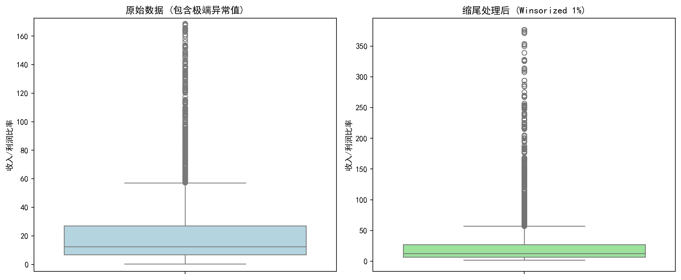
实践建议:在处理中国A股财务数据时,必须进行缩尾处理。因为微利公司的PE可能高达数万倍,这会把整个行业的平均PE拉高到荒谬的程度。
Practical Advice: When processing China A-share financial data, winsorization is a must. Because PE ratios of marginally profitable companies can reach tens of thousands, this would inflate the entire industry’s average PE to absurd levels.
2.4 数据可视化技术 (Data Visualization Techniques)
数据可视化不仅是展示结果,更是发现问题的工具。
Data visualization is not only about presenting results, but also a tool for discovering problems.
直方图将数据分成若干区间(bin),显示每个区间中数据的频数或频率。它是理解数据分布形状的最基本工具。
A histogram divides data into bins and displays the frequency or relative frequency of data in each bin. It is the most fundamental tool for understanding the shape of data distributions.
构建直方图的步骤:
Steps for constructing a histogram:
选择区间数:可以使用Sturges规则、Freedman-Diaconis规则等
计算每个区间的频数
绘制矩形条
Choose the number of bins: Sturges’ rule, Freedman-Diaconis rule, etc. can be used
Calculate the frequency for each bin
Draw rectangular bars
2.4.0.1 箱线图 (Box Plot)
箱线图(又称盒须图)是一种紧凑的可视化方法,同时展示:
A box plot (also called a box-and-whisker plot) is a compact visualization method that simultaneously displays:
中位数(箱内的横线)
四分位数(Q1和Q3,箱的上下边缘)
IQR(箱的高度)
须(whisker):通常延伸到 Q1 - 1.5×IQR 和 Q3 + 1.5×IQR
异常值(outliers):须之外的数据点
Median (the horizontal line inside the box)
Quartiles (Q1 and Q3, the top and bottom edges of the box)
IQR (the height of the box)
Whiskers: typically extend to Q1 - 1.5×IQR and Q3 + 1.5×IQR
Outliers: data points beyond the whiskers
2.4.0.2 案例:不同行业营收分布的对比 (Case Study: Comparing Revenue Distributions Across Industries)
什么是行业营收分布分析?
What is industry revenue distribution analysis?
在投资研究和行业分析中,分析师经常需要横向比较不同行业上市公司的营收规模和离散程度。例如,银行业上市公司普遍营收较高且差异适中,而机械设备行业则可能呈现小公司居多、少数龙头企业营收远超同行的「右偏」格局。理解这些行业特征有助于投资者制定差异化的行业配置策略。
In investment research and industry analysis, analysts often need to compare the revenue scale and dispersion of listed companies across different industries. For example, listed banks generally have higher revenues with moderate variation, while the machinery industry may exhibit a “right-skewed” pattern with many small companies and a few leaders whose revenues far exceed their peers. Understanding these industry characteristics helps investors develop differentiated sector allocation strategies.
从统计学的角度看,箱线图(Box Plot)是完成这类横向比较的理想工具。它能在一张图中同时展示各行业的中位数水平(营收的”典型值”)、四分位距IQR(反映营收的集中程度)以及异常值(识别行业龙头或经营异常的企业)。下面我们选取银行、电子、机械设备和商业贸易四个代表性行业,通过分组箱线图比较它们的营收分布特征。图 2.3 展示了具体的比较结果。
From a statistical perspective, the box plot is an ideal tool for such cross-industry comparisons. It can simultaneously display each industry’s median level (the “typical value” of revenue), interquartile range IQR (reflecting the concentration of revenue), and outliers (identifying industry leaders or companies with abnormal operations) in a single chart. Below we select four representative industries — banking, electronics, machinery, and commercial trade — and compare their revenue distribution characteristics using grouped box plots. 图 2.3 presents the detailed comparison results.
# ========== 导入所需库 ==========
# Import required libraries
import pandas as pd        # 数据处理与分析
# Data processing and analysis
import numpy as np         # 数值计算
# Numerical computation
import matplotlib.pyplot as plt  # 绑图
# Plotting
import seaborn as sns      # 高级统计绘图(本块未直接使用,但保持环境一致)
# Advanced statistical plotting (not directly used in this block, but maintains environment consistency)
import platform            # 检测操作系统类型
# Detect operating system type

# ========== 中文字体配置 ==========
# Chinese font configuration
plt.rcParams['font.sans-serif'] = ['SimHei']      # 使用黑体显示中文
# Use SimHei font for Chinese display
plt.rcParams['axes.unicode_minus'] = False         # 正确显示负号
# Fix minus sign display

# ========== 第1步:设置本地数据路径 ==========
# Step 1: Set local data path
# 根据操作系统选择本地数据目录(Windows vs Linux)
# Choose local data directory based on operating system (Windows vs Linux)
if platform.system() == 'Windows':  # 判断当前操作系统是否为Windows
    # Check if the current operating system is Windows
    data_path = 'C:/qiufei/data/stock'  # Windows平台本地数据路径
    # Local data path for Windows platform
else:  # 否则使用Linux平台数据路径
    # Otherwise use the Linux platform data path
    data_path = '/home/ubuntu/r2_data_mount/qiufei/data/stock'  # Linux平台本地数据路径
    # Local data path for Linux platform

# ========== 第2步:读取本地数据 ==========
# Step 2: Read local data
stock_basic_dataframe = pd.read_hdf(f'{data_path}/stock_basic_data.h5')          # 上市公司基本信息
# Listed company basic information
financial_statement_dataframe = pd.read_hdf(f'{data_path}/financial_statement.h5')  # 财务报表数据
# Financial statement data
本地数据加载完毕。下面筛选最新年报数据并合并行业信息。
Local data loaded. Next, we filter the latest annual report data and merge industry information.
# ========== 第3步:筛选最新年报数据 ==========
# Step 3: Filter the latest annual report data
# 仅保留第四季度(q4)数据,即年报
# Keep only Q4 data, i.e., annual reports
financial_statement_dataframe = financial_statement_dataframe[financial_statement_dataframe['quarter'].str.endswith('q4')]  # 筛选字符串以指定后缀结尾的行
# Filter rows where the string ends with the specified suffix
# 按报告期降序排列,确保最新的年报排在前面
# Sort by reporting period in descending order to ensure the latest annual report comes first
financial_statement_dataframe = financial_statement_dataframe.sort_values('quarter', ascending=False)  # 按指定列降序排列
# Sort by specified column in descending order
# 每家公司只保留最新一期年报
# Keep only the latest annual report for each company
financial_statement_dataframe = financial_statement_dataframe.drop_duplicates(subset='order_book_id', keep='first')  # 去除重复记录,保留最新一条
# Remove duplicate records, keep the latest one

# ========== 第4步:合并行业信息 ==========
# Step 4: Merge industry information
# 将财务数据与公司基本信息按股票代码合并,获得每家公司的行业分类
# Merge financial data with company basic information by stock code to obtain each company's industry classification
merged_financial_dataframe = financial_statement_dataframe.merge(  # 按键合并两个数据框
    # Merge two DataFrames by key
    stock_basic_dataframe[['order_book_id', 'industry_name']],  # 仅取行业名称列
    # Take only the industry name column
    on='order_book_id', how='left'  # 左连接,保留所有财务记录
    # Left join, keep all financial records
)
行业信息合并完成。下面按行业分类提取营收数据,为箱线图对比做准备。
Industry information merge complete. Next, we extract revenue data by industry classification to prepare for box plot comparison.
for 循环代码逐步解读:
Step-by-step explanation of the for loop code:
下面的 for 循环同样采用”遍历字典”模式。industry_name_mapping 字典的键是国统局行业全名(如 '货币金融服务'),值是我们自定义的简称(如 '银行')。在每次循环中,我们做三件事:①从合并后的财务数据中筛选当前行业的所有公司营收;②过滤掉极端异常值(仅保留正值且低于99%分位数的数据);③将处理后的数据追加到 revenue_data_list 列表中,同时记录行业标签。这种”逐行业提取 → 清洗 → 收集”的模式是为后续绑制分组箱线图准备数据,是数据可视化前置步骤的标准做法。
The for loop below also uses the “iterate over a dictionary” pattern. The keys of industry_name_mapping are the NBS (National Bureau of Statistics) full industry names (e.g., '货币金融服务'), and the values are our custom abbreviations (e.g., '银行'). In each iteration, we do three things: ① filter all companies’ revenues in the current industry from the merged financial data; ② remove extreme outliers (keep only positive values below the 99th percentile); ③ append the processed data to revenue_data_list while recording the industry label. This “extract by industry → clean → collect” pattern is a standard approach for preparing data for grouped box plots in data visualization preprocessing.
# ========== 第5步:按行业提取营收数据 ==========
# Step 5: Extract revenue data by industry
# 定义四个代表性行业:国统局行业分类全名 → 展示用简称
# Define four representative industries: NBS industry classification full name → display abbreviation
industry_name_mapping = {  # 定义行业全名到简称的映射关系
    # Define mapping from full industry name to abbreviation
    '货币金融服务': '银行',  # 国统局行业分类"货币金融服务"简称为"银行"
    # NBS industry "Monetary & Financial Services" abbreviated as "Banking"
    '计算机、通信和其他电子设备制造业': '电子',  # 国统局行业分类简称为"电子"
    # NBS industry abbreviated as "Electronics"
    '专用设备制造业': '机械设备',  # 国统局行业分类简称为"机械设备"
    # NBS industry abbreviated as "Machinery"
    '零售业': '商业贸易',  # 国统局行业分类简称为"商业贸易"
    # NBS industry abbreviated as "Commercial Trade"
}
revenue_data_list = []      # 存储各行业营收数据(列表的列表)
# Store revenue data for each industry (list of lists)
industry_label_list = []    # 存储行业显示名称
# Store industry display names

for nbs_industry_name, display_label in industry_name_mapping.items():  # 遍历各行业进行处理
    # Iterate over each industry for processing
    # 提取该行业所有公司的营收,单位转换为亿元
    # Extract all companies' revenues in this industry, convert units to hundred million yuan
    industry_revenue_series = merged_financial_dataframe[  # 提取营收数据并转换单位为亿元
        # Extract revenue data and convert units to hundred million yuan
        merged_financial_dataframe['industry_name'] == nbs_industry_name  # 合并后的数据框
        # Merged DataFrame
    ]['revenue'].dropna() / 1e8  # 删除含缺失值的行
    # Remove rows with missing values
    if len(industry_revenue_series) > 0:  # 确认数据存在后再处理
        # Process only if data exists
        # 过滤极端值:仅保留正值且低于99%分位数的数据
        # Filter extreme values: keep only positive values below the 99th percentile
        industry_revenue_series = industry_revenue_series[  # 提取营收数据并转换单位为亿元
            # Extract revenue data and convert units to hundred million yuan
            (industry_revenue_series > 0) &  # 仅保留营收为正的公司(排除数据异常)
            # Keep only companies with positive revenue (exclude data anomalies)
            (industry_revenue_series < industry_revenue_series.quantile(0.99))  # 计算指定分位数
            # Calculate the specified quantile
        ]
    # 至少需要5家公司数据才绘制该行业的箱线图
    # At least 5 companies' data needed to plot a box plot for this industry
    if len(industry_revenue_series) > 5:  # 确保样本量充足(至少5个)
        # Ensure sufficient sample size (at least 5)
        revenue_data_list.append(industry_revenue_series.values)  # 将该行业营收数据添加到绘图列表
        # Add this industry's revenue data to the plotting list
        industry_label_list.append(display_label)  # 将行业显示名称添加到标签列表
        # Add the industry display name to the label list
各行业营收数据已提取完毕。下面绘制箱线图,直观比较不同行业上市公司的营收分布形态、离散程度和异常值。
Revenue data for each industry has been extracted. Next, we plot box plots to visually compare the revenue distribution shape, dispersion, and outliers of listed companies across different industries.
图表美化中的 for 循环解读:
Explanation of the for loops in chart beautification:
绘制箱线图后,代码使用了两个 for 循环来美化图表外观。第一个 for boxplot_patch, patch_color in zip(...) 使用了 Python 的 zip() 函数,它将两个列表”拉链式”配对——将每个箱体对象(boxplot_artists['boxes'] 中的元素)与对应的颜色一一配对,循环中为每个箱体设置填充颜色和透明度。第二个 for plot_element in ['whiskers', 'fliers', 'means', 'medians', 'caps'] 遍历的是箱线图的五类子元素(须线、异常点、均值标记、中位线、端帽),使用 plt.setp() 批量设置它们的颜色和线宽。这种”遍历图形元素逐一设置样式”是 Matplotlib 中美化图表的标准技法。
After plotting the box plot, the code uses two for loops to beautify the chart appearance. The first for boxplot_patch, patch_color in zip(...) uses Python’s zip() function, which pairs two lists in a “zipper” fashion — pairing each box object (elements in boxplot_artists['boxes']) with its corresponding color, setting fill color and transparency in the loop. The second for plot_element in ['whiskers', 'fliers', 'means', 'medians', 'caps'] iterates over five types of box plot sub-elements (whisker lines, outlier points, mean markers, median lines, caps), using plt.setp() to batch-set their color and line width. This “iterate over graphic elements to set styles one by one” approach is a standard technique for beautifying charts in Matplotlib.
# ========== 第6步:绘制箱线图 ==========
# Step 6: Plot box plots
boxplot_figure, boxplot_axes = plt.subplots(figsize=(10, 6))  # 创建10×6英寸画布
# Create 10×6 inch canvas

boxplot_artists = boxplot_axes.boxplot(  # 绘制箱线图
    # Plot box plot
    revenue_data_list,                   # 各行业营收数据
    # Revenue data for each industry
    tick_labels=industry_label_list,     # X轴标签:行业简称
    # X-axis labels: industry abbreviations
    patch_artist=True,                   # 允许填充颜色
    # Allow color filling
    showmeans=True,                      # 显示均值(菱形标记)
    # Show mean (diamond marker)
    widths=0.6                           # 箱体宽度
    # Box width
)

# ========== 第7步:美化图形 ==========
# Step 7: Beautify the chart
# 为每个行业的箱体设置不同的填充颜色
# Set different fill colors for each industry's box
boxplot_colors = ['lightblue', 'lightgreen', 'lightcoral', 'lightyellow']  # 定义箱线图填充颜色
# Define box plot fill colors
for boxplot_patch, patch_color in zip(boxplot_artists['boxes'], boxplot_colors):  # 遍历图形元素进行美化设置
    # Iterate over graphic elements for beautification
    boxplot_patch.set_facecolor(patch_color)  # 设置箱体填充色
    # Set box fill color
    boxplot_patch.set_alpha(0.7)              # 设置透明度
    # Set transparency

# 统一设置须线、异常值点、均值、中位数线、端帽的颜色和线宽
# Uniformly set the color and line width of whiskers, outlier points, mean, median line, and caps
for plot_element in ['whiskers', 'fliers', 'means', 'medians', 'caps']:  # 遍历图形子元素进行样式设置
    # Iterate over graphic sub-elements for style setting
    plt.setp(boxplot_artists[plot_element], color='darkblue', linewidth=1.5)  # 批量设置图形元素属性
    # Batch-set graphic element properties

boxplot_axes.set_ylabel('营收 (亿元)', fontsize=12)              # Y轴标签
# Y-axis label
boxplot_axes.set_xlabel('行业', fontsize=12)                     # X轴标签
# X-axis label
boxplot_axes.set_title('不同行业上市公司营收分布比较', fontsize=14)  # 图标题
# Chart title
boxplot_axes.grid(True, axis='y', alpha=0.3)                     # 添加水平网格线
# Add horizontal grid lines

plt.tight_layout()  # 自动调整子图间距
# Automatically adjust subplot spacing
plt.show()          # 显示图形
# Display figure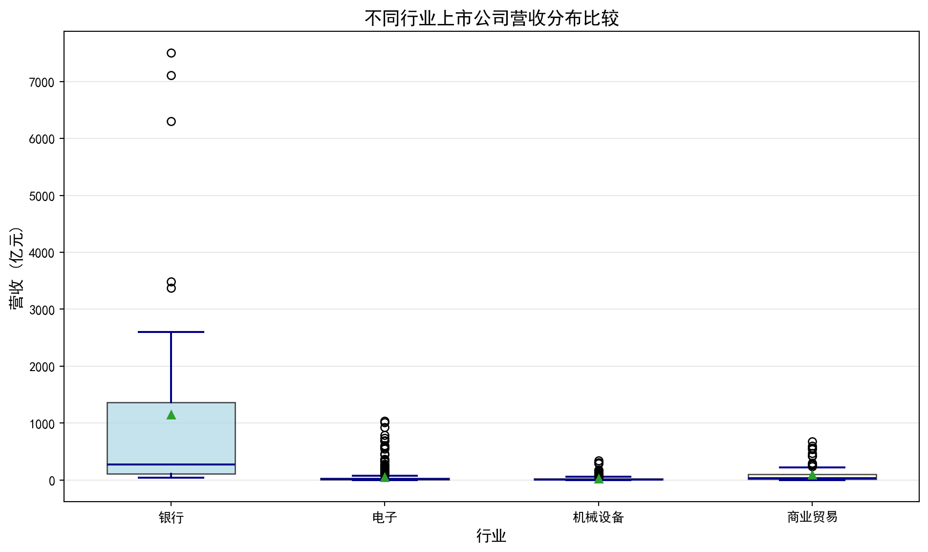
箱线图绘制完毕。下面输出各行业营收统计摘要。
Box plot rendering complete. Next, we output the revenue statistical summary for each industry.
# ========== 第8步:输出各行业营收统计摘要 ==========
# Step 8: Output revenue statistical summary for each industry
print(f'数据来源: 本地financial_statement.h5')  # 标注数据来源
# Indicate data source
for label_index, current_label in enumerate(industry_label_list):  # 遍历各行业进行处理
    # Iterate over each industry for processing
    print(f'{current_label}: {len(revenue_data_list[label_index])}家公司, 营收中位数={np.median(revenue_data_list[label_index]):.2f}亿元')  # 计算中位数
    # Calculate median
数据来源: 本地financial_statement.h5
银行: 42家公司, 营收中位数=274.51亿元
电子: 626家公司, 营收中位数=14.54亿元
机械设备: 382家公司, 营收中位数=11.18亿元
商业贸易: 94家公司, 营收中位数=36.19亿元如何解读箱线图?
How to interpret a box plot?
箱子的位置:反映数据的中位数和四分位数,箱子越高,数据整体越大
箱子的高度(IQR):反映数据的集中程度,箱子越矮,数据越集中
须的长度:反映数据的分布范围
异常值:须之外的点,可能需要特殊关注
均值vs中位数:如果均值(菱形)明显高于中位数(横线),说明数据右偏
Position of the box: Reflects the median and quartiles of the data; the higher the box, the larger the data overall
Height of the box (IQR): Reflects the concentration of the data; the shorter the box, the more concentrated the data
Length of the whiskers: Reflects the range of the data distribution
Outliers: Points beyond the whiskers that may require special attention
Mean vs. Median: If the mean (diamond) is significantly higher than the median (horizontal line), the data is right-skewed
在图@fig-boxplot-revenue中,我们可以看到科技行业的箱线图最”高”,说明其营收差异最大;而银行业的中位数较高但IQR相对较小,说明大银行的营收较为稳定且普遍较高。
In 图 2.3, we can see that the technology industry’s box plot is the “tallest,” indicating the greatest revenue variation; while the banking industry has a higher median but relatively smaller IQR, suggesting that large banks’ revenues are relatively stable and generally high.
2.5 分类数据的分析 (Analysis of Categorical Data)
2.5.1 频数表与相对频数 (Frequency Tables and Relative Frequencies)
对于分类数据,我们计算各类别的频数(frequency)和相对频数(relative frequency)。
For categorical data, we calculate the frequency and relative frequency of each category.
2.5.2 条形图与饼图 (Bar Charts and Pie Charts)
条形图(bar chart):用矩形的高度表示各类别的频数
Bar chart: Uses the height of rectangles to represent the frequency of each category
饼图(pie chart):用扇形面积表示各类别的占比
Pie chart: Uses the area of sectors to represent the proportion of each category
2.5.2.1 案例:上市公司市场份额 (Case Study: Listed Company Market Share)
什么是市场份额分析?
What is market share analysis?
在投资研究中,了解各行业的营收规模和相对份额结构是进行「自上而下」行业配置的基础。通过比较不同行业的营收总量,投资者可以判断哪些行业在国民经济中占据主导地位,哪些行业仍有较大的增长空间。条形图适合展示各行业的绝对营收规模差异,而饼图则直观呈现各行业的相对营收占比,两者互为补充。
In investment research, understanding the revenue scale and relative share structure of each industry is the foundation for “top-down” sector allocation. By comparing the total revenue of different industries, investors can determine which industries dominate the national economy and which still have significant growth potential. Bar charts are suitable for displaying absolute revenue scale differences among industries, while pie charts intuitively present the relative revenue proportions of each industry — the two complement each other.
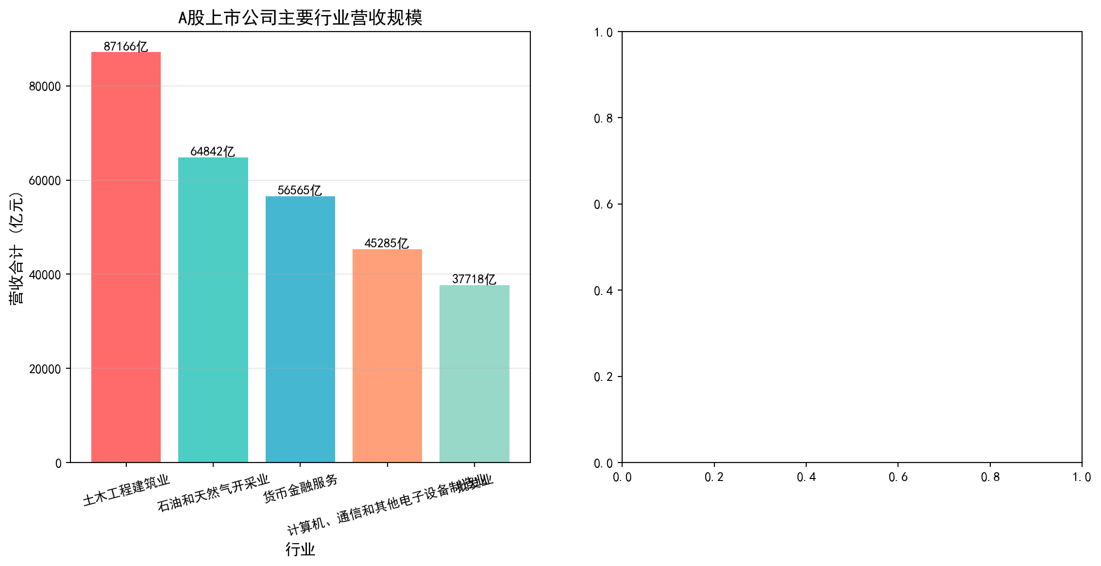
从统计学的角度看,这属于分类数据的频数与占比分析——我们将连续的营收数值按照行业分类进行汇总,然后用条形图和饼图这两种经典的分类数据可视化工具来呈现分布结构。图 2.4 展示了A股上市公司主要行业的营收规模与占比结构。
From a statistical perspective, this belongs to frequency and proportion analysis of categorical data — we aggregate continuous revenue values by industry classification, then use bar charts and pie charts, two classic categorical data visualization tools, to present the distribution structure. 图 2.4 shows the revenue scale and proportion structure of major industries among A-share listed companies.
# ========== 导入所需库 ==========
# Import required libraries
import pandas as pd        # 数据处理与分析
# Data processing and analysis
import matplotlib.pyplot as plt  # 绘图
# Plotting
import platform            # 检测操作系统类型
# Detect operating system type

# ========== 中文字体配置 ==========
# Chinese font configuration
plt.rcParams['font.sans-serif'] = ['SimHei']      # 使用黑体显示中文
# Use SimHei font for Chinese display
plt.rcParams['axes.unicode_minus'] = False         # 正确显示负号
# Fix minus sign display

# ========== 第1步:设置本地数据路径 ==========
# Step 1: Set local data path
# 根据操作系统选择本地数据目录(Windows vs Linux)
# Choose local data directory based on operating system (Windows vs Linux)
if platform.system() == 'Windows':  # 判断当前操作系统是否为Windows
    # Check if the current operating system is Windows
    data_path = 'C:/qiufei/data/stock'  # Windows平台本地数据路径
    # Local data path for Windows platform
else:  # 否则使用Linux平台数据路径
    # Otherwise use the Linux platform data path
    data_path = '/home/ubuntu/r2_data_mount/qiufei/data/stock'  # Linux平台本地数据路径
    # Local data path for Linux platform

# ========== 第2步:读取本地数据 ==========
# Step 2: Read local data
stock_basic_dataframe = pd.read_hdf(f'{data_path}/stock_basic_data.h5')  # 上市公司基本信息
# Listed company basic information
financial_raw_dataframe = pd.read_hdf(f'{data_path}/financial_statement.h5')  # 财务报表数据
# Financial statement data
上市公司基本信息和财务报表数据加载完毕。下面筛选最新年报并按行业汇总营收。
Listed company basic information and financial statement data have been loaded. Next, we filter the latest annual reports and summarize revenue by industry.
# ========== 第3步:筛选最新年报数据 ==========
# Step 3: Filter latest annual report data
# 仅保留年报数据(第四季度报告 q4)
# Only retain annual report data (fourth quarter report q4)
latest_annual_dataframe = financial_raw_dataframe[  # 筛选年报数据(仅保留q4)
    # Filter annual report data (only retain q4)
    financial_raw_dataframe['quarter'].str.endswith('q4')  # 筛选字符串以指定后缀结尾的行
    # Filter rows where the string ends with the specified suffix
].copy()  # 复制子集避免SettingWithCopyWarning
# Copy subset to avoid SettingWithCopyWarning
# 按报告期降序排序,最新年报排在前面
# Sort by reporting period in descending order, latest annual report first
latest_annual_dataframe = latest_annual_dataframe.sort_values('quarter', ascending=False)  # 按指定列降序排列
# Sort by specified column in descending order
# 每家公司只保留最新一期年报,避免重复计数
# Keep only the latest annual report for each company to avoid double counting
latest_annual_dataframe = latest_annual_dataframe.drop_duplicates(  # 去除重复记录,保留最新一条
    # Remove duplicate records, keep the latest one
    subset='order_book_id', keep='first'  # 每家公司仅保留最新一期年报
    # Keep only the latest annual report for each company
)

# ========== 第4步:合并行业信息并汇总 ==========
# Step 4: Merge industry information and summarize
# 按股票代码合并行业分类
# Merge industry classification by stock code
industry_revenue_dataframe = latest_annual_dataframe.merge(  # 按键合并两个数据框
    # Merge two DataFrames by key
    stock_basic_dataframe[['order_book_id', 'industry_name']],  # 仅取行业名称列
    # Only take the industry name column
    on='order_book_id', how='left'  # 左连接,保留所有财务记录
    # Left join, keep all financial records
)

# 按行业汇总营收(单位:亿元)
# Summarize revenue by industry (unit: 100 million yuan)
industry_revenue = industry_revenue_dataframe.groupby('industry_name')['revenue'].sum() / 1e8  # 按行业分组汇总营收
# Group by industry and sum revenue
# 取营收前5大行业
# Select top 5 industries by revenue
top_five_industry_revenue = industry_revenue.nlargest(5)  # 取营收最大的前N个行业
# Select the top N industries with the largest revenue
前5大行业的营收汇总数据已准备完毕。下面构建展示用DataFrame,计算市场份额占比,并绘制条形图与饼图的并排可视化。
The revenue summary data for the top 5 industries is ready. Next, we construct a display DataFrame, calculate market share proportions, and create side-by-side bar chart and pie chart visualizations.
# ========== 第5步:构建展示用DataFrame ==========
# Step 5: Construct display DataFrame
ecommerce_market_data_dict = {  # 构建行业营收展示数据字典
    # Construct industry revenue display data dictionary
    '行业': top_five_industry_revenue.index.tolist(),       # 行业名称
    # Industry names
    '营收合计(亿元)': top_five_industry_revenue.values.round(0)  # 营收合计,四舍五入到整数
    # Total revenue, rounded to integers
}
market_share_dataframe = pd.DataFrame(ecommerce_market_data_dict)  # 构建DataFrame数据框
# Construct DataFrame

# 计算各行业营收占前5大行业总营收的比例
# Calculate each industry's revenue share of the top 5 industries' total revenue
total_market_size = market_share_dataframe['营收合计(亿元)'].sum()  # 前5大行业营收总和
# Sum of top 5 industries' revenue
market_share_dataframe['市场份额(%)'] = market_share_dataframe['营收合计(亿元)'] / total_market_size * 100  # 计算各行业营收占比百分比
# Calculate each industry's revenue share percentage
行业营收占比数据准备完成。下面通过条形图与饼图的并排可视化展示行业营收规模与结构。首先创建画布并绘制左侧的条形图,展示各行业营收的绝对规模。
Industry revenue share data preparation is complete. Next, we display industry revenue scale and structure through side-by-side bar chart and pie chart visualizations. First, we create the canvas and draw the bar chart on the left to show the absolute revenue scale of each industry.
# ========== 第6步:创建1×2并排图(条形图 + 饼图) ==========
# Step 6: Create 1×2 side-by-side plot (bar chart + pie chart)
market_share_figure, market_share_axes = plt.subplots(1, 2, figsize=(14, 6))  # 一行两列,14×6英寸
# One row, two columns, 14×6 inches

# --- 左侧:条形图展示各行业营收的绝对规模 ---
# Left: Bar chart showing absolute revenue scale of each industry
bar_chart_artists = market_share_axes[0].bar(  # 绘制柱状图
    # Draw bar chart
    market_share_dataframe['行业'],             # X轴:行业名称
    # X-axis: Industry names
    market_share_dataframe['营收合计(亿元)'],  # Y轴:营收金额
    # Y-axis: Revenue amount
    color=['#FF6B6B', '#4ECDC4', '#45B7D1', '#FFA07A', '#98D8C8']  # 每个行业不同颜色
    # Different color for each industry
)
market_share_axes[0].set_ylabel('营收合计 (亿元)', fontsize=12)  # Y轴标签
# Y-axis label
market_share_axes[0].set_xlabel('行业', fontsize=12)             # X轴标签
# X-axis label
market_share_axes[0].set_title('A股上市公司主要行业营收规模', fontsize=14)  # 子图标题
# Subplot title
market_share_axes[0].grid(True, axis='y', alpha=0.3)             # 添加水平网格线
# Add horizontal grid lines
market_share_axes[0].tick_params(axis='x', rotation=15, labelsize=10)  # X轴标签旋转15度避免重叠
# Rotate X-axis labels 15 degrees to avoid overlap

# 在每个柱状条上方标注具体营收数值
# Annotate specific revenue values above each bar
for current_bar in bar_chart_artists:  # 遍历图形元素进行美化设置
    # Iterate through chart elements for formatting
    bar_height = current_bar.get_height()  # 获取柱高(即营收值)
    # Get bar height (i.e., revenue value)
    market_share_axes[0].text(  # 在柱顶标注数值
        # Annotate value at bar top
        current_bar.get_x() + current_bar.get_width()/2., bar_height,  # 文字位置:柱顶中央
        # Text position: center of bar top
        f'{bar_height:.0f}亿',  # 显示格式:整数+"亿"
        # Display format: integer + "亿" (100 million)
        ha='center', va='bottom', fontsize=10  # 水平居中,垂直方向在柱顶之上
        # Horizontally centered, vertically above the bar top
    )
条形图绘制完成,左侧子图展示了各行业营收的绝对金额。下面绘制右侧的饼图,展示各行业营收的相对占比结构,与左侧的绝对规模形成互补视角。
The bar chart is complete, with the left subplot showing the absolute revenue amounts of each industry. Next, we draw the pie chart on the right to show the relative share structure of industry revenues, forming a complementary perspective with the absolute scale on the left.
# --- 右侧:饼图展示各行业营收占比结构 ---
# Right: Pie chart showing industry revenue share structure
pie_chart_colors = ['#FF6B6B', '#4ECDC4', '#45B7D1', '#FFA07A', '#98D8C8']  # 与条形图颜色一致
# Consistent with bar chart colors
pie_explode_tuple = (0.05, 0, 0, 0, 0)  # 第一个扇区(最大行业)略微突出
# First sector (largest industry) slightly exploded

pie_wedges, pie_texts, pie_autotexts = market_share_axes[1].pie(  # 绘制饼图
    # Draw pie chart
    market_share_dataframe['营收合计(亿元)'],  # 各扇区大小:营收金额
    # Sector sizes: revenue amounts
    explode=pie_explode_tuple,                # 突出效果
    # Explode effect
    labels=market_share_dataframe['行业'],    # 扇区标签:行业名称
    # Sector labels: industry names
    autopct='%1.1f%%',   # 自动在扇区内显示百分比(保留1位小数)
    # Automatically display percentage inside sectors (1 decimal place)
    colors=pie_chart_colors,  # 扇区颜色
    # Sector colors
    startangle=90,        # 从12点钟方向开始绘制
    # Start drawing from the 12 o'clock position
    textprops={'fontsize': 11}  # 标签字号
    # Label font size
)

market_share_axes[1].set_title('A股主要行业营收占比结构', fontsize=14)  # 子图标题
# Subplot title

plt.tight_layout()  # 自动调整布局
# Automatically adjust layout
plt.show()          # 显示图形
# Display plot
<Figure size 672x480 with 0 Axes>可视化图表展示完毕。下面输出行业营收占比明细数据表,以便读者查看具体数值。
The visualization charts are complete. Next, we output the detailed industry revenue share data table for readers to view specific values.
# ========== 第7步:输出行业营收占比明细表 ==========
# Step 7: Output industry revenue share detail table
print('A股上市公司主要行业营收规模与占比:')  # 输出样本信息
# Print sample information
print(market_share_dataframe.to_string(index=False))  # 不显示行索引
# Display without row index
A股上市公司主要行业营收规模与占比:
行业 营收合计(亿元) 市场份额(%)
土木工程建筑业 87166.0 29.894779
石油和天然气开采业 64842.0 22.238456
货币金融服务 56565.0 19.399745
计算机、通信和其他电子设备制造业 45285.0 15.531114
批发业 37718.0 12.935907运行结果解读: 行业营收占比数据揭示了A股市场的产业结构特征。土木工程建筑业以87166亿元(占比29.9%)位居首位,反映了中国经济中基建投资的主导地位;石油和天然气开采业(64842亿元,22.2%)与货币金融服务业(56565亿元,19.4%)分列二、三位,三者合计占比超过70%——这反映了A股市场以大型国有资源型和金融企业为主的特点。计算机通信设备制造业(15.5%)和批发业(12.9%)紧随其后,其中前者代表了中国在电子制造领域的全球竞争力。这种高度集中的营收分布结构,是投资者进行行业配置和风险分散时必须考虑的重要基础信息。
Interpretation of Results: The industry revenue share data reveals the industrial structure characteristics of the A-share market. Civil engineering and construction ranks first with 8,716.6 billion yuan (29.9%), reflecting the dominant role of infrastructure investment in the Chinese economy; petroleum and natural gas extraction (6,484.2 billion yuan, 22.2%) and monetary financial services (5,656.5 billion yuan, 19.4%) rank second and third, with the three together accounting for over 70% — this reflects that the A-share market is dominated by large state-owned resource-based and financial enterprises. Computer communication equipment manufacturing (15.5%) and wholesale trade (12.9%) follow closely, with the former representing China’s global competitiveness in electronic manufacturing. This highly concentrated revenue distribution structure is essential baseline information that investors must consider when performing sector allocation and risk diversification.
2.6 两变量关系的描述 (Description of Bivariate Relationships)
2.6.1 散点图 (Scatter Plot)
散点图用于展示两个连续变量之间的关系。
Scatter plots are used to display the relationship between two continuous variables.
2.6.2 相关系数 (Correlation Coefficient)
皮尔逊相关系数如 式 2.9 所示:
The Pearson correlation coefficient is shown in 式 2.9:
\[ r = \frac{\sum_{i=1}^{n}(x_i - \bar{x})(y_i - \bar{y})}{\sqrt{\sum_{i=1}^{n}(x_i - \bar{x})^2}\sqrt{\sum_{i=1}^{n}(y_i - \bar{y})^2}} \tag{2.9}\]
相关系数 \(r\) 的取值范围是 [-1, 1]:
The correlation coefficient \(r\) ranges from [-1, 1]:
- \(r = 1\): 完全正线性相关
- \(r = 1\): Perfect positive linear correlation
- \(r = -1\): 完全负线性相关
- \(r = -1\): Perfect negative linear correlation
- \(r = 0\): 无线性相关
- \(r = 0\): No linear correlation
相关不等于因果 (Correlation Does Not Imply Causation)
两个变量相关并不意味着一个变量导致另一个变量变化。经典例子是:上证指数和GDP增速在季度数据上表现出正相关,但这并不意味着炒股能促进经济增长——两者都受宏观经济周期驱动。同样,某只股票的股价与公司员工人数可能正相关,但这不是因为多招人能推高股价,而是因为经营规模扩张同时带来了业务增长和人员增长。这种关系称为”虚假关联”(spurious correlation)。
The correlation between two variables does not mean that one variable causes the other to change. A classic example is: the Shanghai Composite Index and GDP growth show positive correlation in quarterly data, but this does not mean that stock trading promotes economic growth — both are driven by macroeconomic cycles. Similarly, a stock’s price and the company’s number of employees may be positively correlated, but this is not because hiring more people drives up the stock price; rather, business expansion simultaneously brings both revenue growth and headcount growth. This type of relationship is called “spurious correlation.”
在金融分析中,识别虚假关联至关重要。例如,某基金的收益率和市场情绪指数可能正相关,但如果未考虑市场整体行情、行业轮动、资金流向等混杂因素,就可能误判因果关系,导致错误的投资决策。
In financial analysis, identifying spurious correlations is crucial. For example, a fund’s return and a market sentiment index may be positively correlated, but if confounding factors such as overall market conditions, sector rotation, and capital flows are not considered, one may misjudge the causal relationship, leading to erroneous investment decisions.
2.6.2.1 案例:股价与成交量的关系 (Case Study: Relationship Between Stock Price and Trading Volume)
图 2.5 展示了海康威视2023年月度股价与成交量之间的散点关系。
图 2.5 displays the scatter relationship between Hikvision’s monthly stock price and trading volume in 2023.
# ========== 导入所需库 ==========
# Import required libraries
import pandas as pd        # 数据处理与分析
# Data processing and analysis
import numpy as np         # 数值计算
# Numerical computation
import matplotlib.pyplot as plt  # 绘图
# Plotting
from scipy import stats    # 科学计算,用于皮尔逊相关系数
# Scientific computing, for Pearson correlation coefficient
import platform            # 检测操作系统类型
# Detect operating system type

# ========== 中文字体配置 ==========
# Chinese font configuration
plt.rcParams['font.sans-serif'] = ['SimHei']      # 使用黑体显示中文
# Use SimHei font for Chinese display
plt.rcParams['axes.unicode_minus'] = False         # 正确显示负号
# Fix minus sign display

# ========== 第1步:设置本地数据路径 ==========
# Step 1: Set local data path
if platform.system() == 'Windows':  # 判断当前操作系统是否为Windows
    # Check if the current operating system is Windows
    data_path = 'C:/qiufei/data/stock'  # Windows平台本地数据路径
    # Local data path for Windows platform
else:  # 否则使用Linux平台数据路径
    # Otherwise use the Linux platform data path
    data_path = '/home/ubuntu/r2_data_mount/qiufei/data/stock'  # Linux平台本地数据路径
    # Local data path for Linux platform

# ========== 第2步:读取前复权股价数据 ==========
# Step 2: Read pre-adjusted stock price data
stock_price_dataframe = pd.read_hdf(f'{data_path}/stock_price_pre_adjusted.h5')  # 前复权日度行情
# Pre-adjusted daily market data
stock_price_dataframe = stock_price_dataframe.reset_index()  # 将索引转为普通列
# Convert index to regular columns
前复权股价数据读取完毕。下面筛选海康威视2023年数据并按月汇总均价与成交量。
Pre-adjusted stock price data has been loaded. Next, we filter Hikvision’s 2023 data and aggregate monthly average prices and trading volumes.
# ========== 第3步:筛选海康威视2023年数据 ==========
# Step 3: Filter Hikvision 2023 data
# 海康威视股票代码: 002415.XSHE
# Hikvision stock code: 002415.XSHE
hikvision_annual_price_dataframe = stock_price_dataframe[  # 海康威视数据处理
    # Hikvision data processing
    (stock_price_dataframe['order_book_id'] == '002415.XSHE') &  # 海康威视
    # Hikvision
    (stock_price_dataframe['date'] >= '2023-01-01') &             # 2023年开始
    # Starting from 2023
    (stock_price_dataframe['date'] <= '2023-12-31')               # 2023年结束
    # Ending at 2023
].copy()  # 复制子集避免SettingWithCopyWarning
# Copy subset to avoid SettingWithCopyWarning

# ========== 第4步:按月汇总均价和成交量 ==========
# Step 4: Aggregate monthly average price and trading volume
# 将日期转为月度周期
# Convert dates to monthly periods
hikvision_annual_price_dataframe['month'] = pd.to_datetime(  # 转换为日期时间类型
    # Convert to datetime type
    hikvision_annual_price_dataframe['date']  # 传入海康威视日期列进行类型转换
    # Pass in Hikvision date column for type conversion
).dt.to_period('M')  # 将日期转为月度周期
# Convert dates to monthly periods
# 按月分组汇总:收盘价取均值,成交量取总和
# Group by month: mean of closing price, sum of volume
monthly_aggregated_dataframe = hikvision_annual_price_dataframe.groupby('month').agg({  # 按分组汇总统计
    # Aggregate statistics by group
    'close': 'mean',    # 月均收盘价
    # Monthly average closing price
    'volume': 'sum'     # 月总成交量
    # Monthly total trading volume
}).reset_index()  # 重置分组索引为普通列
# Reset group index to regular columns
monthly_aggregated_dataframe['volume'] = monthly_aggregated_dataframe['volume'] / 1e4  # 单位转换为万手
# Convert unit to 10,000 lots

# 提取月均价、月成交量、月份标签为NumPy数组
# Extract monthly average price, monthly volume, and month labels as NumPy arrays
monthly_average_prices = monthly_aggregated_dataframe['close'].values   # 月均价序列
# Monthly average price series
monthly_total_volumes = monthly_aggregated_dataframe['volume'].values   # 月总成交量序列
# Monthly total volume series
trade_month_labels = monthly_aggregated_dataframe['month'].astype(str).values  # 月份字符串标签
# Month string labels
海康威视2023年的月度均价与月度成交量数据已准备完毕。下面计算皮尔逊相关系数,并绘制散点图与趋势线,直观展示股价与成交量之间的线性关系。
Hikvision’s 2023 monthly average price and monthly trading volume data are ready. Next, we calculate the Pearson correlation coefficient and draw a scatter plot with a trend line to visually demonstrate the linear relationship between stock price and trading volume.
# ========== 第5步:计算皮尔逊相关系数 ==========
# Step 5: Calculate Pearson correlation coefficient
# 皮尔逊相关系数衡量两个连续变量之间的线性相关程度
# Pearson correlation coefficient measures the degree of linear correlation between two continuous variables
pearson_correlation_coefficient, correlation_p_value = stats.pearsonr(  # 计算Pearson相关系数及其p值
    # Calculate Pearson correlation coefficient and its p-value
    monthly_average_prices, monthly_total_volumes  # 传入月均价和月成交量两个序列
    # Pass in monthly average price and monthly volume series
)
# ========== 输出相关分析结果 ==========
# Output correlation analysis results
print(f'皮尔逊相关系数: {pearson_correlation_coefficient:.4f}') # r值:衡量线性相关强度
# r value: measures the strength of linear correlation
print(f'p值: {correlation_p_value:.4f}') # 显著性检验的p值
# p-value for significance test
print(f'数据来源: 本地stock_price_pre_adjusted.h5') # 标注数据来源
# Annotate data source皮尔逊相关系数: 0.8536
p值: 0.0004
数据来源: 本地stock_price_pre_adjusted.h5运行结果解读: 皮尔逊相关系数 \(r = 0.8536\),属于强正相关(通常 \(|r| > 0.7\) 即视为强相关)。这意味着海康威视2023年月度股价越高的月份,成交量也倾向越大。从经济学角度看,这一正相关可能反映了”价量齐升”现象——当市场对海康威视前景看好时,买入意愿增加推动价格上涨,同时活跃的交易也带来更大的成交量。p值仅为0.0004,远小于常用的0.05显著性水平,表明这一相关性在统计上高度显著,几乎不可能是随机偶然产生的。下面绘制散点图与趋势线,通过月份颜色编码直观展示股价与成交量的时间变化关系。
Interpretation of Results: The Pearson correlation coefficient \(r = 0.8536\) indicates a strong positive correlation (typically \(|r| > 0.7\) is considered strong correlation). This means that in months when Hikvision’s stock price was higher in 2023, trading volume also tended to be larger. From an economic perspective, this positive correlation may reflect the “price-volume co-movement” phenomenon — when the market is optimistic about Hikvision’s prospects, increased buying interest drives prices up, while active trading also brings greater volume. The p-value is only 0.0004, far below the commonly used 0.05 significance level, indicating that this correlation is highly statistically significant and almost certainly not due to random chance. Next, we draw a scatter plot with a trend line, using month color coding to visually show the temporal relationship between stock price and trading volume.
# ========== 第6步:绘制散点图 + 趋势线 ==========
# Step 6: Draw scatter plot + trend line
scatter_figure, scatter_axes = plt.subplots(figsize=(10, 6))  # 创建10×6英寸画布
# Create 10×6 inch canvas
# 散点图:颜色用月份序号编码,体现时间变化
# Scatter plot: colors encoded by month sequence number to show temporal changes
scatter_plot_artist = scatter_axes.scatter(  # 绘制散点图
    # Draw scatter plot
    monthly_average_prices, monthly_total_volumes,  # X轴:月均价,Y轴:月成交量
    # X-axis: monthly average price, Y-axis: monthly total volume
    s=100, c=range(len(monthly_average_prices)),  # 散点大小100,颜色按月份序号渐变
    # Dot size 100, colors gradient by month sequence
    cmap='viridis', alpha=0.7, edgecolors='black')  # viridis配色,透明度0.7,黑色边框
    # viridis colormap, transparency 0.7, black borders
# 用一次多项式拟合添加线性趋势线
# Add linear trend line using first-order polynomial fit
trend_line_coefficients = np.polyfit(monthly_average_prices, monthly_total_volumes, 1)  # 1次多项式拟合系数
# First-order polynomial fit coefficients
trend_line_polynomial = np.poly1d(trend_line_coefficients)  # 构建多项式函数对象
# Construct polynomial function object
scatter_axes.plot(  # 绘制趋势线
    # Draw trend line
    monthly_average_prices, trend_line_polynomial(monthly_average_prices),  # X坐标和趋势线预测Y值
    # X coordinates and trend line predicted Y values
    'r--', linewidth=2, label=f'趋势线 (斜率={trend_line_coefficients[0]:.4f})')  # 红色虚线,图例含斜率值
    # Red dashed line, legend includes slope value
# 在每个散点旁标注月份
# Annotate month labels next to each scatter point
for label_index in range(len(trade_month_labels)):  # 遍历所有月份数据点
    # Iterate through all monthly data points
    scatter_axes.annotate(  # 在散点旁添加月份文字标注
        # Add month text annotation next to scatter point
        trade_month_labels[label_index][-2:] + '月',  # 提取月份数字并拼接"月"字
        # Extract month number and append "月" (month)
        (monthly_average_prices[label_index], monthly_total_volumes[label_index]),  # 标注位置为散点坐标
        # Annotation position at scatter point coordinates
        xytext=(5, 5), textcoords='offset points', fontsize=9)  # 文字偏移5像素,字号9
        # Text offset 5 pixels, font size 9
# ========== 第7步:设置图表标签与标题 ==========
# Step 7: Set chart labels and title
scatter_axes.set_xlabel('月均收盘价 (元)', fontsize=12)  # X轴标签
# X-axis label
scatter_axes.set_ylabel('月成交量 (万手)', fontsize=12)  # Y轴标签
# Y-axis label
scatter_axes.set_title(f'海康威视股价与成交量关系 (相关系数 r = {pearson_correlation_coefficient:.3f})', fontsize=14)  # 标题含相关系数
# Title includes correlation coefficient
scatter_axes.legend(fontsize=11)  # 显示图例
# Display legend
scatter_axes.grid(True, alpha=0.3)  # 添加半透明网格线
# Add semi-transparent grid lines
plt.colorbar(scatter_plot_artist).set_label('月份', fontsize=11)  # 添加颜色条标注月份序号
# Add color bar to annotate month sequence
plt.tight_layout()  # 自动调整布局防止重叠
# Automatically adjust layout to prevent overlap
plt.show()  # 显示图形
# Display plot
运行结果解读: 图 2.5 清晰呈现了海康威视2023年的”价量关系”。散点整体从左下方向右上方分布,趋势线的正斜率直观确认了 \(r = 0.854\) 的强正相关结论。通过月份颜色编码可以观察到时间规律:年初(1-3月)股价较低、成交量也较小,中期(5-7月)随着市场活跃度提升,价格和成交量同步上行,而年末部分月份则出现一定回调。值得注意的是,尽管整体呈正相关,但个别月份偏离趋势线较远,提醒我们相关系数衡量的是线性关系的平均强度,个别时间点的表现可能受到政策公告、财报发布等事件的影响。
Interpretation of Results: 图 2.5 clearly presents Hikvision’s “price-volume relationship” in 2023. The scatter points generally distribute from the lower left to the upper right, and the positive slope of the trend line visually confirms the strong positive correlation conclusion of \(r = 0.854\). Through month color coding, temporal patterns can be observed: at the beginning of the year (January-March), stock prices were lower and trading volume was also smaller; in the middle period (May-July), as market activity increased, prices and volumes rose simultaneously; while some months near year-end showed certain pullbacks. It is worth noting that, although the overall correlation is positive, some individual months deviate significantly from the trend line, reminding us that the correlation coefficient measures the average strength of the linear relationship, and individual time points may be affected by events such as policy announcements and earnings releases.
2.6.3 警惕:会撒谎的图表 (Beware: Charts That Lie — Misleading Graphs)
既然我们学习了如何制作图表,现在必须学会识别欺骗性图表。这是商业分析师必备的自我防御技能。
Now that we have learned how to create charts, we must learn to identify deceptive charts. This is an essential self-defense skill for business analysts.
2.6.3.1 1. 截断的Y轴 (Truncated Y-Axis)
这是最常见的操纵手段。通过不从0开始绘制Y轴,可以人为地夸大微小的差异。图 2.6 直观地展示了这种手法的效果。
This is the most common manipulation technique. By not starting the Y-axis from 0, one can artificially exaggerate small differences. 图 2.6 visually demonstrates the effect of this technique.
# ========== 导入绘图库 ==========
# Import plotting library
import matplotlib.pyplot as plt  # 绘图
# Plotting

# ========== 第1步:构造示例数据 ==========
# Step 1: Construct example data
# 模拟某公司近4年销售额,增长幅度很小(100→105)
# Simulate a company's sales over 4 years, with very small growth (100→105)
sales_year_list = ['2021', '2022', '2023', '2024']  # 年份标签
# Year labels
annual_sales_list = [100, 102, 103, 105]             # 销售额(亿元)
# Sales (100 million yuan)

# ========== 第2步:创建1×2对比图 ==========
# Step 2: Create 1×2 comparison chart
comparison_figure, (misleading_axes, honest_axes) = plt.subplots(1, 2, figsize=(12, 5))  # 创建1行2列子图布局
# Create 1 row, 2 column subplot layout

# --- 左图:欺骗性做法(截断Y轴) ---
# Left: Deceptive approach (truncated Y-axis)
misleading_axes.bar(sales_year_list, annual_sales_list, color='#E3120B', alpha=0.7)
misleading_axes.set_ylim(98, 106)  # Y轴从98开始,5%的增长看起来像50%
# Y-axis starts from 98, making 5% growth look like 50%
misleading_axes.set_title('夸大的增长 (Y轴从98开始)', fontsize=14, fontweight='bold')  # 设置子图标题
# Set subplot title
misleading_axes.set_ylabel('销售额')  # Y轴标签
# Y-axis label

# --- 右图:诚实做法(Y轴从0开始) ---
# Right: Honest approach (Y-axis starts from 0)
honest_axes.bar(sales_year_list, annual_sales_list, color='#008080', alpha=0.7)
honest_axes.set_ylim(0, 120)   # Y轴从0开始,真实反映增长幅度
# Y-axis starts from 0, truthfully reflecting the growth magnitude
honest_axes.set_title('真实的增长 (Y轴从0开始)', fontsize=14, fontweight='bold')  # 设置子图标题
# Set subplot title

plt.tight_layout()  # 自动调整布局
# Automatically adjust layout
plt.show()          # 显示图形
# Display plot
2.6.3.2 2. 辛普森悖论 (Simpson’s Paradox)
分组看和整体看,趋势可能完全相反。我们在可视化时如果不进行细分,可能会得出错误的结论。
When viewed by subgroups versus in aggregate, trends may be completely reversed. If we do not disaggregate during visualization, we may draw incorrect conclusions.
商业启示:当你看到一张令人震惊的图表时,第一反应不应该是”哇!“,而应该是看一眼坐标轴:是从0开始的吗?
Business Insight: When you see a shocking chart, your first reaction should not be “Wow!” but rather to glance at the axes: Does it start from 0?
2.7 思考与练习 (Exercises)
- 理解集中趋势度量 (Understanding Measures of Central Tendency)
- 某券商营业部10个客户账户的年化收益率(%)为:5, 8, 8, 10, 10, 10, 12, 12, 15, 85
- The annualized returns (%) of 10 client accounts at a brokerage branch are: 5, 8, 8, 10, 10, 10, 12, 12, 15, 85
- 计算均值、中位数和众数
- Calculate the mean, median, and mode
- 哪个度量最能代表”典型”客户的投资收益水平?为什么?
- Which measure best represents the “typical” client’s investment return level? Why?
- 偏度和峰度的应用 (Applications of Skewness and Kurtosis)
- 下载中国A股某个行业(如银行业)的所有上市公司2022年营收数据
- Download the 2022 revenue data for all listed companies in a specific A-share industry (e.g., banking)
- 计算该行业营收的偏度和峰度
- Calculate the skewness and kurtosis of industry revenue
- 绘制直方图和Q-Q图,判断数据是否符合正态分布
- Draw histograms and Q-Q plots to determine whether the data follows a normal distribution
- 如果不符合,是什么分布类型?
- If not, what type of distribution is it?
- 箱线图解读 (Box Plot Interpretation)
- 选择三个您感兴趣的行业(如科技、金融、制造业)
- Select three industries of interest (e.g., technology, finance, manufacturing)
- 获取这些行业上市公司的某个财务指标(如净利润率)
- Obtain a financial metric (e.g., net profit margin) for listed companies in these industries
- 绘制分组箱线图并比较
- Draw grouped box plots and compare
- 分析哪个行业的离散程度最大?哪个行业的异常值最多?
- Analyze which industry has the greatest dispersion? Which industry has the most outliers?
- 相关性分析 (Correlation Analysis)
- 选择两只您感兴趣的A股股票(如同行业的两家公司)
- Select two A-share stocks of interest (e.g., two companies in the same industry)
- 获取其过去3年的日收盘价
- Obtain their daily closing prices over the past 3 years
- 计算日收益率并绘制散点图
- Calculate daily returns and draw a scatter plot
- 计算相关系数并解释其含义
- Calculate the correlation coefficient and explain its meaning
- 这两只股票适合构建投资组合吗?为什么?
- Are these two stocks suitable for building a portfolio? Why?
- 数据可视化项目 (Data Visualization Project)
- 选择一个您感兴趣的中国商业现象(如新能源汽车销量变化)
- Choose a Chinese business phenomenon of interest (e.g., changes in new energy vehicle sales)
- 收集相关数据(可从国家统计局、行业协会等公开渠道获取)
- Collect relevant data (available from public channels such as the National Bureau of Statistics, industry associations, etc.)
- 运用本章学到的可视化方法(直方图、箱线图、散点图等)
- Apply the visualization methods learned in this chapter (histograms, box plots, scatter plots, etc.)
- 思维实验:CEO效应与均值的脆弱性 (Thought Experiment: The CEO Effect and the Fragility of the Mean)
- 既然我们学了均值,来做一个思想实验。
- Now that we have learned about the mean, let’s do a thought experiment.
- 一个小微企业有9名员工,每人月薪5000元。
- A small business has 9 employees, each earning a monthly salary of 5,000 yuan.
- 计算现在的均值和中位数。
- Calculate the current mean and median.
- 现在老板招聘了一位”明星CEO”,月薪50万元。
- Now the boss hires a “star CEO” with a monthly salary of 500,000 yuan.
- 重新计算均值和中位数。
- Recalculate the mean and median.
- 均值增加了多少倍?中位数变了吗?
- How many times did the mean increase? Did the median change?
- 如果你是工会主席,你会用哪个数字来抱怨工资低?
- If you were the union chairman, which number would you use to complain about low wages?
- 如果你是老板,你会用哪个数字来宣传待遇好?
- If you were the boss, which number would you use to advertise good compensation?
- 实证研究:A股估值的分布形态 (Empirical Study: Distribution Shape of A-Share Valuations)
- 很多人假设数据是正态分布的,但在金融里这往往是错的。
- Many people assume data is normally distributed, but in finance this is often wrong.
- 获取A股所有股票的市盈率(P/E)数据。
- Obtain the price-to-earnings ratio (P/E) data for all A-share stocks.
- 绘制直方图。它是对称的吗?还是严重右偏?
- Draw a histogram. Is it symmetric? Or severely right-skewed?
- 尝试对P/E取对数 (\(\ln(PE)\)),再画直方图。
- Try taking the logarithm of P/E (\(\ln(PE)\)) and draw the histogram again.
- 这个形状是不是更像正态分布了?
- Does this shape look more like a normal distribution now?
- 这告诉我们关于金融比率分布的什么特征?(提示:对数正态分布)
- What does this tell us about the distribution characteristics of financial ratios? (Hint: log-normal distribution)
2.7.1 参考答案 (Reference Answers)
习题 2.1 解答 (Exercise 2.1 Solution)
# ========== 导入所需库 ==========
# Import required libraries
import numpy as np  # 用于数值计算
# For numerical computation
from scipy import stats  # 用于统计函数(众数计算)
# For statistical functions (mode calculation)

# ========== 打印题目标题 ==========
# Print exercise title
print('=' * 60)  # 输出结果信息
# Output separator line
print('习题2.1解答:理解集中趋势度量')  # 输出习题标题
# Print exercise title
print('=' * 60)  # 输出结果信息
# Output separator line

# ========== 第1步:构建数据 ==========
# Step 1: Construct data
# 某券商营业部10个客户账户的年化收益率(%)
# Annualized returns (%) of 10 client accounts at a brokerage branch
# 注意最后一个值85%为极端异常值(可能是杠杆或新股收益)
# Note: the last value 85% is an extreme outlier (possibly from leverage or IPO returns)
annual_return_array = np.array([5, 8, 8, 10, 10, 10, 12, 12, 15, 85])  # 创建NumPy数组
# Create NumPy array

# ========== 第2步:计算三大集中趋势度量 ==========
# Step 2: Calculate three measures of central tendency
mean_return = np.mean(annual_return_array)  # 算术平均值
# Arithmetic mean
median_return = np.median(annual_return_array)  # 中位数(排序后中间位置的值)
# Median (value at the middle position after sorting)
mode_return = stats.mode(annual_return_array, keepdims=True)[0][0]  # 众数(出现次数最多的值)
# Mode (value with the highest frequency)
============================================================
习题2.1解答:理解集中趋势度量
============================================================数据构建与集中趋势度量计算完毕。下面输出计算结果并进行分析。
Data construction and central tendency calculation are complete. Next, we output the results and perform analysis.
# ========== 第3步:输出计算结果 ==========
# Step 3: Output calculation results
print(f'\n数据: {annual_return_array}')  # 输出结果信息
# Print data
print(f'\n计算结果:')  # 输出结果信息
# Print calculation results header
print(f'  均值: {mean_return:.1f}%')  # 输出均值(会被极端值拉高)
# Print mean (pulled up by extreme value)
print(f'  中位数: {median_return:.1f}%')  # 输出中位数(稳健度量)
# Print median (robust measure)
print(f'  众数: {mode_return}%')  # 输出众数
# Print mode

# ========== 第4步:分析结果与给出结论 ==========
# Step 4: Analyze results and draw conclusions
print(f'\n分析:')  # 输出分析信息
# Print analysis header
print(f'  - 均值({mean_return:.1f}%)被极端值85%大幅拉高')  # 输出集中趋势统计量
# The mean is significantly pulled up by the extreme value 85%
print(f'  - 中位数({median_return:.1f}%)不受极端值影响,更加稳健')  # 输出集中趋势统计量
# The median is unaffected by extreme values, more robust
print(f'  - 众数({mode_return}%)是出现频次最高的收益率水平')  # 输出结果信息
# The mode is the return level with the highest frequency
print(f'\n结论: 中位数最能代表"典型"客户的投资收益水平')  # 输出分析结论
# Conclusion: The median best represents the "typical" client's investment return level
print(f'原因: 存在一个收益率离群值(85%),使均值被严重拉高。')  # 输出集中趋势统计量
# Reason: An outlier return (85%) severely inflates the mean
print(f'      中位数对极端值不敏感,更能反映大多数客户的真实收益情况。')  # 输出集中趋势统计量
# The median is insensitive to extreme values, better reflecting most clients' actual returns
print(f'      这在金融分析中尤为重要——少数暴利账户不应代表整体投资者表现。')  # 输出分析信息
# This is particularly important in financial analysis — a few extremely profitable accounts should not represent overall investor performance
数据: [ 5  8  8 10 10 10 12 12 15 85]

计算结果:
  均值: 17.5%
  中位数: 10.0%
  众数: 10%

分析:
  - 均值(17.5%)被极端值85%大幅拉高
  - 中位数(10.0%)不受极端值影响,更加稳健
  - 众数(10%)是出现频次最高的收益率水平

结论: 中位数最能代表"典型"客户的投资收益水平
原因: 存在一个收益率离群值(85%),使均值被严重拉高。
      中位数对极端值不敏感,更能反映大多数客户的真实收益情况。
      这在金融分析中尤为重要——少数暴利账户不应代表整体投资者表现。
习题 2.2 解答 (Exercise 2.2 Solution)
# ========== 导入所需库 ==========
# Import required libraries
import pandas as pd          # 数据处理与分析
# Data manipulation and analysis
import numpy as np           # 数值计算
# Numerical computation
import matplotlib.pyplot as plt  # 数据可视化
# Data visualization
from scipy import stats      # 统计分析(偏度、峰度、Q-Q图)
# Statistical analysis (skewness, kurtosis, Q-Q plot)
import platform              # 操作系统检测
# Operating system detection

# ========== 中文字体配置 ==========
# Chinese font configuration
plt.rcParams['font.sans-serif'] = ['SimHei', 'Microsoft YaHei']  # 中文字体
# Set Chinese fonts
plt.rcParams['axes.unicode_minus'] = False  # 负号正常显示
# Fix minus sign display issue

# ========== 第1步:设置本地数据路径 ==========
# Step 1: Set local data path
if platform.system() == 'Windows':       # Windows系统
    # Windows system
    data_path = 'C:/qiufei/data/stock'  # Windows平台本地数据路径
    # Windows platform local data path
else:                                     # Linux系统
    # Linux system
    data_path = '/home/ubuntu/r2_data_mount/qiufei/data/stock'  # Linux平台本地数据路径
    # Linux platform local data path

# ========== 第2步:读取本地数据 ==========
# Step 2: Read local data
financial_statement_dataframe = pd.read_hdf(f'{data_path}/financial_statement.h5')  # 财务报表
# Financial statements
stock_basic_dataframe = pd.read_hdf(f'{data_path}/stock_basic_data.h5')  # 股票基本信息(含行业分类)
# Stock basic information (including industry classification)
财务报表和股票基本信息数据加载完毕。下面筛选银行业公司的财务数据并提取营收指标。
Financial statement and stock basic information data loaded. Next, we filter banking industry company financial data and extract revenue indicators.
# ========== 第3步:筛选银行业公司 ==========
# Step 3: Filter banking industry companies
# 从基本信息表中提取行业名为'货币金融服务'的所有股票代码
# Extract all stock codes with industry name 'Monetary Financial Services' from the basic information table
banking_stock_list = stock_basic_dataframe[  # 提取银行业所有股票代码
    # Extract all banking industry stock codes
    stock_basic_dataframe['industry_name'] == '货币金融服务'  # 筛选行业名为"货币金融服务"的银行业公司
    # Filter companies with industry name 'Monetary Financial Services'
]['order_book_id'].tolist()  # 转换为Python列表
# Convert to Python list
# 从财务报表中筛选银行业公司的财务数据
# Filter banking industry companies' financial data from financial statements
banking_financial_dataframe = financial_statement_dataframe[  # 从财务报表中筛选银行业公司数据
    # Filter banking industry data from financial statements
    financial_statement_dataframe['order_book_id'].isin(banking_stock_list)  # 仅保留银行业股票代码对应的记录
    # Keep only records matching banking industry stock codes
].copy()  # 复制子集避免SettingWithCopyWarning
# Copy subset to avoid SettingWithCopyWarning

# ========== 第4步:取每家银行最新年报 ==========
# Step 4: Get the latest annual report for each bank
# 仅保留年度报告(quarter以q4结尾)
# Keep only annual reports (quarter ending with q4)
banking_financial_dataframe = banking_financial_dataframe[  # 仅保留年报数据(q4季报)
    # Keep only annual report data (Q4)
    banking_financial_dataframe['quarter'].str.endswith('q4')  # 筛选字符串以指定后缀结尾的行
    # Filter rows where quarter string ends with 'q4'
]
# 按报告日期降序排列,确保最新数据在前
# Sort by report date in descending order to ensure latest data comes first
banking_financial_dataframe = banking_financial_dataframe.sort_values('quarter', ascending=False)  # 按指定列降序排列
# Sort by specified column in descending order
# 每家银行仅保留最新的一条年报记录
# Keep only the most recent annual report record for each bank
banking_financial_dataframe = banking_financial_dataframe.drop_duplicates(  # 去除重复记录,保留最新一条
    # Remove duplicate records, keep the latest one
    subset='order_book_id', keep='first'  # 每家银行仅保留最新一期年报
    # Keep only the latest annual report for each bank
)

# ========== 第5步:提取营收数据并转换单位 ==========
# Step 5: Extract revenue data and convert units
# 将营收从元转为亿元,便于阅读
# Convert revenue from yuan to hundred millions for readability
revenue_series = banking_financial_dataframe['revenue'].dropna() / 1e8  # 删除含缺失值的行
# Drop rows with missing values and convert to hundred million yuan
银行业营收数据已提取完毕。下面计算偏度和峰度统计量,并通过直方图和Q-Q图直观展示分布形态。
Banking industry revenue data extraction is complete. Next, we calculate skewness and kurtosis statistics, and visually demonstrate the distribution shape through histograms and Q-Q plots.
# ========== 第6步:计算偏度与峰度 ==========
# Step 6: Calculate skewness and kurtosis
if len(revenue_series) > 5:  # 确保样本量充足
    # Ensure sufficient sample size
    revenue_skewness = stats.skew(revenue_series)      # 偏度:衡量分布不对称程度
    # Skewness: measures the asymmetry of the distribution
    revenue_kurtosis = stats.kurtosis(revenue_series)  # 超额峰度:衡量尾部厚度
    # Excess kurtosis: measures tail thickness

    # 输出统计结果
    # Output statistical results
    print('=' * 60)  # 输出分隔线
    # Output separator line
    print('习题2.2解答:银行业营收偏度和峰度分析')  # 输出习题标题
    # Print exercise title
    print('=' * 60)  # 输出分隔线
    # Output separator line
    print(f'\n样本数: {len(revenue_series)}家银行')  # 输出样本量信息
    # Print sample size
    print(f'营收均值: {np.mean(revenue_series):.2f}亿元')  # 计算并输出营收算术平均值
    # Calculate and print arithmetic mean of revenue
    print(f'营收中位数: {np.median(revenue_series):.2f}亿元')  # 计算并输出营收中位数
    # Calculate and print median of revenue
    print(f'偏度: {revenue_skewness:.4f}')  # 输出偏度统计量
    # Print skewness statistic
    print(f'峰度(超额): {revenue_kurtosis:.4f}')  # 输出超额峰度统计量
    # Print excess kurtosis statistic

    # 解读偏度:正偏>0.5说明分布右偏(少数大行拉高均值)
    # Interpret skewness: positive >0.5 indicates right-skewed distribution (a few large banks pull up the mean)
    print(f'\n解释:')  # 输出解读说明标题
    # Print interpretation header
    if revenue_skewness > 0.5:  # 根据偏度值判断正偏分布
        # Determine positively skewed distribution based on skewness value
        print(f'  偏度{revenue_skewness:.2f}>0,正偏(右偏)分布')  # 正偏分布说明
        # Positively (right) skewed distribution
        print(f'  含义:大多数银行营收中等,少数四大行等营收极高')  # 正偏分布的经济学解读
        # Meaning: Most banks have moderate revenue; a few Big Four banks have extremely high revenue
    elif revenue_skewness < -0.5:  # 判断负偏分布
        # Determine negatively skewed distribution
        print(f'  偏度{revenue_skewness:.2f}<0,负偏(左偏)分布')  # 负偏分布说明
        # Negatively (left) skewed distribution
    else:  # 偏度绝对值较小,近似对称
        # Small absolute skewness, approximately symmetric
        print(f'  偏度接近0,分布相对对称')  # 近似对称分布说明
        # Skewness close to 0, relatively symmetric distribution

    # 解读峰度:>1说明厚尾,极端值出现概率高于正态分布
    # Interpret kurtosis: >1 indicates fat tails, extreme values are more likely than in a normal distribution
    if revenue_kurtosis > 1:  # 根据峰度值判断厚尾特征
        # Determine fat-tail characteristic based on kurtosis value
        print(f'  峰度{revenue_kurtosis:.2f}>0,厚尾分布,极端值多')  # 厚尾分布说明
        # Fat-tailed distribution, more extreme values
    elif revenue_kurtosis < -1:  # 判断薄尾特征
        # Determine thin-tail characteristic
        print(f'  峰度{revenue_kurtosis:.2f}<0,薄尾分布')  # 薄尾分布说明
        # Thin-tailed distribution
else:  # 样本量不足时的容错处理
    # Error handling when sample size is insufficient
    print('银行业数据不足,请检查数据文件')  # 数据不足提示
    # Insufficient banking data, please check data files
============================================================
习题2.2解答:银行业营收偏度和峰度分析
============================================================
样本数: 43家银行
营收均值: 1315.46亿元
营收中位数: 282.61亿元
偏度: 2.1346
峰度(超额): 3.5074
解释:
偏度2.13>0,正偏(右偏)分布
含义:大多数银行营收中等,少数四大行等营收极高
峰度3.51>0,厚尾分布,极端值多偏度和峰度的数值分析已完成。下面通过直方图观察分布形状,并用Q-Q图检验数据是否服从正态分布。
Numerical analysis of skewness and kurtosis is complete. Next, we observe the distribution shape through histograms and use Q-Q plots to test whether the data follows a normal distribution.
# ========== 第7步:绘制直方图和Q-Q图 ==========
# Step 7: Draw histogram and Q-Q plot
if len(revenue_series) > 5:  # 确保样本量充足再绘图
    # Ensure sufficient sample size before plotting
    distribution_figure, distribution_axes = plt.subplots(1, 2, figsize=(12, 5))  # 1行2列子图布局
    # 1 row, 2 columns subplot layout
    # 左图:直方图 —— 直观观察分布形状
    # Left plot: Histogram — visually observe distribution shape
    distribution_axes[0].hist(revenue_series, bins=15, color='skyblue', edgecolor='black')  # 绘制15个分箱的直方图
    # Draw histogram with 15 bins
    distribution_axes[0].set_title('银行业营收直方图')   # 左图标题
    # Left plot title
    distribution_axes[0].set_xlabel('营收(亿元)')        # 横轴:营收金额
    # X-axis: Revenue (hundred million yuan)
    distribution_axes[0].set_ylabel('频数')              # 纵轴:出现次数
    # Y-axis: Frequency

    # 右图:Q-Q图 —— 将数据分位数与理论正态分位数对比
    # Right plot: Q-Q plot — compare data quantiles with theoretical normal quantiles
    # 如果数据服从正态分布,点应落在45度直线上
    # If data follows normal distribution, points should fall on the 45-degree line
    stats.probplot(revenue_series, dist='norm', plot=distribution_axes[1])  # 绘制Q-Q图检验正态性
    # Draw Q-Q plot to test normality
    distribution_axes[1].set_title('Q-Q图 (正态性检验)')  # 右图标题
    # Right plot title

    plt.tight_layout()  # 自动调整布局防止重叠
    # Automatically adjust layout to prevent overlap
    plt.show()  # 显示图形
    # Display the figure
    print("\n结论:直方图明显右偏,且Q-Q图两端显著偏离直线,说明数据不符合正态分布规律,更接近对数正态分布或帕累托分布。")  # 输出分析结论
    # Conclusion: The histogram is clearly right-skewed, and the Q-Q plot deviates significantly from the line at both ends, indicating the data does not follow a normal distribution and is closer to a log-normal or Pareto distribution.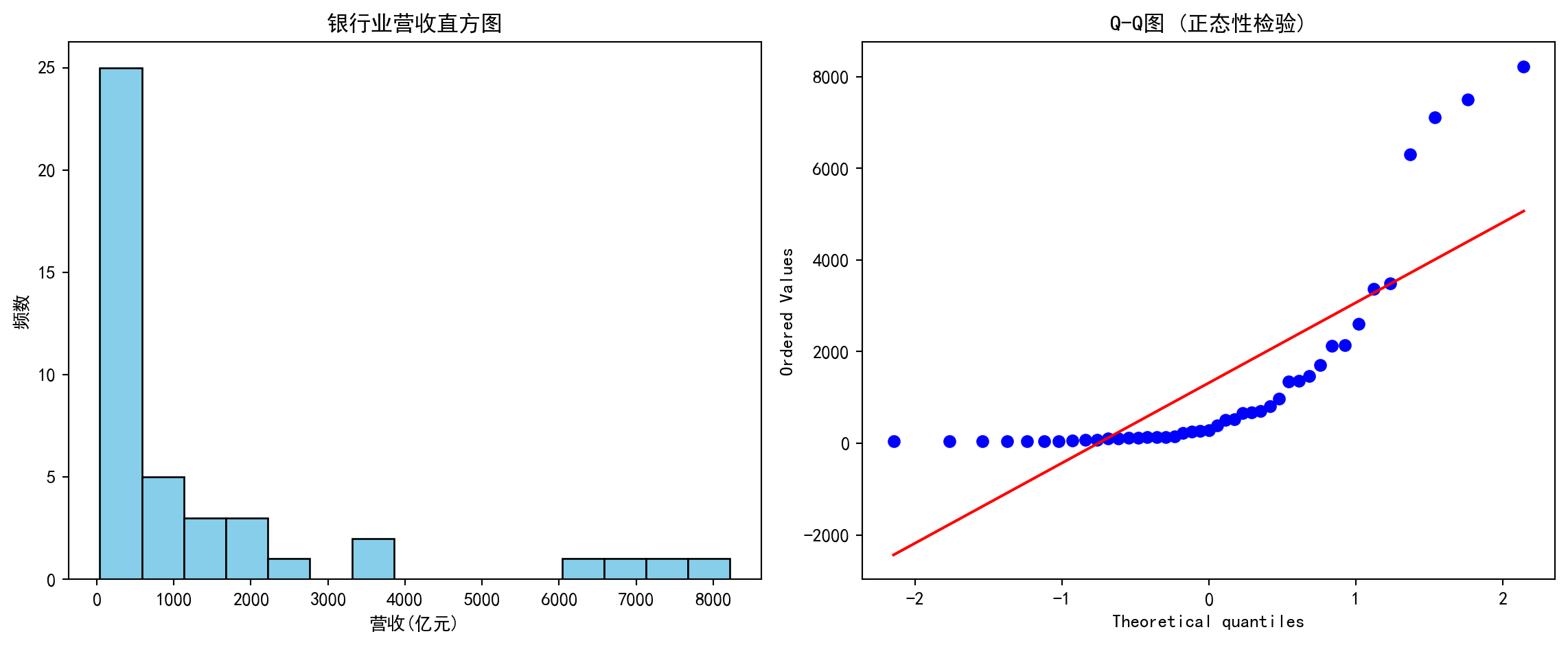
结论:直方图明显右偏,且Q-Q图两端显著偏离直线,说明数据不符合正态分布规律,更接近对数正态分布或帕累托分布。习题 2.3 解答 (Exercise 2.3 Solution)
# ========== 导入所需库 ==========
# Import required libraries
import pandas as pd          # 数据处理与分析
# Data manipulation and analysis
import numpy as np           # 数值计算
# Numerical computation
import matplotlib.pyplot as plt  # 数据可视化
# Data visualization
import platform              # 操作系统检测
# Operating system detection

# ========== 中文字体配置 ==========
# Chinese font configuration
# 设置中文字体以正确显示中文标签
# Set Chinese fonts to correctly display Chinese labels
plt.rcParams['font.sans-serif'] = ['SimHei', 'Microsoft YaHei']  # 设置中文显示字体
# Set Chinese display fonts
# 解决负号显示为方块的问题
# Fix minus sign displayed as square issue
plt.rcParams['axes.unicode_minus'] = False  # 解决负号显示为方块的问题
# Fix minus sign display issue

# ========== 第1步:设置本地数据路径 ==========
# Step 1: Set local data path
# 根据当前操作系统选择正确的本地数据路径
# Select the correct local data path based on the current operating system
if platform.system() == 'Windows':  # 判断当前操作系统是否为Windows
    # Check if current OS is Windows
    data_path = 'C:/qiufei/data/stock'  # Windows平台本地数据路径
    # Windows platform local data path
else:  # 否则使用Linux平台数据路径
    # Otherwise use Linux platform data path
    data_path = '/home/ubuntu/r2_data_mount/qiufei/data/stock'  # Linux平台本地数据路径
    # Linux platform local data path

# ========== 第2步:读取本地数据 ==========
# Step 2: Read local data
# 读取上市公司基本信息(含行业分类)
# Read listed company basic information (including industry classification)
stock_basic_dataframe = pd.read_hdf(f'{data_path}/stock_basic_data.h5')  # 读取上市公司基本信息数据
# Read listed company basic information data
# 读取财务报表数据(含净利润和营收)
# Read financial statement data (including net profit and revenue)
financial_statement_dataframe = pd.read_hdf(f'{data_path}/financial_statement.h5')  # 读取财务报表数据
# Read financial statement data
本地数据加载完毕。下面筛选最新年报数据并去重。
Local data loaded. Next, we filter the latest annual report data and remove duplicates.
# ========== 第3步:筛选最新年报数据 ==========
# Step 3: Filter the latest annual report data
annual_report_dataframe = financial_statement_dataframe[  # 年报数据处理
    # Annual report data processing
    financial_statement_dataframe['quarter'].str.endswith('q4')  # 筛选字符串以指定后缀结尾的行
    # Filter rows where quarter string ends with 'q4'
].copy()  # 复制子集避免SettingWithCopyWarning
# Copy subset to avoid SettingWithCopyWarning
# 按报告日期降序排列,取每只股票最新一期年报
# Sort by report date in descending order, keep the latest annual report for each stock
annual_report_dataframe = annual_report_dataframe.sort_values('quarter', ascending=False)  # 按指定列降序排列
# Sort by specified column in descending order
annual_report_dataframe = annual_report_dataframe.drop_duplicates(  # 去除重复记录,保留最新一条
    # Remove duplicate records, keep the latest one
    subset='order_book_id', keep='first'  # 每家公司仅保留最新一期年报
    # Keep only the latest annual report for each company
)
本地数据加载和最新年报筛选完毕。下面合并行业信息并计算净利润率指标。
Local data loading and latest annual report filtering complete. Next, we merge industry information and calculate net profit margin.
# ========== 第4步:合并行业信息并计算净利润率 ==========
# Step 4: Merge industry information and calculate net profit margin
# 合并行业信息到财务数据中
# Merge industry information into financial data
merged_dataframe = annual_report_dataframe.merge(  # 按键合并两个数据框
    # Merge two DataFrames by key
    stock_basic_dataframe[['order_book_id', 'industry_name']],  # 合并股票基本信息中的行业分类列
    # Merge industry classification column from stock basic information
    on='order_book_id',  # 以股票代码为合并键
    # Use stock code as merge key
    how='left'  # 左连接,保留所有财务记录
    # Left join, keep all financial records
)

# 计算净利润率 = 净利润 / 营业收入 × 100%
# Calculate net profit margin = net profit / revenue × 100%
# 仅保留营收为正的公司(营收为零或负时净利率无意义)
# Keep only companies with positive revenue (net profit margin is meaningless when revenue is zero or negative)
merged_dataframe = merged_dataframe[merged_dataframe['revenue'] > 0].copy()  # 筛选子集并创建副本
# Filter subset and create a copy
merged_dataframe['net_profit_margin_pct'] = (  # 计算净利润率 = 净利润/营收×100%
    # Calculate net profit margin = net profit / revenue × 100%
    merged_dataframe['net_profit'] / merged_dataframe['revenue'] * 100  # 净利润除以营业收入再乘100得到百分比
    # Net profit divided by revenue times 100 to get percentage
)
数据准备和净利润率计算完成后,下面我们选择三个代表性行业(电子制造、银行、公用事业),通过分组箱线图对比它们的净利润率分布差异,并输出各行业的关键统计指标。
After data preparation and net profit margin calculation, we select three representative industries (electronics manufacturing, banking, utilities), compare their net profit margin distribution differences through grouped box plots, and output key statistical indicators for each industry.
# 选择三个对比鲜明的行业 (国统局分类名 → 简称)
# Select three contrasting industries (NBS classification name → abbreviation)
industry_name_mapping = {  # 定义行业全名到简称的映射关系
    # Define mapping from full industry name to abbreviation
    '计算机、通信和其他电子设备制造业': '电子',  # 电子制造行业简称
    # Electronics manufacturing abbreviation
    '货币金融服务': '银行',  # 银行业简称
    # Banking abbreviation
    '电力、热力生产和供应业': '公用事业',  # 公用事业行业简称
    # Utilities abbreviation
}
target_industry_list = list(industry_name_mapping.values())  # 简称列表,用于后续标签
# Abbreviation list for subsequent labels

# ========== 第5步:为每个行业收集净利润率数据 ==========
# Step 5: Collect net profit margin data for each industry
industry_data_dict = {}  # 初始化存储行业数据的字典
# Initialize dictionary to store industry data
for nbs_name, display_label in industry_name_mapping.items():  # 遍历各行业进行处理
    # Iterate through each industry for processing
    # 筛选该行业的数据
    # Filter data for this industry
    industry_margin_series = merged_dataframe[  # 提取该行业的净利润率数据
        # Extract net profit margin data for this industry
        merged_dataframe['industry_name'] == nbs_name  # 合并后的数据框
        # From the merged DataFrame
    ]['net_profit_margin_pct'].dropna()  # 删除含缺失值的行
    # Drop rows with missing values
    # 剔除极端异常值(1%和99%分位以外)以便可视化
    # Remove extreme outliers (outside 1st and 99th percentiles) for visualization
    lower_bound = industry_margin_series.quantile(0.01)  # 计算指定分位数
    # Calculate specified quantile
    upper_bound = industry_margin_series.quantile(0.99)  # 计算指定分位数
    # Calculate specified quantile
    industry_margin_series = industry_margin_series[  # 提取该行业的净利润率数据
        # Extract net profit margin data for this industry
        (industry_margin_series >= lower_bound) &  # 提取该行业的净利润率数据
        # Filter values above lower bound
        (industry_margin_series <= upper_bound)  # 提取该行业的净利润率数据
        # Filter values below upper bound
    ]
    if len(industry_margin_series) > 5:  # 确保样本量充足(至少5个)
        # Ensure sufficient sample size (at least 5)
        industry_data_dict[display_label] = industry_margin_series  # 将该行业的净利润率序列存入字典
        # Store this industry's net profit margin series in the dictionary
行业净利润率数据收集和异常值处理完成。下面绘制分组箱线图,对比不同行业的利润率分布特征。
Industry net profit margin data collection and outlier processing complete. Next, we draw grouped box plots to compare profit margin distribution characteristics across industries.
# ========== 第6步:绘制分组箱线图 ==========
# Step 6: Draw grouped box plots
# 箱线图显示分布的五个关键统计量:最小值、Q1、中位数、Q3、最大值
# Box plots display five key statistics: minimum, Q1, median, Q3, maximum
boxplot_figure, boxplot_axes = plt.subplots(figsize=(10, 6))  # 创建画布和子图
# Create figure and subplot
boxplot_artists = boxplot_axes.boxplot(  # 绘制箱线图
    # Draw box plot
    [industry_data_dict[ind].values for ind in target_industry_list if ind in industry_data_dict],  # 按行业顺序提取箱线图数据
    # Extract box plot data in industry order
    tick_labels=[ind for ind in target_industry_list if ind in industry_data_dict],  # 对应行业简称作为X轴标签
    # Use corresponding industry abbreviations as X-axis labels
    patch_artist=True,  # 填充箱体颜色
    # Fill box body with color
    showmeans=True       # 显示均值(菱形标记)
    # Show mean (diamond marker)
)

# 设置不同行业箱体的颜色以区分
# Set different box colors for each industry to distinguish them
color_list = ['#4ECDC4', '#FF6B6B', '#45B7D1']
for patch_index, box_patch in enumerate(boxplot_artists['boxes']):  # 遍历图形元素进行美化设置
    # Iterate through graphic elements for styling
    box_patch.set_facecolor(color_list[patch_index % len(color_list)])  # 设置箱体填充颜色
    # Set box fill color
    box_patch.set_alpha(0.7)  # 设置透明度
    # Set transparency

boxplot_axes.set_ylabel('净利润率 (%)', fontsize=12)  # 设置Y轴标签
# Set Y-axis label
boxplot_axes.set_xlabel('行业', fontsize=12)  # 设置X轴标签
# Set X-axis label
boxplot_axes.set_title('不同行业上市公司净利润率分布比较', fontsize=14)  # 设置子图标题
# Set subplot title
boxplot_axes.grid(True, axis='y', alpha=0.3)  # 添加网格线
# Add grid lines
# 添加零线参考(净利率为0的水平线)
# Add zero reference line (horizontal line where net profit margin = 0)
boxplot_axes.axhline(y=0, color='red', linestyle='--', alpha=0.5, label='盈亏平衡线')  # 添加水平参考线
# Add horizontal reference line
boxplot_axes.legend()  # 显示图例
# Show legend
plt.tight_layout()  # 自动调整布局防止重叠
# Automatically adjust layout to prevent overlap
plt.show()  # 显示图形
# Display the figure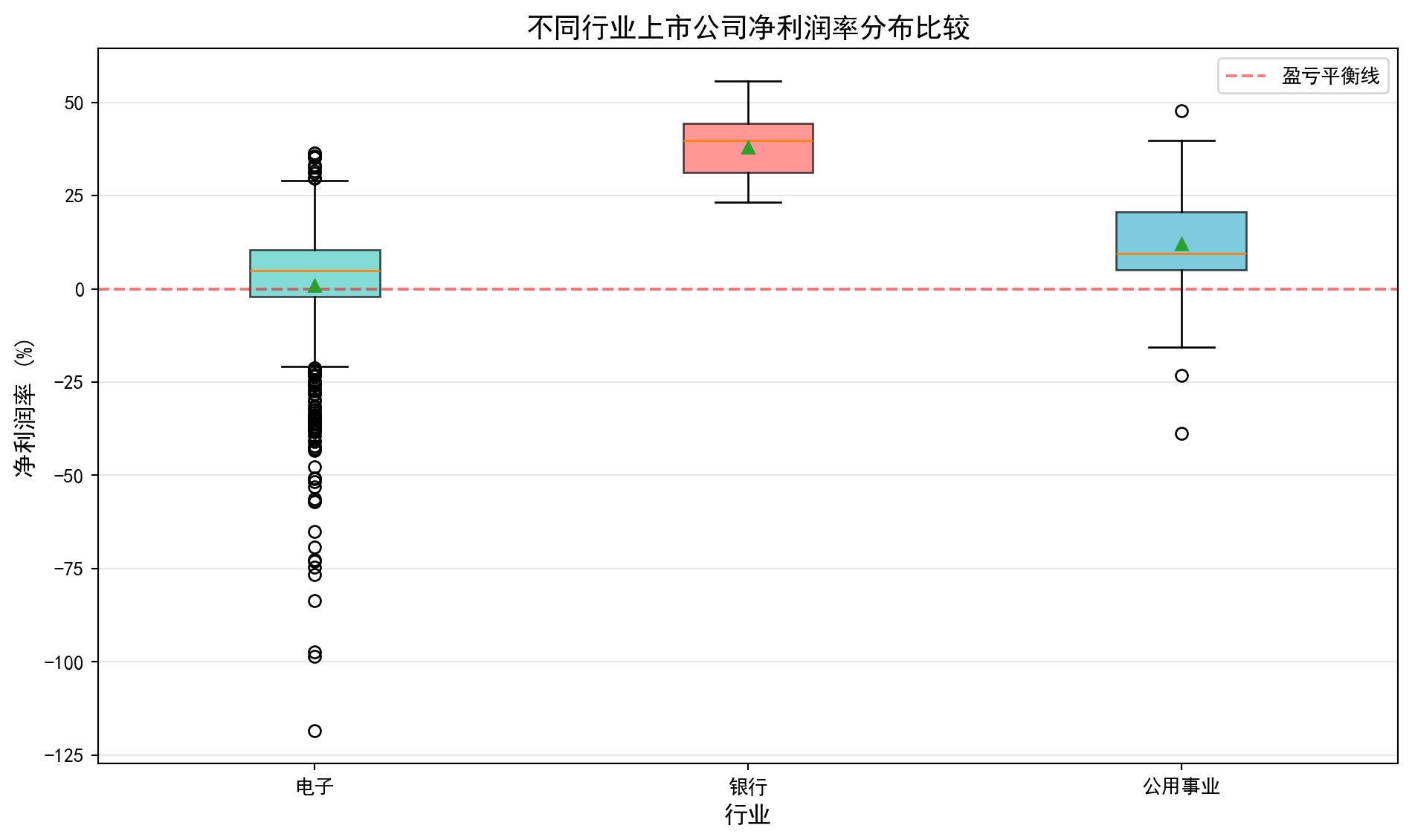
行业净利润率箱线图已绘制完成。下面输出各行业的数值比较统计。
Industry net profit margin box plots are complete. Next, we output numerical comparison statistics for each industry.
# ========== 第7步:输出数值比较 ==========
# Step 7: Output numerical comparison
print('=' * 60)  # 输出结果信息
# Output separator line
print('习题2.3解答:不同行业净利润率统计比较')  # 输出习题标题
# Print exercise title
print('=' * 60)  # 输出结果信息
# Output separator line
for target_industry in target_industry_list:  # 遍历各行业进行处理
    # Iterate through each industry
    if target_industry in industry_data_dict:  # 条件判断
        # Condition check
        margin_data = industry_data_dict[target_industry]  # 提取当前行业的净利润率数据
        # Extract current industry's net profit margin data
        q1_value = margin_data.quantile(0.25)  # 计算指定分位数
        # Calculate specified quantile
        q3_value = margin_data.quantile(0.75)  # 计算指定分位数
        # Calculate specified quantile
        iqr_value = q3_value - q1_value  # 计算四分位距(IQR=Q3-Q1)
        # Calculate interquartile range (IQR = Q3 - Q1)
        print(f'\n{target_industry} ({len(margin_data)}家公司):')  # 输出样本信息
        # Print sample information
        print(f'  中位数: {margin_data.median():.2f}%')  # 计算中位数
        # Calculate median
        print(f'  IQR: {iqr_value:.2f}% (Q1={q1_value:.2f}%, Q3={q3_value:.2f}%)')  # 输出结果信息
        # Print IQR results
        # 定义异常值:IQR方法
        # Define outliers: IQR method
        outlier_lower = q1_value - 1.5 * iqr_value  # 计算异常值下界(Q1-1.5×IQR)
        # Calculate outlier lower bound (Q1 - 1.5 × IQR)
        outlier_upper = q3_value + 1.5 * iqr_value  # 计算异常值上界(Q3+1.5×IQR)
        # Calculate outlier upper bound (Q3 + 1.5 × IQR)
        outlier_count = ((margin_data < outlier_lower) | (margin_data > outlier_upper)).sum()  # 统计IQR方法检测到的异常值个数
        # Count the number of outliers detected by the IQR method
        print(f'  异常值数量: {outlier_count}')  # 输出结果信息
        # Print outlier count

print('\n结论:')  # 输出分析结论
# Print conclusion
print('  - 银行业净利润率最高且最稳定(IQR最小)')  # 输出结果信息
# Banking has the highest and most stable net profit margin (smallest IQR)
print('  - 电子行业离散程度大,创新型公司利润差异显著')  # 输出样本信息
# Electronics industry has high dispersion, significant profit differences among innovative companies
print('  - 公用事业利润率居中,波动较小')  # 输出结果信息
# Utilities have moderate profit margins with low volatility
============================================================
习题2.3解答:不同行业净利润率统计比较
============================================================
电子 (619家公司):
中位数: 4.91%
IQR: 12.67% (Q1=-2.13%, Q3=10.54%)
异常值数量: 78
银行 (41家公司):
中位数: 39.78%
IQR: 13.05% (Q1=31.26%, Q3=44.32%)
异常值数量: 0
公用事业 (82家公司):
中位数: 9.52%
IQR: 15.50% (Q1=5.11%, Q3=20.61%)
异常值数量: 3
结论:
- 银行业净利润率最高且最稳定(IQR最小)
- 电子行业离散程度大,创新型公司利润差异显著
- 公用事业利润率居中,波动较小习题 2.4 解答 (Exercise 2.4 Solution)
# ========== 导入所需库 ==========
# Import required libraries
import pandas as pd          # 数据处理与分析
# Data manipulation and analysis
import numpy as np           # 数值计算
# Numerical computation
import matplotlib.pyplot as plt  # 数据可视化
# Data visualization
from scipy import stats      # 统计分析
# Statistical analysis
import platform              # 操作系统检测
# Operating system detection

# ========== 中文字体配置 ==========
# Chinese font configuration
plt.rcParams['font.sans-serif'] = ['SimHei', 'Microsoft YaHei']  # 中文字体
# Set Chinese fonts
plt.rcParams['axes.unicode_minus'] = False  # 负号正常显示
# Fix minus sign display issue

# ========== 第1步:设置本地数据路径 ==========
# Step 1: Set local data path
if platform.system() == 'Windows':       # Windows系统
    # Windows system
    data_path = 'C:/qiufei/data/stock'  # Windows平台本地数据路径
    # Windows platform local data path
else:                                     # Linux系统
    # Linux system
    data_path = '/home/ubuntu/r2_data_mount/qiufei/data/stock'  # Linux平台本地数据路径
    # Linux platform local data path

# ========== 第2步:读取股价数据 ==========
# Step 2: Read stock price data
stock_price_dataframe = pd.read_hdf(f'{data_path}/stock_price_pre_adjusted.h5')  # 前复权日度行情
# Pre-adjusted daily stock price data
stock_price_dataframe = stock_price_dataframe.reset_index()  # 重置索引,使date和order_book_id成为普通列
# Reset index, making date and order_book_id regular columns
股价数据加载完毕。下面选择两只长三角银行股并计算日收益率。
Stock price data loaded. Next, we select two Yangtze River Delta bank stocks and calculate daily returns.
# ========== 第3步:选择分析标的 ==========
# Step 3: Select analysis targets
# 选择两只同行业(银行)股票,分析其收益率相关性
# Select two stocks from the same industry (banking) to analyze their return correlation
target_stock_codes = ['600000.XSHG', '600926.XSHG']  # 浦发银行(上海)和杭州银行(浙江)
# SPDB (Shanghai) and Bank of Hangzhou (Zhejiang)
target_stock_names = ['浦发银行', '杭州银行']          # 对应的中文名称
# Corresponding Chinese names

# ========== 第4步:筛选分析时间段 ==========
# Step 4: Filter analysis period
# 获取2021-2023年两只股票的日度收盘价数据
# Get daily closing price data for both stocks from 2021-2023
paired_price_dataframe = stock_price_dataframe[  # 筛选两只目标股票的日度行情数据
    # Filter daily data for two target stocks
    (stock_price_dataframe['order_book_id'].isin(target_stock_codes)) &  # 筛选目标股票
    # Filter target stocks
    (stock_price_dataframe['date'] >= '2021-01-01') &                    # 起始日期
    # Start date
    (stock_price_dataframe['date'] <= '2023-12-31')                      # 截止日期
    # End date
].copy()  # 复制子集避免SettingWithCopyWarning
# Copy subset to avoid SettingWithCopyWarning

# ========== 第5步:计算日收益率 ==========
# Step 5: Calculate daily returns
# 将长格式数据转为宽格式(行为日期,列为股票),并计算百分比变化率
# Pivot long-format data to wide format (rows=dates, columns=stocks), and calculate percentage changes
daily_returns_dataframe = paired_price_dataframe.pivot(  # 将长格式数据透视为宽格式
    # Pivot long-format data to wide format
    index='date', columns='order_book_id', values='close'  # 透视表:日期×股票代码
    # Pivot table: date × stock code
).pct_change().dropna()  # pct_change()计算日收益率,dropna()删除首行NaN
# pct_change() calculates daily returns, dropna() removes first row NaN
daily_returns_dataframe.columns = target_stock_names  # 将列名替换为中文股票名称
# Replace column names with Chinese stock names
日收益率数据准备完毕后,我们计算Pearson相关系数并绘制散点图分析两只银行股的联动关系:
After daily return data preparation, we calculate the Pearson correlation coefficient and draw scatter plots to analyze the co-movement relationship between the two bank stocks:
# ========== 第6步:计算Pearson相关系数 ==========
# Step 6: Calculate Pearson correlation coefficient
# Pearson相关系数r∈[-1,1],衡量两个变量的线性相关程度
# Pearson correlation coefficient r ∈ [-1,1], measures the degree of linear correlation between two variables
correlation_coefficient = daily_returns_dataframe[target_stock_names[0]].corr(  # 计算Pearson相关系数
    # Calculate Pearson correlation coefficient
    daily_returns_dataframe[target_stock_names[1]]  # 传入第二只银行股的日收益率序列
    # Pass in the daily return series of the second bank stock
)

# ========== 第7步:输出分析结果 ==========
# Step 7: Output analysis results
print('=' * 60)  # 输出结果信息
# Output separator line
print('习题2.4解答:股票相关性分析')  # 输出习题标题
# Print exercise title
print('=' * 60)  # 输出结果信息
# Output separator line
print(f'\n分析股票: {target_stock_names[0]} vs {target_stock_names[1]}')  # 输出分析信息
# Print analysis information
print(f'分析期间: 2021-2023年')  # 输出分析信息
# Print analysis period
print(f'交易日数: {len(daily_returns_dataframe)}')  # 输出结果信息
# Print number of trading days
print(f'\n相关系数: {correlation_coefficient:.4f}')  # 输出相关性解读
# Print correlation coefficient
============================================================
习题2.4解答:股票相关性分析
============================================================
分析股票: 浦发银行 vs 杭州银行
分析期间: 2021-2023年
交易日数: 726
相关系数: 0.5506相关系数计算与基本统计信息输出完毕。下面根据相关系数的大小进行定性解读并给出投资组合建议。
Correlation coefficient calculation and basic statistical information output complete. Next, we provide qualitative interpretation based on the correlation coefficient magnitude and give portfolio recommendations.
# 根据相关系数大小给出定性解读
# Provide qualitative interpretation based on correlation coefficient magnitude
print(f'\n解释:')  # 输出解读说明
# Print interpretation header
if correlation_coefficient > 0.7:   # r>0.7 高度正相关
    # r > 0.7 highly positively correlated
    print(f'  r={correlation_coefficient:.2f}表示高度正相关')  # 输出相关性解读
    # Highly positively correlated
    print(f'  两只股票走势非常一致')  # 输出结果信息
    # The two stocks move very consistently
    print(f'  投资组合角度:分散化效果有限')  # 输出投资组合建议
    # Portfolio perspective: limited diversification effect
elif correlation_coefficient > 0.3:  # 0.3<r<0.7 中等正相关
    # 0.3 < r < 0.7 moderately positively correlated
    print(f'  r={correlation_coefficient:.2f}表示中等正相关')  # 输出相关性解读
    # Moderately positively correlated
    print(f'  投资组合角度:有一定分散化效果')  # 输出投资组合建议
    # Portfolio perspective: some diversification effect
else:                                # r<0.3 弱相关
    # r < 0.3 weakly correlated
    print(f'  r={correlation_coefficient:.2f}表示弱相关')  # 输出相关性解读
    # Weakly correlated
    print(f'  投资组合角度:分散化效果较好')  # 输出投资组合建议
    # Portfolio perspective: good diversification effect

# 给出基于相关性的投资组合建议
# Give portfolio recommendations based on correlation
print(f'\n投资组合建议:')  # 输出投资组合建议
# Print portfolio recommendation header
print(f'  同行业股票通常相关性较高,')  # 输出相关性解读
# Stocks in the same industry usually have high correlation,
print(f'  若要构建有效的分散化投资组合降低非系统性风险,建议选择不同行业或负相关的股票。')  # 输出投资组合建议
# To build an effectively diversified portfolio to reduce unsystematic risk, it is recommended to select stocks from different industries or negatively correlated stocks.
解释:
  r=0.55表示中等正相关
  投资组合角度:有一定分散化效果

投资组合建议:
  同行业股票通常相关性较高,
  若要构建有效的分散化投资组合降低非系统性风险,建议选择不同行业或负相关的股票。
相关系数计算和投资组合分散化建议输出完毕。下面绘制两只股票日收益率的散点图,直观展示其相关关系。
Correlation coefficient calculation and portfolio diversification recommendations output complete. Next, we draw scatter plots of daily returns for both stocks to visually demonstrate their correlation.
# ========== 第8步:绘制散点图可视化 ==========
# Step 8: Draw scatter plot visualization
scatter_figure, scatter_axes = plt.subplots(figsize=(8, 6))  # 创建画布
# Create figure
# 绘制两只股票日收益率的散点图,alpha设置透明度避免点重叠
# Draw scatter plot of daily returns for both stocks, alpha sets transparency to avoid overlap
scatter_axes.scatter(  # 绘制散点图
    # Draw scatter plot
    daily_returns_dataframe[target_stock_names[0]],  # X轴:浦发银行日收益率
    # X-axis: SPDB daily returns
    daily_returns_dataframe[target_stock_names[1]],  # Y轴:杭州银行日收益率
    # Y-axis: Bank of Hangzhou daily returns
    alpha=0.5  # 设置透明度参数
    # Set transparency parameter
)
scatter_axes.set_title('浦发银行与杭州银行日收益率散点图')  # 图标题
# Figure title
scatter_axes.set_xlabel('浦发银行日收益率')   # X轴标签
# X-axis label
scatter_axes.set_ylabel('杭州银行日收益率')   # Y轴标签
# Y-axis label
scatter_axes.grid(True, alpha=0.3)  # 添加半透明网格线
# Add semi-transparent grid lines
plt.show()  # 显示图形
# Display the figure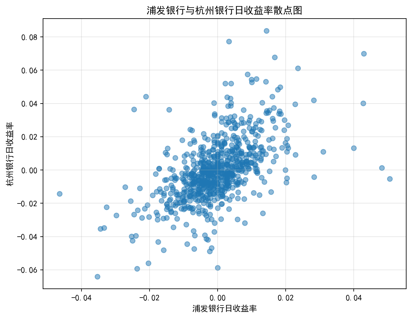
习题 2.5 解答 (Exercise 2.5 Solution)
# ========== 习题2.5: 新能源汽车行业可视化数据准备 ==========
# Exercise 2.5: NEV industry visualization data preparation

# ========== 导入所需库 ==========
# Import required libraries
import pandas as pd          # 数据处理与分析
# Data manipulation and analysis
import numpy as np           # 数值计算
# Numerical computation
import matplotlib.pyplot as plt  # 数据可视化
# Data visualization
import platform              # 操作系统检测
# Operating system detection

# ========== 中文字体配置 ==========
# Chinese font configuration
plt.rcParams['font.sans-serif'] = ['SimHei', 'Microsoft YaHei']  # 中文字体
# Set Chinese fonts
plt.rcParams['axes.unicode_minus'] = False  # 负号正常显示
# Fix minus sign display issue

# ========== 第1步:设置本地数据路径 ==========
# Step 1: Set local data path
if platform.system() == 'Windows':       # Windows系统
    # Windows system
    data_path = 'C:/qiufei/data/stock'  # Windows平台本地数据路径
    # Windows platform local data path
else:                                     # Linux系统
    # Linux system
    data_path = '/home/ubuntu/r2_data_mount/qiufei/data/stock'  # Linux平台本地数据路径
    # Linux platform local data path

# ========== 第2步:读取本地数据 ==========
# Step 2: Read local data
# 读取前复权日度股价数据
# Read pre-adjusted daily stock price data
stock_price_dataframe = pd.read_hdf(f'{data_path}/stock_price_pre_adjusted.h5')  # 读取前复权日度股价行情数据
# Read pre-adjusted daily stock price data
stock_price_dataframe = stock_price_dataframe.reset_index()  # 重置索引
# Reset index
# 读取股票基本信息
# Read stock basic information
stock_basic_dataframe = pd.read_hdf(f'{data_path}/stock_basic_data.h5')  # 读取上市公司基本信息数据
# Read listed company basic information data
数据加载完毕。下面选择新能源汽车产业链的代表性企业并构建可视化画布。
Data loaded. Next, we select representative companies from the NEV industry chain and construct the visualization canvas.
# ========== 第3步:读取财务报表 ==========
# Step 3: Read financial statements
financial_statement_dataframe = pd.read_hdf(f'{data_path}/financial_statement.h5')  # 读取全部财务报表数据
# Read all financial statement data

# ========== 第4步:选择新能源汽车产业链标的 ==========
# Step 4: Select NEV industry chain targets
# 选择4家代表性公司覆盖整车→零部件→设备→电池
# Select 4 representative companies covering vehicle→components→equipment→battery
target_stock_dict = {  # 新能源汽车产业链代表性企业
    # Representative companies in the NEV industry chain
    '601238.XSHG': '广汽集团',  # 整车(广州→泛珠三角,但A股主要标的)
    # Vehicle (Guangzhou, major A-share target)
    '002594.XSHE': '比亚迪',    # 整车+电池(深圳)
    # Vehicle + Battery (Shenzhen)
    '300750.XSHE': '宁德时代',  # 动力电池(福建宁德)
    # Power battery (Ningde, Fujian)
    '300450.XSHE': '先导智能',  # 锂电设备(江苏无锡 → 长三角)
    # Lithium battery equipment (Wuxi, Jiangsu → YRD)
}
target_stock_codes = list(target_stock_dict.keys())  # 股票代码列表
# Stock code list

# ========== 第5步:创建2×2子图布局 ==========
# Step 5: Create 2×2 subplot layout
visualization_figure, visualization_axes = plt.subplots(2, 2, figsize=(14, 10))  # 2行2列画布
# 2 rows, 2 columns canvas
画布创建完毕。下面逐一绘制四张子图。首先是股价走势归一化对比图。
Canvas created. Next, we draw the four subplots one by one. First is the normalized stock price trend comparison chart.
# ========== 第6步:子图1 - 股价走势归一化 ==========
# Step 6: Subplot 1 - Normalized stock price trends
for stock_code in target_stock_codes:  # 遍历每只目标股票
    # Iterate through each target stock
    company_price = stock_price_dataframe[  # 筛选当前股票的日度行情数据
        # Filter daily data for current stock
        (stock_price_dataframe['order_book_id'] == stock_code) &  # 筛选当前股票
        # Filter current stock
        (stock_price_dataframe['date'] >= '2020-01-01') &  # 起始日期为2020年
        # Start date 2020
        (stock_price_dataframe['date'] <= '2023-12-31')  # 截止日期为2023年
        # End date 2023
    ].sort_values('date')  # 按日期排序
    # Sort by date
    if len(company_price) > 0:  # 确认数据不为空
        # Confirm data is not empty
        normalized_price = company_price['close'] / company_price['close'].iloc[0] * 100  # 以期初价格为基准归一化为100
        # Normalize to 100 based on initial price
        visualization_axes[0, 0].plot(  # 在子图上绘制折线
            # Plot line on subplot
            company_price['date'].values, normalized_price.values,  # X轴日期,Y轴归一化价格
            # X-axis date, Y-axis normalized price
            label=target_stock_dict[stock_code], linewidth=1.5  # 图例标签和线宽
            # Legend label and line width
        )

visualization_axes[0, 0].set_title('股价走势对比 (2020年初=100)', fontsize=12)  # 子图标题
# Subplot title
visualization_axes[0, 0].set_ylabel('归一化价格')  # Y轴标签
# Y-axis label
visualization_axes[0, 0].legend(fontsize=8)  # 显示图例
# Show legend
visualization_axes[0, 0].grid(True, alpha=0.3)  # 添加辅助网格线
# Add auxiliary grid lines
股价走势归一化子图绘制完成。下面绘制第二张子图:各公司年度营收对比柱状图。
Normalized stock price trend subplot complete. Next, we draw the second subplot: annual revenue comparison bar chart for each company.
# ========== 第7步:子图2 - 年度营收对比柱状图 ==========
# Step 7: Subplot 2 - Annual revenue comparison bar chart
# 筛选各目标公司的Q4年报数据(全年营收数据)
# Filter Q4 annual report data for each target company (full year revenue data)
for stock_code in target_stock_codes:  # 遍历每只目标股票绘制其营收柱状图
    # Iterate through each target stock to draw its revenue bar chart
    company_financial = financial_statement_dataframe[  # 筛选当前公司的年报财务数据
        # Filter current company's annual report financial data
        (financial_statement_dataframe['order_book_id'] == stock_code) &  # 当前公司
        # Current company
        (financial_statement_dataframe['quarter'].str.endswith('q4'))  # 仅Q4年报
        # Q4 annual report only
    ].sort_values('quarter')  # 按季度排序
    # Sort by quarter
    if len(company_financial) > 1 and 'revenue' in company_financial.columns:  # 确认至少有两期数据
        # Confirm at least two periods of data
        revenue_billions = company_financial['revenue'].values / 1e8  # 将营收从元转换为亿元
        # Convert revenue from yuan to hundred million yuan
        years = company_financial['quarter'].str[:4].values  # 提取年份字符串(如'2023')
        # Extract year string (e.g., '2023')
        # 取最近4年数据,避免图表过于拥挤
        # Take the most recent 4 years of data to avoid overcrowding the chart
        if len(years) > 4:  # 当年份数超过4时截取最近4年
            # When number of years exceeds 4, take the most recent 4
            years = years[-4:]  # 保留最后4年
            # Keep last 4 years
            revenue_billions = revenue_billions[-4:]  # 对应截取营收数据
            # Correspondingly truncate revenue data
        x_positions = np.arange(len(years))  # 生成柱状图X轴位置序列
        # Generate X-axis position sequence for bar chart
        bar_width = 0.18  # 每个柱子的宽度
        # Width of each bar
        offset = list(target_stock_dict.keys()).index(stock_code)  # 当前公司在分组柱状图中的偏移量
        # Current company's offset in the grouped bar chart
        visualization_axes[0, 1].bar(  # 绘制柱状图
            # Draw bar chart
            x_positions + offset * bar_width, revenue_billions,  # X位置偏移实现分组效果
            # X-position offset to achieve grouping effect
            width=bar_width, label=target_stock_dict[stock_code], alpha=0.8  # 柱宽、图例标签、透明度
            # Bar width, legend label, transparency
        )
        if offset == 0:  # 仅第一家公司时设置X轴刻度(避免重复设置)
            # Set X-axis ticks only for the first company (avoid repeated setting)
            visualization_axes[0, 1].set_xticks(x_positions + bar_width * 1.5)  # 刻度居中于分组
            # Center ticks on groups
            visualization_axes[0, 1].set_xticklabels(years)  # 年份标签
            # Year labels

visualization_axes[0, 1].set_title('各公司年度营收对比 (亿元)', fontsize=12)  # 子图标题
# Subplot title
visualization_axes[0, 1].set_ylabel('营收 (亿元)')  # Y轴标签
# Y-axis label
visualization_axes[0, 1].legend(fontsize=8)  # 显示图例
# Show legend
visualization_axes[0, 1].grid(True, axis='y', alpha=0.3)  # 仅在Y轴方向添加网格线
# Add grid lines only on Y-axis
年度营收柱状对比图绘制完成。下面绘制第三张子图:先导智能2021-2023年日收益率分布直方图。
Annual revenue bar chart complete. Next, we draw the third subplot: Leadwise Intelligence 2021-2023 daily return distribution histogram.
# ========== 第8步:子图3 - 日收益率直方图(以先导智能为例) ==========
# Step 8: Subplot 3 - Daily return histogram (using Leadwise Intelligence as example)
leadwise_price = stock_price_dataframe[  # 筛选先导智能指定时段的行情数据
    # Filter Leadwise Intelligence's data for specified period
    (stock_price_dataframe['order_book_id'] == '300450.XSHE') &  # 先导智能股票代码
    # Leadwise Intelligence stock code
    (stock_price_dataframe['date'] >= '2021-01-01') &  # 起始日期
    # Start date
    (stock_price_dataframe['date'] <= '2023-12-31')  # 截止日期
    # End date
].sort_values('date')  # 按日期排序
# Sort by date
leadwise_returns = leadwise_price['close'].pct_change().dropna() * 100  # 计算日收益率(百分比形式)
# Calculate daily returns (in percentage form)

visualization_axes[1, 0].hist(  # 绘制直方图
    # Draw histogram
    leadwise_returns, bins=50, color='steelblue', edgecolor='black', alpha=0.7  # 50个分箱的直方图
    # Histogram with 50 bins
)
visualization_axes[1, 0].axvline(  # 添加垂直参考线
    # Add vertical reference line
    leadwise_returns.mean(), color='red', linestyle='--',  # 用红色虚线标记均值位置
    # Mark mean position with red dashed line
    label=f'均值={leadwise_returns.mean():.2f}%'  # 图例中显示均值
    # Display mean in legend
)
visualization_axes[1, 0].set_title('先导智能日收益率分布 (2021-2023)', fontsize=12)  # 子图标题
# Subplot title
visualization_axes[1, 0].set_xlabel('日收益率 (%)')  # X轴标签
# X-axis label
visualization_axes[1, 0].set_ylabel('频数')  # Y轴标签
# Y-axis label
visualization_axes[1, 0].legend()  # 显示图例
# Show legend
接下来绘制各公司日收益率箱线图,对比不同新能源企业的波动性差异,并输出完整图表:
Next, we draw box plots of daily returns for each company, comparing volatility differences among NEV companies, and output the complete chart:
# ========== 第9步:子图4 - 收益率箱线图对比 ==========
# Step 9: Subplot 4 - Return box plot comparison
return_data_list = []  # 存储各公司收益率数据的列表
# List to store return data for each company
return_label_list = []  # 存储各公司名称标签的列表
# List to store company name labels
for stock_code in target_stock_codes:  # 遍历每只目标股票
    # Iterate through each target stock
    company_price = stock_price_dataframe[  # 筛选当前股票的日度行情数据
        # Filter daily data for current stock
        (stock_price_dataframe['order_book_id'] == stock_code) &  # 筛选当前股票
        # Filter current stock
        (stock_price_dataframe['date'] >= '2021-01-01') &  # 起始日期
        # Start date
        (stock_price_dataframe['date'] <= '2023-12-31')  # 截止日期
        # End date
    ].sort_values('date')  # 按日期排序
    # Sort by date
    daily_ret = company_price['close'].pct_change().dropna() * 100  # 计算日收益率(%)
    # Calculate daily returns (%)
    if len(daily_ret) > 50:  # 确保有足够的数据点绘制箱线图
        # Ensure enough data points for box plot
        return_data_list.append(daily_ret.values)  # 添加收益率数组
        # Append return array
        return_label_list.append(target_stock_dict[stock_code])  # 添加公司简称
        # Append company abbreviation
各公司收益率数据收集完毕。下面绘制箱线图并输出完整图表。
Return data collection for each company complete. Next, we draw the box plots and output the complete chart.
if return_data_list:  # 确保至少有一家公司的数据
    # Ensure at least one company has data
    box_artists = visualization_axes[1, 1].boxplot(  # 绘制箱线图
        # Draw box plot
        return_data_list, labels=return_label_list, patch_artist=True  # 绘制箱线图,启用填充模式
        # Draw box plot with fill mode enabled
    )
    box_colors = ['#4ECDC4', '#FF6B6B', '#45B7D1', '#FFA07A']  # 4种自定义填充颜色
    # 4 custom fill colors
    for idx, box in enumerate(box_artists['boxes']):  # 遍历每个箱体设置颜色
        # Iterate through each box to set color
        box.set_facecolor(box_colors[idx % len(box_colors)])  # 循环使用颜色
        # Cycle through colors
        box.set_alpha(0.7)  # 设置透明度
        # Set transparency

visualization_axes[1, 1].set_title('各公司日收益率波动性比较', fontsize=12)  # 子图标题
# Subplot title
visualization_axes[1, 1].set_ylabel('日收益率 (%)')  # Y轴标签
# Y-axis label
visualization_axes[1, 1].grid(True, axis='y', alpha=0.3)  # 添加Y轴网格线
# Add Y-axis grid lines
# 设置X轴标签字体大小,确保公司名称清晰可读
# Set X-axis label font size to ensure company names are clearly readable
visualization_axes[1, 1].tick_params(axis='x', labelsize=9)  # X轴字号9
# X-axis font size 9

# ========== 第10步:设置总标题并输出图表 ==========
# Step 10: Set overall title and output chart
plt.suptitle('中国新能源汽车产业链综合可视化分析 (2020-2023)', fontsize=14, y=1.01)  # 总标题
# Overall title
plt.tight_layout()  # 自动调整子图间距
# Automatically adjust subplot spacing
plt.show()  # 显示图表
# Display the chart

print('数据来源: 本地stock_price_pre_adjusted.h5, financial_statement.h5')  # 标注数据来源
# Data source annotation
<Figure size 672x480 with 0 Axes>习题2.5解答:新能源汽车行业可视化分析
数据来源: 本地stock_price_pre_adjusted.h5, financial_statement.h5习题 2.6 解答 (Exercise 2.6 Solution)
初始薪资:
[5000]*9。 均值=5000元,中位数=5000元。Initial salaries:
[5000]*9. Mean = 5000 yuan, Median = 5000 yuan.加入CEO后:
[5000]*9 + [500000]。总量=545000元。均值=54500元,中位数=5000元。After adding the CEO:
[5000]*9 + [500000]. Total = 545,000 yuan. Mean = 54,500 yuan, Median = 5000 yuan.均值从5000飙升到了54500,增加了9.9倍。中位数依然稳坐5000元毫无波澜。
The mean skyrocketed from 5000 to 54,500, an increase of 9.9 times. The median remains steadily at 5000 yuan without any change.
如果你是工会主席,应该使用中位数,因为它反映了”绝大部分普通员工(一半以上)“的实际生活水平,没有被少数极端高薪群体拖拽。如果你是资本方招人宣传,可能会暗示性地使用”平均工资5.45万”来吸引眼球。这是一个典型的数据说谎陷阱,所以看新闻通稿时务必分清它说的是平均数还是中位数。
If you were the union chairman, you should use the median, because it reflects the actual living standard of “the vast majority of ordinary employees (more than half)” and is not dragged by a few extreme high earners. If you were the management recruiting, you might suggestively use “average salary 54,500 yuan” to attract attention. This is a classic data deception trap, so when reading press releases, always distinguish whether it’s referring to the mean or the median.
习题 2.7 解答 (Exercise 2.7 Solution)
# ========== 导入所需库 ==========
# Import required libraries
import pandas as pd  # 数据处理框架
# Data processing framework
import numpy as np  # 数值计算
# Numerical computation
import matplotlib.pyplot as plt  # 绘图库
# Plotting library
from scipy import stats  # 统计检验和分布函数
# Statistical tests and distribution functions
import platform  # 操作系统识别
# Operating system identification

# ========== 中文字体配置 ==========
# Chinese font configuration
plt.rcParams['font.sans-serif'] = ['SimHei', 'Microsoft YaHei']  # 设置中文字体
# Set Chinese fonts
plt.rcParams['axes.unicode_minus'] = False  # 解决负号显示问题
# Fix minus sign display issue

# ========== 第1步:设置本地数据路径 ==========
# Step 1: Set local data path
# 根据操作系统自动选择对应的数据存储路径
# Automatically select the corresponding data storage path based on operating system
if platform.system() == 'Windows':  # Windows系统
    # Windows system
    data_path = 'C:/qiufei/data/stock'  # Windows平台本地数据路径
    # Windows platform local data path
else:  # Linux系统
    # Linux system
    data_path = '/home/ubuntu/r2_data_mount/qiufei/data/stock'  # Linux平台本地数据路径
    # Linux platform local data path
所需库导入和数据路径配置完毕。下面读取财务报表并计算估值比率。
Required library imports and data path configuration complete. Next, we read financial statements and calculate valuation ratios.
# ========== 第2步:读取财务报表并提取最新年报数据 ==========
# Step 2: Read financial statements and extract latest annual report data
financial_statement_dataframe = pd.read_hdf(f'{data_path}/financial_statement.h5')  # 读取全部财务报表
# Read all financial statements

# 筛选第四季度(年报)数据,确保使用全年度财务数据
# Filter Q4 (annual report) data to ensure full-year financial data is used
annual_report_dataframe = financial_statement_dataframe[  # 年报数据处理
    # Annual report data processing
    financial_statement_dataframe['quarter'].str.endswith('q4')  # 仅保留Q4年报数据
    # Keep only Q4 annual report data
].copy()  # 复制子集
# Copy subset
annual_report_dataframe = annual_report_dataframe.sort_values('quarter', ascending=False)  # 按季度降序排列
# Sort by quarter in descending order
annual_report_dataframe = annual_report_dataframe.drop_duplicates(  # 去除重复记录,保留最新一条
    # Remove duplicate records, keep the latest one
    subset='order_book_id', keep='first'  # 每家公司保留最新一期年报
    # Keep only the latest annual report for each company
)

# ========== 第3步:计算估值比率(收入/利润比) ==========
# Step 3: Calculate valuation ratio (revenue/profit ratio)
# 筛选净利润大于0的盈利公司(亏损公司的PE无意义)
# Filter profitable companies with net profit > 0 (PE is meaningless for loss-making companies)
profitable_dataframe = annual_report_dataframe[  # 盈利公司数据处理
    # Profitable company data processing
    (annual_report_dataframe['net_profit'] > 0) &  # 净利润为正
    # Net profit is positive
    (annual_report_dataframe['revenue'] > 0)  # 营收为正
    # Revenue is positive
].copy()  # 复制子集
# Copy subset
# 用 revenue / net_profit 近似PE比率的分布特征(收入利润比值越大,利润率越低)
# Use revenue / net_profit to approximate PE ratio distribution characteristics (higher ratio means lower profit margin)
profitable_dataframe['valuation_ratio'] = (  # 盈利公司数据处理
    # Profitable company data processing
    profitable_dataframe['revenue'] / profitable_dataframe['net_profit']  # 营收除以净利润,值越大表明利润率越低
    # Revenue divided by net profit; higher value indicates lower profit margin
)
估值比率计算完成后,下面我们对原始数据进行滤波和极端值处理,然后通过直方图、Q-Q图的原始与对数变换对比,直观展示对数变换如何显著改善金融比率数据的偏度和正态性,这对后续的OLS回归建模具有重要意义。
After valuation ratio calculation, we filter the raw data and handle extreme values, then visually demonstrate through histogram and Q-Q plot comparisons of raw vs. log-transformed data how log transformation significantly improves skewness and normality of financial ratio data, which is crucial for subsequent OLS regression modeling.
# ========== 第4步:过滤无效数据和极端离群值 ==========
# Step 4: Filter invalid data and extreme outliers
valuation_series = profitable_dataframe['valuation_ratio'].dropna()  # 删除缺失值
# Drop missing values
valuation_series = valuation_series[  # 提取估值比率数据(删除缺失值和极端值)
    # Extract valuation ratio data (remove missing values and extreme values)
    np.isfinite(valuation_series) & (valuation_series > 0) & (valuation_series < 500)  # 剔除无穷大和极端值
    # Remove infinity and extreme values
]

print('=' * 60)  # 输出结果信息
# Output separator line
print('习题2.7解答:A股估值的分布形态')  # 输出习题标题
# Print exercise title
print('=' * 60)  # 输出结果信息
# Output separator line
print(f'样本量: {len(valuation_series)}家盈利公司')  # 输出有效样本量
# Print effective sample size

# ========== 第5步:计算原始数据的偏度和峰度 ==========
# Step 5: Calculate skewness and kurtosis of raw data
raw_skewness = stats.skew(valuation_series)  # 计算偏度(衡量分布的不对称性)
# Calculate skewness (measures distribution asymmetry)
raw_kurtosis = stats.kurtosis(valuation_series)  # 计算峰度(衡量分布的尖峪程度)
# Calculate kurtosis (measures distribution peakedness)
print(f'\n原始估值比率统计:')  # 输出结果信息
# Print raw valuation ratio statistics header
print(f'  均值: {valuation_series.mean():.2f}')  # 输出均值
# Print mean
print(f'  中位数: {valuation_series.median():.2f}')  # 输出中位数
# Print median
print(f'  偏度: {raw_skewness:.4f} ({"正偏/右偏" if raw_skewness > 0 else "负偏/左偏"})')  # 判断偏度方向
# Determine skewness direction
print(f'  峰度: {raw_kurtosis:.4f}')  # 输出峰度
# Print kurtosis

# ========== 第6步:对数变换并计算变换后的偏度和峰度 ==========
# Step 6: Log-transform and calculate post-transformation skewness and kurtosis
log_valuation_series = np.log(valuation_series)  # 对估值比率取自然对数
# Take natural logarithm of valuation ratios
log_skewness = stats.skew(log_valuation_series)  # 计算对数变换后的偏度
# Calculate skewness after log transformation
log_kurtosis = stats.kurtosis(log_valuation_series)  # 计算对数变换后的峰度
# Calculate kurtosis after log transformation
print(f'\n对数变换后统计:')  # 输出变换后统计量
# Print post-transformation statistics header
print(f'  偏度: {log_skewness:.4f} ({"更接近0,对称性改善" if abs(log_skewness) < abs(raw_skewness) else "未改善"})')  # 对比偏度变化
# Compare skewness change
print(f'  峰度: {log_kurtosis:.4f}')  # 输出峰度
# Print kurtosis
============================================================
习题2.7解答:A股估值的分布形态
============================================================
样本量: 3887家盈利公司
原始估值比率统计:
均值: 27.48
中位数: 12.41
偏度: 4.7286 (正偏/右偏)
峰度: 28.8778
对数变换后统计:
偏度: 0.5467 (更接近0,对称性改善)
峰度: 0.3962基于原始与对数变换后的分布统计量,我们绘制直方图和Q-Q图进行可视化对比与正态性检验。首先创建2×2画布,分别绘制上半部分的两个直方图(原始数据与对数变换后数据):
Based on the distribution statistics of raw and log-transformed data, we draw histograms and Q-Q plots for visual comparison and normality testing. First, we create a 2×2 canvas, drawing the two histograms in the upper half (raw data and log-transformed data):
# ========== 第7步:创建2×2可视化对比 ==========
# Step 7: Create 2×2 visual comparison
distribution_figure, distribution_axes = plt.subplots(2, 2, figsize=(14, 10))  # 2行2列子图布局
# 2 rows, 2 columns subplot layout

# ---- 左上:原始数据直方图 ----
# ---- Top left: Raw data histogram ----
distribution_axes[0, 0].hist(valuation_series, bins=60, color='steelblue',  # 绘制直方图
    # Draw histogram
                             edgecolor='black', alpha=0.7, density=True)  # 60个分箱的概率密度直方图
    # Probability density histogram with 60 bins
distribution_axes[0, 0].set_title(f'原始估值比率直方图 (偏度={raw_skewness:.2f})', fontsize=12)  # 标题包含偏度值
# Title includes skewness value
distribution_axes[0, 0].set_xlabel('估值比率 (收入/利润)')  # X轴标签
# X-axis label
distribution_axes[0, 0].set_ylabel('概率密度')  # Y轴标签
# Y-axis label
distribution_axes[0, 0].axvline(valuation_series.mean(), color='red', linestyle='--',  # 计算算术平均值
    # Mark arithmetic mean
                                label=f'均值={valuation_series.mean():.1f}')  # 红色虚线标记均值
    # Red dashed line marks mean
distribution_axes[0, 0].axvline(valuation_series.median(), color='green', linestyle='--',  # 计算中位数
    # Mark median
                                label=f'中位数={valuation_series.median():.1f}')  # 绿色虚线标记中位数
    # Green dashed line marks median
distribution_axes[0, 0].legend(fontsize=9)  # 显示图例
# Show legend

# ---- 右上:对数变换后直方图 ----
# ---- Top right: Log-transformed histogram ----
distribution_axes[0, 1].hist(log_valuation_series, bins=50, color='#45B7D1',
                             edgecolor='black', alpha=0.7, density=True)  # 对数变换后的概率密度直方图
# Probability density histogram after log transformation
# 叠加正态分布拟合曲线,用于直观对比变换后分布与正态的接近程度
# Overlay normal distribution fit curve for visual comparison of how close the transformed distribution is to normal
x_range = np.linspace(log_valuation_series.min(), log_valuation_series.max(), 100)  # 生成X轴等距点
# Generate equally spaced points on X-axis
normal_fit_pdf = stats.norm.pdf(x_range, log_valuation_series.mean(), log_valuation_series.std())  # 计算正态PDF
# Calculate normal PDF
distribution_axes[0, 1].plot(x_range, normal_fit_pdf, 'r-', linewidth=2, label='正态拟合')  # 绘制红色拟合线
# Draw red fit line
distribution_axes[0, 1].set_title(f'对数变换后直方图 (偏度={log_skewness:.2f})', fontsize=12)  # 标题含偏度
# Title includes skewness
distribution_axes[0, 1].set_xlabel('ln(估值比率)')  # X轴标签
# X-axis label
distribution_axes[0, 1].set_ylabel('概率密度')  # Y轴标签
# Y-axis label
distribution_axes[0, 1].legend(fontsize=9)  # 显示图例
# Show legend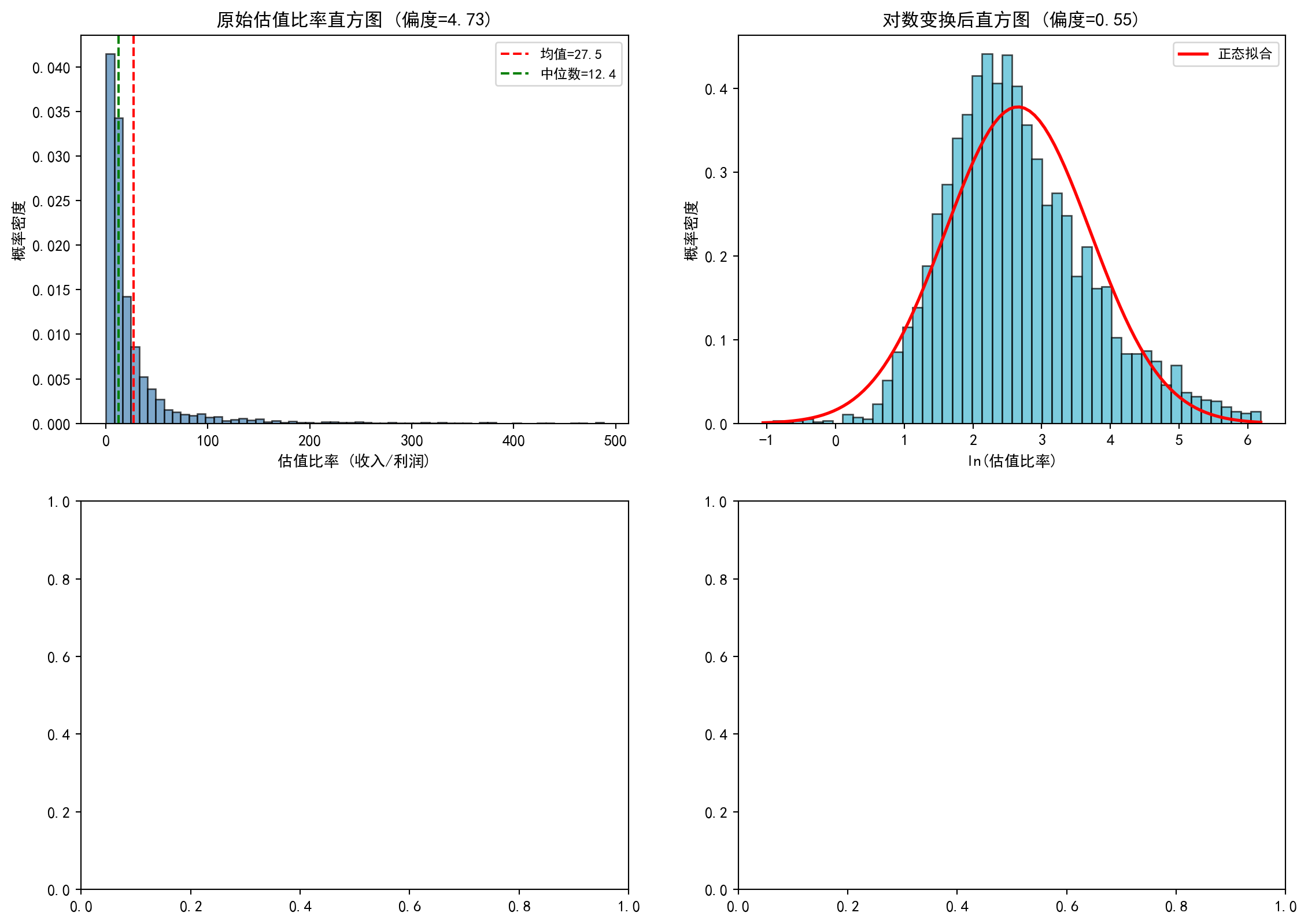
上半部分的直方图绘制完成。接下来绘制下半部分的两个Q-Q图,用于从另一角度直观判断数据是否服从正态分布:
The upper half histograms are complete. Next, we draw the two Q-Q plots in the lower half, providing another perspective to visually assess whether the data follows a normal distribution:
# ---- 左下:原始数据Q-Q图 ----
# ---- Bottom left: Raw data Q-Q plot ----
stats.probplot(valuation_series, dist='norm', plot=distribution_axes[1, 0])  # 原始数据与正态分布的Q-Q图
# Q-Q plot of raw data vs. normal distribution
distribution_axes[1, 0].set_title('原始数据 Q-Q图', fontsize=12)  # 子图标题
# Subplot title
distribution_axes[1, 0].grid(True, alpha=0.3)  # 添加网格线
# Add grid lines

# ---- 右下:对数变换后Q-Q图 ----
# ---- Bottom right: Log-transformed Q-Q plot ----
stats.probplot(log_valuation_series, dist='norm', plot=distribution_axes[1, 1])  # 对数变换后的Q-Q图
# Q-Q plot after log transformation
distribution_axes[1, 1].set_title('对数变换后 Q-Q图', fontsize=12)  # 子图标题
# Subplot title
distribution_axes[1, 1].grid(True, alpha=0.3)  # 添加网格线
# Add grid lines

# ========== 第8步:输出图表 ==========
# Step 8: Output chart
plt.suptitle('A股估值比率的分布形态:原始 vs 对数变换', fontsize=14)  # 总标题
# Overall title
plt.tight_layout()  # 自动调整子图间距
# Automatically adjust subplot spacing
plt.show()  # 显示图表
# Display the chart
<Figure size 672x480 with 0 Axes>分布形态对比图绘制完成。下面通过Shapiro-Wilk检验对对数变换后数据的正态性进行定量验证,并总结核心结论。
Distribution shape comparison chart complete. Next, we use the Shapiro-Wilk test to quantitatively verify the normality of log-transformed data, and summarize the core conclusions.
# ========== 第9步:Shapiro-Wilk正态性检验 ==========
# Step 9: Shapiro-Wilk normality test
# Shapiro-Wilk检验适用于小样本,取确定性子样本避免样本量过大导致检验力过高
# Shapiro-Wilk test is suitable for small samples; take a deterministic subsample to avoid excessive power from large sample size
subsample_size = min(5000, len(log_valuation_series))  # 子样本上限为5000
# Subsample size capped at 5000
# 使用等间隔确定性抽样(非随机)以确保结果可复现
# Use deterministic equally-spaced sampling (non-random) to ensure reproducibility
sampling_step = max(1, len(log_valuation_series) // subsample_size)  # 计算抽样步长
# Calculate sampling step
subsample_values = log_valuation_series.values[::sampling_step][:subsample_size]  # 等间距抽取子样本
# Extract equally-spaced subsample
shapiro_statistic, shapiro_p_value = stats.shapiro(subsample_values)  # 执行Shapiro-Wilk检验
# Execute Shapiro-Wilk test
print(f'\nShapiro-Wilk正态性检验 (对数变换后, n={subsample_size}):')  # 检验标题
# Test title
print(f'  统计量: {shapiro_statistic:.4f}')  # W统计量,越接近1越接近正态
# W statistic, closer to 1 means closer to normal
print(f'  p值: {shapiro_p_value:.6f}')  # p值,小于0.05拒绝正态假设
# p-value, less than 0.05 rejects normality assumption

# ========== 第10步:输出核心结论 ==========
# Step 10: Output core conclusions
print('\n核心结论:')  # 总结分析发现
# Summarize analysis findings
print('  1. 原始估值比率严重右偏——少数微利公司导致极高比率')  # 结论1
# Conclusion 1: Raw valuation ratios are severely right-skewed — a few marginally profitable companies cause extremely high ratios
print('  2. 对数变换后分布更接近正态(偏度显著降低)')  # 结论2
# Conclusion 2: The distribution is closer to normal after log transformation (skewness significantly reduced)
print('  3. 这是对数正态分布(lognormal)的典型特征')  # 结论3
# Conclusion 3: This is a typical characteristic of the log-normal distribution
print('  4. 实证金融建模中,对PE/PB等比率数据取对数是标准预处理步骤')  # 结论4
# Conclusion 4: In empirical financial modeling, taking logarithms of ratio data like PE/PB is a standard preprocessing step
print('     因为OLS回归等方法假设残差正态,对数变换有助于满足这一假设')  # 实践意义
# Because methods like OLS regression assume normal residuals, log transformation helps satisfy this assumption
Shapiro-Wilk正态性检验 (对数变换后, n=3887):
  统计量: 0.9787
  p值: 0.000000

核心结论:
  1. 原始估值比率严重右偏——少数微利公司导致极高比率
  2. 对数变换后分布更接近正态(偏度显著降低)
  3. 这是对数正态分布(lognormal)的典型特征
  4. 实证金融建模中,对PE/PB等比率数据取对数是标准预处理步骤
     因为OLS回归等方法假设残差正态,对数变换有助于满足这一假设
本题通过对数变换前后的对比分析,直观展示了金融比率数据(如估值比率)的右偏特性以及对数变换在改善数据正态性方面的显著效果。这一预处理技巧是实证金融研究中的标准做法,对后续的回归建模和统计推断具有重要的实践意义。
This exercise, through comparing pre- and post-log-transformation analysis, intuitively demonstrates the right-skewed nature of financial ratio data (such as valuation ratios) and the significant effect of log transformation in improving data normality. This preprocessing technique is a standard practice in empirical financial research, with important practical significance for subsequent regression modeling and statistical inference.