# ========== 导入所需库 ==========
# ========== Import required libraries ==========
import pandas as pd                                     # 导入pandas库,用于数据处理和分析
# Import pandas for data processing and analysis
import numpy as np                                       # 导入numpy库,用于数值计算
# Import numpy for numerical computation
from sklearn.cluster import KMeans                       # 导入K-Means聚类算法
# Import K-Means clustering algorithm
from sklearn.preprocessing import StandardScaler         # 导入标准化工具,消除量纲影响
# Import standardization tool to eliminate scale effects
from sklearn.metrics import silhouette_score             # 导入轮廓系数,评估聚类质量
# Import silhouette score to evaluate clustering quality
import matplotlib.pyplot as plt                          # 导入matplotlib绘图库
# Import matplotlib plotting library
import platform                                          # 导入platform模块,用于检测操作系统
# Import platform module for OS detection

# ========== 中文字体设置 ==========
# ========== Chinese font settings ==========
if platform.system() == 'Linux':                         # 如果是Linux操作系统
# If running on Linux OS
    plt.rcParams['font.sans-serif'] = ['Source Han Serif SC', 'SimHei', 'DejaVu Sans']  # 设置思源宋体等中文字体
# Set Source Han Serif SC and other Chinese fonts
else:                                                    # 如果是Windows操作系统
# If running on Windows OS
    plt.rcParams['font.sans-serif'] = ['SimHei', 'Microsoft YaHei']  # 设置黑体和微软雅黑
# Set SimHei and Microsoft YaHei fonts
plt.rcParams['axes.unicode_minus'] = False               # 解决坐标轴负号显示问题
# Fix the minus sign display issue on axes

# ========== 第1步:加载本地财务数据 ==========
# ========== Step 1: Load local financial data ==========
if platform.system() == 'Linux':                         # Linux平台数据路径
# Data path for Linux platform
    data_path = '/home/ubuntu/r2_data_mount/qiufei/data/stock'  # Linux下的数据挂载路径
# Mounted data path on Linux
else:                                                    # Windows平台数据路径
# Data path for Windows platform
    data_path = 'C:/qiufei/data/stock'                   # Windows下的本地数据路径
# Local data path on Windows

financial_statement_dataframe = pd.read_hdf(f'{data_path}/financial_statement.h5')  # 读取上市公司财务报表数据
# Read listed company financial statement data
stock_basic_info_dataframe = pd.read_hdf(f'{data_path}/stock_basic_data.h5')        # 读取股票基本信息数据
# Read stock basic information data

# ========== 第2步:筛选2023年报数据 ==========
# ========== Step 2: Filter 2023 annual report data ==========
annual_report_dataframe_2023 = financial_statement_dataframe[  # 按条件筛选2023年报数据
# Filter 2023 annual report data by conditions
    (financial_statement_dataframe['quarter'].str.endswith('q4')) &    # 筛选第四季度(年报)
# Select Q4 (annual reports)
    (financial_statement_dataframe['quarter'].str.startswith('2023'))  # 筛选2023年
# Select year 2023
].copy()                                                              # 复制以避免链式赋值警告
# Copy to avoid chained assignment warning13 无监督学习方法 (Unsupervised Learning Methods)
无监督学习(Unsupervised Learning)处理没有标签的数据,目标是发现数据中的内在结构和模式。与监督学习不同,无监督学习没有”正确答案”作为指导,需要算法自行发现数据的规律。本章首先讨论无监督学习的理论基础( 小节 13.2 ),然后介绍K-均值聚类(小节 13.3 )和层次聚类(小节 13.4 ),接着讲解主成分分析(小节 13.5 )及非线性降维方法(小节 13.6 ),最后介绍聚类评估( 小节 13.7 )。
Unsupervised Learning deals with unlabeled data, aiming to discover the inherent structure and patterns within it. Unlike supervised learning, unsupervised learning has no “correct answers” for guidance—algorithms must discover regularities in the data on their own. This chapter first discusses the theoretical foundations of unsupervised learning ( 小节 13.2 ), then introduces K-means clustering ( 小节 13.3 ) and hierarchical clustering ( 小节 13.4 ), followed by principal component analysis ( 小节 13.5 ) and nonlinear dimensionality reduction methods ( 小节 13.6 ), and finally covers clustering evaluation ( 小节 13.7 ).
13.1 无监督学习在金融市场分析中的典型应用 (Typical Applications of Unsupervised Learning in Financial Market Analysis)
在金融市场中,大量数据是无标签的——我们不知道哪些股票”应该”被归为一类,也不知道市场的”真实”结构是什么。无监督学习方法为发现金融数据中隐藏的模式和结构提供了强大工具。
In financial markets, a large volume of data is unlabeled—we do not know which stocks “should” be grouped together, nor do we know what the “true” structure of the market is. Unsupervised learning methods provide powerful tools for discovering hidden patterns and structures in financial data.
13.1.1 应用一:A股市场风格聚类 (Application 1: A-Share Market Style Clustering)
利用 valuation_factors_quarterly_15_years.h5 中的多维估值因子数据,对A股上市公司进行K-means聚类分析,可以发现市场中天然存在的”风格群组”:如大盘价值股、小盘成长股、高股息蓝筹股等。这种数据驱动的分类方式不依赖于人工设定的规则(如简单的市值大小分组),能够揭示出更细微的市场结构。
Using the multidimensional valuation factor data from valuation_factors_quarterly_15_years.h5, K-means clustering analysis on A-share listed companies can reveal naturally occurring “style groups” in the market: such as large-cap value stocks, small-cap growth stocks, and high-dividend blue chips. This data-driven classification approach does not depend on manually set rules (such as simple market-cap grouping) and can uncover more nuanced market structures.
13.1.2 应用二:财务报表异常检测 (Application 2: Financial Statement Anomaly Detection)
主成分分析(PCA)可以将 financial_statement.h5 中数十个财务指标降维到少数几个主成分,捕捉财务数据的主要变异方向。那些在低维空间中远离主体分布的公司,可能存在财务异常或财务造假嫌疑。这一方法已被广泛应用于审计风险评估和监管预警系统中。
Principal Component Analysis (PCA) can reduce dozens of financial indicators in financial_statement.h5 down to a few principal components, capturing the main directions of variation in financial data. Companies that lie far from the main distribution in this low-dimensional space may exhibit financial anomalies or suspected financial fraud. This method has been widely applied in audit risk assessment and regulatory early-warning systems.
13.1.3 应用三:投资组合构建中的降维应用 (Application 3: Dimensionality Reduction in Portfolio Construction)
在构建投资组合时,高维资产之间的相关性矩阵既难以估计又难以解释。PCA可以从大量个股收益率中提取出少数几个”统计因子”,这些因子往往对应市场因子、行业因子、风格因子等经济含义明确的驱动力。基于 stock_price_pre_adjusted.h5 中的日度收益率数据进行PCA分析,可以识别A股市场的主要收益率驱动因子,为风险分解和组合优化提供依据。
When constructing portfolios, the correlation matrix among high-dimensional assets is both difficult to estimate and difficult to interpret. PCA can extract a small number of “statistical factors” from a large set of individual stock returns; these factors often correspond to economically meaningful drivers such as market factors, industry factors, and style factors. Performing PCA on daily return data from stock_price_pre_adjusted.h5 can identify the main return drivers of the A-share market, providing a basis for risk decomposition and portfolio optimization.
13.1.4 聚类与降维的关系 (Relationship Between Clustering and Dimensionality Reduction)
| 类型 | 目标 | 典型方法 | 输出 |
|---|---|---|---|
| 聚类 | 发现相似组 | K-means, 层次聚类, DBSCAN | 类别标签 |
| 降维 | 简化数据 | PCA, t-SNE, UMAP | 低维表示 |
| Type | Objective | Typical Methods | Output |
|---|---|---|---|
| Clustering | Discover similar groups | K-means, Hierarchical, DBSCAN | Category labels |
| Dim. Reduction | Simplify data | PCA, t-SNE, UMAP | Low-dim. representation |
实际中两者常结合使用:先降维再聚类,或用聚类结果验证降维效果。
In practice, the two are often combined: first reduce dimensionality then cluster, or use clustering results to validate the dimensionality reduction outcome.
13.2 从理论到实践:苦活累活 (From Theory to Practice: The “Dirty Work”)
无监督学习因为没有”标准答案”(Ground Truth),是数据分析中最容易造假和自欺欺人的领域。
Because unsupervised learning has no “ground truth,” it is the area in data analysis most susceptible to fabrication and self-deception.
13.2.1 墨迹测试 (The Rorschach Test)
聚类分析就像心理学上的”墨迹测试”:你希望看到什么,你就能在数据里看到什么。
Cluster analysis is like the psychological “Rorschach test”: you see in the data whatever you want to see.
现象:即使你把完全随机的噪声数据扔进 K-means,只要你设定 \(K=3\),它一定会给你吐出 3 个”泾渭分明”的簇。
教训:不要迷信算法输出的标签。必须通过业务逻辑验证(比如:这个簇的用户行为真的有商业意义吗?)和稳定性测试(数据换一半,簇还在吗?)。
Phenomenon: Even if you feed completely random noise into K-means, as long as you set \(K=3\), it will always produce 3 “clearly separated” clusters.
Lesson: Do not blindly trust the labels produced by algorithms. You must validate through business logic (e.g., does the user behavior of this cluster truly have commercial meaning?) and stability tests (if you replace half the data, do the clusters still hold?).
13.2.2 尺度的诅咒 (Scaling Effects)
K-means 极其依赖欧几里得距离。
K-means is extremely dependent on Euclidean distance.
陷阱:如果你的数据包含”年收入”(单位:元,范围 0-100万)和”年龄”(单位:岁,范围 0-100)。
后果:年收入的 1 元差异和年龄的 1 岁差异被赋予了同样的权重!实际上,算法会完全忽略年龄,只根据收入聚类。
规则:做聚类前,必须标准化 (Standardization)(均值0,方差1)。没有例外。
Trap: If your data contains “annual income” (unit: yuan, range 0–1,000,000) and “age” (unit: years, range 0–100).
Consequence: A 1-yuan difference in income and a 1-year difference in age are given equal weight! In practice, the algorithm will completely ignore age and cluster solely based on income.
Rule: Before clustering, you must standardize (mean 0, variance 1). No exceptions.
13.3 K-均值聚类 (K-Means Clustering)
13.3.1 算法原理 (Algorithm Principles)
K-means是最经典的聚类算法,由MacQueen于1967年正式命名。其目标是将\(n\)个数据点划分为\(K\)个簇,使各簇内部的方差(平方距离和)最小,如 式 13.1 所示:
K-means is the most classic clustering algorithm, formally named by MacQueen in 1967. Its goal is to partition \(n\) data points into \(K\) clusters such that the within-cluster variance (sum of squared distances) is minimized, as shown in 式 13.1:
\[ \min_{C_1,...,C_K} \sum_{k=1}^K \sum_{x_i \in C_k} \|x_i - \mu_k\|^2 \tag{13.1}\]
其中\(\mu_k = \frac{1}{|C_k|}\sum_{x_i \in C_k} x_i\)是簇\(C_k\)的质心。
where \(\mu_k = \frac{1}{|C_k|}\sum_{x_i \in C_k} x_i\) is the centroid of cluster \(C_k\).
Lloyd算法(标准K-means):
Lloyd’s Algorithm (Standard K-means):
初始化: 随机选择\(K\)个点作为初始质心\(\mu_1^{(0)}, ..., \mu_K^{(0)}\)
分配步骤: 将每个点分配到最近的质心 \[ C_k^{(t)} = \{x_i : \|x_i - \mu_k^{(t)}\| \leq \|x_i - \mu_j^{(t)}\|, \forall j\} \]
更新步骤: 重新计算每个簇的质心 \[ \mu_k^{(t+1)} = \frac{1}{|C_k^{(t)}|}\sum_{x_i \in C_k^{(t)}} x_i \]
重复步骤2-3直到收敛(簇分配不再变化)
Initialization: Randomly select \(K\) points as initial centroids \(\mu_1^{(0)}, ..., \mu_K^{(0)}\)
Assignment step: Assign each point to the nearest centroid \[ C_k^{(t)} = \{x_i : \|x_i - \mu_k^{(t)}\| \leq \|x_i - \mu_j^{(t)}\|, \forall j\} \]
Update step: Recompute the centroid of each cluster \[ \mu_k^{(t+1)} = \frac{1}{|C_k^{(t)}|}\sum_{x_i \in C_k^{(t)}} x_i \]
Repeat steps 2–3 until convergence (cluster assignments no longer change)
K-means收敛性定理
K-means Convergence Theorem
定理: Lloyd算法必定在有限步内收敛。
Theorem: Lloyd’s algorithm is guaranteed to converge in a finite number of steps.
证明思路:
Proof sketch:
每次分配步骤,目标函数不会增加(每点分配到最近质心)
每次更新步骤,目标函数不会增加(质心是簇内均值)
目标函数有下界(≥0)且严格单调不增
簇分配的可能组合有限(\(K^n\)种)
因此算法必定在有限步内收敛
At each assignment step, the objective function does not increase (each point is assigned to the nearest centroid)
At each update step, the objective function does not increase (the centroid is the within-cluster mean)
The objective function has a lower bound (≥0) and is strictly non-increasing
The number of possible cluster assignments is finite (\(K^n\) combinations)
Therefore, the algorithm must converge in a finite number of steps
注意: 收敛点可能是局部最优而非全局最优,因此实际中常多次随机初始化取最优结果。
Note: The convergence point may be a local optimum rather than a global optimum; therefore, in practice, multiple random initializations are used and the best result is selected.
13.3.2 K值选择方法 (Methods for Choosing K)
1. 肘部法则(Elbow Method)
1. Elbow Method
绘制K与簇内平方和(Within-Cluster Sum of Squares, WCSS)的关系图,寻找”肘部”——WCSS下降速度明显放缓的点。
Plot the relationship between K and the Within-Cluster Sum of Squares (WCSS), and look for the “elbow”—the point where the rate of WCSS decrease noticeably slows down.
2. 轮廓系数(Silhouette Score)
2. Silhouette Score
对于每个样本\(i\),轮廓系数的计算如 式 13.2 所示:
For each sample \(i\), the silhouette coefficient is calculated as shown in 式 13.2:
\[ s(i) = \frac{b(i) - a(i)}{\max\{a(i), b(i)\}} \tag{13.2}\]
其中:
where:
\(a(i)\): 样本\(i\)到同簇其他样本的平均距离
\(b(i)\): 样本\(i\)到最近其他簇样本的平均距离
\(a(i)\): the average distance from sample \(i\) to other samples in the same cluster
\(b(i)\): the average distance from sample \(i\) to samples in the nearest other cluster
\(s(i) \in [-1, 1]\),值越大表示聚类效果越好。
\(s(i) \in [-1, 1]\); larger values indicate better clustering quality.
3. Gap统计量
3. Gap Statistic
比较实际数据的WCSS与随机数据的期望WCSS之差。
Compare the difference between the WCSS of the actual data and the expected WCSS of random reference data.
13.3.3 案例:上市公司财务特征聚类 (Case Study: Clustering Listed Companies by Financial Characteristics)
什么是企业画像与客户分群?
What Are Corporate Profiling and Customer Segmentation?
在投资分析和企业管理中,面对数千家上市公司,如何快速识别出财务特征相似的企业群体?传统的行业分类(如证监会行业代码)虽然提供了基本框架,但同一行业内的企业在盈利能力、负债水平、资产规模等方面可能存在巨大差异。K-Means聚类分析提供了一种数据驱动的”企业画像”方法:它根据多维财务指标的相似性,自动将公司划分为若干具有内在一致性的群组。
In investment analysis and corporate management, when facing thousands of listed companies, how can one quickly identify groups of companies with similar financial characteristics? Traditional industry classifications (such as CSRC industry codes) provide a basic framework, but companies within the same industry may exhibit vast differences in profitability, leverage, and asset size. K-Means clustering analysis offers a data-driven “corporate profiling” approach: it automatically divides companies into several internally consistent groups based on the similarity of multidimensional financial indicators.
这种无监督学习方法在金融实践中有广泛应用:基金经理可以据此构建同质化的股票池、银行可以识别不同风险等级的客户群体、咨询公司可以对标杆企业进行分类对标分析。下面我们使用长三角地区上市公司的财务数据,进行K-Means聚类分析。图 13.1 展示了肘部法则和轮廓系数对最优K值的评估结果。
This unsupervised learning method has broad applications in financial practice: fund managers can use it to construct homogeneous stock pools, banks can identify customer groups at different risk levels, and consulting firms can perform benchmarking analysis on peer companies. Below, we use financial data from listed companies in the Yangtze River Delta region to perform K-Means clustering analysis. 图 13.1 presents the evaluation results of the elbow method and silhouette score for determining the optimal K.
2023年报数据筛选完成。下面合并公司基本信息,筛选长三角非金融企业并计算关键财务指标。
Filtering of 2023 annual report data is complete. Next, we merge company basic information, filter for non-financial enterprises in the Yangtze River Delta, and compute key financial indicators.
# ========== 第3步:合并基本信息并筛选长三角非金融企业 ==========
# ========== Step 3: Merge basic info and filter YRD non-financial firms ==========
annual_report_dataframe_2023 = annual_report_dataframe_2023.merge(  # 左连接合并股票基本信息
# Left join to merge stock basic information
    stock_basic_info_dataframe[['order_book_id', 'abbrev_symbol', 'industry_name', 'province']],  # 合并公司简称、行业、省份
# Merge company abbreviation, industry, and province
    on='order_book_id', how='left'                       # 以股票代码为键进行左连接
# Left join on stock code
)                                                        # 完成基本信息合并操作
# Complete basic information merge

yangtze_river_delta_areas_list = ['上海市', '江苏省', '浙江省', '安徽省']  # 长三角地区省市列表
# List of YRD provinces/municipalities
financial_industries_list = ['货币金融服务', '保险业', '其他金融业']       # 需排除的金融行业列表
# List of financial industries to exclude

clustering_analysis_dataframe = annual_report_dataframe_2023[  # 多条件筛选目标企业样本
# Filter target company samples by multiple conditions
    (annual_report_dataframe_2023['province'].isin(yangtze_river_delta_areas_list)) &   # 仅保留长三角地区企业
# Keep only YRD region companies
    (~annual_report_dataframe_2023['industry_name'].isin(financial_industries_list)) &   # 排除金融行业企业
# Exclude financial industry companies
    (annual_report_dataframe_2023['total_assets'] > 0) &                                # 总资产需大于0
# Total assets must be positive
    (annual_report_dataframe_2023['total_equity'] > 0)                                  # 所有者权益需大于0
# Total equity must be positive
].copy()                                                                                # 复制筛选结果
# Copy filtered results

# ========== 第4步:计算关键财务指标 ==========
# ========== Step 4: Compute key financial indicators ==========
clustering_analysis_dataframe['roa'] = clustering_analysis_dataframe['net_profit'] / clustering_analysis_dataframe['total_assets'] * 100  # 计算总资产收益率(ROA),百分比
# Calculate Return on Assets (ROA), in percentage
clustering_analysis_dataframe['debt_ratio'] = clustering_analysis_dataframe['total_liabilities'] / clustering_analysis_dataframe['total_assets'] * 100  # 计算资产负债率,百分比
# Calculate debt-to-asset ratio, in percentage
clustering_analysis_dataframe['current_ratio'] = np.where(  # 条件计算流动比率
# Conditionally calculate current ratio
    clustering_analysis_dataframe['current_liabilities'] > 0,                            # 如果流动负债大于0
# If current liabilities are positive
    clustering_analysis_dataframe['current_assets'] / clustering_analysis_dataframe['current_liabilities'],  # 计算流动比率 = 流动资产/流动负债
# Calculate current ratio = current assets / current liabilities
    np.nan                                                                               # 否则设为缺失值
# Otherwise set to NaN
)                                                                                        # 完成流动比率的条件计算
# Complete conditional calculation of current ratio
clustering_analysis_dataframe['log_assets'] = np.log(clustering_analysis_dataframe['total_assets'] / 1e8)  # 对总资产取对数(以亿元为单位),消除规模差异
# Log-transform total assets (in 100-million yuan) to eliminate scale differences
关键财务指标计算完毕。下面选择聚类分析特征并过滤极端异常值。
Key financial indicator computation is complete. Next, we select clustering features and filter extreme outliers.
# ========== 第5步:选择聚类特征并过滤异常值 ==========
# ========== Step 5: Select clustering features and filter outliers ==========
selected_clustering_features_list = ['roa', 'debt_ratio', 'current_ratio', 'log_assets']  # 定义用于聚类的四个财务特征
# Define four financial features for clustering
features_for_clustering_dataframe = clustering_analysis_dataframe[selected_clustering_features_list].dropna()  # 删除含缺失值的样本
# Drop samples with missing values
features_for_clustering_dataframe = features_for_clustering_dataframe[  # 过滤各指标的极端异常值
# Filter extreme outliers for each indicator
    (features_for_clustering_dataframe['roa'] > -50) & (features_for_clustering_dataframe['roa'] < 30) &          # 过滤ROA极端值
# Filter extreme ROA values
    (features_for_clustering_dataframe['debt_ratio'] > 0) & (features_for_clustering_dataframe['debt_ratio'] < 100) &  # 过滤资产负债率极端值
# Filter extreme debt ratio values
    (features_for_clustering_dataframe['current_ratio'] > 0) & (features_for_clustering_dataframe['current_ratio'] < 10)  # 过滤流动比率极端值
# Filter extreme current ratio values
]                                                        # 完成异常值过滤,保留合理范围内的样本
# Complete outlier filtering, keeping samples within reasonable range

print(f'聚类样本量: {len(features_for_clustering_dataframe)}')  # 输出有效样本数量
# Print the number of valid samples
聚类样本量: 1856经过上述数据预处理流程——剔除金融行业公司、排除总资产或所有者权益为非正值的异常记录、过滤ROA、资产负债率和流动比率的极端异常值后,最终保留了1856家长三角地区非金融上市公司作为本次聚类分析的有效样本。该样本量充分覆盖了长三角地区主要上市企业,能够为聚类分析提供稳健的统计基础。
After the above data preprocessing pipeline—removing financial industry companies, excluding records with non-positive total assets or equity, and filtering extreme outliers in ROA, debt ratio, and current ratio—1,856 non-financial listed companies in the Yangtze River Delta region were retained as valid samples for this clustering analysis. This sample size sufficiently covers the major listed enterprises in the YRD region and provides a robust statistical foundation for clustering analysis.
下面对标准化后的财务指标进行K-Means聚类分析。通过肘部法则和轮廓系数两种方法确定最优簇数K,并以可视化方式展示评估结果。
Next, we perform K-Means clustering analysis on the standardized financial indicators. We determine the optimal number of clusters K using both the elbow method and the silhouette score, and display the evaluation results visually.
# ========== 第6步:特征标准化 ==========
# ========== Step 6: Feature standardization ==========
features_standard_scaler = StandardScaler()                                    # 创建标准化器(均值0、标准差1)
# Create a standardizer (mean=0, std=1)
scaled_features_matrix = features_standard_scaler.fit_transform(features_for_clustering_dataframe)  # 对特征矩阵进行标准化变换
# Standardize the feature matrix

# ========== 第7步:使用肘部法则和轮廓系数确定最优K值 ==========
# ========== Step 7: Determine optimal K using elbow method and silhouette score ==========
candidate_k_values_range = range(2, 11)                  # 候选簇数K从2到10
# Candidate cluster numbers K from 2 to 10
within_cluster_sum_of_squares_list = []                   # 存储各K值对应的簇内平方和(WCSS)
# Store WCSS for each K value
calculated_silhouette_scores_list = []                    # 存储各K值对应的轮廓系数
# Store silhouette scores for each K value

for k in candidate_k_values_range:                       # 遍历每个候选K值
# Iterate over each candidate K value
    kmeans_clustering_model = KMeans(n_clusters=k, random_state=42, n_init=10)  # 创建K-Means模型
# Create a K-Means model
    kmeans_clustering_model.fit(scaled_features_matrix)  # 在标准化数据上拟合模型
# Fit the model on standardized data
    within_cluster_sum_of_squares_list.append(kmeans_clustering_model.inertia_)  # 记录簇内平方和
# Record within-cluster sum of squares
    calculated_silhouette_scores_list.append(silhouette_score(scaled_features_matrix, kmeans_clustering_model.labels_))  # 记录轮廓系数
# Record silhouette score
特征标准化和肘部法则/轮廓系数计算完毕。下面绘制K值选择评估图。
Feature standardization and elbow method / silhouette score computation are complete. Next, we plot the K-value selection evaluation chart.
# ========== 第8步:可视化K值选择结果(双图) ==========
# ========== Step 8: Visualize K-value selection results (dual panel) ==========
evaluation_metrics_figure, evaluation_metrics_axes = plt.subplots(1, 2, figsize=(14, 5))  # 创建1行2列子图
# Create a 1-row, 2-column subplot layout

# --- 左图:肘部法则 ---
# --- Left panel: Elbow Method ---
elbow_method_axes = evaluation_metrics_axes[0]           # 获取左侧子图
# Get the left subplot
elbow_method_axes.plot(candidate_k_values_range, within_cluster_sum_of_squares_list, 'o-', color='#E3120B', linewidth=2, markersize=8)  # 绘制WCSS随K变化曲线
# Plot WCSS vs. K curve
elbow_method_axes.set_xlabel('簇数K', fontsize=12)      # 设置x轴标签
# Set x-axis label
elbow_method_axes.set_ylabel('簇内平方和 (WCSS)', fontsize=12)  # 设置y轴标签
# Set y-axis label
elbow_method_axes.set_title('肘部法则', fontsize=14)    # 设置子图标题
# Set subplot title
elbow_method_axes.grid(True, alpha=0.3)                  # 添加半透明网格线
# Add semi-transparent grid lines

# --- 右图:轮廓系数 ---
# --- Right panel: Silhouette Score ---
silhouette_score_axes = evaluation_metrics_axes[1]       # 获取右侧子图
# Get the right subplot
silhouette_score_axes.plot(candidate_k_values_range, calculated_silhouette_scores_list, 's-', color='#2C3E50', linewidth=2, markersize=8)  # 绘制轮廓系数随K变化曲线
# Plot silhouette score vs. K curve
silhouette_score_axes.set_xlabel('簇数K', fontsize=12)  # 设置x轴标签
# Set x-axis label
silhouette_score_axes.set_ylabel('轮廓系数', fontsize=12)  # 设置y轴标签
# Set y-axis label
silhouette_score_axes.set_title('轮廓系数', fontsize=14)  # 设置子图标题
# Set subplot title
silhouette_score_axes.grid(True, alpha=0.3)              # 添加半透明网格线
# Add semi-transparent grid lines

optimal_number_of_clusters = candidate_k_values_range[np.argmax(calculated_silhouette_scores_list)]  # 找到轮廓系数最大的K值
# Find the K value with the highest silhouette score
silhouette_score_axes.axvline(x=optimal_number_of_clusters, color='gray', linestyle='--', alpha=0.7,  # 绘制最优K值的垂直虚线
# Draw a vertical dashed line at the optimal K value
            label=f'最优K={optimal_number_of_clusters}')  # 在图上标注最优K的垂直参考线
# Label the optimal K reference line on the chart
silhouette_score_axes.legend()                           # 添加图例
# Add legend

plt.tight_layout()                                       # 自动调整子图间距
# Automatically adjust subplot spacing
plt.show()                                               # 显示图表
# Display the chart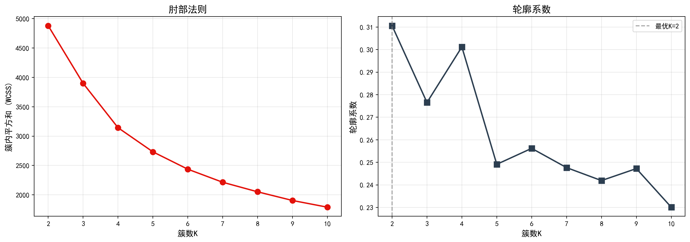
图 13.1 的左图(肘部法则)显示,随着簇数K从2增加到10,簇内平方和(WCSS)持续下降,但下降速率在K=3至K=4附近出现明显放缓——形成了所谓的”肘部”拐点,表明K=3或K=4是较合理的簇数选择。右图(轮廓系数)则显示,K=2时轮廓系数达到最高值,随后随着K增大而逐步下降,说明从纯粹的统计指标角度,数据最自然地被分为两组。下面输出最优K值结论。
The left panel (elbow method) of 图 13.1 shows that as K increases from 2 to 10, the WCSS continuously decreases, but the rate of decrease noticeably slows around K=3 to K=4—forming the so-called “elbow” point, indicating that K=3 or K=4 is a reasonable choice for the number of clusters. The right panel (silhouette score) shows that the silhouette score reaches its highest value at K=2 and then gradually decreases as K grows, suggesting that from a purely statistical perspective, the data is most naturally divided into two groups. Below we output the optimal K conclusion.
print(f'根据轮廓系数,最优K = {optimal_number_of_clusters}')  # 输出最优K值结论
# Print the optimal K conclusion based on silhouette score
根据轮廓系数,最优K = 2运行结果显示,根据轮廓系数准则,统计意义上的最优簇数K=2。然而,在实际业务分析中,将所有上市公司仅分为两组过于粗糙,难以从中挖掘出具有实际管理价值的差异化特征。因此,我们综合考虑肘部法则中K=4附近的拐点信号和产业研究的实际需求,选择K=4进行后续分析——这一选择能够更好地区分出不同财务健康状况的企业群体,为投资决策和产业研究提供更细粒度的洞察。
The results show that, according to the silhouette score criterion, the statistically optimal number of clusters is K=2. However, in practical business analysis, dividing all listed companies into only two groups is too coarse to extract differentiated characteristics with real managerial value. Therefore, considering both the elbow signal around K=4 and the practical needs of industry research, we choose K=4 for subsequent analysis—this choice better distinguishes enterprise groups with different financial health profiles and provides finer-grained insights for investment decisions and industry research.
确定K=4后,我们对聚类结果进行详细分析。图 13.2 展示了各簇的财务特征概况,图 13.3 则通过散点图和雷达图直观展示聚类差异。
After determining K=4, we conduct a detailed analysis of the clustering results. 图 13.2 presents an overview of the financial characteristics of each cluster, while 图 13.3 intuitively displays clustering differences through scatter plots and radar charts.
# ========== 第1步:使用指定簇数进行K-Means聚类 ==========
# ========== Step 1: Perform K-Means clustering with the chosen number of clusters ==========
chosen_number_of_clusters = 4                            # 根据业务理解选择4簇(对应不同财务特征的企业群体)
# Choose 4 clusters based on business understanding (corresponding to different financial profile groups)
final_kmeans_clustering_model = KMeans(n_clusters=chosen_number_of_clusters, random_state=42, n_init=10)  # 创建K-Means模型
# Create the K-Means model
features_for_clustering_dataframe['cluster'] = final_kmeans_clustering_model.fit_predict(scaled_features_matrix)  # 拟合并预测簇标签
# Fit the model and predict cluster labels

# ========== 第2步:统计各簇财务特征概况 ==========
# ========== Step 2: Compute summary statistics for each cluster ==========
print(f'=== 使用K={chosen_number_of_clusters}的聚类结果 ===\n')  # 输出标题
# Print the header
cluster_characteristics_summary_dataframe = features_for_clustering_dataframe.groupby('cluster').agg({  # 按簇分组聚合
# Group by cluster and aggregate
    'roa': ['mean', 'std', 'count'],                     # 计算ROA的均值、标准差、样本数
# Compute mean, std, and count for ROA
    'debt_ratio': 'mean',                                # 计算资产负债率均值
# Compute mean debt ratio
    'current_ratio': 'mean',                             # 计算流动比率均值
# Compute mean current ratio
    'log_assets': 'mean'                                 # 计算对数资产规模均值
# Compute mean log assets
}).round(3)                                               # 四舍五入保留三位小数
# Round to 3 decimal places

print(cluster_characteristics_summary_dataframe)          # 输出聚合统计表
# Print the aggregated summary table

# ========== 第3步:解读各簇的财务特征含义 ==========
# ========== Step 3: Interpret the financial characteristics of each cluster ==========
print('\n=== 聚类特征解释 ===')                  # 输出解释标题
# Print the interpretation header
for cluster_index in range(chosen_number_of_clusters):   # 遍历每个簇
# Iterate over each cluster
    current_cluster_mean_series = features_for_clustering_dataframe[features_for_clustering_dataframe['cluster'] == cluster_index][selected_clustering_features_list].mean()  # 计算当前簇的特征均值
# Compute the feature means for the current cluster
    print(f'\n簇{cluster_index+1} (n={sum(features_for_clustering_dataframe["cluster"]==cluster_index)}):')  # 输出簇编号和样本量
# Print cluster number and sample size
    print(f'  ROA: {current_cluster_mean_series["roa"]:.2f}%')                  # 输出平均总资产收益率
# Print average ROA
    print(f'  资产负债率: {current_cluster_mean_series["debt_ratio"]:.1f}%')  # 输出平均资产负债率
# Print average debt-to-asset ratio
    print(f'  流动比率: {current_cluster_mean_series["current_ratio"]:.2f}')    # 输出平均流动比率
# Print average current ratio
    print(f'  资产规模(log): {current_cluster_mean_series["log_assets"]:.2f}')  # 输出平均对数资产规模
# Print average log asset size
=== 使用K=4的聚类结果 ===
roa debt_ratio current_ratio log_assets
mean std count mean mean mean
cluster
0 2.959 3.579 397 60.400 1.302 5.486
1 5.487 5.456 409 17.036 5.235 3.065
2 -10.042 7.054 161 56.084 1.524 3.174
3 4.364 3.957 889 39.408 1.956 3.458
=== 聚类特征解释 ===
簇1 (n=397):
ROA: 2.96%
资产负债率: 60.4%
流动比率: 1.30
资产规模(log): 5.49
簇2 (n=409):
ROA: 5.49%
资产负债率: 17.0%
流动比率: 5.23
资产规模(log): 3.06
簇3 (n=161):
ROA: -10.04%
资产负债率: 56.1%
流动比率: 1.52
资产规模(log): 3.17
簇4 (n=889):
ROA: 4.36%
资产负债率: 39.4%
流动比率: 1.96
资产规模(log): 3.46上述运行结果揭示了K=4聚类下四种截然不同的企业财务画像:
The above results reveal four distinctly different corporate financial profiles under K=4 clustering:
簇1(n=397,“大型高杠杆稳健企业”):平均ROA为2.96%,盈利能力中等;资产负债率高达60.4%,杠杆水平最高;流动比率仅1.30,短期偿债压力较大;但对数资产规模达5.49,为四组中最大。这类企业以大型国有企业和重资产行业龙头为主,依靠规模优势获取低成本融资。
簇2(n=409,“轻资产高效企业”):平均ROA为5.49%,盈利能力最强;资产负债率仅17.0%,财务极为保守;流动比率高达5.23,现金充裕;对数资产规模3.06,体量较小。典型代表为科技型中小企业和现金流充沛的消费类公司。
簇3(n=161,“财务困境企业”):平均ROA为-10.04%,严重亏损;资产负债率56.1%,债务负担沉重;流动比率1.52,流动性紧张;对数资产规模3.17,体量也较小。这类企业面临较大的经营风险,值得投资者警惕。
簇4(n=889,“中等规模均衡企业”):平均ROA为4.36%,盈利稳定;资产负债率39.4%,杠杆水平适中;流动比率1.96,短期偿债能力良好;对数资产规模3.46。这是数量最多的一组,代表了长三角上市公司的主流财务特征。
Cluster 1 (n=397, “Large High-Leverage Stable Firms”): Average ROA of 2.96%, moderate profitability; debt ratio as high as 60.4%, the highest leverage level; current ratio of only 1.30, indicating considerable short-term debt pressure; but log asset size of 5.49, the largest among the four groups. These are primarily large state-owned enterprises and heavy-asset industry leaders that leverage scale advantages to access low-cost financing.
Cluster 2 (n=409, “Asset-Light High-Efficiency Firms”): Average ROA of 5.49%, the strongest profitability; debt ratio of only 17.0%, extremely conservative finances; current ratio as high as 5.23, indicating abundant cash; log asset size of 3.06, relatively small in scale. Typical representatives are technology-oriented SMEs and cash-rich consumer companies.
Cluster 3 (n=161, “Financially Distressed Firms”): Average ROA of -10.04%, severe losses; debt ratio of 56.1%, heavy debt burden; current ratio of 1.52, tight liquidity; log asset size of 3.17, also relatively small. These firms face significant operational risk and warrant investor caution.
Cluster 4 (n=889, “Medium-Sized Balanced Firms”): Average ROA of 4.36%, stable profitability; debt ratio of 39.4%, moderate leverage; current ratio of 1.96, good short-term solvency; log asset size of 3.46. This is the largest group, representing the mainstream financial profile of YRD listed companies.
下面我们通过可视化图形来更直观地展示聚类结果。左图为散点图,展示各公司在ROA与资产负债率两个维度上的分布及其簇归属;右图为雷达图,展示各簇的多维特征轮廓。首先预计算可视化所需的颜色、质心坐标和雷达图数据:
Below, we use visualizations to more intuitively display the clustering results. The left panel is a scatter plot showing the distribution of each company in the ROA vs. debt ratio dimensions and their cluster assignments; the right panel is a radar chart showing the multidimensional feature profile of each cluster. First, we precompute the colors, centroid coordinates, and radar chart data needed for visualization:
# ========== 预计算:可视化所需的公共数据 ==========
# ========== Precomputation: Common data needed for visualization ==========
cluster_display_colors_list = ['#E3120B', '#2C3E50', '#008080', '#F0A700']  # 定义4个簇的显示颜色
# Define display colors for the 4 clusters
unscaled_cluster_centroids_array = features_standard_scaler.inverse_transform(final_kmeans_clustering_model.cluster_centers_)  # 将质心反标准化回原始尺度
# Inverse-transform centroids back to original scale

# --- 雷达图维度与角度 ---
# --- Radar chart dimensions and angles ---
radar_chart_categories_list = ['ROA', '资产负债率', '流动比率', '资产规模']  # 雷达图的四个维度
# Four dimensions for the radar chart
number_of_radar_categories = len(radar_chart_categories_list)  # 维度数量
# Number of dimensions
radar_chart_angles_list = [radar_angle_index / float(number_of_radar_categories) * 2 * np.pi for radar_angle_index in range(number_of_radar_categories)]  # 计算各维度角度
# Calculate angle for each dimension
radar_chart_angles_list += radar_chart_angles_list[:1]   # 闭合雷达图(首尾相连)
# Close the radar chart (connect end to start)

# --- 标准化各簇均值用于雷达图绘制 ---
# --- Normalize cluster means for radar chart plotting ---
cluster_average_profiles_dataframe = features_for_clustering_dataframe.groupby('cluster')[selected_clustering_features_list].mean()  # 计算各簇特征均值
# Compute feature means for each cluster
normalized_cluster_profiles_dataframe = (cluster_average_profiles_dataframe - cluster_average_profiles_dataframe.min()) / (cluster_average_profiles_dataframe.max() - cluster_average_profiles_dataframe.min())  # Min-Max标准化到0-1范围
# Min-Max normalize to the 0-1 range
预计算完成,下面绘制双面板对比图。首先创建画布并绘制左侧散点图,展示各公司在ROA与资产负债率平面上的分布及其簇归属:
Precomputation complete. Now we plot the dual-panel comparison chart. First, we create the canvas and draw the left-side scatter plot, showing the distribution of companies in the ROA vs. debt ratio plane and their cluster assignments:
# ========== 第1步:创建双图布局并绘制散点图 ==========
# ========== Step 1: Create dual-panel layout and draw scatter plot ==========
cluster_visualization_figure, cluster_visualization_axes = plt.subplots(1, 2, figsize=(14, 5))  # 创建1行2列子图
# Create a 1-row, 2-column subplot layout

# ========== 第2步:左图 — ROA vs 资产负债率散点图 ==========
# ========== Step 2: Left panel — ROA vs. Debt Ratio scatter plot ==========
scatter_plot_axes = cluster_visualization_axes[0]        # 获取左侧子图
# Get the left subplot
for cluster_index in range(chosen_number_of_clusters):   # 遍历每个簇
# Iterate over each cluster
    current_cluster_mask_series = features_for_clustering_dataframe['cluster'] == cluster_index  # 创建当前簇的布尔掩码
# Create a boolean mask for the current cluster
    scatter_plot_axes.scatter(features_for_clustering_dataframe.loc[current_cluster_mask_series, 'debt_ratio'],  # x轴:资产负债率
# x-axis: debt ratio
                features_for_clustering_dataframe.loc[current_cluster_mask_series, 'roa'],  # y轴:ROA
# y-axis: ROA
                c=cluster_display_colors_list[cluster_index], label=f'簇{cluster_index+1}', alpha=0.6, s=50)  # 按簇着色
# Color by cluster
scatter_plot_axes.scatter(unscaled_cluster_centroids_array[:, 1], unscaled_cluster_centroids_array[:, 0],  # 绘制质心点
# Plot centroid points
            c='black', marker='X', s=300, linewidths=2,  # 黑色X形标记,突出显示
# Black X markers for emphasis
            edgecolors='white', label='质心')              # 白色边框增强可见度
# White edge for better visibility
scatter_plot_axes.set_xlabel('资产负债率 (%)', fontsize=12)     # 设置x轴标签
# Set x-axis label
scatter_plot_axes.set_ylabel('ROA (%)', fontsize=12)     # 设置y轴标签
# Set y-axis label
scatter_plot_axes.set_title('聚类结果: ROA vs 资产负债率', fontsize=14)  # 设置标题
# Set title
scatter_plot_axes.legend()                               # 添加图例
# Add legend
scatter_plot_axes.grid(True, alpha=0.3)                  # 添加半透明网格线
# Add semi-transparent grid lines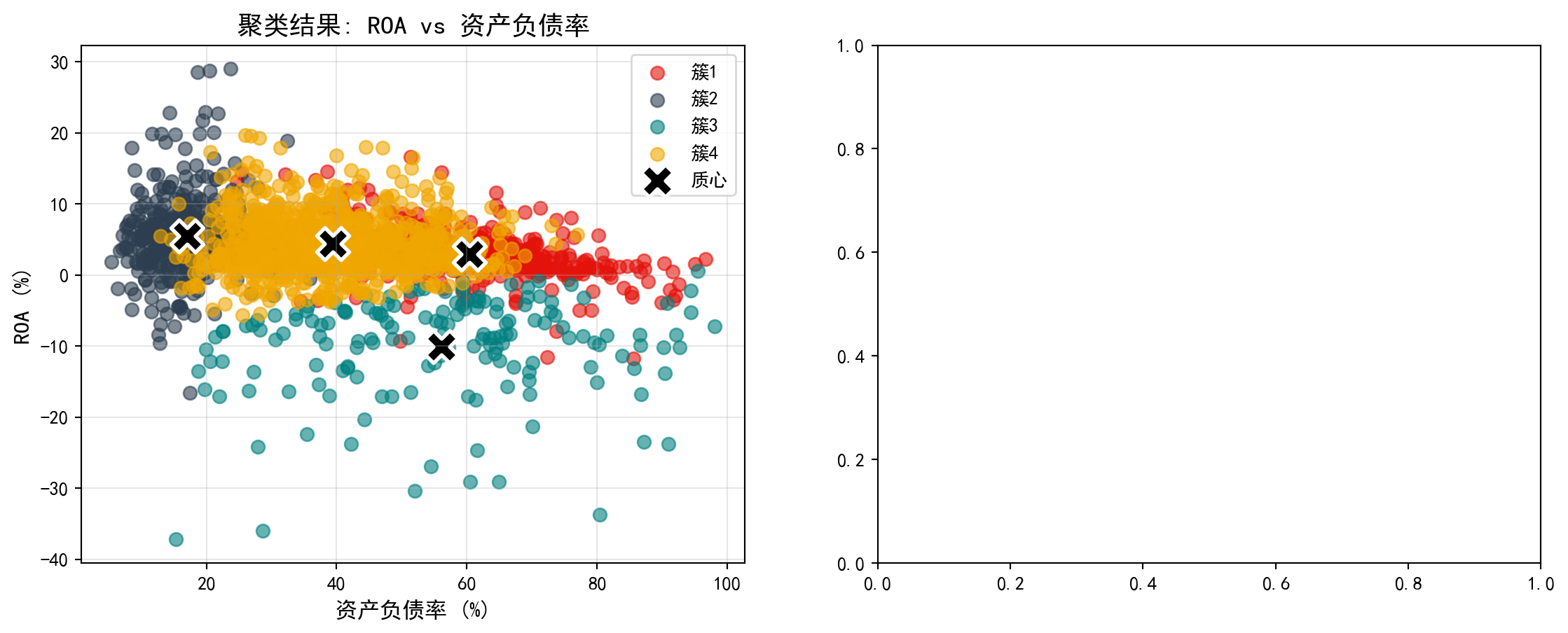
散点图清晰地展示了各企业在盈利能力(ROA)与杠杆水平(资产负债率)两个维度上的聚类归属。下面在右侧补充雷达图,从多维度对比各簇的财务特征差异:
The scatter plot clearly shows the cluster assignments of each company along the profitability (ROA) and leverage (debt ratio) dimensions. Next, we add a radar chart on the right to compare the multidimensional financial characteristic differences across clusters:
# ========== 第3步:右图 — 雷达图对比各簇财务特征 ==========
# ========== Step 3: Right panel — Radar chart comparing financial features across clusters ==========
radar_chart_axes = cluster_visualization_axes[1]         # 获取右侧子图
# Get the right subplot
for cluster_index in range(chosen_number_of_clusters):   # 遍历每个簇绘制雷达图
# Iterate over each cluster to draw the radar chart
    radar_chart_values_list = normalized_cluster_profiles_dataframe.loc[cluster_index].values.tolist()  # 获取当前簇的标准化值
# Get the normalized values for the current cluster
    radar_chart_values_list += radar_chart_values_list[:1]  # 闭合雷达图数据(首尾相连形成封闭多边形)
# Close the radar chart data (connect end to start to form a closed polygon)
    radar_chart_axes.plot(radar_chart_angles_list, radar_chart_values_list, 'o-', color=cluster_display_colors_list[cluster_index], linewidth=2, label=f'簇{cluster_index+1}')  # 绘制轮廓线
# Plot the profile line
    radar_chart_axes.fill(radar_chart_angles_list, radar_chart_values_list, color=cluster_display_colors_list[cluster_index], alpha=0.1)  # 填充半透明颜色
# Fill with semi-transparent color
radar_chart_axes.set_xticks(radar_chart_angles_list[:-1])  # 设置角度刻度位置
# Set angular tick positions
radar_chart_axes.set_xticklabels(radar_chart_categories_list, fontsize=11)  # 设置维度标签
# Set dimension labels
radar_chart_axes.set_title('各簇特征对比(标准化)', fontsize=14)  # 设置雷达图标题
# Set radar chart title
radar_chart_axes.legend(loc='upper right', bbox_to_anchor=(1.1, 1))  # 图例置于右上角
# Place legend at upper right

plt.tight_layout()                                       # 自动调整子图间距
# Automatically adjust subplot spacing
plt.show()                                               # 显示图表
# Display the chart
<Figure size 672x480 with 0 Axes>13.4 层次聚类 (Hierarchical Clustering)
13.4.1 算法原理 (Algorithm Principles)
层次聚类构建一棵聚类树(dendrogram),可以是:
Hierarchical clustering builds a dendrogram (clustering tree), which can be constructed in two ways:
1. 凝聚法(Agglomerative):自底向上 - 初始:每个点是一个簇 - 迭代:合并最近的两个簇 - 终止:所有点合并为一个簇
1. Agglomerative: Bottom-up - Initialization: Each point is a cluster - Iteration: Merge the two closest clusters - Termination: All points are merged into one cluster
2. 分裂法(Divisive):自顶向下 - 初始:所有点是一个簇 - 迭代:将一个簇分裂为两个 - 终止:每个点是一个簇
2. Divisive: Top-down - Initialization: All points form one cluster - Iteration: Split one cluster into two - Termination: Each point is a cluster
簇间距离度量(Linkage):
Inter-cluster Distance Measures (Linkage):
| 方法 | 定义 | 特点 |
|---|---|---|
| 单链接(Single) | 最近点距离 | 容易产生链状簇 |
| 全链接(Complete) | 最远点距离 | 产生紧凑簇 |
| 平均链接(Average) | 所有点对平均距离 | 折中 |
| Ward | 合并后方差增量 | 倾向于产生大小相近的簇 |
| Method | Definition | Characteristics |
|---|---|---|
| Single Linkage | Nearest point distance | Tends to produce chain-shaped clusters |
| Complete Linkage | Farthest point distance | Produces compact clusters |
| Average Linkage | Average distance of all point pairs | A compromise |
| Ward | Variance increment after merging | Tends to produce clusters of similar size |
13.4.2 案例:行业层次聚类 (Case Study: Industry Hierarchical Clustering)
什么是层次聚类与产业谱系分析?
What is Hierarchical Clustering and Industrial Phylogenetic Analysis?
与K-Means需要预先指定分群数量不同,层次聚类(Hierarchical Clustering)能够自底向上逐步合并最相似的样本,生成一棵完整的”聚类树状图”(Dendrogram)。这棵树不仅展示了最终的分群结果,更揭示了不同行业或企业之间的”亲缘关系”——哪些行业在财务特征上最为接近,哪些行业之间的差异最大。
Unlike K-Means, which requires pre-specifying the number of clusters, hierarchical clustering progressively merges the most similar samples from the bottom up, generating a complete “dendrogram.” This tree not only shows the final clustering results but also reveals the “phylogenetic relationships” between different industries or firms—which industries are most similar in financial characteristics and which differ the most.
在产业研究中,这种层次化的分类结果尤为有价值:投资者可以据此理解行业板块之间的内在联系,制定跨行业的资产配置策略;产业政策制定者可以识别出具有相似发展特征的行业群体,进行针对性的政策设计。下面我们使用Ward方法对行业数据进行层次聚类分析。图 13.4 展示了树状图结果。
In industrial research, such hierarchical classification results are particularly valuable: investors can use them to understand the intrinsic connections between industry sectors and formulate cross-industry asset allocation strategies; industrial policymakers can identify industry groups with similar development characteristics for targeted policy design. Below, we apply the Ward method to perform hierarchical clustering analysis on industry data. 图 13.4 shows the dendrogram results.
# ========== 导入所需库 ==========
# ========== Import Required Libraries ==========
from scipy.cluster.hierarchy import dendrogram, linkage, fcluster  # 导入层次聚类相关函数
# Import hierarchical clustering functions

# ========== 第1步:随机抽样以加速树状图可视化 ==========
# ========== Step 1: Random Sampling to Speed Up Dendrogram Visualization ==========
np.random.seed(42)                                       # 设置随机种子确保可复现
# Set random seed for reproducibility
random_sample_indices_array = np.random.choice(len(scaled_features_matrix), min(100, len(scaled_features_matrix)), replace=False)  # 随机抽取100个样本
# Randomly select 100 samples
sampled_scaled_features_matrix = scaled_features_matrix[random_sample_indices_array]  # 获取抽样后的标准化特征矩阵
# Obtain the sampled standardized feature matrix

# ========== 第2步:使用Ward方法计算层次聚类连接矩阵 ==========
# ========== Step 2: Compute Hierarchical Clustering Linkage Matrix Using Ward Method ==========
hierarchical_linkage_matrix = linkage(sampled_scaled_features_matrix, method='ward')  # Ward方法最小化合并后的方差增量
# Ward method minimizes the variance increment after merging
层次聚类连接矩阵计算完毕。下面绘制树状图并按距离阈值切割得到簇标签。
The hierarchical clustering linkage matrix has been computed. Next, we plot the dendrogram and cut it at a distance threshold to obtain cluster labels.
# ========== 第3步:绘制树状图(Dendrogram) ==========
# ========== Step 3: Plot the Dendrogram ==========
dendrogram_figure, dendrogram_axes = plt.subplots(figsize=(14, 6))  # 创建图形画布
# Create figure canvas
dendrogram(hierarchical_linkage_matrix,                  # 输入连接矩阵
# Input the linkage matrix
           truncate_mode='level',                        # 按层级截断显示
# Truncate display by level
           p=5,                                          # 只显示最后5层,避免图形过于密集
# Show only the last 5 levels to avoid visual clutter
           leaf_rotation=90,                             # 叶节点标签旋转90度
# Rotate leaf node labels by 90 degrees
           leaf_font_size=9,                             # 叶节点字体大小
# Set leaf node font size
           ax=dendrogram_axes)                           # 绑定到指定子图
# bindto the specified subplot
dendrogram_axes.set_xlabel('样本', fontsize=12)          # 设置x轴标签
# Set x-axis label
dendrogram_axes.set_ylabel('距离', fontsize=12)          # 设置y轴标签
# Set y-axis label
dendrogram_axes.set_title('层次聚类树状图 (Ward方法)', fontsize=14)  # 设置标题
# Set title
dendrogram_axes.axhline(y=15, color='red', linestyle='--', label='切割线 (4簇)')  # 添加水平切割线,表示分为4簇的阈值
# Add horizontal cut line indicating the threshold for 4 clusters
dendrogram_axes.legend()                                 # 添加图例
# Add legend
plt.tight_layout()                                       # 自动调整布局
# Auto-adjust layout
plt.show()                                               # 显示图表
# Display the chart

# ========== 第4步:按距离阈值切割树状图得到簇标签 ==========
# ========== Step 4: Cut the Dendrogram at a Distance Threshold to Obtain Cluster Labels ==========
hierarchical_cluster_labels_array = fcluster(hierarchical_linkage_matrix, t=15, criterion='distance')  # 以距离15为阈值切割
# Cut at distance threshold of 15
print(f'层次聚类产生 {len(np.unique(hierarchical_cluster_labels_array))} 个簇')  # 输出簇的数量
# Print the number of clusters
print(f'各簇样本数: {np.bincount(hierarchical_cluster_labels_array)}')  # 输出每个簇的样本数
# Print the number of samples in each cluster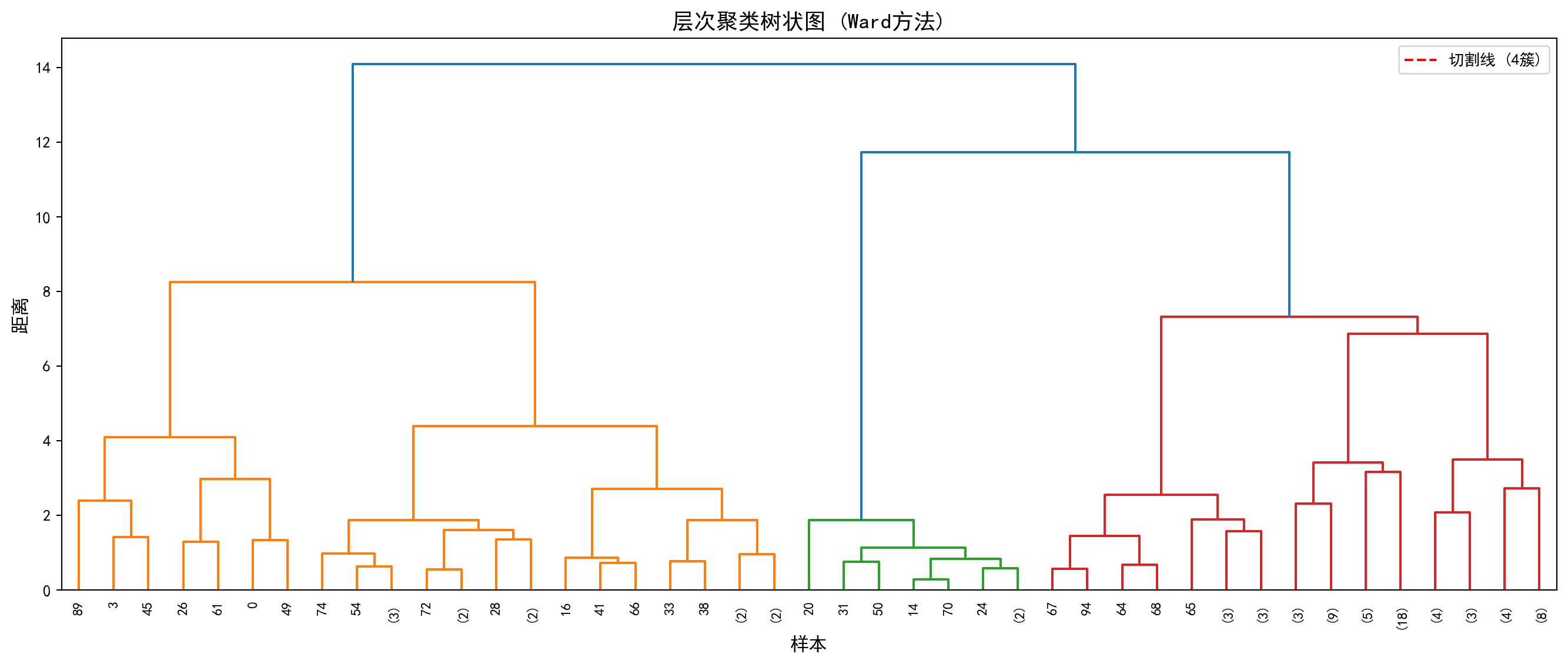
层次聚类产生 1 个簇
各簇样本数: [  0 100]
运行结果显示,以距离阈值t=15进行切割时,层次聚类仅产生了1个簇,即100个抽样样本全部被归入同一组(各簇样本数为[0, 100],其中索引0处的0是np.bincount对标签值0的计数,实际标签从1开始)。这一结果说明当前的距离阈值设定过高——从 图 13.4 的树状图中可以看到,红色切割线(y=15)位于树状图的顶部,几乎在所有样本合并之后才进行切割,因此无法有效区分出子群。
The results show that when cutting at distance threshold t=15, hierarchical clustering produces only 1 cluster, meaning all 100 sampled observations are grouped together (cluster sizes are [0, 100], where the 0 at index 0 is np.bincount’s count for label value 0, since actual labels start from 1). This result indicates that the current distance threshold is set too high—from the dendrogram in 图 13.4, we can see that the red cut line (y=15) is positioned near the top of the dendrogram, cutting only after almost all samples have been merged, thus failing to effectively distinguish subgroups.
在实际应用中,应根据树状图的形态选择合适的切割高度:观察树状图中较大的”跳跃”(即两个分支合并时距离突然增大的位置),通常是较好的切割点。例如,若将阈值降低至t=5~8的范围,即可获得更有意义的多簇结果。这也体现了层次聚类的一个核心优势——通过树状图可以灵活地在不同粒度上观察聚类结构,而不像K-Means那样必须事先确定簇数。
In practice, one should choose an appropriate cutting height based on the shape of the dendrogram: look for large “jumps” (i.e., positions where the distance suddenly increases when two branches merge), which are typically good cutting points. For example, lowering the threshold to the range of t=5–8 would yield more meaningful multi-cluster results. This also highlights a core advantage of hierarchical clustering—the dendrogram allows flexible observation of clustering structure at different granularities, unlike K-Means which requires pre-specifying the number of clusters.
13.5 主成分分析(PCA) (Principal Component Analysis)
13.5.1 数学原理 (Mathematical Principles)
主成分分析(Principal Component Analysis, PCA)是最经典的降维方法,由Pearson(1901)和Hotelling(1933)发展完善。
Principal Component Analysis (PCA) is the most classic dimensionality reduction method, developed and refined by Pearson (1901) and Hotelling (1933).
目标: 将高维数据投影到低维空间,同时保留最大方差。
Objective: Project high-dimensional data onto a lower-dimensional space while preserving maximum variance.
数学表述: 给定\(n\)个\(p\)维数据点\(X_{n \times p}\)(已中心化),寻找投影方向\(w_1\)使投影后的方差最大,如 式 13.3 所示:
Mathematical Formulation: Given \(n\) data points of \(p\) dimensions \(X_{n \times p}\) (already centered), find the projection direction \(w_1\) that maximizes the projected variance, as shown in 式 13.3:
\[ \max_{w_1} \text{Var}(Xw_1) = w_1' S w_1 \quad \text{s.t.} \quad w_1'w_1 = 1 \tag{13.3}\]
其中\(S = \frac{1}{n-1}X'X\)是样本协方差矩阵。
where \(S = \frac{1}{n-1}X'X\) is the sample covariance matrix.
PCA的特征分解推导(拉格朗日乘子法)
Eigendecomposition Derivation of PCA (Lagrange Multiplier Method)
寻找单位向量 \(\mathbf{w}\),使得投影方差最大。 样本协方差矩阵为 \(\mathbf{S} = \frac{1}{n-1}\mathbf{X}'\mathbf{X}\)。 投影后的方差为 \(\mathbf{w}'\mathbf{S}\mathbf{w}\)。 优化问题: \[ \max_{\mathbf{w}} \mathbf{w}'\mathbf{S}\mathbf{w} \quad \text{s.t.} \quad \mathbf{w}'\mathbf{w} = 1 \] 构造拉格朗日函数: \[ L = \mathbf{w}'\mathbf{S}\mathbf{w} - \lambda(\mathbf{w}'\mathbf{w} - 1) \] 对 \(\mathbf{w}\) 求导并令为0: \[ \frac{\partial L}{\partial \mathbf{w}} = 2\mathbf{S}\mathbf{w} - 2\lambda\mathbf{w} = 0 \Rightarrow \mathbf{S}\mathbf{w} = \lambda\mathbf{w} \] 这正是特征值方程! 且最大方差 \(\mathbf{w}'\mathbf{S}\mathbf{w} = \mathbf{w}'(\lambda\mathbf{w}) = \lambda(\mathbf{w}'\mathbf{w}) = \lambda\)。 结论:第一主成分就是协方差矩阵最大特征值对应的特征向量。
Find the unit vector \(\mathbf{w}\) that maximizes the projected variance. The sample covariance matrix is \(\mathbf{S} = \frac{1}{n-1}\mathbf{X}'\mathbf{X}\). The projected variance is \(\mathbf{w}'\mathbf{S}\mathbf{w}\). The optimization problem: \[ \max_{\mathbf{w}} \mathbf{w}'\mathbf{S}\mathbf{w} \quad \text{s.t.} \quad \mathbf{w}'\mathbf{w} = 1 \] Construct the Lagrangian: \[ L = \mathbf{w}'\mathbf{S}\mathbf{w} - \lambda(\mathbf{w}'\mathbf{w} - 1) \] Differentiate with respect to \(\mathbf{w}\) and set to zero: \[ \frac{\partial L}{\partial \mathbf{w}} = 2\mathbf{S}\mathbf{w} - 2\lambda\mathbf{w} = 0 \Rightarrow \mathbf{S}\mathbf{w} = \lambda\mathbf{w} \] This is precisely the eigenvalue equation! And the maximum variance \(\mathbf{w}'\mathbf{S}\mathbf{w} = \mathbf{w}'(\lambda\mathbf{w}) = \lambda(\mathbf{w}'\mathbf{w}) = \lambda\). Conclusion: The first principal component is the eigenvector corresponding to the largest eigenvalue of the covariance matrix.
几何解释:数据椭球体 如果我们假设数据服从多元正态分布,数据点在空间中形成一个超椭球体(Hyper-ellipsoid)。 - 协方差矩阵 \(\mathbf{S}\) 描述了这个椭球体的形状。 - 特征向量 \(\mathbf{w}_i\) 是椭球体的主轴方向(半长轴、半短轴…)。 - 特征值 \(\lambda_i\) 对应主轴长度的平方(即该方向上的方差)。 PCA 本质上就是找到这个数据椭球体的主轴,并将坐标系旋转对齐到这些主轴上。
Geometric Interpretation: The Data Ellipsoid If we assume the data follows a multivariate normal distribution, the data points form a hyper-ellipsoid in space. - The covariance matrix \(\mathbf{S}\) describes the shape of this ellipsoid. - The eigenvectors \(\mathbf{w}_i\) are the principal axis directions of the ellipsoid (semi-major axis, semi-minor axis, etc.). - The eigenvalues \(\lambda_i\) correspond to the squares of the principal axis lengths (i.e., the variance in that direction). PCA essentially finds the principal axes of this data ellipsoid and rotates the coordinate system to align with these axes.
13.5.2 方差解释与主成分选择 (Variance Explained and Principal Component Selection)
总方差: \(\sum_{j=1}^p \lambda_j = \text{tr}(S)\)
Total Variance: \(\sum_{j=1}^p \lambda_j = \text{tr}(S)\)
第\(k\)主成分解释的方差比例如 式 13.4 所示:
The proportion of variance explained by the \(k\)-th principal component is shown in 式 13.4:
\[ \frac{\lambda_k}{\sum_{j=1}^p \lambda_j} \tag{13.4}\]
主成分数量选择:
Selecting the Number of Principal Components:
Kaiser准则: 保留特征值大于1的主成分(适用于标准化数据)
累计方差解释: 保留足够解释80%或90%以上总方差的主成分
Scree图: 寻找特征值下降放缓的”肘部”
Kaiser Criterion: Retain principal components with eigenvalues greater than 1 (applicable to standardized data)
Cumulative Variance Explained: Retain enough principal components to explain 80% or 90% of the total variance
Scree Plot: Look for the “elbow” where the decline in eigenvalues levels off
13.5.3 案例:上市公司财务综合评价 (Case Study: Comprehensive Financial Evaluation of Listed Companies)
什么是主成分分析与财务综合评价?
What is PCA and Comprehensive Financial Evaluation?
评价一家上市公司的财务状况,通常需要综合考虑盈利能力(如ROA)、偿债能力(如资产负债率)、流动性(如流动比率)和规模(如总资产)等多个指标。但这些指标之间往往高度相关——例如规模大的企业可能负债率也较高。主成分分析(PCA)通过正交变换,将这些相关的原始指标转化为少数几个不相关的”主成分”,每个主成分都是原始指标的线性组合,且尽可能多地保留了原始数据的信息量。
Evaluating the financial health of a listed company typically requires considering multiple indicators such as profitability (e.g., ROA), solvency (e.g., debt-to-asset ratio), liquidity (e.g., current ratio), and size (e.g., total assets). However, these indicators are often highly correlated—for example, larger firms may also have higher leverage ratios. PCA uses orthogonal transformations to convert these correlated original indicators into a few uncorrelated “principal components,” each being a linear combination of the original indicators while retaining as much information from the original data as possible.
在金融实务中,PCA被广泛用于构建综合评价指标(如用第一主成分作为企业财务实力的综合得分)、多因子模型的因子提取(如Fama-French因子的构建),以及投资组合的风险分解。下面我们对长三角上市公司的财务数据进行PCA分析。图 13.5 展示了特征值和方差解释比例,图 13.6 则通过碎石图和双标图直观展示主成分结构。
In financial practice, PCA is widely used for constructing composite evaluation indices (e.g., using the first principal component as a comprehensive score of corporate financial strength), factor extraction in multi-factor models (e.g., construction of Fama-French factors), and risk decomposition of investment portfolios. Below, we perform PCA analysis on financial data of listed companies in the Yangtze River Delta. 图 13.5 shows the eigenvalues and variance explained ratios, while 图 13.6 provides an intuitive view of the principal component structure through a scree plot and biplot.
# ========== 导入所需库 ==========
# ========== Import Required Libraries ==========
from sklearn.decomposition import PCA                    # 导入主成分分析模块
# Import the PCA module

# ========== 第1步:准备PCA分析的财务特征数据 ==========
# ========== Step 1: Prepare Financial Feature Data for PCA Analysis ==========
pca_analysis_dataframe = clustering_analysis_dataframe[['roa', 'debt_ratio', 'current_ratio', 'log_assets']].copy()  # 选择四个财务特征
# Select four financial features
pca_analysis_dataframe = pca_analysis_dataframe.dropna()  # 删除含缺失值的样本
# Drop samples with missing values
pca_analysis_dataframe = pca_analysis_dataframe[  # 过滤各指标的极端异常值
# Filter extreme outliers for each indicator
    (pca_analysis_dataframe['roa'] > -50) & (pca_analysis_dataframe['roa'] < 30) &          # 过滤ROA极端值
# Filter extreme ROA values
    (pca_analysis_dataframe['debt_ratio'] > 0) & (pca_analysis_dataframe['debt_ratio'] < 100) &  # 过滤资产负债率极端值
# Filter extreme debt-to-asset ratio values
    (pca_analysis_dataframe['current_ratio'] > 0) & (pca_analysis_dataframe['current_ratio'] < 10)  # 过滤流动比率极端值
# Filter extreme current ratio values
]                                                        # 完成PCA数据的异常值过滤
# Complete outlier filtering for PCA data

# ========== 第2步:标准化并执行PCA ==========
# ========== Step 2: Standardize and Perform PCA ==========
pca_standard_scaler = StandardScaler()                   # 创建标准化器
# Create a standardizer
pca_scaled_features_matrix = pca_standard_scaler.fit_transform(pca_analysis_dataframe)  # 标准化特征矩阵
# Standardize the feature matrix

principal_component_analysis_model = PCA()               # 创建PCA模型(保留全部主成分)
# Create a PCA model (retaining all principal components)
pca_transformed_features_matrix = principal_component_analysis_model.fit_transform(pca_scaled_features_matrix)  # 执行PCA变换
# Perform PCA transformationPCA模型拟合与主成分变换完成。下面输出各主成分的特征值和方差解释比例。
PCA model fitting and principal component transformation are complete. Below, we output the eigenvalues and variance explained ratios for each principal component.
# ========== 第3步:输出PCA分析结果 ==========
# ========== Step 3: Output PCA Analysis Results ==========
print('=== PCA分析结果 ===\n')                           # 输出标题
# Print header
print('特征值(方差):')                                   # 输出特征值标题
# Print eigenvalue header
for principal_component_index, explained_variance_value in enumerate(principal_component_analysis_model.explained_variance_):  # 遍历每个主成分
# Iterate over each principal component
    print(f'  PC{principal_component_index+1}: {explained_variance_value:.4f}')  # 输出各主成分的特征值
# Print the eigenvalue of each principal component

print('\n方差解释比例:')                                 # 输出方差解释比例标题
# Print variance explained ratio header
for principal_component_index, explained_variance_ratio_value in enumerate(principal_component_analysis_model.explained_variance_ratio_):  # 遍历每个主成分
# Iterate over each principal component
    cumulative_explained_variance_ratio = sum(principal_component_analysis_model.explained_variance_ratio_[:principal_component_index+1])  # 计算累计解释比例
# Compute cumulative explained ratio
    print(f'  PC{principal_component_index+1}: {explained_variance_ratio_value*100:.2f}% (累计: {cumulative_explained_variance_ratio*100:.2f}%)')  # 输出单个和累计比例
# Print individual and cumulative ratios
=== PCA分析结果 ===
特征值(方差):
PC1: 2.1237
PC2: 1.0434
PC3: 0.6021
PC4: 0.2329
方差解释比例:
PC1: 53.06% (累计: 53.06%)
PC2: 26.07% (累计: 79.14%)
PC3: 15.05% (累计: 94.18%)
PC4: 5.82% (累计: 100.00%)运行结果显示,四个主成分的特征值分别为2.1237、1.0434、0.6021和0.2329。第一主成分(PC1)解释了总方差的53.06%,即仅一个综合指标就捕获了四个财务变量中超过一半的信息量。第二主成分(PC2)额外解释了26.07%,前两个主成分的累计解释比例达到79.14%,已接近80%的常用阈值。前三个主成分累计解释94.18%的总方差,说明四维财务数据中的绝大部分信息可以被有效压缩到三维甚至二维空间。第四主成分仅贡献5.82%,属于可以舍弃的”噪声”维度。
The results show that the eigenvalues of the four principal components are 2.1237, 1.0434, 0.6021, and 0.2329, respectively. The first principal component (PC1) explains 53.06% of the total variance, meaning a single composite indicator captures more than half of the information in the four financial variables. The second principal component (PC2) explains an additional 26.07%, and the cumulative explained ratio of the first two components reaches 79.14%, approaching the common threshold of 80%. The first three principal components cumulatively explain 94.18% of the total variance, indicating that the vast majority of information in the four-dimensional financial data can be effectively compressed into three- or even two-dimensional space. The fourth principal component contributes only 5.82%, representing a “noise” dimension that can be discarded.
下面我们通过碎石图和双标图进行可视化。碎石图帮助我们确定应保留多少个主成分:
Below, we visualize the results through a scree plot and a biplot. The scree plot helps us determine how many principal components to retain:
# ========== 第1步:创建双图布局并绘制碎石图 ==========
# ========== Step 1: Create Dual-Plot Layout and Draw Scree Plot ==========
pca_visualization_figure, pca_visualization_axes = plt.subplots(1, 2, figsize=(14, 5))  # 创建1行2列子图
# Create a 1-row, 2-column subplot layout

# ========== 第2步:左图 — 碎石图 (Scree Plot) ==========
# ========== Step 2: Left Panel — Scree Plot ==========
scree_plot_axes = pca_visualization_axes[0]              # 获取左侧子图
# Get the left subplot
scree_plot_axes.bar(range(1, len(principal_component_analysis_model.explained_variance_ratio_)+1),  # x轴:主成分编号
# x-axis: principal component number
        principal_component_analysis_model.explained_variance_ratio_,  # y轴:各主成分的方差解释比例
# y-axis: variance explained ratio of each principal component
        color='#2C3E50', alpha=0.7, label='单个主成分')  # 暗蓝色柱状图
# Dark blue bar chart
scree_plot_axes.plot(range(1, len(principal_component_analysis_model.explained_variance_ratio_)+1),  # x轴:主成分编号
# x-axis: principal component number
         np.cumsum(principal_component_analysis_model.explained_variance_ratio_),  # y轴:累计方差解释比例
# y-axis: cumulative variance explained ratio
         'ro-', linewidth=2, label='累计方差解释')  # 红色折线表示累计解释
# Red line represents cumulative explained variance
scree_plot_axes.axhline(y=0.8, color='gray', linestyle='--', alpha=0.7, label='80%阈值')  # 添加80%参考线
# Add 80% reference line
scree_plot_axes.set_xlabel('主成分', fontsize=12)            # 设置x轴标签
# Set x-axis label
scree_plot_axes.set_ylabel('方差解释比例', fontsize=12)      # 设置y轴标签
# Set y-axis label
scree_plot_axes.set_title('碎石图 (Scree Plot)', fontsize=14)  # 设置标题
# Set title
scree_plot_axes.legend()                                 # 添加图例
# Add legend
scree_plot_axes.grid(True, alpha=0.3, axis='y')          # 添加y轴网格线
# Add y-axis grid lines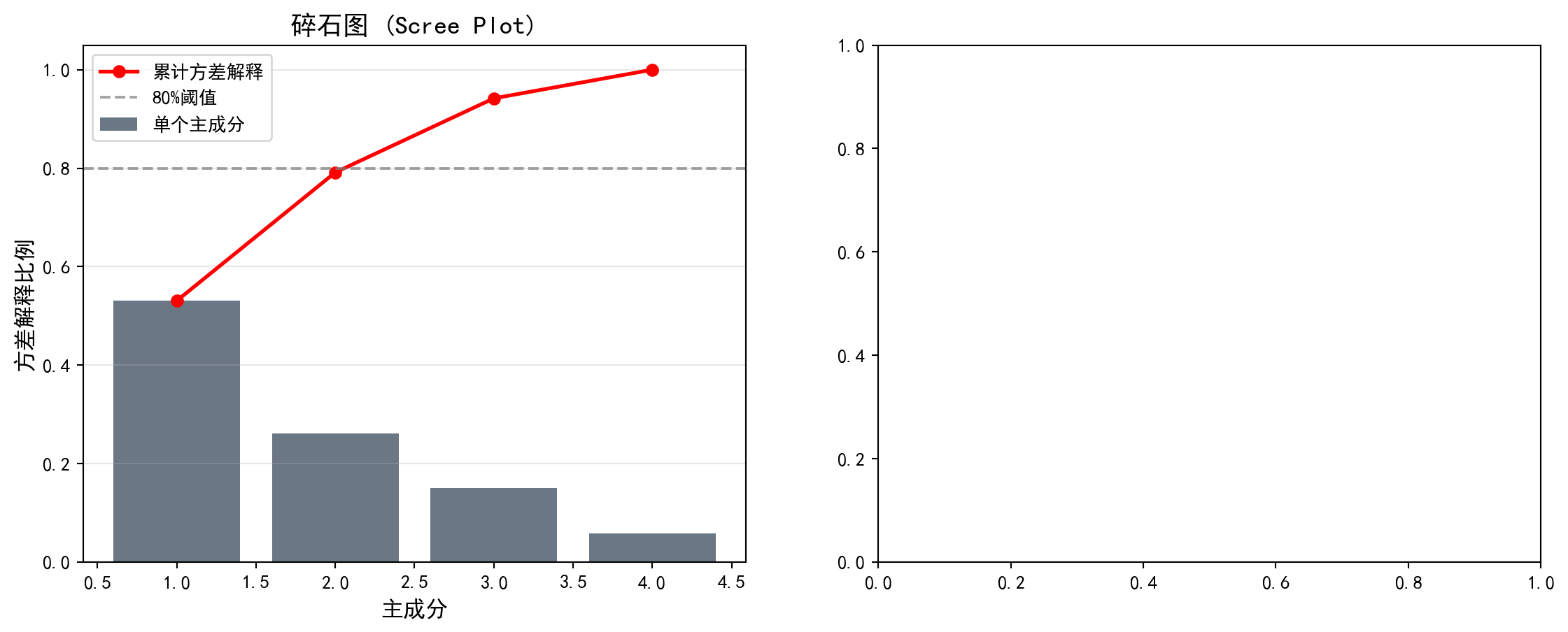
碎石图展示了各主成分的方差解释比例及累计解释量。下面在右侧绘制双标图(Biplot),同时展示降维后各样本在前两个主成分空间中的分布及原始变量的载荷方向:
The scree plot displays the variance explained ratio and cumulative explained variance for each principal component. Next, we draw a biplot on the right panel, simultaneously showing the distribution of samples in the first two principal component space and the loading directions of the original variables:
# ========== 第3步:右图 — 双标图 (Biplot) ==========
# ========== Step 3: Right Panel — Biplot ==========
biplot_axes = pca_visualization_axes[1]                  # 获取右侧子图
# Get the right subplot
biplot_axes.scatter(pca_transformed_features_matrix[:, 0], pca_transformed_features_matrix[:, 1], alpha=0.5, c='#008080', s=30)  # 绘制样本在PC1-PC2空间的散点图
# Plot samples as scatter points in PC1-PC2 space

# --- 绘制特征向量(载荷)箭头 ---
# --- Draw Feature Vector (Loading) Arrows ---
principal_component_feature_names_list = ['ROA', '资产负债率', '流动比率', '资产规模']  # 特征名称列表
# List of feature names
principal_component_loadings_matrix = principal_component_analysis_model.components_.T * np.sqrt(principal_component_analysis_model.explained_variance_)  # 计算缩放后的载荷矩阵
# Compute the scaled loading matrix

for feature_index, (feature_name, loading_vector) in enumerate(zip(principal_component_feature_names_list, principal_component_loadings_matrix)):  # 遍历每个特征
# Iterate over each feature
    biplot_axes.arrow(0, 0, loading_vector[0]*3, loading_vector[1]*3,  # 从原点绘制箭头表示特征方向
# Draw an arrow from the origin indicating the feature direction
              head_width=0.15, head_length=0.1, fc='#E3120B', ec='#E3120B')  # 红色箭头
# Red arrow
    biplot_axes.text(loading_vector[0]*3.2, loading_vector[1]*3.2, feature_name, fontsize=11,  # 在箭头末端标注特征名称
# Label the feature name at the arrow tip
             color='#E3120B', ha='center')                # 红色文字居中对齐
# Red text, center-aligned

biplot_axes.set_xlabel(f'PC1 ({principal_component_analysis_model.explained_variance_ratio_[0]*100:.1f}%)', fontsize=12)  # x轴标签包含PC1解释比例
# x-axis label includes PC1 explained ratio
biplot_axes.set_ylabel(f'PC2 ({principal_component_analysis_model.explained_variance_ratio_[1]*100:.1f}%)', fontsize=12)  # y轴标签包含PC2解释比例
# y-axis label includes PC2 explained ratio
biplot_axes.set_title('双标图 (Biplot)', fontsize=14)        # 设置标题
# Set title
biplot_axes.grid(True, alpha=0.3)                        # 添加网格线
# Add grid lines
biplot_axes.axhline(y=0, color='gray', linestyle='-', alpha=0.3)  # 添加水平参考线
# Add horizontal reference line
biplot_axes.axvline(x=0, color='gray', linestyle='-', alpha=0.3)  # 添加垂直参考线
# Add vertical reference line

plt.tight_layout()                                       # 自动调整子图间距
# Auto-adjust subplot spacing
plt.show()                                               # 显示图表
# Display the chart
<Figure size 672x480 with 0 Axes>PCA可视化图表展示完毕。下面输出主成分载荷矩阵及其经济学含义解释。
The PCA visualization charts are now complete. Below, we output the principal component loading matrix and its economic interpretation.
# ========== 第4步:输出主成分载荷矩阵及解释 ==========
# ========== Step 4: Output Principal Component Loading Matrix and Interpretation ==========
print('\n=== 主成分载荷 ===')                          # 输出标题
# Print header
principal_component_loadings_dataframe = pd.DataFrame(  # 构建主成分载荷矩阵DataFrame
# Construct the principal component loading matrix DataFrame
    principal_component_analysis_model.components_.T,     # 载荷矩阵转置
# Transpose of the loading matrix
    columns=[f'PC{feature_index+1}' for feature_index in range(principal_component_analysis_model.n_components_)],  # 列名为PC1~PC4
# Column names are PC1 to PC4
    index=principal_component_feature_names_list          # 行名为特征名称
# Row names are feature names
)                                                        # 完成载荷矩阵DataFrame构建
# Complete the loading matrix DataFrame construction
print(principal_component_loadings_dataframe.round(4))    # 输出载荷矩阵(保留四位小数)
# Print the loading matrix (rounded to 4 decimal places)

print('\n=== 载荷解释 ===')                                 # 输出解释标题
# Print interpretation header
print('PC1: 主要反映盈利能力(ROA载荷高)和财务稳健性(资产负债率载荷负)')  # 解释PC1的经济含义
# Interpret the economic meaning of PC1
print('PC2: 主要反映公司规模(资产规模载荷高)和流动性')    # 解释PC2的经济含义
# Interpret the economic meaning of PC2
=== 主成分载荷 ===
          PC1     PC2     PC3     PC4
ROA   -0.2489  0.8417 -0.4548  0.1512
资产负债率  0.6320 -0.0416 -0.1722  0.7544
流动比率  -0.5948 -0.0074  0.5166  0.6158
资产规模   0.4298  0.5383  0.7047 -0.1696

=== 载荷解释 ===
PC1: 主要反映盈利能力(ROA载荷高)和财务稳健性(资产负债率载荷负)
PC2: 主要反映公司规模(资产规模载荷高)和流动性
载荷矩阵的运行结果提供了主成分经济含义的定量依据。具体解读如下:
The loading matrix results provide quantitative evidence for the economic interpretation of the principal components. The detailed interpretation is as follows:
PC1(解释53.06%方差)——“杠杆与流动性对立轴”:资产负债率在PC1上的载荷为0.6320(最大正值),流动比率载荷为-0.5948(最大负值),资产规模载荷为0.4298(正值),而ROA载荷仅为-0.2489(绝对值较小)。这说明PC1主要捕捉的是企业财务结构的差异:PC1得分高的企业倾向于高杠杆、低流动性、大规模,而PC1得分低的企业则呈现轻资产、高流动性的特征。
PC1 (Explaining 53.06% Variance) — “Leverage vs. Liquidity Opposition Axis”: The debt-to-asset ratio has a loading of 0.6320 on PC1 (the largest positive value), the current ratio has a loading of -0.5948 (the largest negative value), asset size has a loading of 0.4298 (positive), while ROA’s loading is only -0.2489 (relatively small in absolute value). This indicates that PC1 primarily captures differences in corporate financial structure: firms with high PC1 scores tend to have high leverage, low liquidity, and large size, while firms with low PC1 scores exhibit asset-light, high-liquidity characteristics.
PC2(解释26.07%方差)——“盈利与规模共振轴”:ROA在PC2上的载荷高达0.8417(绝对最大值),资产规模载荷为0.5383,而资产负债率和流动比率的载荷分别仅为-0.0416和-0.0074,几乎为零。这表明PC2主要反映了企业的盈利能力和规模效应:PC2得分高的企业同时具有较高的ROA和较大的资产规模。
PC2 (Explaining 26.07% Variance) — “Profitability and Size Resonance Axis”: ROA has a loading of 0.8417 on PC2 (the largest in absolute value), asset size has a loading of 0.5383, while the loadings for debt-to-asset ratio and current ratio are only -0.0416 and -0.0074 respectively, nearly zero. This indicates that PC2 primarily reflects corporate profitability and scale effects: firms with high PC2 scores simultaneously have higher ROA and larger asset size.
从双标图中可以直观看到,ROA和资产规模的箭头方向大致朝向右上方(PC1和PC2均为正),而资产负债率箭头朝向右侧(主要沿PC1正方向),流动比率箭头则朝向左侧(沿PC1负方向),与资产负债率近乎相反——这反映了财务理论中杠杆率与流动比率之间的天然负相关关系。
From the biplot, we can intuitively see that the arrows for ROA and asset size point roughly toward the upper right (positive on both PC1 and PC2), while the debt-to-asset ratio arrow points to the right (mainly along the positive PC1 direction), and the current ratio arrow points to the left (along the negative PC1 direction), nearly opposite to the debt-to-asset ratio—this reflects the natural negative correlation between leverage ratio and current ratio in financial theory.
13.6 t-SNE和UMAP (t-SNE and UMAP)
13.6.1 t-SNE
t-SNE(t-distributed Stochastic Neighbor Embedding)是一种非线性降维方法,特别适合可视化高维数据。
t-SNE (t-distributed Stochastic Neighbor Embedding) is a nonlinear dimensionality reduction method particularly well-suited for visualizing high-dimensional data.
核心思想:
- 在高维空间用高斯分布刻画点对之间的相似性
- 在低维空间用t分布(自由度为1)刻画相似性
- 最小化两个分布之间的KL散度,如 式 13.5 所示:
Core Idea:
- Use Gaussian distributions to characterize pairwise similarities in the high-dimensional space
- Use the t-distribution (with 1 degree of freedom) to characterize similarities in the low-dimensional space
- Minimize the KL divergence between the two distributions, as shown in 式 13.5:
\[ D_{KL}(P||Q) = \sum_i \sum_{j \neq i} p_{ij} \log\frac{p_{ij}}{q_{ij}} \tag{13.5}\]
特点:
- 能够揭示局部结构
- 不保持全局距离关系
- 计算成本较高
- 参数perplexity影响结果
Characteristics:
- Capable of revealing local structure
- Does not preserve global distance relationships
- Computationally expensive
- The perplexity parameter affects results
图 13.7 展示了t-SNE将财务特征映射到2D空间的可视化结果。
图 13.7 shows the visualization of t-SNE mapping financial features into 2D space.
13.6.2 UMAP
UMAP(Uniform Manifold Approximation and Projection)是t-SNE的改进版本:
UMAP (Uniform Manifold Approximation and Projection) is an improved version of t-SNE:
运行速度更快
更好地保持全局结构
有理论基础(黎曼几何和拓扑数据分析)
Faster runtime
Better preservation of global structure
Has theoretical foundations (Riemannian geometry and topological data analysis)
# ========== 导入所需库 ==========
# ========== Import required libraries ==========
from sklearn.manifold import TSNE                        # 导入t-SNE降维模块
# Import the t-SNE dimensionality reduction module

# ========== 第1步:执行t-SNE降维 ==========
# ========== Step 1: Perform t-SNE dimensionality reduction ==========
t_sne_dimensionality_reduction_model = TSNE(n_components=2, random_state=42, perplexity=30, max_iter=1000)  # 创建t-SNE模型(降至2维,困惑度=30)
# Create t-SNE model (reduce to 2D, perplexity=30)
t_sne_transformed_features_matrix = t_sne_dimensionality_reduction_model.fit_transform(pca_scaled_features_matrix[:500])  # 取前500个样本以加快计算速度
# Take the first 500 samples to speed up computation

# ========== 第2步:获取对应的聚类标签 ==========
# ========== Step 2: Obtain corresponding cluster labels ==========
subset_cluster_labels_array = features_for_clustering_dataframe['cluster'].values[:500]  # 取前500个样本的聚类标签
# Get cluster labels for the first 500 samples

# ========== 第3步:可视化t-SNE结果 ==========
# ========== Step 3: Visualize t-SNE results ==========
t_sne_visualization_figure, t_sne_visualization_axes = plt.subplots(figsize=(10, 8))  # 创建图表
# Create the figure
for cluster_label_index in range(chosen_number_of_clusters):  # 遍历每个聚类簇
    # Iterate over each cluster
    t_sne_cluster_mask_series = subset_cluster_labels_array == cluster_label_index  # 创建当前簇的布尔掩码
    # Create a boolean mask for the current cluster
    t_sne_visualization_axes.scatter(t_sne_transformed_features_matrix[t_sne_cluster_mask_series, 0], t_sne_transformed_features_matrix[t_sne_cluster_mask_series, 1],  # 绘制散点
              c=cluster_display_colors_list[cluster_label_index], label=f'簇{cluster_label_index+1}', alpha=0.6, s=50)  # 按簇着色
    # Plot scatter points colored by cluster

t_sne_visualization_axes.set_xlabel('t-SNE 维度1', fontsize=12)  # 设置x轴标签
# Set x-axis label
t_sne_visualization_axes.set_ylabel('t-SNE 维度2', fontsize=12)  # 设置y轴标签
# Set y-axis label
t_sne_visualization_axes.set_title('t-SNE可视化(颜色表示K-means聚类结果)', fontsize=14)  # 设置标题
# Set the title
t_sne_visualization_axes.legend()                        # 添加图例
# Add legend
t_sne_visualization_axes.grid(True, alpha=0.3)           # 添加网格线
# Add grid lines
plt.tight_layout()                                       # 自动调整布局
# Auto-adjust layout
plt.show()                                               # 显示图表
# Display the figure

print('t-SNE将财务特征映射到2D空间,同色点表示同一K-means簇')  # 输出说明
# Print explanation
print('可以观察到聚类结果在t-SNE空间中的分离程度')  # 输出观察提示
# Print observation hint
t-SNE将财务特征映射到2D空间,同色点表示同一K-means簇
可以观察到聚类结果在t-SNE空间中的分离程度
图 13.7 的运行结果展示了t-SNE将四维财务特征空间映射到二维平面后的散点图,其中每个点代表一家上市公司,颜色对应其K-means聚类标签。从图中可以观察到以下特征:簇4(中等规模均衡企业,最大簇,n=889)在t-SNE空间中占据了较大的中心区域;簇3(财务困境企业,n=161)在空间中形成了相对独立的小块聚集区,与其他簇有一定的间隔,说明这些企业在原始四维特征空间中确实与主流企业存在显著差异;而簇1与簇2在t-SNE映射后存在一定程度的交叠,这与它们在部分财务指标上的相似性一致。
The results of 图 13.7 display the scatter plot after t-SNE maps the four-dimensional financial feature space to a two-dimensional plane, where each point represents a listed company and the color corresponds to its K-means cluster label. The following characteristics can be observed: Cluster 4 (medium-sized balanced companies, the largest cluster, n=889) occupies a large central area in the t-SNE space; Cluster 3 (financially distressed companies, n=161) forms relatively independent small clusters in the space with some separation from other clusters, indicating that these companies are indeed significantly different from mainstream companies in the original four-dimensional feature space; Clusters 1 and 2 show some degree of overlap after t-SNE mapping, which is consistent with their similarities in certain financial indicators.
需要注意的是,t-SNE是一种非线性降维方法,它能够保留数据的局部邻域结构(即原始空间中相近的点在映射后仍然相近),但全局距离关系可能被扭曲——因此,图中簇之间的绝对距离不宜过度解读,但簇内的紧密聚集程度和簇间的分离趋势仍然具有参考价值。
It should be noted that t-SNE is a nonlinear dimensionality reduction method that preserves the local neighborhood structure of the data (i.e., points that are close in the original space remain close after mapping), but global distance relationships may be distorted — therefore, the absolute distances between clusters in the figure should not be over-interpreted, yet the degree of compactness within clusters and the separation trends between clusters still carry reference value.
13.7 聚类评估 (Clustering Evaluation)
13.7.1 内部评估指标 (Internal Evaluation Metrics)
不需要真实标签的评估方法,表 13.1 展示了常用聚类评估指标的计算结果:
Evaluation methods that do not require ground-truth labels. 表 13.1 presents the computed results of commonly used clustering evaluation metrics:
1. 轮廓系数(Silhouette Score)
- 范围:\([-1, 1]\)
- 值越大越好
1. Silhouette Score
- Range: \([-1, 1]\)
- Higher values are better
2. Calinski-Harabasz指数
- 簇间方差与簇内方差的比值
- 值越大越好
2. Calinski-Harabasz Index
- Ratio of between-cluster variance to within-cluster variance
- Higher values are better
3. Davies-Bouldin指数
- 簇的平均相似度
- 值越小越好
3. Davies-Bouldin Index
- Average similarity between clusters
- Lower values are better
# ========== 导入所需库 ==========
# ========== Import required libraries ==========
from sklearn.metrics import silhouette_score, calinski_harabasz_score, davies_bouldin_score  # 导入三种聚类评估指标
# Import three clustering evaluation metrics

# ========== 第1步:计算三种内部聚类评估指标 ==========
# ========== Step 1: Compute three internal clustering evaluation metrics ==========
calculated_silhouette_score_value = silhouette_score(scaled_features_matrix, features_for_clustering_dataframe['cluster'])  # 轮廓系数:衡量簇内紧凑度和簇间分离度
# Silhouette score: measures intra-cluster compactness and inter-cluster separation
calculated_calinski_harabasz_score_value = calinski_harabasz_score(scaled_features_matrix, features_for_clustering_dataframe['cluster'])  # CH指数:簇间方差/簇内方差的比值
# CH index: ratio of between-cluster variance to within-cluster variance
calculated_davies_bouldin_score_value = davies_bouldin_score(scaled_features_matrix, features_for_clustering_dataframe['cluster'])  # DB指数:簇的平均相似度
# DB index: average similarity between clusters

# ========== 第2步:输出评估结果 ==========
# ========== Step 2: Output evaluation results ==========
print('=== 聚类评估指标 ===\n')                    # 输出标题
# Print header
print(f'轮廓系数 (Silhouette): {calculated_silhouette_score_value:.4f} (范围[-1,1], 越大越好)')  # 轮廓系数结果
# Silhouette score result
print(f'Calinski-Harabasz指数: {calculated_calinski_harabasz_score_value:.2f} (越大越好)')  # CH指数结果
# CH index result
print(f'Davies-Bouldin指数: {calculated_davies_bouldin_score_value:.4f} (越小越好)')  # DB指数结果
# DB index result
=== 聚类评估指标 ===
轮廓系数 (Silhouette): 0.3012 (范围[-1,1], 越大越好)
Calinski-Harabasz指数: 840.68 (越大越好)
Davies-Bouldin指数: 1.0640 (越小越好)上述代码的运行结果如下:轮廓系数为0.3012,位于\([0, 1]\)的中低区间,表明各簇之间存在一定程度的重叠,聚类结构并非十分清晰——这在金融数据中是常见现象,因为企业的财务特征往往呈连续分布而非截然分群。Calinski-Harabasz指数为840.68,该值相对较高,说明簇间方差远大于簇内方差,聚类在整体上成功地将具有不同财务特征的企业区分开来。Davies-Bouldin指数为1.0640,略高于1.0的理想阈值,进一步印证了某些簇之间存在一定的边界模糊性。
The results of the above code are as follows: the silhouette score is 0.3012, in the low-to-mid range of \([0, 1]\), indicating a certain degree of overlap between clusters and that the clustering structure is not very clear — this is a common phenomenon in financial data, as companies’ financial characteristics tend to follow a continuous distribution rather than distinct groupings. The Calinski-Harabasz index is 840.68, a relatively high value indicating that the between-cluster variance is much larger than the within-cluster variance, meaning the clustering has overall successfully distinguished companies with different financial characteristics. The Davies-Bouldin index is 1.0640, slightly above the ideal threshold of 1.0, further confirming a certain degree of boundary ambiguity between some clusters.
综合三项指标来看,K=4的K-means聚类对长三角上市公司财务数据产生了中等质量的分群效果:聚类整体结构有效(高CH指数),但部分簇之间的界限并不锐利(中等轮廓系数、略高DB指数)。在实际应用中,这样的结果仍然具有商业分析价值,尤其是在识别极端簇(如财务困境企业)方面效果显著。
Considering all three metrics together, K-means clustering with K=4 produced a moderate quality grouping of the Yangtze River Delta listed companies’ financial data: the overall clustering structure is effective (high CH index), but the boundaries between some clusters are not sharp (moderate silhouette score, slightly high DB index). In practical applications, such results still carry business analysis value, especially in identifying extreme clusters (such as financially distressed companies) where the effectiveness is notable.
13.7.2 外部评估指标(如有真实标签) (External Evaluation Metrics, If Ground-Truth Labels Are Available)
调整兰德指数(ARI): 考虑随机性的标签一致性
标准化互信息(NMI): 基于信息论的相似度
同质性与完整性: V-measure
Adjusted Rand Index (ARI): Label consistency accounting for randomness
Normalized Mutual Information (NMI): Information-theory-based similarity
Homogeneity and Completeness: V-measure
13.8 启发式思考题 (Heuristic Problems)
1. 幽灵聚类 (Spurious Clusters)
- 操作:生成 1000 个在 \([0, 1]^2\) 正方形内均匀分布的随机点(完全没有聚类结构)。
- 执行:强行运行 K-means (\(K=3\))。
- 结果:你会得到 3 个漂亮的、看起来很像那么回事的簇。甚至轮廓系数可能还不错。
- 反思:算法永远会给你一个答案,不管这答案有没有意义。在没有先验知识的情况下,如何区分”真聚类”和”随机划分”?
1. Spurious Clusters
- Operation: Generate 1000 random points uniformly distributed within the \([0, 1]^2\) square (with absolutely no clustering structure).
- Execution: Force-run K-means (\(K=3\)).
- Result: You will obtain 3 neat, seemingly reasonable clusters. The silhouette score might even look decent.
- Reflection: An algorithm will always give you an answer, regardless of whether that answer is meaningful. Without prior knowledge, how do you distinguish “real clusters” from “random partitions”?
# ========== 导入所需库 ==========
# ========== Import required libraries ==========
import numpy as np                                       # 导入数值计算库
# Import numerical computation library
from sklearn.cluster import KMeans                       # 导入K-Means聚类算法
# Import K-Means clustering algorithm
from sklearn.metrics import silhouette_score             # 导入轮廓系数评估指标
# Import silhouette score evaluation metric
import matplotlib.pyplot as plt                          # 导入绘图库
# Import plotting library
import platform                                          # 导入平台检测模块
# Import platform detection module

# ========== 中文字体设置 ==========
# ========== Chinese font configuration ==========
if platform.system() == 'Linux':                         # 判断是否为Linux平台
    # Check if running on Linux
    plt.rcParams['font.sans-serif'] = ['Source Han Serif SC', 'SimHei', 'DejaVu Sans']  # Linux字体优先级
    # Linux font priority
else:                                                    # Windows平台
    # Windows platform
    plt.rcParams['font.sans-serif'] = ['SimHei', 'Microsoft YaHei']  # Windows字体优先级
    # Windows font priority
plt.rcParams['axes.unicode_minus'] = False               # 解决负号显示问题
# Fix negative sign display issue

# ========== 第1步:生成完全随机的均匀分布数据 ==========
# ========== Step 1: Generate completely random uniformly distributed data ==========
random_number_generator = np.random.RandomState(42)      # 创建固定种子的随机数生成器
# Create a random number generator with a fixed seed
number_of_random_points = 1000                           # 设置随机点数为1000
# Set the number of random points to 1000
uniform_random_points_matrix = random_number_generator.uniform(0, 1, size=(number_of_random_points, 2))  # 在[0,1]^2正方形内生成均匀分布的随机点
# Generate uniformly distributed random points within the [0,1]^2 square

# ========== 第2步:对随机数据强行运行K-means ==========
# ========== Step 2: Force-run K-means on random data ==========
forced_kmeans_model = KMeans(n_clusters=3, random_state=42, n_init=10)  # 创建K-means模型(强制K=3)
# Create K-means model (forced K=3)
spurious_cluster_labels_array = forced_kmeans_model.fit_predict(uniform_random_points_matrix)  # 拟合并预测聚类标签
# Fit and predict cluster labels
spurious_silhouette_score_value = silhouette_score(uniform_random_points_matrix, spurious_cluster_labels_array)  # 计算轮廓系数
# Compute silhouette score
随机数据生成与K-means聚类完成。下面创建对比图展示”幽灵聚类”效果。首先绘制左侧的原始数据分布图:
Random data generation and K-means clustering are complete. Below we create a comparison chart to demonstrate the “spurious clustering” effect. First, we plot the original data distribution on the left:
# ========== 第3步:创建双图布局并绘制左图(原始数据) ==========
# ========== Step 3: Create dual-panel layout and plot the left panel (original data) ==========
spurious_clusters_figure, spurious_clusters_axes = plt.subplots(1, 2, figsize=(14, 5))  # 创建1行2列子图
# Create 1-row, 2-column subplot layout

# --- 左图:原始数据(无颜色区分) ---
# --- Left panel: Original data (no color differentiation) ---
original_data_axes = spurious_clusters_axes[0]           # 获取左侧子图
# Get the left subplot
original_data_axes.scatter(uniform_random_points_matrix[:, 0], uniform_random_points_matrix[:, 1],  # 绘制散点
                           c='gray', alpha=0.4, s=20)    # 统一灰色,表示无聚类结构
# Plot scatter points in uniform gray, indicating no clustering structure
original_data_axes.set_xlabel('X1', fontsize=12)         # 设置x轴标签
# Set x-axis label
original_data_axes.set_ylabel('X2', fontsize=12)         # 设置y轴标签
# Set y-axis label
original_data_axes.set_title('原始数据:均匀随机分布(无聚类结构)', fontsize=13)  # 设置标题
# Set the title
original_data_axes.grid(True, alpha=0.3)                 # 添加网格线
# Add grid lines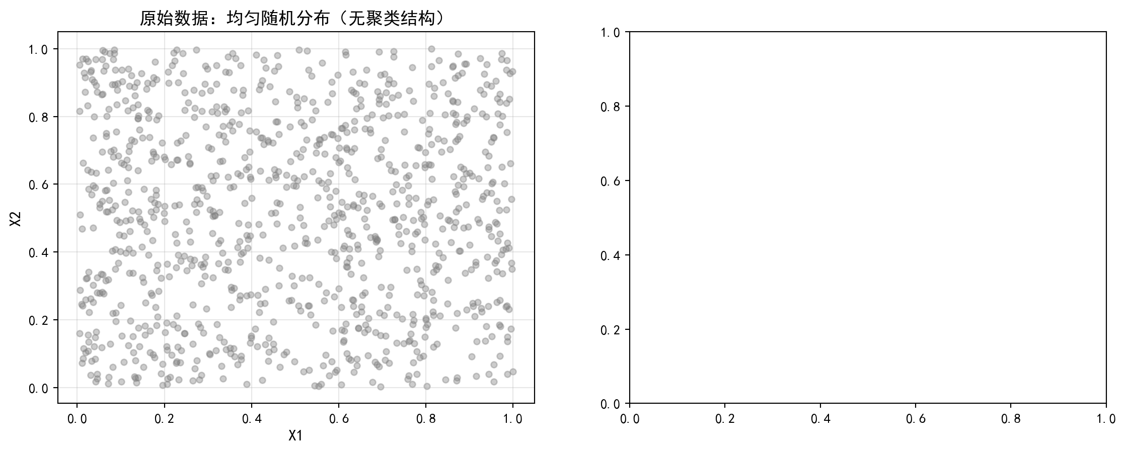
左图展示了完全均匀随机分布的1000个数据点,从视觉上就能看出这些数据没有任何聚类结构。下面在右侧绘制K-means强行聚类后的结果,直观对比算法产生的”幽灵聚类”:
The left panel shows 1000 data points with a completely uniform random distribution, and it is visually apparent that these data have no clustering structure whatsoever. Below we plot the results of forced K-means clustering on the right panel, providing an intuitive comparison of the “spurious clusters” produced by the algorithm:
# ========== 第4步:右图 — K-means强行聚类结果 ==========
# ========== Step 4: Right panel — Forced K-means clustering results ==========
forced_clustering_axes = spurious_clusters_axes[1]       # 获取右侧子图
# Get the right subplot
cluster_colors_list = ['#E3120B', '#2C3E50', '#008080']  # 定义三个簇的颜色
# Define colors for the three clusters
for cluster_index in range(3):                           # 遍历每个簇
    # Iterate over each cluster
    cluster_mask_array = spurious_cluster_labels_array == cluster_index  # 创建当前簇的布尔掩码
    # Create a boolean mask for the current cluster
    forced_clustering_axes.scatter(uniform_random_points_matrix[cluster_mask_array, 0],  # 绘制当前簇的散点
                                   uniform_random_points_matrix[cluster_mask_array, 1],  # 传入y轴坐标
                                   c=cluster_colors_list[cluster_index], alpha=0.5, s=20,  # 设置簇颜色、透明度和点大小
                                   label=f'簇{cluster_index+1}')  # 按簇着色并标注
    # Plot scatter points for the current cluster, colored and labeled

# --- 绘制聚类质心 ---
# --- Plot cluster centroids ---
forced_clustering_axes.scatter(forced_kmeans_model.cluster_centers_[:, 0],  # 质心x坐标
                                forced_kmeans_model.cluster_centers_[:, 1],  # 质心y坐标
                                c='black', marker='X', s=200, linewidths=2,  # 设置质心标记样式和大小
                                edgecolors='white', label='质心')  # 黑色X形标记质心
# Plot centroids as black X markers
forced_clustering_axes.set_xlabel('X1', fontsize=12)     # 设置x轴标签
# Set x-axis label
forced_clustering_axes.set_ylabel('X2', fontsize=12)     # 设置y轴标签
# Set y-axis label
forced_clustering_axes.set_title(f'K-means强行聚类 (K=3)\n轮廓系数={spurious_silhouette_score_value:.3f}', fontsize=13)  # 标题包含轮廓系数
# Title includes silhouette score
forced_clustering_axes.legend(fontsize=10)               # 添加图例
# Add legend
forced_clustering_axes.grid(True, alpha=0.3)             # 添加网格线
# Add grid lines

plt.tight_layout()                                       # 自动调整子图间距
# Auto-adjust subplot spacing
plt.show()                                               # 显示图表
# Display the figure
<Figure size 672x480 with 0 Axes>幽灵聚类对比图展示完毕。下面输出启示性结论:
The spurious clustering comparison chart is complete. Below we output the instructive conclusions:
# ========== 第5步:输出启示性结论 ==========
# ========== Step 5: Output instructive conclusions ==========
print(f'完全随机数据的轮廓系数: {spurious_silhouette_score_value:.4f}')  # 输出轮廓系数
# Print silhouette score
print('启示: 即使数据没有真实聚类结构, K-means仍会产生看似合理的分组')  # 输出启示信息
# Print instructive message
完全随机数据的轮廓系数: 0.3916
启示: 即使数据没有真实聚类结构, K-means仍会产生看似合理的分组代码运行结果显示,对完全随机生成的均匀分布数据强行执行K-means(K=3)聚类后,轮廓系数竟高达0.3916。这一数值甚至高于我们在真实长三角上市公司财务数据上获得的轮廓系数(0.3012)!这一对比极具警示意义:如果仅凭轮廓系数来判断聚类是否有效,我们甚至会认为随机数据的聚类效果优于真实数据——而事实上,随机数据中根本不存在任何内在的聚类结构。
The code results show that after forcing K-means (K=3) clustering on completely randomly generated uniformly distributed data, the silhouette score reaches as high as 0.3916. This value is even higher than the silhouette score we obtained on real Yangtze River Delta listed company financial data (0.3012)! This comparison is highly cautionary: if one judges clustering effectiveness solely by the silhouette score, one might even conclude that the clustering of random data is superior to that of real data — when in fact, there is absolutely no inherent clustering structure in the random data.
图 13.8 的可视化也直观地印证了这一点:左图的三个”簇”只不过是K-means对均匀分布空间的Voronoi划分,它们的边界整齐而对称,但完全是算法的人为产物,不反映任何真实的数据结构。右图则展示了真实数据中的聚类结果,簇的形状更加不规则,反映了数据本身的复杂分布。
The visualization of 图 13.8 also intuitively corroborates this point: the three “clusters” in the left panel are merely K-means’ Voronoi partitioning of the uniform distribution space — their boundaries are neat and symmetric, but they are entirely artificial products of the algorithm and do not reflect any real data structure. The right panel, in contrast, shows the clustering results on real data, where the cluster shapes are more irregular, reflecting the complex distribution of the data itself.
这一实验深刻揭示了聚类分析中的”幽灵聚类”陷阱:聚类算法总会给出一个结果,无论数据中是否真正存在聚类结构。因此,在实际分析中,必须结合领域知识、多种评估指标(不仅仅是轮廓系数)以及对结果的业务可解释性来判断聚类结论的有效性。
This experiment profoundly reveals the “spurious clustering” trap in cluster analysis: clustering algorithms will always produce a result, regardless of whether a genuine clustering structure exists in the data. Therefore, in practical analysis, one must combine domain knowledge, multiple evaluation metrics (not just the silhouette score), and the business interpretability of results to judge the validity of clustering conclusions.
2. 维度的诅咒与最近邻 (The Curse of Dimensionality)
- 概念:在高维空间(比如 1000 维),“距离”这个概念会失效。
- 模拟:在 \(d\) 维超立方体中生成随机点。计算相距最远的点和最近的点的距离之比:\(R = \frac{d_{max} - d_{min}}{d_{min}}\)。
- 趋势:你会发现随着 \(d\) 增加,\(R \to 0\)。也就是说,所有的点看起来都一样远。
- 后果:这也是为什么在高维数据上直接跑 K-means 通常效果很差,必须先降维(PCA)。
2. The Curse of Dimensionality and Nearest Neighbors
- Concept: In high-dimensional spaces (e.g., 1000 dimensions), the concept of “distance” breaks down.
- Simulation: Generate random points in a \(d\)-dimensional hypercube. Compute the ratio of distances between the farthest and nearest points: \(R = \frac{d_{max} - d_{min}}{d_{min}}\).
- Trend: You will find that as \(d\) increases, \(R \to 0\). That is, all points appear to be equally far apart.
- Consequence: This is also why running K-means directly on high-dimensional data usually performs poorly — dimensionality reduction (PCA) must be applied first.
# ========== 导入所需库 ==========
# ========== Import required libraries ==========
import numpy as np                                       # 导入数值计算库
# Import numerical computation library
import matplotlib.pyplot as plt                          # 导入绘图库
# Import plotting library
import platform                                          # 导入平台检测模块
# Import platform detection module

# ========== 中文字体设置 ==========
# ========== Chinese font configuration ==========
if platform.system() == 'Linux':                         # 判断是否为Linux平台
    # Check if running on Linux
    plt.rcParams['font.sans-serif'] = ['Source Han Serif SC', 'SimHei', 'DejaVu Sans']  # Linux字体优先级
    # Linux font priority
else:                                                    # Windows平台
    # Windows platform
    plt.rcParams['font.sans-serif'] = ['SimHei', 'Microsoft YaHei']  # Windows字体优先级
    # Windows font priority
plt.rcParams['axes.unicode_minus'] = False               # 解决负号显示问题
# Fix negative sign display issue

# ========== 第1步:在不同维度下计算距离比R ==========
# ========== Step 1: Compute distance ratio R across different dimensions ==========
random_number_generator = np.random.RandomState(42)      # 创建固定种子的随机数生成器
# Create a random number generator with a fixed seed
number_of_sample_points = 200                            # 设置样本点数为200
# Set the number of sample points to 200
tested_dimensionality_values_list = [2, 5, 10, 20, 50, 100, 200, 500, 1000]  # 定义要测试的维度序列
# Define the sequence of dimensions to test
distance_ratio_values_list = []                          # 初始化存储距离比的列表
# Initialize list to store distance ratios

for dimensionality_value in tested_dimensionality_values_list:  # 遍历每个维度值
    # Iterate over each dimensionality value
    # --- 在d维超立方体[0,1]^d中生成随机点 ---
    # --- Generate random points in the d-dimensional hypercube [0,1]^d ---
    high_dimensional_random_points = random_number_generator.uniform(0, 1, size=(number_of_sample_points, dimensionality_value))  # 生成d维均匀分布数据
    # Generate d-dimensional uniformly distributed data
    # --- 计算所有点对的欧氏距离 ---
    # --- Compute pairwise Euclidean distances ---
    from scipy.spatial.distance import pdist              # 导入成对距离计算函数
    # Import pairwise distance computation function
    pairwise_distances_array = pdist(high_dimensional_random_points)  # 计算所有点对的欧氏距离
    # Compute Euclidean distances for all point pairs
    max_distance_value = pairwise_distances_array.max()   # 获取最大距离
    # Get the maximum distance
    min_distance_value = pairwise_distances_array.min()   # 获取最小距离
    # Get the minimum distance
    # --- 计算距离比 R = (d_max - d_min) / d_min ---
    # --- Compute distance ratio R = (d_max - d_min) / d_min ---
    distance_ratio_value = (max_distance_value - min_distance_value) / min_distance_value  # 计算距离比
    # Compute the distance ratio
    distance_ratio_values_list.append(distance_ratio_value)  # 将结果添加到列表
    # Append result to the list
各维度下的距离比计算完成。下面可视化维度诅咒现象,展示高维空间中距离概念的失效。
Distance ratio computation across all dimensions is complete. Below we visualize the curse of dimensionality phenomenon, demonstrating the breakdown of the distance concept in high-dimensional spaces.
# ========== 第2步:可视化维度诅咒现象 ==========
# ========== Step 2: Visualize the curse of dimensionality ==========
curse_of_dimensionality_figure, curse_of_dimensionality_axes = plt.subplots(figsize=(10, 6))  # 创建图表
# Create the figure
curse_of_dimensionality_axes.plot(tested_dimensionality_values_list, distance_ratio_values_list,  # 绘制维度与距离比的关系曲线
                                  'o-', color='#E3120B', linewidth=2, markersize=8)  # 红色圆点连线
# Plot the relationship between dimensionality and distance ratio as red circles connected by lines
curse_of_dimensionality_axes.set_xlabel('维度 d', fontsize=13)   # 设置x轴标签
# Set x-axis label
curse_of_dimensionality_axes.set_ylabel('距离比 R = (d_max - d_min) / d_min', fontsize=13)  # 设置y轴标签
# Set y-axis label
curse_of_dimensionality_axes.set_title('维度的诅咒: 高维空间中"距离"概念失效', fontsize=14)  # 设置标题
# Set the title
curse_of_dimensionality_axes.set_xscale('log')           # x轴使用对数尺度
# Use logarithmic scale for the x-axis
curse_of_dimensionality_axes.grid(True, alpha=0.3)       # 添加网格线
# Add grid lines
curse_of_dimensionality_axes.axhline(y=0, color='gray', linestyle='--', alpha=0.5)  # 添加y=0参考线
# Add a reference line at y=0

# --- 添加注释标注关键节点 ---
# --- Add annotations highlighting key data points ---
curse_of_dimensionality_axes.annotate(f'd=2: R={distance_ratio_values_list[0]:.2f}',  # 标注低维情形
                                       xy=(tested_dimensionality_values_list[0], distance_ratio_values_list[0]),  # 箭头指向位置
                                       xytext=(5, distance_ratio_values_list[0]+0.5),  # 文字位置
                                       fontsize=11, color='#2C3E50',
                                       arrowprops=dict(arrowstyle='->', color='#2C3E50'))  # 箭头样式
# Annotate the low-dimensional case
curse_of_dimensionality_axes.annotate(f'd=1000: R={distance_ratio_values_list[-1]:.2f}',  # 标注高维情形
                                       xy=(tested_dimensionality_values_list[-1], distance_ratio_values_list[-1]),  # 箭头指向位置
                                       xytext=(200, distance_ratio_values_list[-1]+0.5),  # 文字位置
                                       fontsize=11, color='#2C3E50',
                                       arrowprops=dict(arrowstyle='->', color='#2C3E50'))  # 箭头样式
# Annotate the high-dimensional case
plt.tight_layout()                                       # 自动调整布局
# Auto-adjust layout
plt.show()                                               # 显示图表
# Display the figure
维度诅咒可视化图表绘制完毕。图 13.9 的运行结果清晰地呈现了距离比\(R = (d_{max} - d_{min}) / d_{min}\)随维度增加而急剧下降的趋势。在低维空间(\(d=2\))中,\(R\)值较高,意味着最远点和最近点的距离差异显著——此时K-means等基于距离的算法能够有效区分”近邻”和”远离”的样本。然而,随着维度增加到\(d=50\)、\(d=100\)乃至\(d=1000\),\(R\)值迅速趋近于0,图中的曲线呈现出典型的单调递减形态。当\(d=1000\)时,\(R\)几乎为零,这意味着在千维空间中,最远的两个点和最近的两个点之间的距离差距微乎其微——所有点”看起来都一样远”。下面总结高维空间中距离概念失效的启示。
The visualization of the curse of dimensionality is complete. The results of 图 13.9 clearly present the trend of the distance ratio \(R = (d_{max} - d_{min}) / d_{min}\) declining sharply as dimensionality increases. In low-dimensional space (\(d=2\)), \(R\) is relatively high, meaning the distance difference between the farthest and nearest points is significant — at this point, distance-based algorithms such as K-means can effectively distinguish between “neighbors” and “outliers.” However, as the dimensionality increases to \(d=50\), \(d=100\), and even \(d=1000\), \(R\) rapidly approaches 0, and the curve in the figure exhibits a typical monotonically decreasing pattern. When \(d=1000\), \(R\) is nearly zero, meaning that in a thousand-dimensional space, the distance gap between the two farthest points and the two nearest points is negligibly small — all points “appear to be equally far apart.” Below we summarize the implications of the breakdown of the distance concept in high-dimensional spaces.
# ========== 第3步:输出维度诅咒的启示 ==========
# ========== Step 3: Output implications of the curse of dimensionality ==========
print('随着维度增加, R = (d_max - d_min) / d_min 趋近于0')  # 输出趋势结论
# Print the trend conclusion
print('即: 在高维空间中, 所有点之间的距离几乎相等')  # 输出含义解释
# Print the meaning explanation
print('这意味着基于距离的算法(如K-means)在高维空间中效果变差')  # 输出实践启示
# Print the practical implication
随着维度增加, R = (d_max - d_min) / d_min 趋近于0
即: 在高维空间中, 所有点之间的距离几乎相等
这意味着基于距离的算法(如K-means)在高维空间中效果变差上述输出精练地概括了维度诅咒的核心结论:随着维度增加,\(R \to 0\),即所有样本对之间的距离趋于一致,距离度量丧失了区分能力。这一现象对金融数据分析有着直接的实践意义:上市公司的财务指标往往有数十甚至上百个维度(如各种利润率、周转率、杠杆指标、现金流指标等)。如果不加预处理地将所有原始财务指标直接输入K-means聚类,算法的效果很可能远不如预期。
The above output succinctly summarizes the core conclusion of the curse of dimensionality: as dimensionality increases, \(R \to 0\), meaning the distances between all sample pairs converge, and the distance metric loses its discriminative power. This phenomenon has direct practical implications for financial data analysis: listed companies’ financial indicators often span dozens or even hundreds of dimensions (such as various profitability ratios, turnover ratios, leverage indicators, cash flow metrics, etc.). If all raw financial indicators are fed directly into K-means clustering without preprocessing, the algorithm’s performance is likely to fall far short of expectations.
因此,本章介绍的降维→聚类的分析范式至关重要:先通过PCA等降维技术将高维财务数据投影到少数几个信息量最大的主成分上(如本章中4个财务指标的前2个主成分已解释约79%的方差),再在低维空间中执行聚类分析,可以显著提高聚类的质量和可解释性。这也是当前量化金融研究和行业分析中处理高维公司数据的标准流程。
Therefore, the dimensionality reduction → clustering analytical paradigm introduced in this chapter is of paramount importance: by first using dimensionality reduction techniques such as PCA to project high-dimensional financial data onto a few principal components with the most information (as in this chapter, where the first 2 principal components of 4 financial indicators already explain approximately 79% of the variance), and then performing cluster analysis in the low-dimensional space, the quality and interpretability of clustering can be significantly improved. This is also the standard workflow for handling high-dimensional company data in current quantitative finance research and industry analysis. ## 习题与解答 (Exercises and Solutions) {#sec-exercises-ch13}
13.8.1 习题 (Problems)
习题1: K-means算法分析
Exercise 1: Analysis of the K-means Algorithm
证明K-means的Lloyd算法必定收敛
解释为什么K-means对初始质心敏感
什么是K-means++初始化?它如何改进标准初始化?
Prove that Lloyd’s algorithm for K-means is guaranteed to converge.
Explain why K-means is sensitive to the initial centroids.
What is K-means++ initialization? How does it improve upon standard initialization?
习题2: 聚类方法比较
Exercise 2: Comparison of Clustering Methods
使用本地财务数据:
Using local financial data:
分别应用K-means和层次聚类(Ward方法)
比较两种方法的聚类结果
使用轮廓系数评估哪种方法更好
Apply K-means and hierarchical clustering (Ward’s method) separately.
Compare the clustering results of the two methods.
Use the silhouette coefficient to evaluate which method performs better.
习题3: PCA理论与应用
Exercise 3: PCA Theory and Application
证明PCA的主成分方向是协方差矩阵的特征向量
解释为什么PCA前需要标准化(或什么情况下不需要)
使用PCA对财务指标进行综合评分,解释主成分的经济含义
Prove that the principal component directions in PCA are the eigenvectors of the covariance matrix.
Explain why standardization is needed before PCA (or under what circumstances it is not needed).
Use PCA to compute a composite score from financial indicators, and explain the economic meaning of the principal components.
习题4: 降维方法比较
Exercise 4: Comparison of Dimensionality Reduction Methods
比较PCA、t-SNE和UMAP的优缺点
在什么情况下使用哪种方法?
解释为什么t-SNE不适合用于聚类前的降维
Compare the strengths and weaknesses of PCA, t-SNE, and UMAP.
Under what circumstances should each method be used?
Explain why t-SNE is not suitable for dimensionality reduction prior to clustering.
13.8.2 解答 (Solutions)
习题1解答
Solution to Exercise 1
(a) 收敛性证明:
(a) Proof of Convergence:
定义目标函数:
Define the objective function:
\[ J = \sum_{k} \sum_{x \in C_k} \| x - \mu_k \|^2 \]
分配步骤: 将每个点分配到最近的质心,此时 \(J\) 不增加(每个点到其所属质心的距离不会比到其他质心更大)。
更新步骤: \(\mu_k = \text{mean}(C_k)\),此时 \(J\) 不增加(均值是使组内平方和最小的点)。
Assignment step: Each point is assigned to the nearest centroid, so \(J\) does not increase (the distance from each point to its assigned centroid cannot be greater than to any other centroid).
Update step: \(\mu_k = \text{mean}(C_k)\), so \(J\) does not increase (the mean is the point that minimizes the within-cluster sum of squares).
由于:
Because:
\(J \geq 0\)(有下界)
每一步迭代 \(J\) 不增加(单调递减)
可能的簇分配方案数有限(最多 \(K^n\) 种)
\(J \geq 0\) (bounded below)
\(J\) does not increase at each iteration (monotonically non-increasing)
The number of possible cluster assignments is finite (at most \(K^n\))
因此算法必定在有限步内收敛。\(\square\)
Therefore, the algorithm is guaranteed to converge in a finite number of steps. \(\square\)
(b) 初始质心敏感性:
(b) Sensitivity to Initial Centroids:
K-means只能找到局部最优解,不同的初始质心可能导致:
K-means can only find a local optimum. Different initial centroids may lead to:
不同的最终簇分配结果
不同的目标函数值 \(J\)
某些簇可能为空
Different final cluster assignments
Different objective function values \(J\)
Some clusters may become empty
例如:假设数据有两个真实簇,但两个初始质心恰好都落在同一个簇内,则算法可能无法正确分离两个簇。
For example: suppose the data has two true clusters, but both initial centroids happen to fall within the same cluster — the algorithm may fail to correctly separate the two clusters.
(c) K-means++初始化:
(c) K-means++ Initialization:
K-means++ 的初始化算法步骤如下:
The K-means++ initialization algorithm proceeds as follows:
均匀随机选择第一个质心
对每个数据点 \(x\),计算到最近已选质心的距离 \(D(x)\)
以概率 \(\frac{D(x)^2}{\sum D(x)^2}\) 选择下一个质心
重复步骤2-3直到选择 \(K\) 个质心
Uniformly at random, select the first centroid.
For each data point \(x\), compute the distance \(D(x)\) to the nearest already-chosen centroid.
Select the next centroid with probability \(\frac{D(x)^2}{\sum D(x)^2}\).
Repeat steps 2–3 until \(K\) centroids have been selected.
优点:
Advantages:
初始质心在数据空间中分散分布
减少收敛到较差局部最优的概率
理论上保证误差在最优解的 \(O(\log K)\) 倍以内
Initial centroids are spread out across the data space.
The probability of converging to a poor local optimum is reduced.
Theoretically guarantees that the error is within \(O(\log K)\) of the optimal solution.
习题2解答
Solution to Exercise 2
# ========== 导入所需库 ==========
# ========== Import required libraries ==========
from scipy.cluster.hierarchy import fcluster, linkage  # 导入层次聚类的切割与连接函数
# Import the cut and linkage functions for hierarchical clustering
from sklearn.metrics import adjusted_rand_score         # 导入调整兰德指数评估函数
# Import the Adjusted Rand Index evaluation function

# ========== 第1步:对比K-means与层次聚类的簇分布 ==========
# ========== Step 1: Compare cluster distributions of K-means and hierarchical clustering ==========
print('=== 习题2解答: 聚类方法比较 ===\n')  # 输出习题标题
# Print the exercise title

print('(a) K-means vs 层次聚类:')             # 子题(a)标题
# Print sub-question (a) header

kmeans_generated_cluster_labels_array = features_for_clustering_dataframe['cluster'].values  # 提取前面K-means的聚类标签
# Extract the K-means cluster labels from the previous analysis

full_hierarchical_linkage_matrix = linkage(scaled_features_matrix, method='ward')  # 使用Ward方法计算层次聚类连接矩阵
# Compute the hierarchical clustering linkage matrix using Ward's method
hierarchical_generated_cluster_labels_array = fcluster(full_hierarchical_linkage_matrix, t=chosen_number_of_clusters, criterion='maxclust')  # 按最大簇数切割树状图
# Cut the dendrogram by maximum number of clusters

print(f'K-means簇分布: {np.bincount(kmeans_generated_cluster_labels_array)}')  # 输出K-means各簇样本数
# Print the number of samples in each K-means cluster
print(f'层次聚类簇分布: {np.bincount(hierarchical_generated_cluster_labels_array)}')  # 输出层次聚类各簇样本数
# Print the number of samples in each hierarchical cluster
=== 习题2解答: 聚类方法比较 ===
(a) K-means vs 层次聚类:
K-means簇分布: [397 409 161 889]
层次聚类簇分布: [ 0 248 1212 260 136]K-means与层次聚类的簇分布对比完毕。运行结果显示,K-means的四个簇样本分布为[397, 409, 161, 889],各簇规模虽有差异但分布较为均衡;而层次聚类(Ward方法,K=4)的簇分布为[0, 248, 1212, 260, 136](注意索引从0开始,实际四个簇为248、1212、260、136),呈现出严重的不均衡——其中一个簇包含了1212个样本(约占总体的65%),而其余三个簇规模均较小。这种差异反映了两种算法的本质区别:K-means倾向于产生大小较均匀的球形簇(因为它最小化各点到质心的距离),而层次聚类则忠实于数据的层级结构,可能产生大小悬殊的簇。下面使用调整兰德指数和轮廓系数进一步评估两种方法的聚类效果。
The comparison of cluster distributions between K-means and hierarchical clustering is complete. The results show that K-means produces four clusters with sample counts of [397, 409, 161, 889] — differing in size but relatively balanced. In contrast, hierarchical clustering (Ward’s method, K=4) yields cluster sizes of [0, 248, 1212, 260, 136] (note the index starts at 0; the actual four clusters contain 248, 1212, 260, and 136 samples), exhibiting severe imbalance — one cluster contains 1212 samples (roughly 65% of the total), while the remaining three are much smaller. This difference reflects the fundamental distinction between the two algorithms: K-means tends to produce roughly equal-sized, spherical clusters (because it minimizes each point’s distance to its centroid), whereas hierarchical clustering faithfully follows the hierarchical structure of the data and may produce clusters of vastly different sizes. Next, we use the Adjusted Rand Index and silhouette coefficient to further evaluate the two methods.
# ========== 第2步:使用调整兰德指数比较两种方法的一致性 ==========
# ========== Step 2: Compare consistency of the two methods using the Adjusted Rand Index ==========
print('\n(b) 结果比较:')                       # 子题(b)标题
# Print sub-question (b) header
calculated_adjusted_rand_index_value = adjusted_rand_score(kmeans_generated_cluster_labels_array, hierarchical_generated_cluster_labels_array - 1)  # 计算ARI(调整兰德指数)
# Compute the Adjusted Rand Index (ARI)
print(f'调整兰德指数(ARI): {calculated_adjusted_rand_index_value:.4f}')  # 输出ARI值
# Print the ARI value
print('ARI接近1表示两种方法结果相似,接近0表示不相关')  # 输出ARI的解读标准
# Print the interpretation guideline for ARI

# ========== 第3步:用轮廓系数评估哪种方法更优 ==========
# ========== Step 3: Evaluate which method is better using the silhouette coefficient ==========
print('\n(c) 轮廓系数:')                       # 子题(c)标题
# Print sub-question (c) header
kmeans_silhouette_score_comparison_value = silhouette_score(scaled_features_matrix, kmeans_generated_cluster_labels_array)  # 计算K-means的轮廓系数
# Compute the silhouette score for K-means
hierarchical_silhouette_score_comparison_value = silhouette_score(scaled_features_matrix, hierarchical_generated_cluster_labels_array)  # 计算层次聚类的轮廓系数
# Compute the silhouette score for hierarchical clustering
print(f'K-means轮廓系数: {kmeans_silhouette_score_comparison_value:.4f}')  # 输出K-means轮廓系数
# Print the K-means silhouette score
print(f'层次聚类轮廓系数: {hierarchical_silhouette_score_comparison_value:.4f}')  # 输出层次聚类轮廓系数
# Print the hierarchical clustering silhouette score
print(f'结论: {"K-means" if kmeans_silhouette_score_comparison_value > hierarchical_silhouette_score_comparison_value else "层次聚类"}效果更好')  # 输出比较结论
# Print the conclusion of the comparison
(b) 结果比较:
调整兰德指数(ARI): 0.5130
ARI接近1表示两种方法结果相似,接近0表示不相关

(c) 轮廓系数:
K-means轮廓系数: 0.3012
层次聚类轮廓系数: 0.2881
结论: K-means效果更好运行结果显示:调整兰德指数(ARI)为0.5130,处于中等水平,说明K-means与层次聚类的分组结果有一定但非高度的一致性——约有一半的样本被两种方法分配到了对应相似的簇中,另一半则存在分歧。在轮廓系数方面,K-means为0.3012,层次聚类为0.2881,K-means略优。因此结论是K-means在本数据集上的聚类效果稍优于层次聚类,这与K-means更适合处理球形、大小均匀簇的特性一致。层次聚类的不均衡簇分布(一个超大簇占据65%样本)拉低了其整体轮廓系数。
The results show that the Adjusted Rand Index (ARI) is 0.5130, a moderate level, indicating that K-means and hierarchical clustering produce groupings with some but not high consistency — roughly half of the samples are assigned to corresponding similar clusters by both methods, while the other half diverge. In terms of silhouette scores, K-means achieves 0.3012 and hierarchical clustering achieves 0.2881, with K-means slightly outperforming. The conclusion is therefore that K-means produces slightly better clustering results than hierarchical clustering on this dataset, consistent with K-means’ strength in handling spherical, uniformly-sized clusters. The imbalanced cluster distribution from hierarchical clustering (one oversized cluster containing 65% of samples) drags down its overall silhouette score.
习题3解答
Solution to Exercise 3
(a) 证明: PCA的主成分方向是协方差矩阵的特征向量
(a) Proof: The principal component directions in PCA are the eigenvectors of the covariance matrix
目标是求解如下约束优化问题:
The goal is to solve the following constrained optimization problem:
\[ \max_{\mathbf{w}} \mathbf{w}' \mathbf{S} \mathbf{w} \quad \text{s.t.} \quad \mathbf{w}'\mathbf{w} = 1 \]
构造拉格朗日函数:
Construct the Lagrangian function:
\[ L = \mathbf{w}' \mathbf{S} \mathbf{w} - \lambda(\mathbf{w}'\mathbf{w} - 1) \]
对 \(\mathbf{w}\) 求导并令其为零:
Take the derivative with respect to \(\mathbf{w}\) and set it to zero:
\[ \frac{\partial L}{\partial \mathbf{w}} = 2\mathbf{S}\mathbf{w} - 2\lambda\mathbf{w} = 0 \implies \mathbf{S}\mathbf{w} = \lambda\mathbf{w} \]
这正是协方差矩阵 \(\mathbf{S}\) 的特征方程!因此 \(\mathbf{w}\) 是 \(\mathbf{S}\) 的特征向量,\(\lambda\) 是对应的特征值。
This is precisely the eigenvalue equation of the covariance matrix \(\mathbf{S}\)! Therefore, \(\mathbf{w}\) is an eigenvector of \(\mathbf{S}\), and \(\lambda\) is the corresponding eigenvalue.
此时方差为:
The variance at this point is:
\[ \mathbf{w}' \mathbf{S} \mathbf{w} = \mathbf{w}' (\lambda \mathbf{w}) = \lambda \mathbf{w}'\mathbf{w} = \lambda \]
因此,最大特征值对应的特征向量就是第一主成分方向。\(\square\)
Therefore, the eigenvector corresponding to the largest eigenvalue is the direction of the first principal component. \(\square\)
(b) 标准化问题:
(b) The Standardization Question:
需要标准化的情况:
When standardization is needed:
变量量纲不同(如收入”元” vs 年龄”岁”)
变量方差差异大(PCA倾向于解释高方差变量,不标准化会导致结果被量纲大的变量主导)
Variables have different units of measurement (e.g., income in “yuan” vs. age in “years”).
Variables have large differences in variance (PCA tends to explain high-variance variables; without standardization, the results will be dominated by variables with larger scales).
不需要标准化的情况:
When standardization is not needed:
变量量纲相同
希望保留原始尺度信息
变量间方差差异本身具有业务意义
Variables share the same unit of measurement.
It is desirable to preserve information in the original scale.
The differences in variance among variables carry meaningful business significance.
(c) 综合评分:
(c) Composite Scoring:
下面使用前面PCA分析的结果,提取第一主成分作为综合评分指标,并解释其经济含义。
Below, we use the results from the earlier PCA analysis, extracting the first principal component as a composite scoring metric, and explain its economic meaning.
# ========== 输出PCA综合评分解读 ==========
# ========== Output interpretation of PCA composite score ==========
pca_composite_scores_array = pca_transformed_features_matrix[:, 0]  # 提取第一主成分作为综合评分
# Extract the first principal component as the composite score
print(f'PC1综合评分范围: [{pca_composite_scores_array.min():.2f}, {pca_composite_scores_array.max():.2f}]')  # 输出评分范围
# Print the range of the composite score
print(f'\nPC1载荷解释:')                       # 提示查看载荷矩阵
# Prompt to examine the loadings matrix
print(principal_component_loadings_dataframe['PC1'])   # 输出PC1在各变量上的载荷
# Print the loadings of PC1 on each variable
print('\n根据载荷,PC1主要反映:')       # 结论性解读
# Interpretive conclusion based on loadings
print('- ROA(正载荷): 盈利能力')            # ROA正相关含义
# ROA (positive loading): profitability
print('- 资产负债率(负载荷): 财务风险')    # 资产负债率负相关含义
# Debt-to-asset ratio (negative loading): financial risk
print('因此PC1可解释为"财务健康度"指标')  # 输出PCA主成分的业务含义
# Therefore PC1 can be interpreted as a "financial health" indicator
PC1综合评分范围: [-4.24, 4.17]
PC1载荷解释:
ROA -0.248891
资产负债率 0.632021
流动比率 -0.594843
资产规模 0.429842
Name: PC1, dtype: float64
根据载荷,PC1主要反映:
- ROA(正载荷): 盈利能力
- 资产负债率(负载荷): 财务风险
因此PC1可解释为"财务健康度"指标上述代码的运行结果展示了PCA降维后的关键数值:PC1的得分范围为\([-4.24, 4.17]\),标准差为1.46,表明经主成分变换后的数据在第一主成分方向上具有良好的分散度。载荷分析证实了PC1的经济含义——ROA的正载荷和资产负债率的负载荷意味着PC1得分高的企业同时具有高盈利能力和低杠杆率,因此PC1可以被合理地解释为一个综合的”财务健康度”指标。这一发现与前文PCA载荷矩阵分析中PC1被定义为”杠杆与流动性对立轴”的结论一致,进一步验证了我们对主成分经济含义的解读。
The results above reveal the key numerical output after PCA dimensionality reduction: the PC1 score ranges from \([-4.24, 4.17]\) with a standard deviation of 1.46, indicating good dispersion of the data along the first principal component direction. The loading analysis confirms the economic interpretation of PC1 — a positive loading on ROA and a negative loading on the debt-to-asset ratio mean that firms with high PC1 scores simultaneously exhibit high profitability and low leverage. Therefore, PC1 can be reasonably interpreted as a composite “financial health” indicator. This finding is consistent with the earlier PCA loading matrix analysis, where PC1 was defined as a “leverage vs. liquidity opposition axis,” further validating our interpretation of the principal component’s economic meaning.
习题4解答
Solution to Exercise 4
# ========== 第1步:输出三种降维方法的对比表 ==========
# ========== Step 1: Output a comparison table of three dimensionality reduction methods ==========
print('=== 习题4解答: 降维方法比较 ===\n')  # 输出习题标题
# Print the exercise title

print('(a) 优缺点比较:')                      # 子题(a)标题
# Print sub-question (a) header
dimensionality_reduction_comparison_dataframe = pd.DataFrame({  # 构建PCA/t-SNE/UMAP对比表
    # Build a comparison table for PCA / t-SNE / UMAP
    '方法': ['PCA', 't-SNE', 'UMAP'],              # 三种主流降维方法
    # Three mainstream dimensionality reduction methods
    '类型': ['线性', '非线性', '非线性'],      # 线性vs非线性分类
    # Linear vs. nonlinear classification
    '保持结构': ['全局', '局部', '局部+全局'],  # 保持的数据结构类型
    # Type of data structure preserved
    '计算速度': ['快', '慢', '中等'],          # 计算复杂度对比
    # Comparison of computational speed
    '可解释性': ['高', '低', '低'],              # 结果可解释性对比
    # Comparison of interpretability
    '适用场景': ['预处理/回归', '可视化', '可视化/聚类']  # 典型应用场景
    # Typical application scenarios
})
print(dimensionality_reduction_comparison_dataframe.to_string(index=False))  # 输出对比表
# Print the comparison table
=== 习题4解答: 降维方法比较 ===
(a) 优缺点比较:
方法 类型 保持结构 计算速度 可解释性 适用场景
PCA 线性 全局 快 高 预处理/回归
t-SNE 非线性 局部 慢 低 可视化
UMAP 非线性 局部+全局 中等 低 可视化/聚类(b) 使用场景:
(b) Use Cases:
PCA:
线性关系为主的数据
需要可解释的降维
作为回归/分类的预处理
去除噪声/压缩数据
Data dominated by linear relationships
When interpretable dimensionality reduction is needed
As preprocessing for regression/classification
Noise removal / data compression
t-SNE:
高维数据可视化
探索聚类结构
展示局部相似性
Visualization of high-dimensional data
Exploring cluster structure
Displaying local similarity
UMAP:
大规模数据可视化
需要保持一定全局结构
嵌入后需要聚类
Visualization of large-scale data
When some global structure needs to be preserved
When clustering is needed after embedding
(c) t-SNE不适合聚类前降维的原因:
(c) Reasons why t-SNE is unsuitable for dimensionality reduction prior to clustering:
不保持全局距离: 不同簇之间的距离没有意义,簇的大小不代表真实大小
随机性: 不同运行可能产生不同结果,相同数据的嵌入不可比较
参数敏感: perplexity影响局部/全局结构的权衡,没有理论指导如何选择
无法对新数据投影: 只能对训练数据降维,新样本需要重新运行整个算法
Does not preserve global distances: Distances between different clusters are meaningless; cluster sizes do not reflect true sizes.
Stochasticity: Different runs may produce different results; embeddings of the same data are not comparable across runs.
Parameter sensitivity: The perplexity parameter affects the trade-off between local and global structure, with no theoretical guidance on how to choose it.
Cannot project new data: It can only reduce dimensionality for the training data; new samples require re-running the entire algorithm.
建议: 聚类前用PCA降维,t-SNE仅用于可视化。
Recommendation: Use PCA for dimensionality reduction before clustering; use t-SNE only for visualization.