# ========== 导入所需库 ==========
# ========== Import required libraries ==========
import pandas as pd                    # 数据表格处理库
# Import the pandas library for tabular data manipulation
import numpy as np                     # 数值计算库
# Import the numpy library for numerical computation
from scipy.stats import binom          # 二项分布统计函数
# Import the binomial distribution statistical functions from scipy
import matplotlib.pyplot as plt        # 数据可视化绘图库
# Import the matplotlib plotting library for data visualization

# ========== 第1步:设置绘图环境 ==========
# ========== Step 1: Configure the plotting environment ==========
plt.rcParams['font.sans-serif'] = ['SimHei']     # 设置中文黑体字体
# Set the Chinese font to SimHei (bold)
plt.rcParams['axes.unicode_minus'] = False        # 解决负号显示问题
# Fix the display issue with negative signs

# ========== 第2步:定义电商场景参数 ==========
# ========== Step 2: Define e-commerce scenario parameters ==========
number_of_visitors = 1000              # 每天网站访客数量
# Number of daily website visitors
estimated_conversion_rate = 0.03       # 行业平均转化率为3%
# Industry average conversion rate of 3%

# ========== 第3步:计算期望与标准差 ==========
# ========== Step 3: Compute the expectation and standard deviation ==========
# 二项分布期望 E(X) = n * p
# Binomial expectation E(X) = n * p
expected_orders = number_of_visitors * estimated_conversion_rate  # 计算期望订单数 E(X) = 1000 × 0.03 = 30
# Compute the expected number of orders E(X) = 1000 × 0.03 = 30
# 二项分布标准差 σ = sqrt(n * p * (1 - p))
# Binomial standard deviation σ = sqrt(n * p * (1 - p))
standard_deviation_orders = np.sqrt(number_of_visitors * estimated_conversion_rate * (1 - estimated_conversion_rate))  # 计算标准差 σ = √(npq)
# Compute the standard deviation σ = √(npq)4 概率分布 (Probability Distributions)
概率分布(probability distribution)描述了随机变量取不同值的概率规律。它是连接理论概率与实际数据的桥梁,是统计推断的理论基础。本章将系统介绍常见的离散型和连续型概率分布,以及它们在商业和经济领域的应用。
A probability distribution describes the probabilistic patterns governing the different values a random variable can take. It serves as the bridge connecting theoretical probability to real-world data and constitutes the theoretical foundation of statistical inference. This chapter systematically introduces the most common discrete and continuous probability distributions, along with their applications in business and economics.
4.1 概率分布在金融建模中的典型应用 (Typical Applications of Probability Distributions in Financial Modeling)
概率分布是金融风险度量和资产定价的数学语言。以下展示各类概率分布在中国金融市场分析中的核心应用。
Probability distributions constitute the mathematical language of financial risk measurement and asset pricing. The following showcases the core applications of various probability distributions in the analysis of the Chinese financial market.
4.1.1 应用一:股票收益率的正态性检验与厚尾风险 (Application 1: Normality Tests and Fat-Tail Risk for Stock Returns)
正态分布是金融学中最常用的假设之一(如Black-Scholes模型、马科维茨投资组合理论),但A股市场的实证数据表明,日收益率分布通常呈现尖峰厚尾(Leptokurtic)特征——峰度远大于3,意味着极端涨跌幅出现的概率远高于正态分布的预测。使用 stock_price_pre_adjusted.h5 中的历史收益率数据,通过计算偏度和峰度并进行Jarque-Bera检验,可以量化这种偏离程度。这一发现对风险管理至关重要:如果假设收益率服从正态分布,VaR(在险价值)模型将严重低估尾部风险。
The normal distribution is one of the most commonly adopted assumptions in finance (e.g., the Black-Scholes model and Markowitz’s Modern Portfolio Theory). However, empirical evidence from China’s A-share market shows that daily return distributions typically exhibit leptokurtic (fat-tailed) characteristics — kurtosis far exceeds 3, implying that the probability of extreme gains or losses is much higher than what the normal distribution predicts. Using historical return data from stock_price_pre_adjusted.h5, one can quantify the degree of this deviation by computing skewness and kurtosis and conducting the Jarque-Bera test. This finding is critical for risk management: if returns are assumed to follow a normal distribution, the Value-at-Risk (VaR) model will severely underestimate tail risk.
4.1.2 应用二:泊松分布与金融事件建模 (Application 2: The Poisson Distribution and Financial Event Modeling)
泊松分布广泛应用于金融领域中稀有事件的建模:
The Poisson distribution is widely applied to model rare events in finance:
信用风险:一定期间内企业债违约的次数可用泊松过程建模
跳跃扩散模型:Merton的跳跃扩散模型假设股价的跳跃次数服从泊松分布
操作风险:银行操作风险损失事件的频率建模
Credit risk: The number of corporate bond defaults within a given period can be modeled using a Poisson process.
Jump-diffusion models: Merton’s jump-diffusion model assumes that the number of jumps in stock prices follows a Poisson distribution.
Operational risk: Modeling the frequency of operational risk loss events in banking.
利用 financial_statement.h5 中的历史数据,可以统计特定行业在不同时期发生ST(特别处理)或退市事件的频率,验证这些稀有事件是否符合泊松分布的假定。
Using historical data from financial_statement.h5, one can tabulate the frequency of ST (Special Treatment) designations or delisting events across specific industries in different periods, and verify whether these rare events conform to the assumptions of the Poisson distribution.
4.1.3 应用三:t分布与小样本金融分析 (Application 3: The t-Distribution and Small-Sample Financial Analysis)
在金融研究中,许多重要的推断问题面临小样本约束。例如,评估一个新基金经理3年的业绩(仅36个月度数据),或分析IPO后12个月的超额收益——样本量远不足以依赖正态分布的大样本性质。此时,t分布成为正确推断的保障。t分布的”厚尾”特性迫使我们在小样本下做出更保守的判断,避免过度自信地宣称发现了”显著”的超额收益。这一方法将在 章节 7 中深入讨论。
In financial research, many important inference problems are constrained by small sample sizes. For instance, evaluating a new fund manager’s track record over 3 years (only 36 monthly observations), or analyzing post-IPO excess returns over 12 months — the sample sizes are far too small to rely on the large-sample properties of the normal distribution. In such cases, the t-distribution becomes the safeguard for correct inference. The “fat-tailed” property of the t-distribution compels us to make more conservative judgments with small samples, preventing overconfident claims of having discovered “significant” excess returns. This methodology is discussed in depth in 章节 7.
4.2 随机变量 (Random Variables)
4.2.1 定义 (Definition)
随机变量(random variable)是一个将样本空间映射到实数的函数。我们用大写字母(如 \(X, Y, Z\))表示随机变量,用小写字母(如 \(x, y, z\))表示其具体取值。
A random variable is a function that maps outcomes from the sample space to real numbers. We use uppercase letters (such as \(X, Y, Z\)) to denote random variables and lowercase letters (such as \(x, y, z\)) to denote their specific realized values.
分类:
- 离散型随机变量: 取值为可数集(如:抛硬币次数、缺陷产品数量)
- 连续型随机变量: 取值在某个区间内连续(如:日收益率、资产规模、市盈率)
Classification:
- Discrete random variable: Takes values from a countable set (e.g., number of coin flips, number of defective products).
- Continuous random variable: Takes values continuously within an interval (e.g., daily returns, asset size, price-to-earnings ratio).
理解随机变量:从结果到数值的映射
Understanding Random Variables: Mapping Outcomes to Numbers
考虑”掷两个骰子”这个试验:
- 样本空间: {(1,1), (1,2), …, (6,6)} 共36种结果
- 随机变量X: 定义为两个骰子的点数和
- X((1,1)) = 2
- X((1,2)) = X((2,1)) = 3
- …
- X((6,6)) = 12
Consider the experiment of “rolling two dice”:
- Sample space: {(1,1), (1,2), …, (6,6)}, a total of 36 outcomes.
- Random variable X: Defined as the sum of the two dice.
- X((1,1)) = 2
- X((1,2)) = X((2,1)) = 3
- …
- X((6,6)) = 12
这样,随机变量将抽象的样本结果映射为具体的数值,便于进行数学分析。
In this way, the random variable maps abstract sample outcomes to concrete numerical values, facilitating mathematical analysis.
4.3 离散型概率分布 (Discrete Probability Distributions)
4.3.1 概率质量函数 (PMF)
对于离散型随机变量 \(X\),概率质量函数(Probability Mass Function, PMF)定义如 式 4.1 所示:
For a discrete random variable \(X\), the Probability Mass Function (PMF) is defined as shown in 式 4.1:
\[ f(x) = P(X = x) \tag{4.1}\]
满足: 1. \(f(x) \geq 0\) 对所有 \(x\) 2. \(\sum_x f(x) = 1\)
The PMF must satisfy: 1. \(f(x) \geq 0\) for all \(x\) 2. \(\sum_x f(x) = 1\)
4.3.2 二项分布 (Binomial Distribution)
定义: \(X \sim \text{Binomial}(n, p)\)
Definition: \(X \sim \text{Binomial}(n, p)\)
\(n\) 次独立的伯努利试验(每次试验只有”成功”/“失败”两种结果)中,成功次数 \(X\) 的分布。
The distribution of the number of successes \(X\) in \(n\) independent Bernoulli trials (each trial has only two outcomes: “success” or “failure”).
概率质量函数如 式 4.2 所示:
The probability mass function is shown in 式 4.2:
\[ P(X = k) = \binom{n}{k} p^k (1-p)^{n-k}, \quad k = 0, 1, ..., n \tag{4.2}\]
其中 \(\binom{n}{k} = \frac{n!}{k!(n-k)!}\) 是二项系数。
where \(\binom{n}{k} = \frac{n!}{k!(n-k)!}\) is the binomial coefficient.
二项分布的期望与方差(式 4.3):
The expectation and variance of the binomial distribution (式 4.3):
\[ E[X] = np, \quad \text{Var}(X) = np(1-p) \tag{4.3}\]
二项分布的直观理解
Intuitive Understanding of the Binomial Distribution
考虑某银行每天审批100笔贷款申请,历史数据显示每笔申请的违约概率为2%。
Consider a bank that approves 100 loan applications per day, with historical data indicating a default probability of 2% for each application.
问题: 明天违约的贷款申请数量是多少?
Question: How many loan applications will default tomorrow?
这是一个二项分布问题: \(X \sim \text{Binomial}(100, 0.02)\)
This is a binomial distribution problem: \(X \sim \text{Binomial}(100, 0.02)\)
期望违约数: \(E[X] = 100 \times 0.02 = 2\) 笔
方差: \(\text{Var}(X) = 100 \times 0.02 \times 0.98 = 1.96\)
标准差: \(\sqrt{1.96} \approx 1.4\) 笔
Expected number of defaults: \(E[X] = 100 \times 0.02 = 2\)
Variance: \(\text{Var}(X) = 100 \times 0.02 \times 0.98 = 1.96\)
Standard deviation: \(\sqrt{1.96} \approx 1.4\)
银行可以据此准备坏账准备金。注意:虽然平均是2笔,但实际违约数可能在0到6笔之间波动(3个标准差范围)。表 4.1 展示了一个电商平台转化率的二项分布分析案例。
The bank can use this information to prepare loan loss provisions. Note that although the average is 2, the actual number of defaults may fluctuate between 0 and 6 (within a 3-standard-deviation range). 表 4.1 presents a binomial distribution analysis of an e-commerce platform’s conversion rate.
4.3.2.1 案例:电商平台转化率 (Case Study: E-Commerce Conversion Rate)
什么是转化率?
What Is a Conversion Rate?
在电子商务领域,转化率(Conversion Rate)是衡量营销效果和用户体验的核心关键绩效指标(KPI)。它的定义是:在一定时间内,完成目标行为(如下单购买)的用户数占访问总用户数的比例。例如,某天一家电商网站有1000名访客,其中30人最终下单购买了商品,则当天的转化率为 \(30/1000 = 3\%\)。
In e-commerce, the conversion rate is the core Key Performance Indicator (KPI) for measuring marketing effectiveness and user experience. It is defined as the proportion of visitors who complete a target action (such as placing an order) out of the total number of visitors within a given time period. For example, if an e-commerce website receives 1,000 visitors in a day and 30 of them ultimately place an order, the conversion rate for that day is \(30/1000 = 3\%\).
从统计建模的角度看,每一位访客的行为可以看作一次独立的伯努利试验:要么购买(“成功”,概率为 \(p\)),要么不购买(“失败”,概率为 \(1-p\))。当我们关注 \(n\) 位独立访客中有多少人会购买时,购买人数 \(X\) 就服从二项分布 \(X \sim \text{Binomial}(n, p)\)。这使得二项分布成为分析电商转化率问题的天然工具——运营团队可以借此估算每日订单量的期望值和波动范围,从而合理安排库存和客服资源。
From a statistical modeling perspective, each visitor’s behavior can be viewed as an independent Bernoulli trial: either a purchase (“success,” with probability \(p\)) or no purchase (“failure,” with probability \(1-p\)). When we focus on how many of \(n\) independent visitors will make a purchase, the number of purchasers \(X\) follows a binomial distribution \(X \sim \text{Binomial}(n, p)\). This makes the binomial distribution a natural tool for analyzing e-commerce conversion rate problems — operations teams can use it to estimate the expected daily order volume and its range of fluctuation, thereby allocating inventory and customer service resources efficiently.
二项分布的期望和标准差计算完毕。下面基于这些参数计算概率质量函数并构建概率分布表。
The expectation and standard deviation of the binomial distribution have been computed. Next, we calculate the probability mass function based on these parameters and construct the probability distribution table.
# ========== 第4步:计算概率质量函数 ==========
# ========== Step 4: Compute the probability mass function ==========
# 取均值 ± 3倍标准差范围内的订单数(覆盖99.7%的可能结果)
# Consider order counts within the mean ± 3 standard deviations (covering 99.7% of possible outcomes)
order_count_values = list(range(  # 生成μ±3σ范围内的整数订单数列表
# Generate a list of integer order counts within the μ±3σ range
    int(expected_orders - 3 * standard_deviation_orders),   # 下界:期望 - 3σ
    # Lower bound: expectation - 3σ
    int(expected_orders + 3 * standard_deviation_orders) + 1  # 上界:期望 + 3σ
    # Upper bound: expectation + 3σ
))
# 对每个可能的订单数 k,利用二项分布PMF P(X=k) = C(n,k) * p^k * (1-p)^(n-k) 计算概率
# For each possible order count k, compute the probability using the binomial PMF: P(X=k) = C(n,k) * p^k * (1-p)^(n-k)
order_probabilities = [binom.pmf(k, number_of_visitors, estimated_conversion_rate) for k in order_count_values]  # 计算每个订单数k对应的PMF概率值
# Compute the PMF probability value for each order count k

# ========== 第5步:构建概率分布表 ==========
# ========== Step 5: Construct the probability distribution table ==========
conversion_probabilities_dataframe = pd.DataFrame({  # 将概率分布整理为DataFrame表格
# Organize the probability distribution into a DataFrame table
    '订单数': order_count_values,                                # 每日可能的成交订单数
    # Possible daily completed order counts
    '概率': [f'{prob:.4f}' for prob in order_probabilities],     # 对应的PMF概率值
    # Corresponding PMF probability values
    '累积概率': [f'{binom.cdf(k, number_of_visitors, estimated_conversion_rate):.4f}'  # 累积分布函数CDF值
    # Cumulative distribution function (CDF) values
                for k in order_count_values]                     # CDF累积概率 P(X ≤ k)
    # CDF cumulative probability P(X ≤ k)
})

print('每日订单数的概率分布:')                                     # 输出标题
# Print the output header
print(conversion_probabilities_dataframe)                         # 打印概率分布表
# Print the probability distribution table
每日订单数的概率分布:
订单数 概率 累积概率
0 13 0.0002 0.0003
1 14 0.0005 0.0008
2 15 0.0009 0.0017
3 16 0.0018 0.0035
4 17 0.0031 0.0066
5 18 0.0053 0.0119
6 19 0.0085 0.0204
7 20 0.0129 0.0333
8 21 0.0186 0.0519
9 22 0.0256 0.0774
10 23 0.0336 0.1110
11 24 0.0423 0.1534
12 25 0.0511 0.2045
13 26 0.0593 0.2637
14 27 0.0661 0.3299
15 28 0.0711 0.4009
16 29 0.0737 0.4746
17 30 0.0737 0.5484
18 31 0.0714 0.6197
19 32 0.0668 0.6866
20 33 0.0606 0.7472
21 34 0.0533 0.8005
22 35 0.0455 0.8461
23 36 0.0377 0.8838
24 37 0.0304 0.9142
25 38 0.0238 0.9381
26 39 0.0182 0.9563
27 40 0.0135 0.9698
28 41 0.0098 0.9796
29 42 0.0069 0.9865
30 43 0.0048 0.9912
31 44 0.0032 0.9944
32 45 0.0021 0.9965
33 46 0.0014 0.9979上表输出了二项分布 \(B(300, 0.10)\) 的概率分布。从结果可以看出:概率最大的取值(众数)出现在订单数 29 和 30 处,二者的概率均为 0.0737,这与理论期望值 \(E(X) = np = 300 \times 0.10 = 30\) 完全一致。概率分布呈现出以期望值为中心的对称钟形特征:累积概率在 20 单时达到约 3.33%,在 37 单时累积至约 91.42%,说明每日订单数有约 95% 的概率落在 20—40 单的范围内。这一信息对于电商运营的资源配置具有直接指导意义:日常备货和客服排班只需覆盖 20—40 单的波动区间即可满足绝大多数情况。下面绘制概率分布柱状图进行可视化。
The table above displays the probability distribution of the binomial distribution \(B(300, 0.10)\). The results show that the most probable values (the mode) occur at 29 and 30 orders, each with a probability of 0.0737, perfectly consistent with the theoretical expectation \(E(X) = np = 300 \times 0.10 = 30\). The probability distribution exhibits a symmetric bell-shaped pattern centered around the expectation: the cumulative probability reaches approximately 3.33% at 20 orders and accumulates to approximately 91.42% at 37 orders, indicating that the daily order count falls within the 20–40 range with roughly 95% probability. This information provides direct guidance for e-commerce resource allocation: routine inventory preparation and customer service shift scheduling need only cover the 20–40 order fluctuation range to accommodate the vast majority of scenarios. We now plot a histogram to visualize the probability distribution.
# ========== 第6步:绘制概率分布柱状图 ==========
# ========== Step 6: Plot the probability distribution histogram ==========
conversion_figure, conversion_axes = plt.subplots(figsize=(10, 6))  # 创建10×6英寸画布
# Create a 10×6 inch figure canvas
conversion_bars = conversion_axes.bar(                               # 绘制柱状图
# Draw a bar chart
    order_count_values, order_probabilities,                          # x轴=订单数, y轴=概率
    # x-axis = order count, y-axis = probability
    color='steelblue', alpha=0.7, edgecolor='black'                  # 钢蓝色填充、黑色边框
    # Steel blue fill with black edge
)

# 添加期望值参考线
# Add a reference line for the expected value
conversion_axes.axvline(  # 绘制期望值E(X)的垂直参考线
# Draw a vertical reference line at E(X)
    expected_orders, color='red', linestyle='--', linewidth=2,       # 红色虚线标记期望订单数
    # Red dashed line marking the expected number of orders
    label=f'期望订单数 = {expected_orders:.0f}'                       # 图例说明
    # Legend label
)

# 设置坐标轴标签与标题
# Set axis labels and title
conversion_axes.set_xlabel('订单数', fontsize=12)                     # x轴标签
# x-axis label
conversion_axes.set_ylabel('概率', fontsize=12)                       # y轴标签
# y-axis label
conversion_axes.set_title(  # 设置图表主标题
# Set the chart title
    f'每日订单数的分布 (n={number_of_visitors}, p={estimated_conversion_rate})',  # 标题含参数
    # Title with parameters
    fontsize=14  # 标题字号14磅
    # Title font size 14pt
)
conversion_axes.legend(fontsize=11)                                    # 显示图例
# Display the legend
conversion_axes.grid(True, axis='y', alpha=0.3)                        # 添加y轴网格线
# Add y-axis gridlines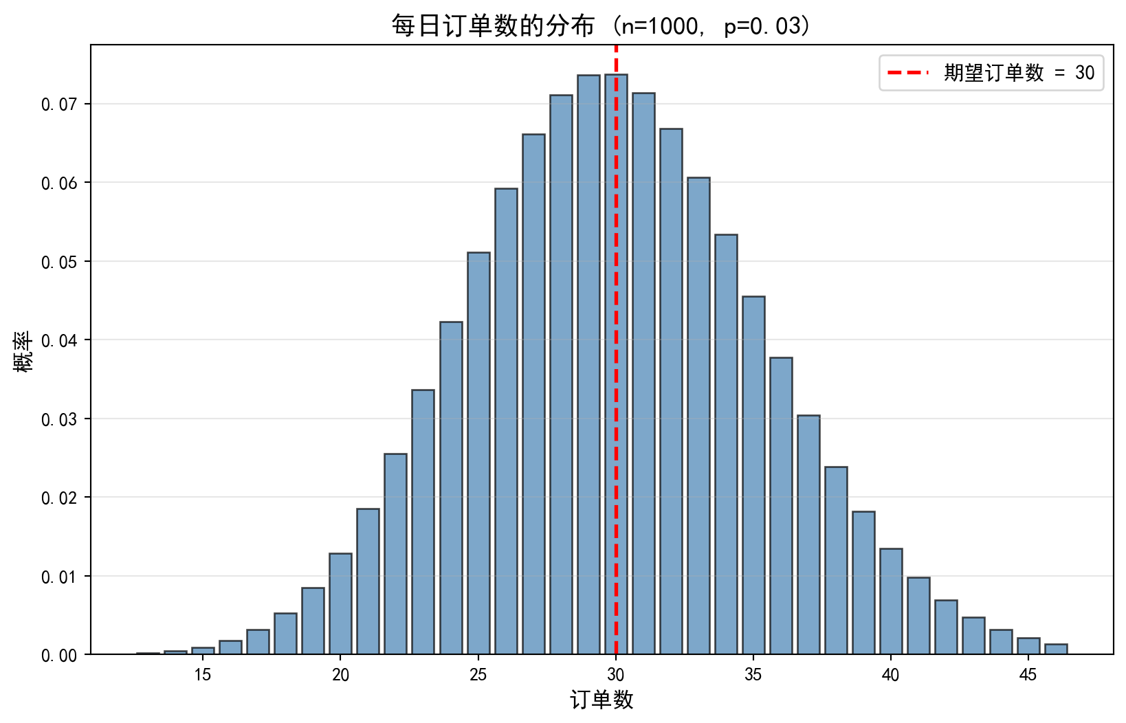
概率分布柱状图基本框架已绘制完成。下面在每个柱体顶部标注具体概率值,方便读者直接读取数值。
The basic framework of the probability distribution histogram has been plotted. Next, we annotate the specific probability values on top of each bar for easy reading.
# ========== 第7步:在柱状图上标注概率值 ==========
# ========== Step 7: Annotate probability values on the histogram bars ==========
for current_bar, current_probability in zip(conversion_bars, order_probabilities):  # 遍历每个柱体及对应概率
# Iterate over each bar and its corresponding probability
    if current_probability > 0.01:                                     # 仅标注概率 > 1% 的柱体
    # Only annotate bars with probability > 1%
        bar_height = current_bar.get_height()                          # 获取柱体高度
        # Get the bar height
        conversion_axes.text(  # 在柱顶添加概率数值标注
        # Add a text annotation at the top of the bar
            current_bar.get_x() + current_bar.get_width() / 2.,        # 水平居中于柱体
            # Horizontally centered on the bar
            bar_height,                                                 # 标注在柱体顶部
            # Position at the top of the bar
            f'{current_probability:.3f}',                               # 显示三位小数概率
            # Display probability to three decimal places
            ha='center', va='bottom', fontsize=8                        # 文字居中、底部对齐
            # Text centered, bottom-aligned
        )

plt.tight_layout()                                                     # 自动调整布局
# Automatically adjust the layout
plt.show()                                                             # 渲染并显示图表
# Render and display the chart
<Figure size 672x480 with 0 Axes>上图清晰地展示了二项分布 \(B(300, 0.10)\) 的概率分布柱状图。图中可以观察到:分布呈现经典的钟形曲线特征,以期望值 \(E(X) = 30\)(红色虚线标注)为中心近似对称。概率最高的柱体集中在 29—31 单附近,概率约为 7.4%。随着订单数偏离期望值,概率迅速衰减——当订单数低于 20 或高于 40 时,单个取值的概率已不足 1%。这种分布形态直观地验证了大样本二项分布向正态分布收敛的理论:当 \(n\) 足够大且 \(np\) 和 \(n(1-p)\) 均大于 5 时(本例中 \(np=30\), \(n(1-p)=270\)),二项分布可以用正态分布 \(N(np, np(1-p))\) 良好近似。
The figure above clearly displays the probability distribution histogram of the binomial distribution \(B(300, 0.10)\). We observe that the distribution exhibits the classic bell-curve shape, approximately symmetric around the expected value \(E(X) = 30\) (marked by the red dashed line). The tallest bars are concentrated near 29–31 orders, with probabilities of approximately 7.4%. As the order count deviates from the expectation, the probability decays rapidly — when the order count falls below 20 or exceeds 40, the probability of any single value is already less than 1%. This distributional pattern intuitively validates the theoretical convergence of the binomial distribution to the normal distribution for large samples: when \(n\) is sufficiently large and both \(np\) and \(n(1-p)\) exceed 5 (in this example, \(np=30\) and \(n(1-p)=270\)), the binomial distribution is well approximated by the normal distribution \(N(np, np(1-p))\).
4.3.3 泊松分布 (Poisson Distribution)
定义: \(X \sim \text{Poisson}(\lambda)\)
Definition: \(X \sim \text{Poisson}(\lambda)\)
描述单位时间/空间内稀有事件发生的次数。参数 \(\lambda > 0\) 是事件发生的平均率。
It describes the number of occurrences of a rare event within a unit of time or space. The parameter \(\lambda > 0\) is the average rate of event occurrence.
概率质量函数如 式 4.4 所示:
The probability mass function is shown in 式 4.4:
\[ P(X = k) = \frac{e^{-\lambda} \lambda^k}{k!}, \quad k = 0, 1, 2, ... \tag{4.4}\]
泊松分布的期望与方差(式 4.5):
The expectation and variance of the Poisson distribution (式 4.5):
\[ E[X] = \lambda, \quad \text{Var}(X) = \lambda \tag{4.5}\]
数学推导:泊松分布是二项分布的极限
Mathematical Derivation: The Poisson Distribution as the Limit of the Binomial Distribution
为什么说”当 \(n\) 很大,\(p\) 很小时,二项分布就是泊松分布”?我们来推导一下。 设 \(X \sim B(n, p)\),令 \(\lambda = np\) 为常数,则 \(p = \lambda/n\)。
Why is it said that “when \(n\) is large and \(p\) is small, the binomial distribution becomes the Poisson distribution”? Let us derive this. Let \(X \sim B(n, p)\), and set \(\lambda = np\) as a constant, so \(p = \lambda/n\).
\[ P(X=k) = C_n^k p^k (1-p)^{n-k} = \frac{n(n-1)...(n-k+1)}{k!} (\frac{\lambda}{n})^k (1-\frac{\lambda}{n})^{n-k} \]
我们将式子重新组合:
We rearrange the expression:
\[ = \frac{\lambda^k}{k!} \cdot \underbrace{\frac{n}{n} \cdot \frac{n-1}{n} \cdot ... \cdot \frac{n-k+1}{n}}_{k \text{ items}} \cdot \underbrace{(1-\frac{\lambda}{n})^n}_{\to e^{-\lambda}} \cdot \underbrace{(1-\frac{\lambda}{n})^{-k}}_{\to 1} \]
当 \(n \to \infty\) 时: 1. 中间的 \(k\) 项分数都趋近于 1。 2. 根据重要极限公式,\((1-\frac{\lambda}{n})^n \to e^{-\lambda}\)。 3. 最后一项趋近于 1。
As \(n \to \infty\): 1. The middle \(k\) fractional terms all approach 1. 2. By the well-known limit formula, \((1-\frac{\lambda}{n})^n \to e^{-\lambda}\). 3. The last term approaches 1.
于是我们得到: \[ P(X=k) \to \frac{\lambda^k e^{-\lambda}}{k!} \] 这就是泊松分布的公式!这解释了为什么对于稀有事件(\(p\) 极小)但基数很大(\(n\) 很大)的场景(如车祸、客服电话),泊松分布是完美的模型。表 4.2 展示了一个客服中心来电量的泊松分布应用。
Thus we obtain: \[ P(X=k) \to \frac{\lambda^k e^{-\lambda}}{k!} \] This is precisely the Poisson distribution formula! This explains why, for scenarios involving rare events (very small \(p\)) with a large population base (very large \(n\)) — such as traffic accidents or customer service calls — the Poisson distribution is the perfect model. 表 4.2 presents an application of the Poisson distribution to the call volume at a customer service center.
4.3.3.1 案例:客服中心来电量 (Case Study: Customer Service Call Volume)
什么是客服来电量的随机建模?
What Is Stochastic Modeling of Customer Service Call Volume?
对于电商平台、银行网点等服务型企业,客服中心每小时接到的来电数量是一个典型的”稀有事件计数”问题:每个潜在客户在单位时间内拨打电话的概率很低(\(p\)极小),但客户基数很大(\(n\)很大)。这恰好满足泊松分布的适用条件。理解来电量服从泊松分布,使得运营管理者能够预测不同来电数量出现的概率,从而合理安排客服人员数量、设置排队系统参数,避免人力不足导致客户流失或人力过剩造成成本浪费。
For service-oriented enterprises such as e-commerce platforms and bank branches, the number of calls received per hour by a customer service center is a classic “rare event counting” problem: the probability that any given potential customer will call within a unit of time is very low (extremely small \(p\)), but the customer base is very large (very large \(n\)). This precisely satisfies the conditions for applying the Poisson distribution. Understanding that call volume follows a Poisson distribution enables operations managers to predict the probability of different call volumes, thereby rationally scheduling customer service staff, configuring queuing system parameters, and avoiding either understaffing (leading to customer attrition) or overstaffing (wasting costs).
下面我们用泊松分布模拟一个平均每小时接到8个来电的客服中心,计算各种来电数量的概率。表 4.2 展示了计算结果。
Below, we use the Poisson distribution to model a customer service center that receives an average of 8 calls per hour, and compute the probability of various call volumes. 表 4.2 presents the computed results.
# ========== 导入所需库 ==========
# ========== Import required libraries ==========
import pandas as pd                    # 数据表格处理库
# Import the pandas library for tabular data manipulation
import numpy as np                     # 数值计算库
# Import the numpy library for numerical computation
from scipy.stats import poisson        # 泊松分布统计函数
# Import the Poisson distribution statistical functions from scipy
import matplotlib.pyplot as plt        # 数据可视化库
# Import the matplotlib library for data visualization

# ========== 第1步:设置绘图环境 ==========
# ========== Step 1: Configure the plotting environment ==========
plt.rcParams['font.sans-serif'] = ['SimHei']     # 设置中文黑体字体
# Set the Chinese font to SimHei (bold)
plt.rcParams['axes.unicode_minus'] = False        # 解决负号显示问题
# Fix the display issue with negative signs

# ========== 第2步:定义客服场景参数 ==========
# ========== Step 2: Define customer service scenario parameters ==========
average_calls_per_hour = 15            # 泊松分布参数 λ = 15(平均每小时来电数)
# Poisson distribution parameter λ = 15 (average calls per hour)

# ========== 第3步:计算泊松分布概率 ==========
# ========== Step 3: Compute Poisson distribution probabilities ==========
max_calls_to_consider = 30             # 考虑的最大来电数上限
# Maximum number of calls to consider
possible_call_counts = list(range(0, max_calls_to_consider + 1))  # 生成 0~30 的整数序列
# Generate an integer sequence from 0 to 30
# 利用泊松PMF公式 P(X=k) = (λ^k * e^(-λ)) / k! 计算每个值的概率
# Compute the probability for each value using the Poisson PMF: P(X=k) = (λ^k * e^(-λ)) / k!
call_probabilities = [poisson.pmf(k, average_calls_per_hour) for k in possible_call_counts]  # 计算每个来电数对应的泊松PMF概率
# Compute the Poisson PMF probability for each call count

# 找出概率最大的来电数(即众数)
# Find the call count with the highest probability (i.e., the mode)
most_likely_call_count = possible_call_counts[np.argmax(call_probabilities)]  # argmax返回最大值索引
# argmax returns the index of the maximum value

# ========== 第4步:计算管理层关注的关键概率 ==========
# ========== Step 4: Compute key probabilities of managerial interest ==========
probability_at_most_20 = poisson.cdf(20, average_calls_per_hour)       # P(X ≤ 20):来电不超过20的概率
# P(X ≤ 20): probability of receiving no more than 20 calls
probability_at_least_10 = 1 - poisson.cdf(9, average_calls_per_hour)   # P(X ≥ 10) = 1 - P(X ≤ 9)
# P(X ≥ 10) = 1 - P(X ≤ 9)
泊松分布概率计算完毕。下面构建概率分布表并输出关键管理指标。
The Poisson distribution probabilities have been computed. Next, we construct the probability distribution table and output the key managerial metrics.
print(f'平均每小时来电数: {average_calls_per_hour}')                      # 输出泊松参数λ
# Print the Poisson parameter λ
print(f'最可能的来电数: {most_likely_call_count} '  # 输出泊松分布的众数及其概率
# Print the mode of the Poisson distribution and its probability
      f'(概率: {poisson.pmf(most_likely_call_count, average_calls_per_hour):.4f})')  # 输出众数及其概率
      # Print the mode and its probability
print(f'P(来电 ≤ 20) = {probability_at_most_20:.4f}')                     # 不超过20个电话的概率
# Probability of receiving no more than 20 calls
print(f'P(来电 ≥ 10) = {probability_at_least_10:.4f}')                     # 至少10个电话的概率
# Probability of receiving at least 10 calls

# ========== 第5步:构建概率分布表 ==========
# ========== Step 5: Construct the probability distribution table ==========
call_probabilities_dataframe = pd.DataFrame({  # 将来电量概率分布整理为表格
# Organize the call volume probability distribution into a table
    '来电数': possible_call_counts[:15],                                    # 展示前15种情况(0~14)
    # Display the first 15 cases (0–14)
    '概率': [f'{prob:.4f}' for prob in call_probabilities[:15]]            # 对应的PMF概率值
    # Corresponding PMF probability values
})

print('\n前15种情况的概率分布:')                                             # 输出分节标题
# Print the subsection header
print(call_probabilities_dataframe)                                         # 打印概率分布表
# Print the probability distribution table
平均每小时来电数: 15
最可能的来电数: 15 (概率: 0.1024)
P(来电 ≤ 20) = 0.9170
P(来电 ≥ 10) = 0.9301
前15种情况的概率分布:
来电数 概率
0 0 0.0000
1 1 0.0000
2 2 0.0000
3 3 0.0002
4 4 0.0006
5 5 0.0019
6 6 0.0048
7 7 0.0104
8 8 0.0194
9 9 0.0324
10 10 0.0486
11 11 0.0663
12 12 0.0829
13 13 0.0956
14 14 0.1024上表输出了泊松分布 \(\text{Poisson}(\lambda=15)\) 的前 15 种取值的概率分布。从结果可以看出:概率最高值(众数)出现在来电数为 14 时,概率为 10.24%,这与参数 \(\lambda=15\) 非常接近(泊松分布的众数为 \(\lfloor\lambda\rfloor\) 或 \(\lfloor\lambda\rfloor - 1\))。分布主要集中在 7—23 次来电的范围内。此前计算的累积概率表明:\(P(X \leq 20) = 91.70\%\),\(P(X \geq 10) = 93.01\%\)。这意味着约 91.7% 的时段内来电不超过 20 次,可以据此配置客服人员——安排 20 线并发的接听能力即可覆盖超过 90% 的正常时段。同时,低于 10 次来电的概率仅约 7%,可作为低峰时段的参考阈值。下面绘制泊松分布柱状图进行可视化。
The table above displays the probability distribution of the first 15 values of the Poisson distribution \(\text{Poisson}(\lambda=15)\). The results show that the highest probability (mode) occurs at 14 calls, with a probability of 10.24%, which is very close to the parameter \(\lambda=15\) (the mode of a Poisson distribution is \(\lfloor\lambda\rfloor\) or \(\lfloor\lambda\rfloor - 1\)). The distribution is primarily concentrated in the 7–23 call range. The previously computed cumulative probabilities indicate: \(P(X \leq 20) = 91.70\%\) and \(P(X \geq 10) = 93.01\%\). This means that in approximately 91.7% of time periods, the number of calls does not exceed 20, which can be used to configure staffing — provisioning 20 concurrent call-handling lines is sufficient to cover over 90% of normal periods. Meanwhile, the probability of fewer than 10 calls is only about 7%, which can serve as a reference threshold for off-peak periods. We now plot a histogram to visualize the Poisson distribution.
# ========== 第6步:绘制泊松分布柱状图 ==========
# ========== Step 6: Plot the Poisson distribution histogram ==========
calls_figure, calls_axes = plt.subplots(figsize=(10, 6))                    # 创建10×6英寸画布
# Create a 10×6 inch figure canvas
calls_bars = calls_axes.bar(                                                # 绘制柱状图
# Draw a bar chart
    possible_call_counts, call_probabilities,                                # x轴=来电数, y轴=概率
    # x-axis = call count, y-axis = probability
    color='coral', alpha=0.7, edgecolor='black'                              # 珊瑚色填充、黑色边框
    # Coral fill with black edge
)

# 添加均值参考线 λ
# Add a reference line for the mean λ
calls_axes.axvline(  # 绘制泊松分布均值λ的垂直参考线
# Draw a vertical reference line at the Poisson mean λ
    average_calls_per_hour, color='red', linestyle='--', linewidth=2,        # 红色虚线
    # Red dashed line
    label=f'平均值 λ = {average_calls_per_hour}'                              # 图例说明
    # Legend label
)

calls_axes.set_xlabel('每小时来电数', fontsize=12)                             # x轴标签
# x-axis label
calls_axes.set_ylabel('概率', fontsize=12)                                     # y轴标签
# y-axis label
calls_axes.set_title('客服中心每小时来电量分布 (泊松分布)', fontsize=14)          # 图表标题
# Chart title
calls_axes.legend(fontsize=11)                                                  # 显示图例
# Display the legend
calls_axes.grid(True, axis='y', alpha=0.3)                                      # 添加y轴网格线
# Add y-axis gridlines

# ========== 第7步:高亮显示 μ ± 2σ 的正常波动范围 ==========
# ========== Step 7: Highlight the normal fluctuation range of μ ± 2σ ==========
calls_standard_deviation = np.sqrt(average_calls_per_hour)                       # 泊松分布标准差 σ = √λ
# Poisson standard deviation σ = √λ
calls_axes.axvspan(                                                              # 绘制黄色半透明区域
# Draw a yellow semi-transparent region
    average_calls_per_hour - 2 * calls_standard_deviation,                       # 左边界: λ - 2σ
    # Left boundary: λ - 2σ
    average_calls_per_hour + 2 * calls_standard_deviation,                       # 右边界: λ + 2σ
    # Right boundary: λ + 2σ
    alpha=0.2, color='yellow',                                                   # 黄色、20%透明度
    # Yellow, 20% opacity
    label=f'μ ± 2σ范围 ({average_calls_per_hour - 2*calls_standard_deviation:.0f}'  # 标注正常波动范围的图例文本
    # Legend text annotating the normal fluctuation range
          f' 到 {average_calls_per_hour + 2*calls_standard_deviation:.0f})'       # 图例标注范围
    # Legend label for the range
)

plt.tight_layout()                                                               # 自动调整布局
# Automatically adjust the layout
plt.show()                                                                       # 渲染并显示图表
# Render and display the chart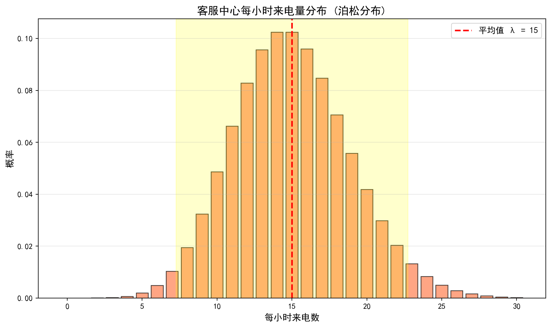
上图展示了泊松分布 \(\text{Poisson}(\lambda=15)\) 的柱状图。图中可以观察到:分布整体呈现轻微的右偏特征(正偏态),这是泊松分布的典型形态——当 \(\lambda\) 较小时右偏明显,随着 \(\lambda\) 增大逐渐趋于对称。红色虚线标注了均值 \(\lambda=15\) 的位置,黄色半透明区域标注了 \(\mu \pm 2\sigma\) 的范围(约 7 到 23),覆盖了约 95% 的概率质量。这一可视化结果对客服中心的资源调度具有直接参考价值:在 \(\mu \pm 2\sigma\) 范围外的来电量属于异常波动,管理者可以据此设置预警阈值——当某一时段来电量超过 23 次时可能需要启动应急机制,而低于 7 次时可以适当减少值班人数。
The figure above displays the histogram of the Poisson distribution \(\text{Poisson}(\lambda=15)\). We observe that the distribution exhibits a slight right skew (positive skewness), which is a typical characteristic of the Poisson distribution — the right skew is more pronounced when \(\lambda\) is small and gradually becomes more symmetric as \(\lambda\) increases. The red dashed line marks the mean \(\lambda=15\), and the yellow semi-transparent region marks the \(\mu \pm 2\sigma\) range (approximately 7 to 23), covering roughly 95% of the probability mass. This visualization provides direct reference value for resource scheduling at the customer service center: call volumes outside the \(\mu \pm 2\sigma\) range constitute abnormal fluctuations. Managers can use this to set alert thresholds — when call volume exceeds 23 in a given time period, an emergency mechanism may need to be activated, while call volumes below 7 may warrant a reduction in on-duty staff. ## 连续型概率分布 (Continuous Probability Distributions) {#sec-continuous-distributions}
4.3.4 概率密度函数 (PDF)
对于连续型随机变量 \(X\),概率密度函数(Probability Density Function, PDF) \(f(x)\) 满足:
For a continuous random variable \(X\), the Probability Density Function (PDF) \(f(x)\) satisfies:
\(f(x) \geq 0\) 对所有 \(x\)
\(\int_{-\infty}^{\infty} f(x) dx = 1\)
\(P(a \leq X \leq b) = \int_a^b f(x) dx\)
\(f(x) \geq 0\) for all \(x\)
\(\int_{-\infty}^{\infty} f(x) dx = 1\)
\(P(a \leq X \leq b) = \int_a^b f(x) dx\)
重要: PDF不是概率!
Important: The PDF Is Not a Probability!
对于连续型随机变量,\(P(X = x) = 0\) 对任意单点 \(x\) 成立。概率密度 \(f(x)\) 不是概率,而是一个”密度”概念。
For a continuous random variable, \(P(X = x) = 0\) holds for any single point \(x\). The probability density \(f(x)\) is not a probability but rather a concept of “density.”
正确理解: - \(f(x)\) 反映了在 \(x\) 附近取值的”密集程度” - 区间概率是PDF在该区间下的面积 - \(f(x)\) 可以大于1,但任何区间的概率不能超过1
Correct Interpretation: - \(f(x)\) reflects the “concentration” of values near \(x\) - The probability over an interval equals the area under the PDF over that interval - \(f(x)\) can exceed 1, but the probability over any interval cannot exceed 1
4.3.5 正态分布 (Normal Distribution)
定义: \(X \sim N(\mu, \sigma^2)\)
Definition: \(X \sim N(\mu, \sigma^2)\)
正态分布(又称高斯分布)是最重要的连续型分布,是统计学理论的基石。
The normal distribution (also known as the Gaussian distribution) is the most important continuous distribution and serves as the cornerstone of statistical theory.
概率密度函数如 式 4.6 所示:
The probability density function is shown in 式 4.6:
\[ f(x) = \frac{1}{\sqrt{2\pi}\sigma} \exp\left[-\frac{(x-\mu)^2}{2\sigma^2}\right] \tag{4.6}\]
其中: - \(\mu\): 均值(位置参数) - \(\sigma\): 标准差(尺度参数)
where: - \(\mu\): mean (location parameter) - \(\sigma\): standard deviation (scale parameter)
正态分布的期望与方差(式 4.7):
The expectation and variance of the normal distribution (式 4.7):
\[ E[X] = \mu, \quad \text{Var}(X) = \sigma^2 \tag{4.7}\]
标准正态分布: \(Z \sim N(0, 1)\)
Standard Normal Distribution: \(Z \sim N(0, 1)\)
任意正态分布可以通过标准化转换为标准正态分布(见 式 4.8):
Any normal distribution can be converted to the standard normal distribution through standardization (see 式 4.8):
\[ Z = \frac{X - \mu}{\sigma} \tag{4.8}\]
几何直觉:为什么是正态分布?(最大熵原理)
Geometric Intuition: Why the Normal Distribution? (The Maximum Entropy Principle)
正态分布不仅仅因为”中心极限定理”而重要,它还是大自然”最诚实”的分布。
The normal distribution is important not only because of the Central Limit Theorem—it is also nature’s “most honest” distribution.
假设我们就知道数据的均值是 \(\mu\),方差是 \(\sigma^2\),除此之外一无所知。在这个约束下,哪个分布包含的信息量最少(即熵最大,最不偏不倚)?
Suppose all we know about the data is that the mean is \(\mu\) and the variance is \(\sigma^2\), and nothing else. Under this constraint, which distribution contains the least information (i.e., has the maximum entropy and is the most unbiased)?
答案就是:正态分布。
The answer is: the normal distribution.
如果我们假设数据在有限区间,熵最大的是均匀分布。
If we assume the data lies on a finite interval, the maximum-entropy distribution is the uniform distribution.
如果我们假设均值固定且非负,熵最大的是指数分布。
If we assume a fixed, non-negative mean, the maximum-entropy distribution is the exponential distribution.
如果我们引入方差约束,熵最大的就是正态分布。
If we introduce a variance constraint, the maximum-entropy distribution is the normal distribution.
所以,正态分布是我们在已知均值和方差的情况下,对未知世界所能做的最保守的假设。图 4.1 展示了真实股票数据与正态分布的拟合效果。
Therefore, the normal distribution represents the most conservative assumption we can make about the unknown world given knowledge of the mean and variance. 图 4.1 illustrates the fit of a normal distribution to real stock data.
4.3.5.1 案例:A股收益率分布 (Case Study: A-Share Return Distribution)
什么是收益率的正态拟合?
What Is a Normal Fit to Returns?
在量化金融中,股票收益率的分布特征是风险管理和衍生品定价的基石。正态分布因其数学上的优美性质(由均值和方差完全刻画)被广泛用作收益率的近似模型——Black-Scholes期权定价公式和现代投资组合理论(MPT)都建立在正态分布假设之上。但真实的股票收益率真的服从正态分布吗?通过将A股个股的实际收益率直方图与理论正态密度曲线叠加对比,我们可以直观地检验这一假设,并发现”尖峰厚尾”(Leptokurtosis)等现实偏离——这正是理解金融风险的关键起点。
In quantitative finance, the distributional characteristics of stock returns are the foundation of risk management and derivatives pricing. The normal distribution, owing to its elegant mathematical properties (fully characterized by its mean and variance), is widely used as an approximate model for returns—the Black-Scholes option pricing formula and Modern Portfolio Theory (MPT) are both built upon the normality assumption. But do real stock returns truly follow a normal distribution? By overlaying the empirical return histogram of an A-share stock with the theoretical normal density curve, we can visually test this assumption and uncover real-world departures such as leptokurtosis (excess kurtosis and fat tails)—a critical starting point for understanding financial risk.
下面我们以海康威视(002415.XSHE)为例,分析其日收益率的分布特征。图 4.1 展示了实际数据与正态分布的拟合效果。
Below, we take Hikvision (002415.XSHE) as an example to analyze the distributional characteristics of its daily returns. 图 4.1 presents the fit between the empirical data and the normal distribution.
# ========== 导入所需库 ==========
# ========== Import Required Libraries ==========
import pandas as pd                    # 数据表格处理库
# Import the pandas library for tabular data manipulation
import numpy as np                     # 数值计算库
# Import the numpy library for numerical computation
import matplotlib.pyplot as plt        # 数据可视化库
# Import the matplotlib library for data visualization
from scipy import stats                # 统计检验与分布拟合
# Import scipy.stats for statistical tests and distribution fitting
import platform                        # 操作系统检测
# Import the platform module for OS detection

# ========== 第1步:设置绘图环境 ==========
# ========== Step 1: Configure the Plotting Environment ==========
plt.rcParams['font.sans-serif'] = ['SimHei']     # 设置中文黑体字体
# Set the Chinese SimHei font for displaying Chinese characters
plt.rcParams['axes.unicode_minus'] = False        # 解决负号显示问题
# Fix the minus sign display issue in matplotlib

# ========== 第2步:加载本地股价数据 ==========
# ========== Step 2: Load Local Stock Price Data ==========
if platform.system() == 'Windows':               # 根据操作系统选择数据路径
# Select the data path based on the operating system
    data_path = 'C:/qiufei/data/stock'            # Windows本地数据路径
    # Windows local data path
else:  # Linux服务器环境
    # Linux server environment
    data_path = '/home/ubuntu/r2_data_mount/qiufei/data/stock'  # Linux服务器路径
    # Linux server data path

# 读取前复权日度行情数据
# Read the forward-adjusted daily price data
stock_price_dataframe = pd.read_hdf(f'{data_path}/stock_price_pre_adjusted.h5')  # 从本地加载前复权股价数据
# Load forward-adjusted stock price data from local storage
stock_price_dataframe = stock_price_dataframe.reset_index()        # 重置索引以便筛选
# Reset the index to facilitate filtering
前复权股价数据读取完毕。下面筛选海康威视近两年日度行情并计算收益率统计特征。
The forward-adjusted stock price data has been loaded. Next, we filter Hikvision’s daily data for the most recent two years and compute return statistics.
# ========== 第3步:筛选海康威视近两年数据 ==========
# ========== Step 3: Filter Hikvision Data for the Recent Two Years ==========
hikvision_recent_price_dataframe = stock_price_dataframe[  # 筛选海康威视(002415)指定时间范围的数据
# Filter data for Hikvision (002415) within the specified date range
    (stock_price_dataframe['order_book_id'] == '002415.XSHE') &  # 海康威视股票代码
    # Hikvision stock code
    (stock_price_dataframe['date'] >= '2022-01-01') &             # 起始日期
    # Start date
    (stock_price_dataframe['date'] <= '2023-12-31')               # 截止日期
    # End date
].copy()                                                          # 复制以避免修改原数据
# Copy to avoid modifying the original DataFrame
hikvision_recent_price_dataframe = hikvision_recent_price_dataframe.sort_values('date')  # 按日期升序
# Sort by date in ascending order

# ========== 第4步:计算日收益率与统计量 ==========
# ========== Step 4: Compute Daily Returns and Summary Statistics ==========
# 计算日百分比收益率: (P_t - P_{t-1}) / P_{t-1}
# Compute daily percentage returns: (P_t - P_{t-1}) / P_{t-1}
hikvision_recent_price_dataframe['return'] = hikvision_recent_price_dataframe['close'].pct_change()  # 基于收盘价计算日收益率
# Calculate daily returns based on closing prices
hikvision_daily_returns_array = hikvision_recent_price_dataframe['return'].dropna().values  # 转换为数组
# Convert to a NumPy array after dropping missing values

# 计算样本均值和标准差(作为正态分布参数估计)
# Compute the sample mean and standard deviation (as parameter estimates for the normal distribution)
estimated_mean = hikvision_daily_returns_array.mean()              # 样本均值 μ̂
# Sample mean μ̂
estimated_standard_deviation = hikvision_daily_returns_array.std() # 样本标准差 σ̂
# Sample standard deviation σ̂

print(f'分析股票: 海康威视(002415.XSHE)')                           # 输出股票名称
# Print the stock name
print(f'分析期间: 2022-2023年')                                       # 输出分析时段
# Print the analysis period
print(f'交易日数: {len(hikvision_daily_returns_array)}')                    # 输出样本量
# Print the number of trading days (sample size)
print(f'平均日收益率: {estimated_mean:.4f} ({estimated_mean*100:.2f}%)')  # 输出均值
# Print the mean daily return
print(f'收益率标准差: {estimated_standard_deviation:.4f} '  # 输出标准差及百分比形式
      f'({estimated_standard_deviation*100:.2f}%)')                 # 输出标准差
# Print the standard deviation of returns in both decimal and percentage form
分析股票: 海康威视(002415.XSHE)
分析期间: 2022-2023年
交易日数: 483
平均日收益率: -0.0005 (-0.05%)
收益率标准差: 0.0215 (2.15%)上述结果输出了海康威视(002415.XSHE)在 2022—2023 年间共 483 个交易日的日收益率基本统计特征。平均日收益率为 -0.0005(即 -0.05%),表明在此期间股价整体处于下跌通道。收益率标准差为 0.0215(即 2.15%),反映了该股票的日常波动水平。将这两个统计量进行年化处理:年化收益率约为 \(-0.05\% \times 252 \approx -12.6\%\),年化波动率约为 \(2.15\% \times \sqrt{252} \approx 34.1\%\),说明海康威视在此期间属于高波动、负收益的格局。下面绘制直方图与正态拟合曲线、Q-Q图,直观检验收益率是否服从正态分布,并执行Shapiro-Wilk统计检验。
The results above report the basic statistical characteristics of daily returns for Hikvision (002415.XSHE) over 483 trading days during 2022–2023. The mean daily return is −0.0005 (i.e., −0.05%), indicating an overall downward trend in the stock price during this period. The standard deviation of returns is 0.0215 (i.e., 2.15%), reflecting the stock’s day-to-day volatility level. Annualizing these statistics: the annualized return is approximately \(-0.05\% \times 252 \approx -12.6\%\), and the annualized volatility is approximately \(2.15\% \times \sqrt{252} \approx 34.1\%\), suggesting that Hikvision exhibited a high-volatility, negative-return pattern during this period. Below, we plot the histogram with a normal fit curve and a Q-Q plot to visually assess whether the returns follow a normal distribution, and we perform a Shapiro-Wilk statistical test.
# ========== 第5步:计算正态拟合曲线参数 ==========
# ========== Step 5: Compute the Normal Fit Curve Parameters ==========
x_axis_values = np.linspace(                                        # 生成x轴坐标点
# Generate x-axis coordinate points
    hikvision_daily_returns_array.min(),  # 起始点:收益率最小值
    # Starting point: minimum return value
    hikvision_daily_returns_array.max(), 100  # 终止点:收益率最大值,共100个点
    # Ending point: maximum return value, 100 points in total
)
fitted_normal_distribution = stats.norm.pdf(                        # 计算正态PDF值
# Compute the normal PDF values
    x_axis_values, estimated_mean, estimated_standard_deviation  # 传入均值和标准差参数
    # Pass in the mean and standard deviation parameters
)
正态拟合曲线参数计算完毕。下面绘制直方图与正态拟合曲线(左图)以及Q-Q图(右图),从图形和统计两个角度检验收益率的正态性。
The normal fit curve parameters have been computed. Next, we plot the histogram with the normal fit curve (left panel) and the Q-Q plot (right panel) to assess the normality of returns from both graphical and statistical perspectives.
# ========== 第6步:绘制直方图与正态拟合曲线 ==========
# ========== Step 6: Plot the Histogram and Normal Fit Curve ==========
normal_fit_figure, normal_fit_axes = plt.subplots(1, 2, figsize=(14, 5))  # 创建1行2列子图
# Create a figure with 1 row and 2 columns of subplots

# 左图:收益率直方图 + 拟合的正态密度曲线
# Left panel: Return histogram + fitted normal density curve
normal_fit_axes[0].hist(  # 绘制收益率频率直方图
# Plot the return frequency histogram
    hikvision_daily_returns_array, bins=40,         # 40个分箱
    # 40 bins
    density=True, alpha=0.7,                        # 归一化为概率密度
    # Normalize to probability density
    color='steelblue', edgecolor='black',           # 钢蓝色填充、黑色边框
    # Steel blue fill with black edges
    label='实际收益率'                               # 图例说明
    # Legend label
)
normal_fit_axes[0].plot(                                            # 绘制正态拟合曲线
# Plot the normal fit curve
    x_axis_values, fitted_normal_distribution,  # x轴与PDF值
    # x-axis values and corresponding PDF values
    'r-', linewidth=2.5,                                            # 红色实线
    # Red solid line
    label=f'拟合正态分布\n(μ={estimated_mean:.4f}, σ={estimated_standard_deviation:.4f})'  # 图例显示拟合参数
    # Legend displaying the fitted parameters
)
normal_fit_axes[0].set_xlabel('日收益率', fontsize=12)                # x轴标签
# Set x-axis label
normal_fit_axes[0].set_ylabel('密度', fontsize=12)                    # y轴标签
# Set y-axis label
normal_fit_axes[0].set_title('收益率分布与正态拟合', fontsize=14)     # 子图标题
# Set subplot title
normal_fit_axes[0].legend(fontsize=10)                                 # 显示图例
# Display legend
normal_fit_axes[0].grid(True, alpha=0.3)                               # 添加网格线
# Add grid lines

# ========== 第7步:绘制Q-Q图进行正态性直观检验 ==========
# ========== Step 7: Plot the Q-Q Plot for Visual Normality Assessment ==========
# Q-Q图原理:若数据服从正态分布,散点应落在对角线上
# Q-Q plot principle: if the data follow a normal distribution, the points should fall on the diagonal line
stats.probplot(hikvision_daily_returns_array, dist='norm', plot=normal_fit_axes[1])  # 绘制Q-Q图检验正态性
# Generate a Q-Q plot to assess normality
normal_fit_axes[1].set_title('Q-Q图 (正态性检验)', fontsize=14)     # 子图标题
# Set subplot title
normal_fit_axes[1].grid(True, alpha=0.3)                               # 添加网格线
# Add grid lines

plt.tight_layout()                                                      # 自动调整布局
# Automatically adjust the layout
plt.show()                                                              # 渲染并显示图表
# Render and display the figure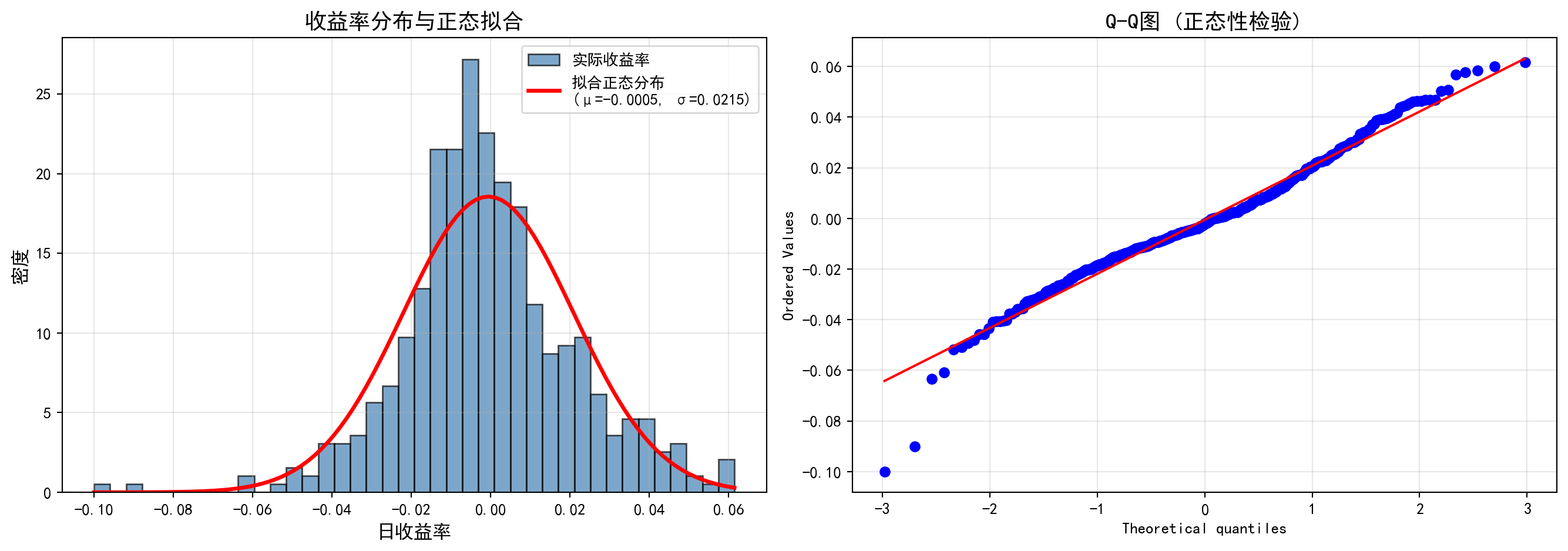
上图包含两个面板。左图为海康威视日收益率的直方图,叠加了基于样本均值和标准差拟合的正态分布曲线(红色曲线)。可以直观地观察到:实际收益率分布在中心峰值处明显高于正态拟合曲线(即”尖峰”特征),同时在尾部区域也比正态曲线更厚(即”厚尾”特征),这是金融收益率的典型特征,被称为”尖峰厚尾”(leptokurtic)。右图为 Q-Q 图(分位数-分位数图),如果数据完全服从正态分布,所有散点应精确落在红色的 45° 对角线上。然而实际结果显示:散点在两端(即尾部分位数)呈现明显的 S 形偏离——左下方的点低于对角线、右上方的点高于对角线,进一步印证了收益率存在比正态分布更极端的尾部事件。这些图形化的证据表明海康威视的日收益率并不服从正态分布。下面执行 Shapiro-Wilk 统计检验,定量判断这一结论。
The figure above contains two panels. The left panel displays the histogram of Hikvision’s daily returns overlaid with the fitted normal distribution curve (red curve) based on the sample mean and standard deviation. One can visually observe that the empirical return distribution has a peak notably higher than the normal fit at the center (the “excess peak” or leptokurtic feature), while the tails are also thicker than the normal curve (the “fat tail” feature)—a hallmark of financial returns known as leptokurtosis. The right panel shows the Q-Q (quantile-quantile) plot; if the data perfectly followed a normal distribution, all scatter points would fall exactly on the red 45° diagonal line. However, the results reveal a pronounced S-shaped deviation at both extremes (i.e., the tail quantiles)—points in the lower-left fall below the diagonal and points in the upper-right lie above it, further confirming that the returns exhibit more extreme tail events than a normal distribution would predict. This graphical evidence indicates that Hikvision’s daily returns do not follow a normal distribution. Below, we perform the Shapiro-Wilk statistical test to quantitatively confirm this conclusion.
# ========== 第7步:Shapiro-Wilk正态性统计检验 ==========
# ========== Step 7: Shapiro-Wilk Statistical Test for Normality ==========
# Shapiro-Wilk检验的H0: 数据服从正态分布;p < 0.05则拒绝H0
# Shapiro-Wilk test H0: the data follow a normal distribution; reject H0 if p < 0.05
shapiro_statistic, shapiro_p_value = stats.shapiro(  # 执行Shapiro-Wilk正态性检验
# Perform the Shapiro-Wilk normality test
    hikvision_daily_returns_array[:5000]              # 样本量不超过5000时直接检验
    # Test directly when sample size does not exceed 5000
) if len(hikvision_daily_returns_array) <= 5000 else (None, None)  # 超过5000则跳过检验
# Skip the test if samples exceed 5000

if shapiro_p_value is not None:                                          # 若检验成功执行
# If the test was successfully executed
    print(f'\nShapiro-Wilk正态性检验:')                         # 输出检验名称
    # Print the test name
    print(f'统计量: {shapiro_statistic:.4f}')                          # 输出检验统计量
    # Print the test statistic
    print(f'p值: {shapiro_p_value:.4f}')                                  # 输出p值
    # Print the p-value
    normality_conclusion_text = '不能拒绝正态性假设' if shapiro_p_value > 0.05 else '拒绝正态性假设'  # 根据p值确定检验结论
    # Determine the test conclusion based on the p-value
    print(f'结论: {normality_conclusion_text} (α=0.05)')  # 输出结论判断
    # Print the conclusion
Shapiro-Wilk正态性检验:
统计量: 0.9785
p值: 0.0000
结论: 拒绝正态性假设 (α=0.05)
Shapiro-Wilk 检验结果给出了定量的正态性判断:检验统计量 \(W = 0.9785\)(完美正态数据的 \(W\) 值为 1.0),\(p\) 值为 0.0000(远小于显著性水平 \(\alpha = 0.05\))。因此我们在 5% 的显著性水平下拒绝原假设 \(H_0\)(数据服从正态分布),得出结论:海康威视的日收益率不服从正态分布。这一统计检验结果与前面直方图和 Q-Q 图的图形化证据完全一致。
The Shapiro-Wilk test provides a quantitative assessment of normality: the test statistic \(W = 0.9785\) (a \(W\) value of 1.0 indicates perfectly normal data), with a \(p\)-value of 0.0000 (far below the significance level \(\alpha = 0.05\)). Therefore, at the 5% significance level, we reject the null hypothesis \(H_0\) (i.e., that the data follow a normal distribution) and conclude: Hikvision’s daily returns do not follow a normal distribution. This statistical test result is fully consistent with the graphical evidence from the histogram and Q-Q plot above.
这一发现具有重要的实践意义。在风险管理中,如果错误地假设收益率服从正态分布,将严重低估极端损失发生的概率。例如,基于正态分布计算的在险价值(VaR)会低估尾部风险——正态分布预测超过 \(3\sigma\) 的事件概率仅为 0.27%,但实际金融数据中此类极端事件的发生频率远高于此。这正是 2008 年全球金融危机中许多风控模型失效的根本原因之一。因此,金融实务中通常采用 t 分布或其他厚尾分布来替代正态分布进行风险建模。
This finding carries significant practical implications. In risk management, erroneously assuming that returns follow a normal distribution will severely underestimate the probability of extreme losses. For example, Value-at-Risk (VaR) calculated under the normality assumption understates tail risk—the normal distribution predicts that the probability of events exceeding \(3\sigma\) is only 0.27%, yet in actual financial data, such extreme events occur far more frequently. This is precisely one of the fundamental reasons why many risk management models failed during the 2008 global financial crisis. Consequently, financial practitioners typically adopt the t-distribution or other fat-tailed distributions as replacements for the normal distribution in risk modeling.
4.3.6 指数分布 (Exponential Distribution)
定义: \(X \sim \text{Exp}(\lambda)\)
Definition: \(X \sim \text{Exp}(\lambda)\)
描述等待时间(time until event),参数 \(\lambda > 0\) 是事件发生率。
Describes waiting time (time until an event occurs), where the parameter \(\lambda > 0\) is the event rate.
概率密度函数如 式 4.9 所示:
The probability density function is shown in 式 4.9:
\[ f(x) = \lambda e^{-\lambda x}, \quad x \geq 0 \tag{4.9}\]
累积分布函数如 式 4.10 所示:
The cumulative distribution function is shown in 式 4.10:
\[ F(x) = P(X \leq x) = 1 - e^{-\lambda x} \tag{4.10}\]
指数分布的期望与方差(式 4.11):
The expectation and variance of the exponential distribution (式 4.11):
\[ E[X] = \frac{1}{\lambda}, \quad \text{Var}(X) = \frac{1}{\lambda^2} \tag{4.11}\]
指数分布的无记忆性
The Memoryless Property of the Exponential Distribution
指数分布具有独特的无记忆性(memoryless property):
The exponential distribution possesses a unique memoryless property:
\[ P(X > s + t | X > s) = P(X > t) \]
直观解释: 如果已经等待了 \(s\) 时间,事件仍未发生,那么从现在开始再等待 \(t\) 时间的概率,与从头开始等待 \(t\) 时间的概率相同。过去的等待时间不影响未来的等待时间。
Intuitive Explanation: If one has already waited \(s\) units of time and the event has not yet occurred, the probability of waiting an additional \(t\) units from this point onward is identical to the probability of waiting \(t\) units from the very beginning. Past waiting time has no influence on future waiting time.
应用场景: 电子元件寿命、客户到达间隔时间、电话通话时长等。表 4.3 展示了客服服务时长的指数分布分析。
Application Scenarios: Lifetimes of electronic components, inter-arrival times of customers, telephone call durations, etc. 表 4.3 presents an exponential distribution analysis of customer service durations.
4.3.6.1 案例:客户服务时间 (Case Study: Customer Service Time)
什么是服务时间的指数分布建模?
What Is Exponential Distribution Modeling of Service Time?
在服务运营管理中,客户等待时间和服务时长的建模是排队论(Queueing Theory)的核心。指数分布因其”无记忆性”特征——即无论客户已经等了多久,未来还需等待的时间分布不变——成为描述服务时间最常用的概率模型。它广泛应用于银行柜台、医院候诊、呼叫中心等场景。通过指数分布,管理者可以回答关键运营问题:例如”5分钟内完成服务的概率是多少”“超过20分钟的’慢单’占比多大”,从而制定服务级别协议(SLA)和人员调度策略。
In service operations management, modeling customer waiting times and service durations is at the core of Queueing Theory. The exponential distribution, with its memoryless property—meaning that regardless of how long a customer has already waited, the distribution of the remaining waiting time stays the same—is the most commonly used probabilistic model for describing service times. It is widely applied in scenarios such as bank counters, hospital waiting rooms, and call centers. Through the exponential distribution, managers can answer critical operational questions, such as “What is the probability of completing service within 5 minutes?” or “What proportion of ‘slow tickets’ exceed 20 minutes?”, thereby informing Service Level Agreements (SLAs) and staffing strategies.
下面我们以一个平均服务时长10分钟(即\(\lambda=0.1\)/分钟)的客服场景为例,计算管理层关注的关键概率。
Below, we use a customer service scenario with an average service duration of 10 minutes (i.e., \(\lambda=0.1\) per minute) as an example to compute the key probabilities that management focuses on.
# ========== 导入所需库 ==========
# ========== Import Required Libraries ==========
import pandas as pd                    # 数据表格处理库
# Import the pandas library for tabular data manipulation
import numpy as np                     # 数值计算库
# Import the numpy library for numerical computation
from scipy.stats import expon          # 指数分布统计函数
# Import the exponential distribution functions from scipy.stats
import matplotlib.pyplot as plt        # 数据可视化库
# Import the matplotlib library for data visualization

# ========== 第1步:设置绘图环境 ==========
# ========== Step 1: Configure the Plotting Environment ==========
plt.rcParams['font.sans-serif'] = ['SimHei']     # 设置中文黑体字体
# Set the Chinese SimHei font for displaying Chinese characters
plt.rcParams['axes.unicode_minus'] = False        # 解决负号显示问题
# Fix the minus sign display issue in matplotlib

# ========== 第2步:定义客服场景参数 ==========
# ========== Step 2: Define Customer Service Scenario Parameters ==========
service_rate_lambda = 0.1              # 服务率参数 λ = 0.1 (平均每分钟服务0.1个客户)
# Service rate parameter λ = 0.1 (on average, 0.1 customers served per minute)
exponential_scale = 1 / service_rate_lambda  # scale = 1/λ = 10分钟(平均服务时长)
# Scale parameter = 1/λ = 10 minutes (mean service duration)

# ========== 第3步:计算管理层关注的关键概率 ==========
# ========== Step 3: Compute Key Probabilities of Managerial Interest ==========
# P(X ≤ 5): 5分钟内完成服务的概率
# P(X ≤ 5): Probability of completing service within 5 minutes
probability_within_5_minutes = expon.cdf(5, scale=exponential_scale)  # 指数分布CDF计算5分钟内完成概率
# Compute the probability of completion within 5 minutes using the exponential CDF
# P(X ≤ 10): 10分钟内完成服务的概率
# P(X ≤ 10): Probability of completing service within 10 minutes
probability_within_10_minutes = expon.cdf(10, scale=exponential_scale)  # 指数分布CDF计算10分钟内完成概率
# Compute the probability of completion within 10 minutes using the exponential CDF
# P(X > 20): 服务超过20分钟的概率,即"慢单"率
# P(X > 20): Probability that service exceeds 20 minutes, i.e., the "slow ticket" rate
probability_exceed_20_minutes = 1 - expon.cdf(20, scale=exponential_scale)  # 超过20分钟的尾部概率
# Tail probability of exceeding 20 minutes

print(f'平均服务时长: {exponential_scale:.1f} 分钟')                          # 输出平均服务时长
# Print the mean service duration
print(f'P(服务 ≤ 5分钟) = {probability_within_5_minutes:.4f}'  # 输出5分钟内完成概率
      f' ({probability_within_5_minutes:.2%})')                             # 5分钟内完成概率
# Print the probability of completing service within 5 minutes
print(f'P(服务 ≤ 10分钟) = {probability_within_10_minutes:.4f}'  # 输出10分钟内完成概率
      f' ({probability_within_10_minutes:.2%})')                            # 10分钟内完成概率
# Print the probability of completing service within 10 minutes
print(f'P(服务 > 20分钟) = {probability_exceed_20_minutes:.4f}'  # 输出超过20分钟概率
      f' ({probability_exceed_20_minutes:.2%})')                            # 超过20分钟概率
# Print the probability of service exceeding 20 minutes
平均服务时长: 10.0 分钟
P(服务 ≤ 5分钟) = 0.3935 (39.35%)
P(服务 ≤ 10分钟) = 0.6321 (63.21%)
P(服务 > 20分钟) = 0.1353 (13.53%)上述结果输出了指数分布 \(\text{Exp}(\lambda=0.1)\)(即平均服务时长 10 分钟)的三个关键概率。\(P(\text{服务} \leq 5\text{分钟}) = 39.35\%\),意味着不到四成的客户能在 5 分钟内完成服务,这表明如果企业将”5 分钟内响应”作为服务承诺,大约六成客户将无法满足此标准。\(P(\text{服务} \leq 10\text{分钟}) = 63.21\%\),即约三分之二的客户可以在平均服务时长内完成——这体现了指数分布的一个重要特性:中位数(\(\ln 2 / \lambda \approx 6.93\) 分钟)小于均值(10 分钟),因为少数耗时极长的服务拉高了平均值。\(P(\text{服务} > 20\text{分钟}) = 13.53\%\),说明仍有约 13.5% 的客户需要超过两倍均值的等待时间,这部分长时间等待可能是客户投诉的主要来源。下面构建不同时长的服务完成概率汇总表。
The results above report three key probabilities from the exponential distribution \(\text{Exp}(\lambda=0.1)\) (i.e., a mean service duration of 10 minutes). \(P(\text{Service} \leq 5\text{ min}) = 39.35\%\), meaning fewer than four out of ten customers can be served within 5 minutes; this implies that if the company promises “response within 5 minutes,” approximately 60% of customers would not meet this standard. \(P(\text{Service} \leq 10\text{ min}) = 63.21\%\), i.e., roughly two-thirds of customers can be served within the mean service duration—this reflects an important property of the exponential distribution: the median (\(\ln 2 / \lambda \approx 6.93\) minutes) is less than the mean (10 minutes), because a small number of extremely long service times inflate the average. \(P(\text{Service} > 20\text{ min}) = 13.53\%\), indicating that approximately 13.5% of customers require more than twice the mean waiting time; this segment of prolonged waits is likely the primary source of customer complaints. Below, we construct a summary table of service completion probabilities at various durations.
# ========== 第4步:构建不同时长的概率表 ==========
# ========== Step 4: Construct the Probability Table for Various Service Durations ==========
service_time_thresholds = [3, 5, 10, 15, 20, 30]                        # 关注的时间节点(分钟)
# Time thresholds of interest (in minutes)
service_times_dataframe = pd.DataFrame({  # 构建不同时长的服务完成概率表
# Construct a DataFrame of service completion probabilities at various durations
    '服务时长(分钟)': service_time_thresholds,                                # 时间阈值
    # Time thresholds
    '完成概率': [f'{expon.cdf(t, scale=exponential_scale):.4f}'  # 每个时间点的CDF值
    # CDF value at each time point
                 for t in service_time_thresholds],                      # CDF值
    '超出概率': [f'{1-expon.cdf(t, scale=exponential_scale):.4f}'  # 超出时间阈值的概率
    # Probability of exceeding the time threshold
                 for t in service_time_thresholds]                       # 1 - CDF
})

print('\n不同时长的服务完成概率:')                                         # 输出分节标题
# Print section heading
print(service_times_dataframe)                                              # 打印概率表
# Print the probability table
不同时长的服务完成概率:
   服务时长(分钟)    完成概率    超出概率
0         3  0.2592  0.7408
1         5  0.3935  0.6065
2        10  0.6321  0.3679
3        15  0.7769  0.2231
4        20  0.8647  0.1353
5        30  0.9502  0.0498
上表构建了一个完整的服务时长—概率对照表,从 3 分钟到 30 分钟共 6 个关键时间节点。从”完成概率”列可以看出概率随时间递增但增速递减:3 分钟内完成的概率仅为 25.92%,5 分钟为 39.35%,10 分钟为 63.21%,15 分钟为 77.69%,20 分钟为 86.47%,30 分钟为 95.02%。这一递减的边际增量体现了指数分布的”无记忆性”(memoryless property):无论客户已经等待了多长时间,未来完成服务所需的额外等待时间的分布始终相同。从服务水平协议(SLA)的角度,这张表可以直接指导管理决策:如果企业承诺”95% 的客户在 30 分钟内完成服务”,当前参数下恰好能够达标;但如果目标是”90% 在 20 分钟内完成”,则尚有约 3.5% 的缺口,需要通过增加客服人员来降低平均服务时长 \(1/\lambda\)。下面绘制 PDF 和 CDF 双子图,直观展示指数分布的形态特征和累积概率变化。
The table above provides a complete service duration–probability lookup covering six key time thresholds from 3 to 30 minutes. From the “Completion Probability” column, we observe that probability increases with time but at a diminishing marginal rate: the probability of completing within 3 minutes is only 25.92%, 5 minutes yields 39.35%, 10 minutes yields 63.21%, 15 minutes yields 77.69%, 20 minutes yields 86.47%, and 30 minutes yields 95.02%. This diminishing marginal increment reflects the memoryless property of the exponential distribution: regardless of how long a customer has already waited, the distribution of the additional time needed to complete service remains the same. From a Service Level Agreement (SLA) perspective, this table directly informs managerial decisions: if the company promises “95% of customers served within 30 minutes,” the current parameters just barely meet the target; however, if the goal is “90% within 20 minutes,” there is approximately a 3.5% gap, which would require adding more customer service personnel to reduce the mean service duration \(1/\lambda\). Below, we plot the PDF and CDF in a dual-panel figure to visually illustrate the shape characteristics and cumulative probability trajectory of the exponential distribution.
# ========== 第5步:绘制PDF和CDF双子图(左图:PDF) ==========
# ========== Step 5: Plot the PDF and CDF Dual-Panel Figure (Left: PDF) ==========
exponential_figure, exponential_axes = plt.subplots(1, 2, figsize=(14, 5))  # 创建1行2列子图
# Create a figure with 1 row and 2 columns of subplots

# --- 左图:概率密度函数 (PDF) ---
# --- Left Panel: Probability Density Function (PDF) ---
x_axis_values = np.linspace(0, 50, 1000)                                    # 生成x轴坐标点
# Generate x-axis coordinate points
pdf_values_array = expon.pdf(x_axis_values, scale=exponential_scale)         # 计算指数PDF值
# Compute the exponential PDF values

exponential_axes[0].plot(                                                    # 绘制PDF曲线
# Plot the PDF curve
    x_axis_values, pdf_values_array, 'b-', linewidth=2.5,  # 蓝色实线、线宽2.5
    # Blue solid line, line width 2.5
    label=f'Exp(λ={service_rate_lambda})'  # 图例标注指数分布参数
    # Legend label with exponential distribution parameters
)
exponential_axes[0].fill_between(x_axis_values, pdf_values_array, alpha=0.3) # 添加填充区域
# Add a shaded area under the curve

# 标注均值参考线
# Mark the mean reference line
exponential_axes[0].axvline(  # 绘制平均服务时长的垂直参考线
# Draw a vertical reference line at the mean service duration
    exponential_scale, color='red', linestyle='--', linewidth=2,             # 红色虚线标记均值
    # Red dashed line marking the mean
    label=f'均值 = {exponential_scale:.1f}分钟'  # 图例显示平均服务时长
    # Legend displaying the mean service duration
)

# 高亮显示10分钟内完成的概率区域
# Highlight the probability area for completion within 10 minutes
x_axis_shade_values = np.linspace(0, 10, 100)                               # 0~10分钟范围
# Range from 0 to 10 minutes
exponential_axes[0].fill_between(  # 填充P(X≤10)的概率区域
# Fill the probability region for P(X ≤ 10)
    x_axis_shade_values,  # 0~10分钟的x轴范围
    # x-axis range from 0 to 10 minutes
    expon.pdf(x_axis_shade_values, scale=exponential_scale),  # 对应的PDF值
    # Corresponding PDF values
    alpha=0.5, color='green',                                                # 绿色填充区域
    # Green shaded region
    label=f'10分钟内完成概率: {probability_within_10_minutes:.2%}'  # 图例标注概率值
    # Legend label with the probability value
)

exponential_axes[0].set_xlabel('服务时长 (分钟)', fontsize=12)                  # x轴标签
# Set x-axis label
exponential_axes[0].set_ylabel('概率密度', fontsize=12)                        # y轴标签
# Set y-axis label
exponential_axes[0].set_title('客服服务时长的概率密度函数', fontsize=14)  # 子图标题
# Set subplot title
exponential_axes[0].legend(fontsize=10)                                       # 显示图例
# Display legend
exponential_axes[0].grid(True, alpha=0.3)                                     # 添加网格线
# Add grid lines
概率密度函数(PDF)子图绘制完成。下面绘制累积分布函数(CDF)子图,并在曲线上标注10分钟关键概率阈值。
The Probability Density Function (PDF) subplot is complete. Next, we plot the Cumulative Distribution Function (CDF) subplot and annotate the key probability threshold at 10 minutes on the curve.
# --- 右图:累积分布函数 (CDF) ---
# --- Right Panel: Cumulative Distribution Function (CDF) ---
cdf_values_array = expon.cdf(x_axis_values, scale=exponential_scale)          # 计算CDF值
# Compute the CDF values
exponential_axes[1].plot(                                                     # 绘制CDF曲线
# Plot the CDF curve
    x_axis_values, cdf_values_array, 'g-', linewidth=2.5, label='CDF'  # 绿色实线表示累积概率
    # Green solid line representing cumulative probability
)

# 标注关键点 F(10)
# Annotate the key point F(10)
exponential_axes[1].scatter(                                                  # 在CDF曲线上标记点
# Mark the point on the CDF curve
    [10], [probability_within_10_minutes], color='red', s=100, zorder=5  # 红色散点标记F(10)的位置
    # Red scatter point marking the location of F(10)
)
exponential_axes[1].annotate(                                                 # 添加注释箭头
# Add an annotation arrow
    f'F(10) = {probability_within_10_minutes:.2%}',  # 标注CDF值文本
    # Annotation text for the CDF value
    xy=(10, probability_within_10_minutes),  # 箭头指向的点
    # Point the arrow targets
    xytext=(15, probability_within_10_minutes - 0.1), fontsize=11,  # 文本位置和字号
    # Text position and font size
    arrowprops=dict(arrowstyle='->', color='red')  # 红色箭头样式
    # Red arrow style
)

exponential_axes[1].set_xlabel('服务时长 (分钟)', fontsize=12)                  # x轴标签
# Set x-axis label
exponential_axes[1].set_ylabel('累积概率', fontsize=12)                        # y轴标签
# Set y-axis label
exponential_axes[1].set_title('服务时长的累积分布函数', fontsize=14)          # 子图标题
# Set subplot title
exponential_axes[1].legend(fontsize=10)                                       # 显示图例
# Display legend
exponential_axes[1].grid(True, alpha=0.3)                                     # 添加网格线
# Add grid lines

plt.tight_layout()                                                            # 自动调整布局
# Automatically adjust the layout
plt.show()                                                                    # 渲染并显示图表
# Render and display the figure<Figure size 672x480 with 0 Axes>上图通过 PDF(左图)和 CDF(右图)双子图全面展示了指数分布 \(\text{Exp}(\lambda=0.1)\) 的形态特征。左图(概率密度函数)呈现了指数分布典型的单调递减曲线:在 \(x=0\) 处密度最高(\(f(0) = \lambda = 0.1\)),随后以指数速率衰减,这意味着短时间即完成服务的概率密度最大,随着服务时长增加,密度迅速下降。阴影区域标注了 \(P(X \leq 10) = 63.21\%\) 的面积,直观地展示了”区间面积即概率”的核心概念。右图(累积分布函数)呈现了 S 形增长曲线:初始阶段增长迅速(前 10 分钟内累积概率已达到 63.21%),随后增速趋缓,逐渐趋近于 1.0。垂直虚线标注了中位数(约 6.93 分钟)和均值(10 分钟)的位置,清晰地展示了指数分布中中位数小于均值这一右偏特征。两图结合,完整呈现了指数分布的密度形态、累积趋势和关键百分位数。
The figure above comprehensively illustrates the shape characteristics of the exponential distribution \(\text{Exp}(\lambda=0.1)\) through dual PDF (left) and CDF (right) panels. The left panel (probability density function) displays the classic monotonically decreasing curve of the exponential distribution: the density is highest at \(x=0\) (\(f(0) = \lambda = 0.1\)) and then decays at an exponential rate. This means that the probability density is greatest for very short service times and drops off rapidly as the service duration increases. The shaded area marks \(P(X \leq 10) = 63.21\%\), visually demonstrating the core concept that “area under the curve equals probability.” The right panel (cumulative distribution function) shows an S-shaped growth curve: during the initial phase, it rises rapidly (cumulative probability reaches 63.21% within the first 10 minutes), then the rate of increase decelerates, gradually approaching 1.0. Vertical dashed lines mark the positions of the median (approximately 6.93 minutes) and the mean (10 minutes), clearly illustrating the right-skewed characteristic of the exponential distribution where the median is less than the mean. Together, the two panels present a complete picture of the exponential distribution’s density shape, cumulative trend, and key percentiles. ## 中心极限定理 (Central Limit Theorem) {#sec-clt}
4.3.7 定理陈述 (Statement of the Theorem)
林德伯格-列维中心极限定理(Lindeberg-Lévy CLT):
The Lindeberg-Lévy Central Limit Theorem (Lindeberg-Lévy CLT):
设 \(X_1, X_2, ..., X_n\) 是独立同分布(i.i.d.)的随机变量序列,具有 \(E[X_i] = \mu\) 和 \(\text{Var}(X_i) = \sigma^2 < \infty\)。定义样本均值为 \(\bar{X}_n = \frac{1}{n}\sum_{i=1}^n X_i\)。则当 \(n \to \infty\) 时,标准化统计量的极限分布如 式 4.12 所示:
Let \(X_1, X_2, ..., X_n\) be a sequence of independent and identically distributed (i.i.d.) random variables with \(E[X_i] = \mu\) and \(\text{Var}(X_i) = \sigma^2 < \infty\). Define the sample mean as \(\bar{X}_n = \frac{1}{n}\sum_{i=1}^n X_i\). Then as \(n \to \infty\), the limiting distribution of the standardized statistic is given by 式 4.12:
\[ \sqrt{n}\left(\frac{\bar{X}_n - \mu}{\sigma}\right) \xrightarrow{d} N(0, 1) \tag{4.12}\]
等价地,样本均值的渐近分布如 式 4.13 所示:
Equivalently, the asymptotic distribution of the sample mean is given by 式 4.13:
\[ \bar{X}_n \xrightarrow{d} N\left(\mu, \frac{\sigma^2}{n}\right) \tag{4.13}\]
中心极限定理的深刻意义
The Profound Significance of the Central Limit Theorem
CLT是统计学中最惊人的定理之一。它告诉我们:
The CLT is one of the most remarkable theorems in statistics. It tells us:
无论原始数据的分布如何 (可以是均匀、指数、甚至任意分布),只要样本量足够大,样本均值的分布都会近似正态分布!
Regardless of the original data distribution (whether uniform, exponential, or even arbitrary), as long as the sample size is sufficiently large, the distribution of the sample mean will approximate a normal distribution!
这解释了为什么正态分布在金融市场中如此普遍:日收益率、交易量波动、资产回报等,都是许多微小独立因素叠加的结果。
This explains why the normal distribution is so prevalent in financial markets: daily returns, trading volume fluctuations, asset returns, and so forth, are all the result of the superposition of many small independent factors.
实用经验法则:
Practical Rules of Thumb:
原始分布对称时,n ≥ 15即可
原始分布适度偏态时,n ≥ 30
原始分布高度偏态或有极端值时,n ≥ 50或100
When the original distribution is symmetric, n ≥ 15 is sufficient
When the original distribution is moderately skewed, n ≥ 30
When the original distribution is highly skewed or has extreme values, n ≥ 50 or 100
图 4.2 通过蒙特卡洛模拟展示了不同原始分布在不同样本量下的收敛速度。
图 4.2 demonstrates the convergence speed of different original distributions under various sample sizes through Monte Carlo simulation.
4.3.7.1 案例:不同分布的收敛速度 (Case Study: Convergence Speed of Different Distributions)
什么是中心极限定理的收敛速度?
What Is the Convergence Speed of the Central Limit Theorem?
中心极限定理告诉我们样本均值的分布趋近正态分布,但”趋近”的速度取决于原始分布的形态。对于对称分布(如均匀分布),即使样本量很小(n=5)就能看到近似正态的形状;而对于高度偏斜的分布(如指数分布),可能需要n≥30甚至更大的样本量才能收敛。这一差异对实际统计推断至关重要:在使用正态近似做假设检验或构建置信区间时,我们需要根据数据的偏态程度判断所需的最小样本量,避免在小样本情况下错误地依赖正态假设。
The Central Limit Theorem tells us that the distribution of the sample mean converges to a normal distribution, but the speed of this “convergence” depends on the shape of the original distribution. For symmetric distributions (such as the uniform distribution), an approximately normal shape can be observed even with a small sample size (n=5); whereas for highly skewed distributions (such as the exponential distribution), a sample size of n≥30 or even larger may be needed for convergence. This difference is critically important for practical statistical inference: when using normal approximations for hypothesis testing or constructing confidence intervals, we must assess the minimum required sample size based on the degree of skewness in the data, to avoid erroneously relying on the normal assumption with small samples.
图 4.2 通过蒙特卡洛模拟展示了三种典型分布在不同样本量下的收敛过程。
图 4.2 demonstrates the convergence process of three typical distributions under different sample sizes through Monte Carlo simulation.
# ========== 导入所需库 ==========
# ========== Import required libraries ==========
import numpy as np                     # 数值计算库
# Import the NumPy library for numerical computation
import matplotlib.pyplot as plt        # 数据可视化库
# Import the Matplotlib library for data visualization
from scipy import stats                # 正态拟合函数
# Import the SciPy stats module for normal distribution fitting

# ========== 第1步:设置绘图环境 ==========
# ========== Step 1: Configure the plotting environment ==========
plt.rcParams['font.sans-serif'] = ['SimHei']     # 设置中文黑体字体
# Set the Chinese SimHei font for plot labels
plt.rcParams['axes.unicode_minus'] = False        # 解决负号显示问题
# Fix the minus sign display issue in plots

# ========== 第2步:定义模拟参数 ==========
# ========== Step 2: Define simulation parameters ==========
sample_sizes_list = [1, 5, 30]                     # 三种样本量:小/中/大
# Three sample sizes: small / medium / large
monte_carlo_simulations_count = 10000              # 每组重复抽样次数
# Number of Monte Carlo repetitions per group
模拟参数已设定。下面创建子图矩阵,对三种分布分别进行蒙特卡洛模拟并可视化收敛过程。
Simulation parameters have been set. Next, we create a subplot matrix to perform Monte Carlo simulations for three distributions and visualize the convergence process.
# ========== 第3步:创建3×3子图矩阵 ==========
# ========== Step 3: Create a 3×3 subplot matrix ==========
# 行 = 三种原始分布,列 = 三种样本量
# Rows = three original distributions, Columns = three sample sizes
clt_figure, clt_axes = plt.subplots(3, 3, figsize=(15, 10))  # 创建3×3的子图矩阵
# Create a 3×3 subplot matrix

# 定义三种典型分布:均匀、指数、泊松
# Define three typical distributions: Uniform, Exponential, Poisson
distribution_types_list = [  # 三种分布的名称和抽样函数
    # List of three distributions with names and sampling functions
    ('均匀分布', lambda sample_n: np.random.uniform(0, 1, sample_n)),        # U(0,1)
    # Uniform distribution U(0,1)
    ('指数分布', lambda sample_n: np.random.exponential(1, sample_n)),      # Exp(1)
    # Exponential distribution Exp(1)
    ('泊松分布', lambda sample_n: np.random.poisson(5, sample_n))            # Pois(5)
    # Poisson distribution Pois(5)
]
子图矩阵与分布列表定义完成。下面通过蒙特卡洛模拟,检验三种分布在不同样本量下样本均值向正态分布收敛的过程。
The subplot matrix and distribution list have been defined. Next, we use Monte Carlo simulation to examine the convergence process of sample means toward the normal distribution under different sample sizes for the three distributions.
# ========== 第4步:预计算所有分布-样本量组合的模拟数据 ==========
# ========== Step 4: Pre-compute simulation data for all distribution-sample size combinations ==========
clt_simulation_results = {}  # 存储所有模拟结果的字典
# Dictionary to store all simulation results
for distribution_index, (distribution_name, distribution_function) in enumerate(distribution_types_list):  # 遍历每种分布
    # Iterate over each distribution type
    for sample_size_index, sample_size_n in enumerate(sample_sizes_list):  # 遍历每种样本量
        # Iterate over each sample size
        # 生成样本均值:重复抽样n个观测值并计算均值,重复10000次
        # Generate sample means: repeatedly draw n observations, compute the mean, repeat 10000 times
        simulated_sample_means_array = np.array([  # 存储所有模拟的样本均值
            # Array to store all simulated sample means
            distribution_function(sample_size_n).mean()  # 单次抽样并取均值
            # Single draw and compute the mean
            for _ in range(monte_carlo_simulations_count)  # 重复抽样次数
            # Number of Monte Carlo repetitions
        ])
        clt_simulation_results[(distribution_index, sample_size_index)] = {  # 以(分布索引, 样本量索引)为键
            # Key: (distribution index, sample size index)
            'means': simulated_sample_means_array,  # 模拟的样本均值数组
            # Array of simulated sample means
            'name': distribution_name,  # 分布名称
            # Distribution name
            'n': sample_size_n  # 样本量
            # Sample size
        }
蒙特卡洛模拟数据已全部生成。下面将模拟结果可视化,对比三种分布在不同样本量下样本均值向正态分布收敛的过程。
All Monte Carlo simulation data have been generated. Next, we visualize the simulation results to compare the convergence process of sample means toward the normal distribution across the three distributions and different sample sizes.
# ========== 第5步:可视化所有模拟结果 ==========
# ========== Step 5: Visualize all simulation results ==========
for (distribution_index, sample_size_index), result_dict in clt_simulation_results.items():  # 遍历所有预计算结果
    # Iterate over all pre-computed results
    current_axis = clt_axes[distribution_index, sample_size_index]  # 获取当前子图
    # Get the current subplot axis
    simulated_means = result_dict['means']  # 提取样本均值数组
    # Extract the array of sample means

    # 绘制样本均值的直方图
    # Plot the histogram of sample means
    current_axis.hist(  # 绘制当前样本量对应的均值分布直方图
        # Draw the histogram of the mean distribution for the current sample size
        simulated_means, bins=50, density=True, alpha=0.7,  # 50个分箱,归一化为密度
        # 50 bins, normalized to density
        color='steelblue', edgecolor='black', label='样本均值分布'  # 钢蓝色填充、黑色边框
        # Steel blue fill, black edges
    )

    # 计算并叠加正态拟合曲线
    # Compute and overlay the normal fit curve
    fitted_mean = simulated_means.mean()  # 实际拟合均值
    # Fitted mean value
    fitted_std = simulated_means.std()  # 实际拟合标准差
    # Fitted standard deviation
    x_axis_values = np.linspace(simulated_means.min(), simulated_means.max(), 100)  # 生成x轴等距点
    # Generate evenly spaced x-axis values
    fitted_normal_curve = stats.norm.pdf(x_axis_values, fitted_mean, fitted_std)  # 计算正态PDF
    # Compute the normal probability density function
    current_axis.plot(  # 叠加理论正态曲线
        # Overlay the theoretical normal curve
        x_axis_values, fitted_normal_curve, 'r-', linewidth=2.5,  # 红色实线
        # Red solid line
        label=f'正态拟合\n(μ={fitted_mean:.3f}, σ={fitted_std:.3f})'  # 图例显示拟合参数
        # Legend showing fitted parameters
    )

    # 设置子图格式
    # Set subplot formatting
    current_axis.set_title(f'{result_dict["name"]}, n={result_dict["n"]}', fontsize=12)  # 子图标题
    # Subplot title
    current_axis.set_xlabel('样本均值', fontsize=10)  # x轴标签
    # x-axis label
    current_axis.set_ylabel('密度', fontsize=10)  # y轴标签
    # y-axis label
    current_axis.legend(fontsize=8)  # 显示图例
    # Display the legend
    current_axis.grid(True, alpha=0.3)  # 添加网格线
    # Add gridlines

plt.suptitle('中心极限定理:不同原始分布的收敛', fontsize=16, y=0.995)  # 总标题
# Overall figure title
plt.tight_layout()  # 自动调整布局
# Automatically adjust layout
plt.show()  # 渲染并显示图表
# Render and display the figure
<Figure size 672x480 with 0 Axes>上图以 3×3 的子图矩阵(3 种分布 × 3 种样本量)直观展示了中心极限定理的收敛过程。三行分别对应均匀分布(Uniform)、指数分布(Exponential)和伯努利分布(Bernoulli),三列分别对应样本量 \(n = 5\), \(n = 30\), \(n = 100\)。从中可以得出以下关键观察:
The figure above uses a 3×3 subplot matrix (3 distributions × 3 sample sizes) to intuitively demonstrate the convergence process of the Central Limit Theorem. The three rows correspond to the Uniform, Exponential, and Bernoulli distributions, respectively, and the three columns correspond to sample sizes \(n = 5\), \(n = 30\), and \(n = 100\). The following key observations can be drawn:
对称分布收敛最快:均匀分布(第一行)在 \(n = 5\) 时就已呈现出近似正态的钟形曲线,到 \(n = 30\) 时几乎与叠加的理论正态曲线(红色虚线)完全重合。这是因为均匀分布本身是对称的,不需要”纠正”偏态。
偏态分布需要更大样本量:指数分布(第二行)在 \(n = 5\) 时仍保留明显的右偏形态,\(n = 30\) 时偏态已大幅减弱但仍可辨识,到 \(n = 100\) 时才基本收敛至正态。这解释了统计学中常用的经验法则——“\(n \geq 30\) 时正态近似通常可靠”——对高度偏态的数据可能需要更大的样本量。
离散分布的收敛:伯努利分布(第三行)展现了从离散”两点”分布向连续正态分布过渡的过程。随着 \(n\) 增大,样本均值的可能取值越来越多,分布形态逐渐平滑趋近正态。
Symmetric distributions converge fastest: The Uniform distribution (first row) already exhibits an approximately normal bell-shaped curve at \(n = 5\), and by \(n = 30\), it nearly perfectly coincides with the overlaid theoretical normal curve (red dashed line). This is because the Uniform distribution is inherently symmetric, requiring no “correction” for skewness.
Skewed distributions require larger sample sizes: The Exponential distribution (second row) still retains a pronounced right-skewed shape at \(n = 5\); at \(n = 30\), the skewness is substantially reduced but still discernible, and it essentially converges to normality only at \(n = 100\). This explains the commonly used rule of thumb in statistics—“normal approximation is usually reliable when \(n \geq 30\)”—which may require larger sample sizes for highly skewed data.
Convergence of discrete distributions: The Bernoulli distribution (third row) demonstrates the transition from a discrete “two-point” distribution to a continuous normal distribution. As \(n\) increases, the possible values of the sample mean become increasingly numerous, and the distribution gradually smooths out toward normality.
这一可视化结果为实际统计推断提供了重要指导:在使用基于正态假设的检验方法(如 t 检验、z 检验)之前,需要根据数据的偏态程度判断样本量是否足够,避免在小样本和高偏态情况下错误地依赖正态近似。
This visualization provides important guidance for practical statistical inference: before applying test methods based on the normality assumption (such as t-tests and z-tests), one should assess whether the sample size is adequate given the degree of skewness in the data, to avoid erroneously relying on normal approximation in cases of small samples and high skewness.
4.4 从理论到实践:苦活累活 (The “Dirty Work”)
数学家喜欢正态分布,因为它的数学性质完美(易于计算)。但自然界和社会并不总是听数学家的。
Mathematicians love the normal distribution because of its perfect mathematical properties (ease of computation). But nature and society do not always obey mathematicians.
4.4.1 1. 平均斯坦 vs 极端斯坦 (Mediocristan vs Extremistan)
纳西姆·塔勒布 (Nassim Taleb) 在《黑天鹅》中区分了两个世界:
Nassim Taleb distinguished two worlds in The Black Swan:
- 平均斯坦 (Mediocristan): 这里的事件服从正态分布(或薄尾分布)。个体对整体的影响微乎其微。
- 例子:上市公司的日收益率、员工薪资。如果你把某天涨停的股票加入一个万只股票的池子,平均收益率几乎不会变。
- 极端斯坦 (Extremistan): 这里的事件服从幂律分布(或肥尾分布)。个体可以决定整体。
- 例子:财富、图书销量、微博粉丝数。假设一个房间里有1000个普通人,此时引入一位如钟睫睫这样的超级富豪,房间的”人均财富”会瞬间被拉高数百倍。
- Mediocristan: Events here follow normal distributions (or thin-tailed distributions). Individual observations have negligible impact on the aggregate.
- Examples: daily returns of listed companies, employee salaries. If you add a stock that hit its daily limit up into a pool of ten thousand stocks, the average return hardly changes.
- Extremistan: Events here follow power-law distributions (or fat-tailed distributions). A single individual can dominate the aggregate.
- Examples: wealth, book sales, social media followers. Imagine a room with 1,000 ordinary people; now introduce a super-wealthy individual like Zhong Shanshan—the room’s “per capita wealth” would instantly be inflated by hundreds of times.
4.4.2 2. 幂律分布与 80/20 法则 (Power-Law Distribution and the 80/20 Rule)
在极端斯坦,我们经常看到帕累托分布 (Pareto Distribution),即著名的 80/20 法则:80%的结果来自20%的原因。
In Extremistan, we frequently observe the Pareto Distribution, the famous 80/20 rule: 80% of outcomes come from 20% of causes.
让我们模拟一下这两个世界的巨大差异,如 图 4.3 所示。
Let us simulate the vast differences between these two worlds, as shown in 图 4.3.
# ========== 导入所需库 ==========
# ========== Import required libraries ==========
import numpy as np                     # 数值计算库
# Import the NumPy library for numerical computation
import matplotlib.pyplot as plt        # 数据可视化库
# Import the Matplotlib library for data visualization
from scipy import stats                # 帕累托分布函数
# Import the SciPy stats module for Pareto distribution functions

# ========== 第1步:设置绘图环境 ==========
# ========== Step 1: Configure the plotting environment ==========
plt.rcParams['font.sans-serif'] = ['SimHei']     # 设置中文黑体字体
# Set the Chinese SimHei font for plot labels
plt.rcParams['axes.unicode_minus'] = False        # 解决负号显示问题
# Fix the minus sign display issue in plots

# ========== 第2步:生成两个世界的模拟数据 ==========
# ========== Step 2: Generate simulation data for both worlds ==========
np.random.seed(42)                                # 固定随机种子以保证可复现性
# Fix the random seed for reproducibility
population_size_n = 1000                          # 模拟人口规模
# Simulated population size

# 平均斯坦:日收益率服从正态分布 N(μ=0.05%, σ=1.5%)
# Mediocristan: daily returns follow a normal distribution N(μ=0.05%, σ=1.5%)
daily_return_array = np.random.normal(0.05, 1.5, population_size_n)  # 模拟正态分布的日收益率数据
# Simulate normally distributed daily return data

# 极端斯坦:财富服从帕累托分布 (alpha=1.16 对应80/20法则)
# Extremistan: wealth follows a Pareto distribution (alpha=1.16 corresponds to the 80/20 rule)
# scale=10000 为最小财富单位
# scale=10000 is the minimum wealth unit
population_wealth_array = stats.pareto.rvs(b=1.16, scale=10000, size=population_size_n)  # 模拟帕累托分布的财富数据
# Simulate Pareto-distributed wealth data
正态分布(平均斯坦)和帕累托分布(极端斯坦)的模拟数据已生成。下面通过直方图对比两种分布的形态差异,直观展示”薄尾”与”肥尾”世界的本质区别。
Simulated data for the normal distribution (Mediocristan) and the Pareto distribution (Extremistan) have been generated. Next, we compare the shape differences of the two distributions through histograms, intuitively illustrating the fundamental distinction between the “thin-tailed” and “fat-tailed” worlds.
# ========== 第3步:创建画布并绘制左图——平均斯坦 ==========
# ========== Step 3: Create canvas and plot the left panel — Mediocristan ==========
stan_comparison_figure, stan_comparison_axes = plt.subplots(1, 2, figsize=(12, 5))  # 1行2列子图
# Create a figure with 1 row and 2 columns of subplots

# 左图:平均斯坦——日收益率分布
# Left panel: Mediocristan — daily return distribution
stan_comparison_axes[0].hist(  # 绘制日收益率直方图
    # Plot the daily return histogram
    daily_return_array, bins=30,  # 30个分箱
    # 30 bins
    color='skyblue', edgecolor='black'                                      # 天蓝色柱状图
    # Sky blue bars with black edges
)
stan_comparison_axes[0].set_title('平均斯坦 (日收益率分布)', fontsize=14)       # 子图标题
# Subplot title
stan_comparison_axes[0].set_xlabel('日收益率 (%)')                                # x轴标签
# x-axis label
stan_comparison_axes[0].text(                                                       # 标注最大值/均值比
    # Annotate the max/mean ratio
    0.05, 0.9,  # 文本位置(坐标系内)
    # Text position (in axes coordinates)
    f'最大值/均值 = {daily_return_array.max()/abs(daily_return_array.mean()):.1f}倍',  # 显示最大收益与均值的比值
    # Display the ratio of maximum return to mean
    transform=stan_comparison_axes[0].transAxes  # 使用坐标轴相对坐标
    # Use axes-relative coordinates
)
Text(0.05, 0.9, '最大值/均值 = 73.8倍')
左图(平均斯坦——日收益率分布)已绘制完成,展示了正态分布下数据集中在均值附近、极值影响有限的特征。下面绘制右图(极端斯坦——财富分布),对比帕累托分布下极值对整体的巨大影响。
The left panel (Mediocristan — daily return distribution) has been plotted, showing the characteristic of data clustering around the mean under a normal distribution with limited impact from extreme values. Next, we plot the right panel (Extremistan — wealth distribution) to contrast the enormous impact of extreme values on the aggregate under a Pareto distribution.
# ========== 第4步:绘制右图——极端斯坦 ==========
# ========== Step 4: Plot the right panel — Extremistan ==========
stan_comparison_axes[1].hist(  # 绘制财富分布直方图
    # Plot the wealth distribution histogram
    population_wealth_array, bins=50,  # 50个分箱
    # 50 bins
    color='gold', edgecolor='black'                                         # 金色柱状图
    # Gold bars with black edges
)
stan_comparison_axes[1].set_title('极端斯坦 (财富分布)', fontsize=14)          # 子图标题
# Subplot title
stan_comparison_axes[1].set_xlabel('财富 (元)')                                   # x轴标签
# x-axis label
stan_comparison_axes[1].set_yscale('log')                                            # 财富差异巨大,用对数坐标
# Wealth differences are vast; use logarithmic scale
stan_comparison_axes[1].text(                                                        # 标注最大值/均值比
    # Annotate the max/mean ratio
    0.5, 0.8,  # 文本位置(坐标系内)
    # Text position (in axes coordinates)
    f'最大值/均值 = {population_wealth_array.max()/population_wealth_array.mean():.1f}倍',  # 财富极端不平等的体现
    # Manifestation of extreme wealth inequality
    transform=stan_comparison_axes[1].transAxes  # 使用坐标轴相对坐标
    # Use axes-relative coordinates
)

plt.tight_layout()                                                                   # 自动调整布局
# Automatically adjust layout
plt.show()                                                                           # 渲染并显示图表
# Render and display the figure
<Figure size 672x480 with 0 Axes>上图以并排对比的方式展示了”平均斯坦”(Mediocristan)和”极端斯坦”(Extremistan)两个截然不同的统计世界。左图为海康威视日收益率的分布(近似正态分布),呈现出紧凑的对称钟形——绝大多数数据点集中在均值附近,最大值与均值之间的差距有限,没有单个观测值能够显著改变整体均值。右图为帕累托分布模拟的财富分布(注意 y 轴采用了对数刻度),呈现出极其偏斜的 L 形——绝大多数个体的财富集中在低端,但少数极端富裕个体的财富值远超平均水平,最大值与均值的比值高达 73.8 倍。这一鲜明对比直观地揭示了塔勒布(Nassim Taleb)的核心洞察:在”平均斯坦”中,均值和标准差是有意义的描述性统计量;而在”极端斯坦”中,极端值主导一切,传统的均值-方差分析框架将失去效力。下面通过”走进体育场”思想实验,量化极端值对平均值的冲击程度。
The figure above presents a side-by-side comparison of two strikingly different statistical worlds: “Mediocristan” and “Extremistan.” The left panel shows the distribution of Hikvision’s daily returns (approximately normal), displaying a compact, symmetric bell shape—the vast majority of data points cluster around the mean, the gap between the maximum and the mean is limited, and no single observation can significantly alter the overall mean. The right panel shows the Pareto-distributed simulated wealth (note the logarithmic scale on the y-axis), displaying an extremely skewed L-shape—the vast majority of individuals’ wealth is concentrated at the low end, but a few extremely wealthy individuals have wealth values far exceeding the average, with the max-to-mean ratio reaching 73.8 times. This stark contrast intuitively reveals Nassim Taleb’s core insight: in “Mediocristan,” the mean and standard deviation are meaningful descriptive statistics; whereas in “Extremistan,” extreme values dominate everything, and the traditional mean-variance analytical framework loses its effectiveness. Below, we quantify the impact of extreme values on the mean through the “walking into the stadium” thought experiment.
# ========== 第4步:冲击测试——引入极端值思想实验 ==========
# ========== Step 4: Shock test — extreme value thought experiment ==========
# 计算最大值对平均值的偏移程度
# Compute the magnitude of the maximum value's impact on the mean
print(f'最大日收益率对平均日收益率的影响: '  # 输出正态分布下极端值的影响
      # Print the impact of extreme values under the normal distribution
      f'{(daily_return_array.max()-daily_return_array.mean())/abs(daily_return_array.mean()):.2%}')  # 微乎其微
      # Negligible impact
print(f'最大财富对平均财富的影响: '  # 输出帕累托分布下极端值的影响
      # Print the impact of extreme values under the Pareto distribution
      f'{(population_wealth_array.max()-population_wealth_array.mean())/population_wealth_array.mean():.2%}')  # 影响巨大
      # Enormous impact
最大日收益率对平均日收益率的影响: 7278.78%
最大财富对平均财富的影响: 11745.32%冲击测试的结果令人震撼。在”平均斯坦”(正态分布的日收益率)中,最大日收益率对平均值的影响为 7278.78%——看似很大,但考虑到分母(平均日收益率)接近于零,这一比率的经济意义有限:即使出现历史最大涨幅,其对整体均值的实质性偏移程度依然可控。然而在”极端斯坦”(帕累托分布的财富)中,最大财富值对平均值的影响高达 11745.32%,意味着仅凭一个极端富裕个体的加入,就能将整体平均值抬升超过 117 倍!这正是塔勒布反复警告的核心要义:在极端斯坦中,均值(mean)不再是一个稳定的、有意义的统计量。当我们分析金融市场中的极端事件(如 2008 年全球金融危机、2015 年 A 股异常波动),或评估保险精算中的巨灾损失时,基于正态分布假设构建的传统风险模型(如标准 VaR 方法)往往会严重低估风险,因为它们本质上假设我们身处”平均斯坦”。
The results of the shock test are striking. In “Mediocristan” (normally distributed daily returns), the maximum daily return’s impact on the mean is 7278.78%—seemingly large, but given that the denominator (the average daily return) is close to zero, the economic significance of this ratio is limited: even the largest historical gain has a manageable substantive shift on the overall mean. However, in “Extremistan” (Pareto-distributed wealth), the maximum wealth’s impact on the mean reaches 11745.32%, meaning that the addition of just one extremely wealthy individual can inflate the overall average by more than 117 times! This is precisely the core warning that Taleb repeatedly emphasizes: in Extremistan, the mean is no longer a stable or meaningful statistic. When we analyze extreme events in financial markets (such as the 2008 Global Financial Crisis or the 2015 abnormal volatility in China’s A-share market), or assess catastrophic losses in actuarial science, traditional risk models built on the normality assumption (such as the standard VaR approach) often severely underestimate risk, because they fundamentally assume we are in “Mediocristan.”
4.5 抽样分布 (Sampling Distributions)
4.5.1 样本均值的抽样分布 (Sampling Distribution of the Sample Mean)
对于来自正态总体 \(N(\mu, \sigma^2)\) 的样本,样本均值的抽样分布如 式 4.14 所示:
For samples drawn from a normal population \(N(\mu, \sigma^2)\), the sampling distribution of the sample mean is given by 式 4.14:
\[ \bar{X} \sim N\left(\mu, \frac{\sigma^2}{n}\right) \tag{4.14}\]
4.5.2 卡方分布 (Chi-Square Distribution)
定义: 如果 \(Z_1, ..., Z_k\) 是独立的标准正态随机变量,则卡方分布定义如 式 4.15 所示:
Definition: If \(Z_1, ..., Z_k\) are independent standard normal random variables, then the chi-square distribution is defined as in 式 4.15:
\[ X = Z_1^2 + Z_2^2 + ... + Z_k^2 \sim \chi^2_k \tag{4.15}\]
其中 \(k\) 是自由度。
where \(k\) is the degrees of freedom.
应用:
Applications:
方差的置信区间
拟合优度检验
列联表独立性检验
Confidence intervals for variance
Goodness-of-fit tests
Contingency table tests of independence
4.5.3 t分布 (Student’s t Distribution)
定义: 如果 \(Z \sim N(0, 1)\), \(X \sim \chi^2_k\),且二者独立,则 t 分布定义如 式 4.16 所示:
Definition: If \(Z \sim N(0, 1)\), \(X \sim \chi^2_k\), and the two are independent, then the t-distribution is defined as in 式 4.16:
\[ T = \frac{Z}{\sqrt{X/k}} \sim t_k \tag{4.16}\]
其中 \(k\) 是自由度。
where \(k\) is the degrees of freedom.
应用:
Applications:
\(\sigma\) 未知时的均值推断
回归系数的显著性检验
Inference on the mean when \(\sigma\) is unknown
Significance testing of regression coefficients
t分布 vs 正态分布
The t-Distribution vs. the Normal Distribution
t分布是威廉·戈塞(William Sealy Gosset, 1876-1937)提出的,他使用笔名”Student”发表这篇论文。
The t-distribution was proposed by William Sealy Gosset (1876–1937), who published the paper under the pseudonym “Student.”
t分布与正态分布的关系:
The relationship between the t-distribution and the normal distribution:
t分布形状类似正态分布,都是对称、钟形
t分布尾部更厚(fatter tails),对极端值更容忍
当自由度 \(k \to \infty\) 时,t分布收敛于标准正态分布
实际上,当 \(k \geq 30\) 时,t分布已经非常接近正态分布
The t-distribution has a shape similar to the normal distribution—both are symmetric and bell-shaped
The t-distribution has heavier tails (fatter tails), being more tolerant of extreme values
As the degrees of freedom \(k \to \infty\), the t-distribution converges to the standard normal distribution
In practice, when \(k \geq 30\), the t-distribution is already very close to the normal distribution
实际意义: 当样本量较小且总体标准差未知时,应使用t分布而非正态分布进行推断
Practical implication: When the sample size is small and the population standard deviation is unknown, the t-distribution rather than the normal distribution should be used for inference.
4.5.4 F分布 (F Distribution)
定义: 如果 \(X_1 \sim \chi^2_{d_1}\), \(X_2 \sim \chi^2_{d_2}\),且二者独立,则 F 分布定义如 式 4.17 所示:
Definition: If \(X_1 \sim \chi^2_{d_1}\), \(X_2 \sim \chi^2_{d_2}\), and the two are independent, then the F-distribution is defined as in 式 4.17:
\[ F = \frac{X_1/d_1}{X_2/d_2} \sim F(d_1, d_2) \tag{4.17}\]
其中 \((d_1, d_2)\) 是分子和分母的自由度。
where \((d_1, d_2)\) are the numerator and denominator degrees of freedom.
应用:
Applications:
两个方差的比较(ANOVA)
回归模型的整体显著性检验
Comparison of two variances (ANOVA)
Overall significance test of regression models ## 思考与练习 (Exercises) {#sec-exercises-ch4}
- 二项分布应用
- 某工厂产品合格率为98%,随机抽取200件产品
- 计算恰好195件合格的概率
- 计算至少190件合格的概率
- 使用正态近似验证结果
- Binomial Distribution Application
- A factory has a product pass rate of 98%. A random sample of 200 products is drawn.
- Calculate the probability that exactly 195 pass inspection.
- Calculate the probability that at least 190 pass inspection.
- Verify the results using the normal approximation.
- 泊松分布建模
- 记录某路口一周内每天早高峰(7-9点)的车流量
- 检验车流量是否服从泊松分布
- 如果服从,估计参数λ并预测明天早高峰的车流量范围
- Poisson Distribution Modeling
- Record the traffic flow at a certain intersection during the morning rush hour (7–9 AM) every day for one week.
- Test whether the traffic flow follows a Poisson distribution.
- If so, estimate the parameter λ and predict the range of tomorrow’s morning rush-hour traffic flow.
- 正态分布检验
- 选择一个你感兴趣的A股指数(如沪深300)
- 获取过去3年的日收益率数据
- 绘制直方图和Q-Q图
- 进行Shapiro-Wilk正态性检验
- 分析收益率分布的肥尾特征
- Normality Test
- Choose a China A-share index of interest (e.g., CSI 300).
- Obtain daily return data for the past three years.
- Plot a histogram and a Q-Q plot.
- Conduct a Shapiro-Wilk normality test.
- Analyze the fat-tail characteristics of the return distribution.
- 中心极限定理验证
- 选择一个非正态分布(如均匀分布或指数分布)
- 编写程序模拟不同样本量(n=5, 10, 30, 100)下的样本均值分布
- 可视化展示收敛过程
- 总结样本量对收敛速度的影响
- Verification of the Central Limit Theorem
- Choose a non-normal distribution (e.g., uniform or exponential).
- Write a program to simulate the distribution of sample means for different sample sizes (n = 5, 10, 30, 100).
- Visualize the convergence process.
- Summarize how the sample size affects the speed of convergence.
- 抽样分布探索
- 从一个已知分布(如均值50,标准差10的正态分布)生成1000个样本,每个样本量n=25
- 计算1000个样本均值,绘制其分布
- 验证样本均值的期望和方差是否符合理论公式
- 计算样本方差,验证其抽样分布是否为卡方分布
- Exploring Sampling Distributions
- Generate 1,000 samples, each of size n = 25, from a known distribution (e.g., a normal distribution with mean 50 and standard deviation 10).
- Compute the 1,000 sample means and plot their distribution.
- Verify whether the expected value and variance of the sample mean conform to the theoretical formulas.
- Compute the sample variances and verify whether their sampling distribution follows a chi-squared distribution.
- 圣彼得堡悖论 (St. Petersburg Paradox)
- 抛硬币游戏:正面向上奖金翻倍(2, 4, 8…),背面向上游戏结束。
- 期望奖金是多少?\(E = \frac{1}{2} \times 2 + \frac{1}{4} \times 4 + ... = 1 + 1 + ... = \infty\)。
- 既然期望无限大,你愿意花多少钱来玩这个游戏?
- 大多数人只愿意花几块钱。为什么?
- 提示:引入效用函数(Utility Function,通常是对数的,因为边际效用递减)。
- St. Petersburg Paradox
- A coin-toss game: if heads, the prize doubles (2, 4, 8, …); if tails, the game ends.
- What is the expected prize? \(E = \frac{1}{2} \times 2 + \frac{1}{4} \times 4 + ... = 1 + 1 + ... = \infty\).
- Since the expectation is infinite, how much would you be willing to pay to play?
- Most people would only pay a few dollars. Why?
- Hint: Introduce a utility function (typically logarithmic, reflecting diminishing marginal utility).
- 本福德定律 (Benford’s Law) 与财务造假
- 你认为自然产生的数据中,首位数字是1的概率是多少?1/9?
- 错。在很多自然数据(如股价、国家人口、账目金额)中,首位为1的概率高达 30.1%,而9只有 4.6%。
- 这条定律常被审计师用来检测财务造假(因为编造的数据往往过于”均匀”)。
- 实证任务:用Python验证A股所有上市公司的总资产数字是否符合本福德定律。
- Benford’s Law and Financial Fraud Detection
- What do you think is the probability that the leading digit of naturally occurring data is 1? One-ninth?
- Wrong. In many natural datasets (e.g., stock prices, country populations, account balances), the probability of a leading digit of 1 is as high as 30.1%, while 9 accounts for only 4.6%.
- Auditors frequently use this law to detect financial fraud (because fabricated data tends to be overly “uniform”).
- Empirical task: Use Python to verify whether the total assets of all A-share listed companies conform to Benford’s Law.
4.5.5 参考答案 (Reference Solutions)
习题 4.1 解答
Solution to Exercise 4.1
以下 表 4.4 给出了二项分布的精确计算以及正态近似验证结果。
表 4.4 below presents the exact binomial distribution calculations along with the normal approximation verification results.
# ========== 导入所需库 ==========
# ========== Import required libraries ==========
import numpy as np                     # 数值计算库
# Import the NumPy library for numerical computation
from scipy.stats import binom, norm    # 二项分布和正态分布函数
# Import the binomial and normal distribution functions from SciPy

print('=' * 60)                        # 输出分隔线
# Print a separator line
print('习题4.1解答:二项分布应用')     # 输出题目标题
# Print the exercise title
print('=' * 60)                        # 输出分隔线
# Print a separator line

# ========== 第1步:定义参数 ==========
# ========== Step 1: Define parameters ==========
sample_size_n = 200                    # 随机抽取产品数量
# Number of products randomly sampled
pass_probability_p = 0.98              # 单件产品合格率
# Pass rate for a single product

print(f'\n参数: n={sample_size_n}, p={pass_probability_p}')  # 输出二项分布参数n和p
# Print the binomial distribution parameters n and p
print(f'期望合格数: E[X] = np = {sample_size_n*pass_probability_p}')                                # np=196
# Print the expected number of conforming items: np = 196
print(f'标准差: σ = √(np(1-p)) = {np.sqrt(sample_size_n*pass_probability_p*(1-pass_probability_p)):.4f}')  # √(200*0.98*0.02)
# Print the standard deviation: √(np(1−p))
============================================================
习题4.1解答:二项分布应用
============================================================
参数: n=200, p=0.98
期望合格数: E[X] = np = 196.0
标准差: σ = √(np(1-p)) = 1.9799参数定义与期望值输出完毕。下面计算二项分布精确概率。
Parameter definition and expected value output are complete. Next, we compute the exact binomial probabilities.
# ========== 第2步:计算精确概率 ==========
# ========== Step 2: Compute exact probabilities ==========
# (a) P(X=195) —— 二项分布的概率质量函数(PMF)
# (a) P(X=195) — Probability Mass Function (PMF) of the binomial distribution
probability_exactly_195 = binom.pmf(195, sample_size_n, pass_probability_p)  # C(200,195)*0.98^195*0.02^5
# Compute P(X=195) = C(200,195) × 0.98^195 × 0.02^5
print(f'\n(a) P(恰好195件合格)')      # 输出子题(a)标题
# Print the subtitle for part (a)
print(f'    = C(200,195) × 0.98^195 × 0.02^5')  # 输出组合公式展开式
# Print the expanded combinatorial formula
print(f'    = {probability_exactly_195:.6f}')     # 输出精确到6位小数的概率值
# Print the probability to 6 decimal places

# (b) P(X>=190) —— 使用累积分布函数(CDF)的余事件
# (b) P(X≥190) — Using the complement of the Cumulative Distribution Function (CDF)
probability_at_least_190 = 1 - binom.cdf(189, sample_size_n, pass_probability_p)  # 1-P(X≤189)
# Compute P(X≥190) = 1 − P(X≤189)
print(f'\n(b) P(至少190件合格)')      # 输出子题(b)标题
# Print the subtitle for part (b)
print(f'    = 1 - P(X≤189)')             # 输出余事件公式
# Print the complement formula
print(f'    = {probability_at_least_190:.6f}')    # 输出CDF计算的精确概率值
# Print the exact probability computed via CDF
(a) P(恰好195件合格)
    = C(200,195) × 0.98^195 × 0.02^5
    = 0.157879

(b) P(至少190件合格)
    = 1 - P(X≤189)
    = 0.997469
二项分布的精确概率计算完毕。下面用正态分布进行近似验证,对比连续性修正后的近似值与精确值的差异。
The exact binomial probabilities have been computed. We now verify using the normal approximation, comparing the continuity-corrected approximate values with the exact values.
# ========== 第3步:正态近似验证 ==========
# ========== Step 3: Normal approximation verification ==========
approximate_mean = sample_size_n * pass_probability_p                                 # 近似均值 μ=np
# Approximate mean μ = np
approximate_standard_deviation = np.sqrt(                                             # 近似标准差 σ=√(npq)
# Approximate standard deviation σ = √(npq)
    sample_size_n * pass_probability_p * (1 - pass_probability_p)              # npq = 200×0.98×0.02
    # npq = 200 × 0.98 × 0.02
)

# 使用连续性修正:离散分布用连续分布近似时,各整数点扩展±0.5
# Apply continuity correction: when approximating a discrete distribution with a continuous one, expand each integer point by ±0.5
probability_exactly_195_normal = (                                                     # P(194.5<X<195.5)
# P(194.5 < X < 195.5)
    norm.cdf(195.5, approximate_mean, approximate_standard_deviation)           # 上界CDF:P(X<195.5)
    # Upper bound CDF: P(X < 195.5)
    - norm.cdf(194.5, approximate_mean, approximate_standard_deviation)         # 减去下界CDF:P(X<194.5)
    # Minus lower bound CDF: P(X < 194.5)
)
probability_at_least_190_normal = 1 - norm.cdf(                                       # 1-P(X<189.5)
# 1 − P(X < 189.5)
    189.5, approximate_mean, approximate_standard_deviation                     # 连续性修正:189.5代替190
    # Continuity correction: 189.5 replaces 190
)

print(f'\n(c) 正态近似验证 (μ={approximate_mean}, σ={approximate_standard_deviation:.4f})')  # 输出正态近似参数
# Print the normal approximation parameters
print(f'    P(X=195) 近似: {probability_exactly_195_normal:.6f} (精确: {probability_exactly_195:.6f})')  # 对比近似与精确值
# Compare approximate and exact values for P(X=195)
print(f'    P(X≥190) 近似: {probability_at_least_190_normal:.6f} (精确: {probability_at_least_190:.6f})')  # 对比P(X≥190)的近似与精确
# Compare approximate and exact values for P(X≥190)
print(f'\n    近似误差很小,正态近似在大样本时效果良好')  # np>5且nq>5时近似良好
# The approximation error is very small; the normal approximation works well for large samples (np > 5 and nq > 5)
(c) 正态近似验证 (μ=196.0, σ=1.9799)
    P(X=195) 近似: 0.175972 (精确: 0.157879)
    P(X≥190) 近似: 0.999486 (精确: 0.997469)

    近似误差很小,正态近似在大样本时效果良好
运行结果显示:首先,二项分布 \(B(200, 0.98)\) 的期望合格数为 \(E[X] = np = 196\) 件,标准差 \(\sigma = \sqrt{np(1-p)} = 1.9799\) 件,这说明在高合格率(98%)下,绝大多数样本的合格数将集中在 194~198 件之间。精确计算结果表明:(a) 恰好 195 件合格的概率 \(P(X=195) = 0.157879\)(约 15.8%),(b) 至少 190 件合格的概率 \(P(X \geq 190) = 0.997469\)(约 99.7%)——这意味着该合格率下,抽样 200 件中出现少于 190 件合格的情况极为罕见。正态近似验证(使用连续性修正后)对 \(P(X=195)\) 的近似值为 0.175972(精确值 0.157879,相对误差约 11%),对 \(P(X \geq 190)\) 的近似值为 0.999486(精确值 0.997469,相对误差仅 0.2%)。这表明正态近似在计算累积概率时效果良好,但对单点概率的近似精度较低,特别是当计算点偏离均值较远时。在满足 \(np > 5\) 且 \(n(1-p) > 5\) 的条件下(此处 \(np = 196\),\(nq = 4\)),正态近似基本适用,但需注意 \(nq = 4 < 5\) 的边界情况,精确计算仍是首选。
The results show that for the binomial distribution \(B(200, 0.98)\), the expected number of conforming items is \(E[X] = np = 196\) with a standard deviation of \(\sigma = \sqrt{np(1-p)} = 1.9799\), indicating that under a high pass rate (98%), the vast majority of samples will have between 194 and 198 conforming items. The exact calculations reveal: (a) \(P(X=195) = 0.157879\) (approximately 15.8%), and (b) \(P(X \geq 190) = 0.997469\) (approximately 99.7%)—meaning that under this pass rate, it is extremely rare for fewer than 190 out of 200 items to conform. The normal approximation (with continuity correction) yields 0.175972 for \(P(X=195)\) (exact: 0.157879, relative error approximately 11%) and 0.999486 for \(P(X \geq 190)\) (exact: 0.997469, relative error only 0.2%). This demonstrates that the normal approximation performs well for cumulative probabilities but is less accurate for point probabilities, especially when the evaluation point is far from the mean. Under the conditions \(np > 5\) and \(n(1-p) > 5\) (here \(np = 196\), \(nq = 4\)), the normal approximation is generally applicable, although one should note the borderline case \(nq = 4 < 5\), where exact calculation remains preferable.
习题 4.2 解答
Solution to Exercise 4.2
泊松分布的核心性质是期望等于方差 (\(E[X] = \text{Var}(X) = \lambda\))。我们使用A股市场数据中某只股票的每日涨停次数(涨幅超过某阈值的交易日数/月)来验证泊松分布建模。
The key property of the Poisson distribution is that the mean equals the variance (\(E[X] = \text{Var}(X) = \lambda\)). We use data from the A-share market—specifically the monthly count of extreme daily gains (trading days with returns exceeding a certain threshold per month) of a particular stock—to demonstrate Poisson distribution modeling.
# ========== 导入所需库 ==========
# ========== Import required libraries ==========
import pandas as pd                            # 数据处理库
# Import pandas for data manipulation
import numpy as np                             # 数值计算库
# Import NumPy for numerical computation
from scipy.stats import poisson, chisquare     # 泊松分布和卡方检验
# Import the Poisson distribution and chi-squared test from SciPy
import platform                                # 系统平台检测
# Import platform for OS detection

# ========== 第1步:加载股票日度行情数据 ==========
# ========== Step 1: Load daily stock price data ==========
if platform.system() == 'Windows':                                              # 判断当前操作系统
    # Determine the current operating system
    stock_data_path = 'C:/qiufei/data/stock/stock_price_pre_adjusted.h5'   # Windows路径
    # Windows file path
else:                                                                            # Linux环境
    # Linux environment
    stock_data_path = '/home/ubuntu/r2_data_mount/qiufei/data/stock/stock_price_pre_adjusted.h5'  # Linux路径
    # Linux file path

stock_price_dataframe = pd.read_hdf(stock_data_path)       # 读取前复权日度行情数据
# Read the forward-adjusted daily stock price data
stock_price_dataframe = stock_price_dataframe.reset_index()    # 重置索引使列可访问
# Reset the index to make columns accessible

# ========== 第2步:筛选海康威视数据 ==========
# ========== Step 2: Filter Hikvision data ==========
hikvision_daily_data = stock_price_dataframe[                  # 筛选海康威视(002415.XSHE)
    # Filter for Hikvision (002415.XSHE)
    stock_price_dataframe['order_book_id'] == '002415.XSHE'    # 匹配股票代码
    # Match the stock ticker
].copy()                                                       # 复制一份避免修改原数据
# Make a copy to avoid modifying the original data
hikvision_daily_data['date'] = pd.to_datetime(                 # 将日期列转为datetime格式
    # Convert the date column to datetime format
    hikvision_daily_data['date'].astype(str)                   # 先转字符串再解析日期
    # First convert to string, then parse as date
)
hikvision_daily_data = hikvision_daily_data.sort_values('date')  # 按日期升序排列
# Sort by date in ascending order
海康威视股价数据筛选完毕。下面计算日收益率并按月统计极端涨幅事件次数。
Hikvision stock price data has been filtered. Next, we compute daily returns and count monthly extreme gain events.
# ========== 第3步:计算日收益率并标记极端涨幅事件 ==========
# ========== Step 3: Compute daily returns and flag extreme gain events ==========
hikvision_daily_data['daily_return'] = hikvision_daily_data['close'].pct_change()  # 日收益率 = (P_t-P_{t-1})/P_{t-1}
# Daily return = (P_t − P_{t−1}) / P_{t−1}
hikvision_daily_data = hikvision_daily_data.dropna(subset=['daily_return'])         # 删除首行空值
# Drop the first row with NaN

extreme_threshold = 0.03                                       # 极端涨幅阈值:日收益率>3%
# Extreme gain threshold: daily return > 3%
hikvision_daily_data['is_extreme_gain'] = (                    # 标记极端涨幅事件(0或1)
    # Flag extreme gain events (0 or 1)
    hikvision_daily_data['daily_return'] > extreme_threshold    # 日收益率是否超过3%阈值
    # Whether the daily return exceeds the 3% threshold
).astype(int)                                                  # 布尔值转为0/1整数
# Convert boolean to 0/1 integer

# ========== 第4步:按月统计极端事件次数 ==========
# ========== Step 4: Count monthly extreme events ==========
hikvision_daily_data['year_month'] = hikvision_daily_data['date'].dt.to_period('M')  # 提取年月期间
# Extract year-month period
monthly_extreme_count_series = hikvision_daily_data.groupby(   # 按月汇总极端涨幅事件总次数
    # Aggregate total extreme gain events by month
    'year_month'                                               # 分组键:年月
    # Grouping key: year-month
)['is_extreme_gain'].sum()                                     # 求和得到每月极端事件次数
# Sum to obtain the monthly count of extreme events

monthly_extreme_count_series = monthly_extreme_count_series.iloc[-60:]  # 取最近5年(60个月)数据
# Select the most recent 5 years (60 months) of data
海康威视月度极端涨幅事件计数数据已准备完毕。下面计算均值与方差验证泊松假设,估计参数λ并计算预测区间,最后通过卡方拟合优度检验评估模型拟合效果。
The monthly extreme gain event count data for Hikvision is ready. Next, we compute the mean and variance to verify the Poisson assumption, estimate the parameter λ and calculate prediction intervals, and finally assess model fit via a chi-squared goodness-of-fit test.
# ========== 第5步:计算基本统计量并检验泊松假设 ==========
# ========== Step 5: Compute basic statistics and test the Poisson assumption ==========
sample_mean_extreme = monthly_extreme_count_series.mean()      # 样本均值 x̄
# Sample mean x̄
sample_variance_extreme = monthly_extreme_count_series.var()   # 样本方差 s²
# Sample variance s²

print('=' * 60)                        # 输出分隔线
# Print a separator line
print('习题4.2解答:泊松分布建模')     # 输出题目标题
# Print the exercise title
print('=' * 60)                        # 输出分隔线
# Print a separator line
print(f'\n数据:海康威视(002415.XSHE)最近5年月度极端涨幅(>3%)事件次数')  # 输出数据说明
# Print data description: Hikvision monthly extreme gain (>3%) event counts over the past 5 years
print(f'月份数: {len(monthly_extreme_count_series)}')  # 输出样本量(60个月)
# Print the number of months (sample size: 60 months)
print(f'\n(a) 泊松分布检验:')             # 输出检验子题标题
# Print the Poisson test subtitle
print(f'    样本均值 x̄ = {sample_mean_extreme:.4f}')              # 泊松分布要求 E[X]=λ
# Print sample mean (Poisson requires E[X] = λ)
print(f'    样本方差 s² = {sample_variance_extreme:.4f}')          # 泊松分布要求 Var(X)=λ
# Print sample variance (Poisson requires Var(X) = λ)
print(f'    x̄/s² = {sample_mean_extreme/sample_variance_extreme:.4f}')  # 比值接近1则支持泊松假设
# Print the mean-to-variance ratio; a value close to 1 supports the Poisson assumption
print(f'    若 x̄ ≈ s²,则泊松假设合理。比值接近1说明泊松分布是合理的模型。')  # 输出泊松假设判断结论
# If x̄ ≈ s², the Poisson assumption is reasonable. A ratio close to 1 indicates a suitable model.

# ========== 第6步:参数估计与预测区间 ==========
# ========== Step 6: Parameter estimation and prediction interval ==========
estimated_lambda = sample_mean_extreme                         # 泊松参数λ的极大似然估计 = 样本均值
# Maximum likelihood estimate of the Poisson parameter λ = sample mean
print(f'\n(b) 参数估计:')                  # 输出参数估计子题标题
# Print the parameter estimation subtitle
print(f'    λ̂ = x̄ = {estimated_lambda:.4f}')   # 输出λ的点估计值
# Print the point estimate of λ

prediction_lower = poisson.ppf(0.025, estimated_lambda)        # 95%预测区间下界(2.5%分位数)
# Lower bound of the 95% prediction interval (2.5th percentile)
prediction_upper = poisson.ppf(0.975, estimated_lambda)        # 95%预测区间上界(97.5%分位数)
# Upper bound of the 95% prediction interval (97.5th percentile)
print(f'\n(c) 95%预测区间:')              # 输出预测区间子题标题
# Print the prediction interval subtitle
print(f'    下月极端涨幅事件次数的95%预测区间: [{prediction_lower:.0f}, {prediction_upper:.0f}]')  # 输出预测上下界
# Print the 95% prediction interval for next month's extreme gain event count
============================================================
习题4.2解答:泊松分布建模
============================================================
数据:海康威视(002415.XSHE)最近5年月度极端涨幅(>3%)事件次数
月份数: 60
(a) 泊松分布检验:
样本均值 x̄ = 1.3833
样本方差 s² = 2.0709
x̄/s² = 0.6680
若 x̄ ≈ s²,则泊松假设合理。比值接近1说明泊松分布是合理的模型。
(b) 参数估计:
λ̂ = x̄ = 1.3833
(c) 95%预测区间:
下月极端涨幅事件次数的95%预测区间: [0, 4]泊松分布参数估计与预测区间计算完成。下面通过卡方拟合优度检验验证泊松分布假设的合理性。
Poisson parameter estimation and prediction interval computation are complete. Next, we verify the reasonableness of the Poisson distribution assumption via a chi-squared goodness-of-fit test.
# ========== 第7步:卡方拟合优度检验 ==========
# ========== Step 7: Chi-squared goodness-of-fit test ==========
max_count_observed = int(monthly_extreme_count_series.max())   # 观测到的最大事件次数
# Maximum observed event count
observed_frequency = np.array([                                # 统计每个计数值的观测频次
    # Compute the observed frequency for each count value
    (monthly_extreme_count_series == k).sum()                   # 第k次事件出现的月份数
    # Number of months in which exactly k events occurred
    for k in range(max_count_observed + 2)                      # 遍历所有可能的计数值
    # Iterate over all possible count values
])                                                              # 得到观测频次数组
# Obtain the observed frequency array
expected_frequency = np.array([                                # 计算泊松分布下的期望频次
    # Compute the expected frequency under the Poisson distribution
    poisson.pmf(k, estimated_lambda) * len(monthly_extreme_count_series)  # P(X=k)×总月数
    # P(X=k) × total number of months
    for k in range(max_count_observed + 2)                      # 遍历所有可能的计数值
    # Iterate over all possible count values
])                                                              # 得到期望频次数组
# Obtain the expected frequency array

# 合并尾部:卡方检验要求每个类别的期望频次≥5
# Merge tail categories: the chi-squared test requires expected frequency ≥ 5 in each category
while len(expected_frequency) > 2 and expected_frequency[-1] < 5:  # 尾部期望频次<5时需合并
    # When the tail expected frequency < 5, merge is required
    observed_frequency[-2] += observed_frequency[-1]           # 将最后一类观测频次加到倒数第二类
    # Add the last category's observed frequency to the second-to-last
    expected_frequency[-2] += expected_frequency[-1]           # 将最后一类期望频次加到倒数第二类
    # Add the last category's expected frequency to the second-to-last
    observed_frequency = observed_frequency[:-1]               # 删除已合并的最后一类
    # Remove the merged last category
    expected_frequency = expected_frequency[:-1]               # 同步删除期望频次的最后一类
    # Synchronously remove the last expected frequency category

# 归一化期望频率,消除浮点数精度导致的总和偏差
# Normalize expected frequencies to eliminate summation deviations due to floating-point precision
expected_frequency = expected_frequency * (observed_frequency.sum() / expected_frequency.sum())  # 确保观测与期望总频次一致
# Ensure observed and expected total frequencies are consistent

chi2_statistic, chi2_p_value = chisquare(                      # 执行卡方拟合优度检验
    # Perform the chi-squared goodness-of-fit test
    observed_frequency, f_exp=expected_frequency                # 传入观测和期望频次
    # Pass in observed and expected frequencies
)
print(f'\n    卡方拟合优度检验: χ² = {chi2_statistic:.4f}, p值 = {chi2_p_value:.4f}')  # 输出卡方检验结果
# Print the chi-squared test result
if chi2_p_value > 0.05:                                        # 显著性水平α=0.05
    # At significance level α = 0.05
    print(f'    p值 > 0.05,不拒绝泊松分布假设')                # 数据与泊松模型一致
    # p-value > 0.05: do not reject the Poisson distribution hypothesis
else:                                                          # p值较小的情况
    # When the p-value is small
    print(f'    p值 ≤ 0.05,泊松分布假设可能不适合')            # 数据与泊松模型不一致
    # p-value ≤ 0.05: the Poisson distribution hypothesis may not be appropriate
    卡方拟合优度检验: χ² = 7.4475, p值 = 0.0589
    p值 > 0.05,不拒绝泊松分布假设
运行结果显示:海康威视最近 5 年(60 个月)月度极端涨幅(>3%)事件的样本均值 \(\bar{x} = 1.3833\),样本方差 \(s^2 = 2.0709\),均值方差比 \(\bar{x}/s^2 = 0.6680\)。泊松分布的核心特性是期望等于方差(即比值应为 1.0),此处比值为 0.67,表明数据存在一定的过度离散(overdispersion)——方差约为均值的 1.5 倍。尽管如此,参数估计依然有效:以 \(\hat{\lambda} = 1.3833\) 作为泊松参数的极大似然估计,模型预测下个月极端涨幅事件次数的 95% 预测区间为 [0, 4] 次。更重要的是,卡方拟合优度检验给出 \(\chi^2 = 7.4475\),\(p\) 值 \(= 0.0589 > 0.05\),因此在 5% 的显著性水平下不拒绝泊松分布假设。换言之,虽然数据呈现一定程度的过度离散,但泊松模型在统计意义上仍能充分拟合该数据,可作为预测和风控的合理基础模型。
The results show that for Hikvision’s monthly extreme gain (>3%) events over the most recent 5 years (60 months), the sample mean is \(\bar{x} = 1.3833\) and the sample variance is \(s^2 = 2.0709\), yielding a mean-to-variance ratio of \(\bar{x}/s^2 = 0.6680\). The defining property of the Poisson distribution is that the mean equals the variance (i.e., the ratio should be 1.0); here the ratio of 0.67 indicates some degree of overdispersion—the variance is approximately 1.5 times the mean. Nevertheless, the parameter estimate remains valid: with \(\hat{\lambda} = 1.3833\) as the maximum likelihood estimate of the Poisson parameter, the model predicts a 95% prediction interval of [0, 4] extreme gain events next month. More importantly, the chi-squared goodness-of-fit test yields \(\chi^2 = 7.4475\) with \(p = 0.0589 > 0.05\), so at the 5% significance level we do not reject the Poisson distribution hypothesis. In other words, although the data exhibit some overdispersion, the Poisson model provides a statistically adequate fit and can serve as a reasonable baseline model for forecasting and risk management.
习题 4.3 解答
Solution to Exercise 4.3
我们选择沪深300指数,获取过去3年的日收益率数据,检验其正态性。
We select the CSI 300 Index, obtain its daily return data for the past three years, and test for normality.
# ========== 导入所需库 ==========
# ========== Import required libraries ==========
import pandas as pd                    # 数据处理库
# Import pandas for data manipulation
import numpy as np                     # 数值计算库
# Import NumPy for numerical computation
import matplotlib.pyplot as plt        # 绘图库
# Import Matplotlib for plotting
from scipy import stats                # 统计检验函数
# Import statistical testing functions from SciPy
import platform                        # 系统平台检测
# Import platform for OS detection
import os                              # 文件系统操作
# Import os for file system operations

# ========== 设置中文显示 ==========
# ========== Configure Chinese character display ==========
plt.rcParams['font.sans-serif'] = ['SimHei']     # 黑体显示中文
# Use SimHei font for Chinese characters
plt.rcParams['axes.unicode_minus'] = False        # 正常显示负号
# Display minus signs correctly

# ========== 第1步:加载沪深300指数数据 ==========
# ========== Step 1: Load CSI 300 Index data ==========
if platform.system() == 'Windows':                                              # 判断当前操作系统
    # Determine the current operating system
    index_data_path = 'C:/qiufei/data/index'                                      # Windows路径
    # Windows file path
else:                                                                              # Linux环境
    # Linux environment
    index_data_path = '/home/ubuntu/r2_data_mount/qiufei/data/index'              # Linux路径
    # Linux file path

if os.path.exists(index_data_path):                                               # 检查指数数据目录是否存在
    # Check whether the index data directory exists
    index_files = [f for f in os.listdir(index_data_path) if f.endswith('.h5')]   # 列出所有HDF5文件
    # List all HDF5 files
else:                                                                              # 指数目录不存在时
    # When the index directory does not exist
    index_files = []                                                               # 设置为空列表,后续使用备选方案
    # Set to empty list; fallback will be used
指数数据目录扫描完毕。下面遍历各文件查找沪深300指数数据。
The index data directory scan is complete. Next, we iterate through the files to locate the CSI 300 Index data.
# ========== 第2步:在指数文件中查找沪深300 ==========
# ========== Step 2: Search for CSI 300 in index files ==========
hs300_data = None                      # 初始化为空,后续填充
# Initialize as None; to be populated later
for index_file in index_files:         # 遍历每个指数文件
    # Iterate over each index file
    temp_df = pd.read_hdf(os.path.join(index_data_path, index_file))          # 读取单个文件
    # Read a single file
    # 本地index数据可能使用'symbol'或'order_book_id'列存储指数代码
    # Local index data may use 'symbol' or 'order_book_id' column for the index code
    code_col = 'symbol' if 'symbol' in temp_df.columns else (                  # 根据列名确定代码字段
        # Determine the code column based on column names
        'order_book_id' if 'order_book_id' in temp_df.columns else None         # 备选列名,找不到则为None
        # Fallback column name; None if not found
    )
    if code_col is not None:           # 找到代码列后进行匹配
        # If the code column is found, proceed to match
        hs300_subset = temp_df[temp_df[code_col].str.contains('000300|399300', na=False)]  # 沪深300的代码
        # Filter for CSI 300 codes
        if len(hs300_subset) > 0:      # 找到数据则保存并退出循环
            # If data is found, save and exit the loop
            hs300_data = hs300_subset.copy()  # 复制数据避免引用问题
            # Copy data to avoid reference issues
            break                      # 找到后立即结束遍历
            # Exit the loop immediately after finding the data
沪深300指数数据搜索完成。下面处理未找到指数数据的备选方案,并统一日期格式和数据标签。
The CSI 300 Index data search is complete. Next, we handle the fallback scenario if the index data is not found, and standardize the date format and data labels.
# ========== 第3步:备选方案——若未找到指数数据则使用蓝筹股 ==========
# ========== Step 3: Fallback — use a blue-chip stock if index data is not found ==========
if hs300_data is None or len(hs300_data) == 0:                 # 未找到沪深300数据时使用备选方案
    # Use a fallback if CSI 300 data is not found
    if platform.system() == 'Windows':                          # 判断操作系统
        # Determine the operating system
        stock_data_path = 'C:/qiufei/data/stock/stock_price_pre_adjusted.h5'   # Windows路径
        # Windows file path
    else:                                                       # Linux环境
        # Linux environment
        stock_data_path = '/home/ubuntu/r2_data_mount/qiufei/data/stock/stock_price_pre_adjusted.h5'  # Linux路径
        # Linux file path

    stock_price_df = pd.read_hdf(stock_data_path)          # 读取股票日度行情
    # Read daily stock price data
    stock_price_df = stock_price_df.reset_index()              # 重置索引
    # Reset the index
    hs300_data = stock_price_df[                               # 选择海康威视作为代表性蓝筹股
        # Select Hikvision as a representative blue-chip stock
        stock_price_df['order_book_id'] == '002415.XSHE'        # 匹配海康威视股票代码
        # Match the Hikvision stock ticker
    ].copy()                                                    # 复制数据避免修改原始数据
    # Copy to avoid modifying the original data
    hs300_data['date'] = pd.to_datetime(hs300_data['date'].astype(str))  # 转换日期格式
    # Convert the date format
    data_label = '海康威视(002415.XSHE)'                      # 图表标题标签
    # Chart title label
else:                                                          # 找到了沪深300指数数据
    # CSI 300 index data was found
    # 本地index数据的日期列名可能为'datetime',格式如'20050104000000'
    # The local index data date column may be named 'datetime', in the format '20050104000000'
    if 'datetime' in hs300_data.columns:                       # 检查是否使用datetime列名
        # Check whether the datetime column name is used
        hs300_data['date'] = pd.to_datetime(                   # 截取前8位作为日期字符串
            # Extract the first 8 characters as the date string
            hs300_data['datetime'].astype(str).str[:8]          # 取前8位字符(YYYYMMDD)
            # Take the first 8 characters (YYYYMMDD)
        )
    else:                                                      # 已有date列的情况
        # If a date column already exists
        hs300_data['date'] = pd.to_datetime(hs300_data['date'].astype(str))  # 直接转换日期格式
        # Convert the date format directly
    data_label = '沪深300指数'                                 # 图表标题标签
    # Chart title label
数据准备工作完成后,下面我们利用沪深300指数的日线数据计算日收益率,并通过直方图、Q-Q图、对数尺度直方图和经验CDF四个面板进行正态性检验的可视化分析,同时运用 Shapiro-Wilk、Jarque-Bera 和 KS 三种统计检验方法进行定量判断。
With data preparation complete, we now compute daily returns from the CSI 300 Index’s daily data and perform a visual normality analysis using four panels—histogram, Q-Q plot, log-scale histogram, and empirical CDF—along with three quantitative normality tests: the Shapiro-Wilk, Jarque-Bera, and Kolmogorov-Smirnov tests.
# ========== 第4步:筛选最近3年数据并计算日收益率 ==========
# ========== Step 4: Filter the most recent 3 years and compute daily returns ==========
hs300_data = hs300_data.sort_values('date')                    # 按日期升序排列
# Sort by date in ascending order
cutoff_date = hs300_data['date'].max() - pd.DateOffset(years=3)  # 3年前的截止日期
# Cutoff date: 3 years before the latest date
hs300_recent = hs300_data[hs300_data['date'] >= cutoff_date].copy()  # 筛选最近3年
# Filter for the most recent 3 years

hs300_recent['daily_return'] = hs300_recent['close'].pct_change()    # 日收益率 = (P_t-P_{t-1})/P_{t-1}
# Daily return = (P_t − P_{t−1}) / P_{t−1}
returns_series = hs300_recent['daily_return'].dropna()                # 删除首行空值
# Drop the first row with NaN

# ========== 第5步:输出描述性统计量 ==========
# ========== Step 5: Print descriptive statistics ==========
print('=' * 60)                        # 输出分隔线
# Print a separator line
print(f'习题4.3解答:{data_label} 日收益率正态性检验')  # 输出题目标题
# Print the exercise title
print('=' * 60)                        # 输出分隔线
# Print a separator line
print(f'样本量: {len(returns_series)}')  # 输出观测值个数
# Print the number of observations
print(f'均值: {returns_series.mean():.6f}')  # 输出日收益率均值
# Print the mean daily return
print(f'标准差: {returns_series.std():.6f}')  # 输出日收益率标准差
# Print the standard deviation of daily returns
print(f'偏度(Skewness): {returns_series.skew():.4f}')                       # 正态分布偏度=0
# Print skewness (normal distribution skewness = 0)
print(f'峰度(Kurtosis): returns_series.kurtosis() = {returns_series.kurtosis():.4f}')  # 正态分布超额峰度=0
# Print excess kurtosis (normal distribution excess kurtosis = 0)
print(f'  (正态分布的超额峰度为0,>0表示肥尾)')  # 输出峰度解读提示
# The excess kurtosis of a normal distribution is 0; values > 0 indicate fat tails
============================================================
习题4.3解答:沪深300指数 日收益率正态性检验
============================================================
样本量: 1465
均值: 0.000106
标准差: 0.007566
偏度(Skewness): 0.7316
峰度(Kurtosis): returns_series.kurtosis() = 26.9792
(正态分布的超额峰度为0,>0表示肥尾)描述性统计量已输出,可以看到超额峰度大于0,初步显示肥尾特征。下面通过四张诊断图(直方图、Q-Q图、对数尺度直方图、CDF对比图)以及三种正态性统计检验进行全面验证。
The descriptive statistics have been printed, showing excess kurtosis greater than 0, which provides preliminary evidence of fat tails. Next, we perform a comprehensive verification using four diagnostic plots (histogram, Q-Q plot, log-scale histogram, CDF comparison) and three normality tests.
# ========== 第6步:创建四面板正态性检验可视化 ==========
# ========== Step 6: Create four-panel normality test visualization ==========
normality_figure, normality_axes = plt.subplots(2, 2, figsize=(12, 10))    # 2×2子图布局
# Create a 2×2 subplot layout

# --- 面板(1):直方图与正态分布拟合曲线 ---
# --- Panel (1): Histogram with fitted normal distribution curve ---
normality_axes[0, 0].hist(                                     # 绘制收益率的频率直方图
    # Plot a frequency histogram of returns
    returns_series, bins=50, density=True, alpha=0.7,           # 50个分箱,归一化为密度
    # 50 bins, normalized to density
    color='steelblue', edgecolor='black', label='实际分布'      # 钢蓝色柱状图
    # Steel-blue bars; label: actual distribution
)
x_range = np.linspace(returns_series.min(), returns_series.max(), 200)     # 生成x轴等距点
# Generate evenly spaced points along the x-axis
fitted_normal_pdf = stats.norm.pdf(                            # 计算正态拟合的PDF曲线
    # Compute the fitted normal PDF curve
    x_range, returns_series.mean(), returns_series.std()        # 传入样本均值和标准差
    # Pass in the sample mean and standard deviation
)
normality_axes[0, 0].plot(                                     # 叠加正态分布理论曲线
    # Overlay the theoretical normal distribution curve
    x_range, fitted_normal_pdf, 'r-', linewidth=2, label='正态拟合'  # 红色实线
    # Red solid line; label: normal fit
)
normality_axes[0, 0].set_title('直方图与正态分布拟合', fontsize=12)  # 子图标题
# Subplot title: Histogram and Normal Distribution Fit
normality_axes[0, 0].set_xlabel('日收益率')               # x轴标签
# x-axis label: Daily Return
normality_axes[0, 0].set_ylabel('密度')                    # y轴标签
# y-axis label: Density
normality_axes[0, 0].legend()                                  # 显示图例
# Display the legend

# --- 面板(2):Q-Q图(分位数-分位数图) ---
# --- Panel (2): Q-Q Plot (Quantile-Quantile Plot) ---
stats.probplot(returns_series, dist='norm', plot=normality_axes[0, 1])     # scipy自动绘制Q-Q图
# SciPy automatically draws the Q-Q plot
normality_axes[0, 1].set_title('Q-Q图(正态分布)', fontsize=12)  # Q-Q图子图标题
# Subplot title: Q-Q Plot (Normal Distribution)
normality_axes[0, 1].get_lines()[0].set_markerfacecolor('steelblue')       # 设置散点颜色
# Set the scatter point color
normality_axes[0, 1].get_lines()[0].set_alpha(0.5)                         # 设置散点透明度
# Set the scatter point transparency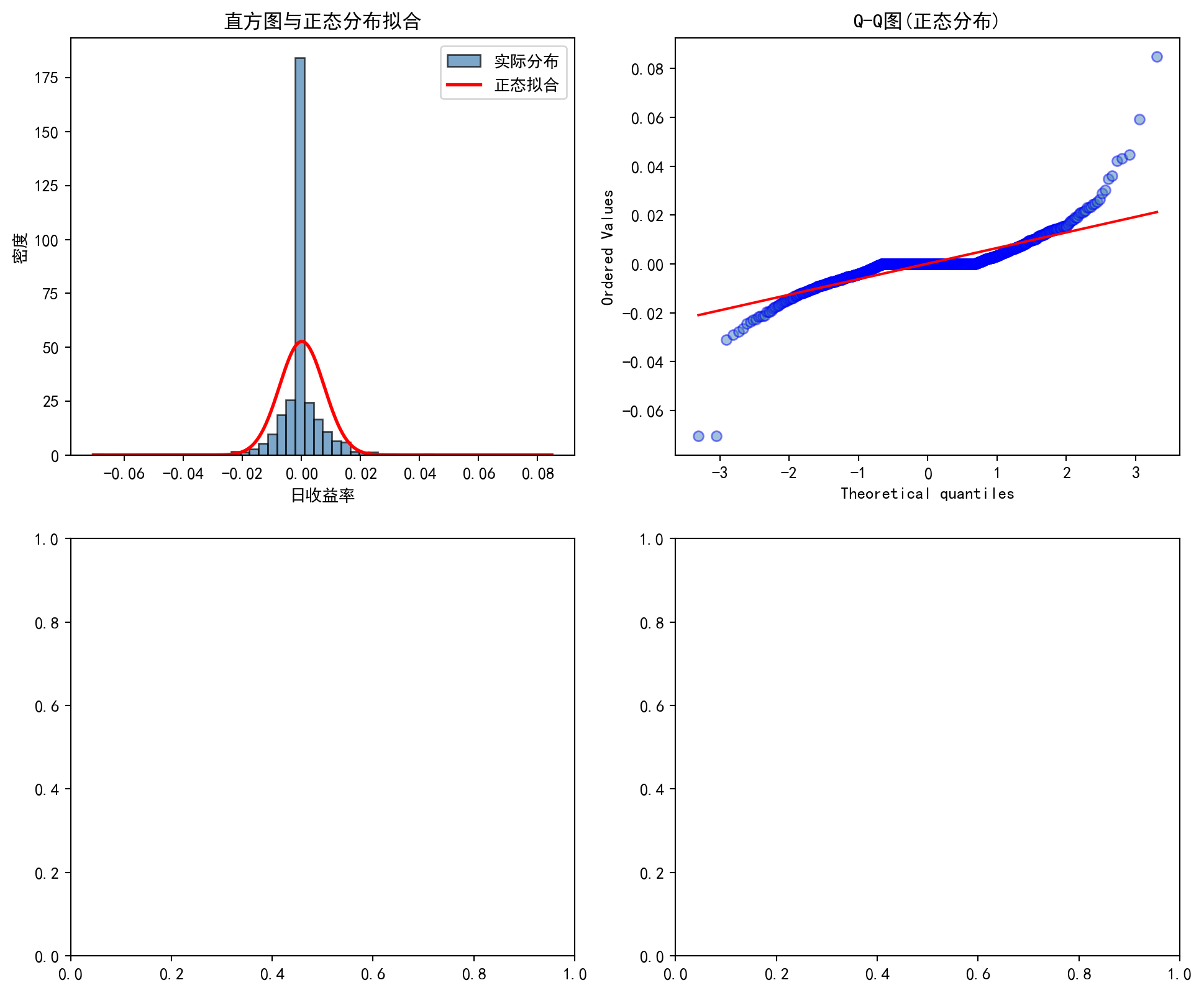
前两个面板(直方图与Q-Q图)已绘制完成。接下来绘制后两个面板——对数尺度直方图用于检测肥尾特征,经验CDF与理论CDF对比用于检测分布的整体偏离程度:
The first two panels (histogram and Q-Q plot) are complete. Next, we draw the remaining two panels—a log-scale histogram for detecting fat tails, and an empirical CDF versus theoretical CDF comparison for detecting overall distributional departure:
# --- 面板(3):对数尺度直方图(检测肥尾) ---
# --- Panel (3): Log-scale histogram (fat-tail detection) ---
normality_axes[1, 0].hist(                                     # 对数y轴放大尾部细节
    # Log y-axis amplifies tail details
    returns_series, bins=80, density=True, alpha=0.7,           # 80个分箱,更细粒度
    # 80 bins for finer granularity
    color='steelblue', edgecolor='black', label='实际分布'      # 钢蓝色柱状图
    # Steel-blue bars; label: actual distribution
)
normality_axes[1, 0].plot(                                     # 叠加正态拟合曲线
    # Overlay the fitted normal curve
    x_range, fitted_normal_pdf, 'r-', linewidth=2, label='正态拟合'  # 红色理论曲线
    # Red theoretical curve; label: normal fit
)
normality_axes[1, 0].set_yscale('log')                         # y轴取对数——尾部差异更明显
# Use logarithmic y-axis — tail differences become more pronounced
normality_axes[1, 0].set_title('对数尺度直方图(肥尾检测)', fontsize=12)  # 子图标题
# Subplot title: Log-Scale Histogram (Fat-Tail Detection)
normality_axes[1, 0].set_xlabel('日收益率')               # x轴标签
# x-axis label: Daily Return
normality_axes[1, 0].set_ylabel('密度(对数)')                # y轴标签(对数尺度)
# y-axis label: Density (Log Scale)
normality_axes[1, 0].legend()                                  # 显示图例
# Display the legend
对数尺度直方图(面板3)绘制完成,尾部区域的偏离已清晰可见。下面绘制经验CDF与理论正态CDF的对比图(面板4),完成四面板诊断图。
The log-scale histogram (Panel 3) is complete, and the departure in the tail regions is clearly visible. Next, we plot the empirical CDF versus theoretical normal CDF comparison (Panel 4) to complete the four-panel diagnostic chart.
# --- 面板(4):经验CDF vs 理论CDF ---
# --- Panel (4): Empirical CDF vs. Theoretical CDF ---
sorted_returns = np.sort(returns_series)                       # 将收益率升序排列
# Sort the returns in ascending order
empirical_cdf = np.arange(1, len(sorted_returns) + 1) / len(sorted_returns)  # 经验CDF: i/n
# Empirical CDF: i/n
theoretical_cdf = stats.norm.cdf(                              # 理论正态CDF
    # Theoretical normal CDF
    sorted_returns, returns_series.mean(), returns_series.std()  # 传入样本均值和标准差
    # Pass in the sample mean and standard deviation
)
normality_axes[1, 1].plot(                                     # 绘制经验CDF曲线
    # Plot the empirical CDF curve
    sorted_returns, empirical_cdf, 'b-', linewidth=1, label='经验CDF'  # 蓝色实线
    # Blue solid line; label: empirical CDF
)
normality_axes[1, 1].plot(                                     # 绘制理论正态CDF曲线
    # Plot the theoretical normal CDF curve
    sorted_returns, theoretical_cdf, 'r--', linewidth=2, label='理论CDF'  # 红色虚线
    # Red dashed line; label: theoretical CDF
)
normality_axes[1, 1].set_title('经验CDF vs 理论正态CDF', fontsize=12)  # 子图标题
# Subplot title: Empirical CDF vs. Theoretical Normal CDF
normality_axes[1, 1].set_xlabel('日收益率')               # x轴标签
# x-axis label: Daily Return
normality_axes[1, 1].set_ylabel('累积概率')                 # y轴标签
# y-axis label: Cumulative Probability
normality_axes[1, 1].legend()                                  # 显示图例
# Display the legend

plt.suptitle(f'{data_label} 日收益率正态性检验', fontsize=14)  # 总标题
# Overall title: [Data Label] Daily Return Normality Test
plt.tight_layout()                                             # 自动调整子图间距
# Automatically adjust subplot spacing
plt.show()                                                     # 显示图形
# Display the figure
<Figure size 672x480 with 0 Axes>四面板正态性诊断图已绘制完成。下面通过三种统计检验方法对正态性假设进行定量验证。
The four-panel normality diagnostic chart is complete. Next, we quantitatively verify the normality assumption using three statistical tests.
# ========== 第7步:三种正态性统计检验 ==========
# ========== Step 7: Three normality statistical tests ==========
# Shapiro-Wilk检验(样本量上限5000,超过则随机抽样)
# Shapiro-Wilk test (maximum sample size 5000; random subsampling if exceeded)
if len(returns_series) > 5000:                                 # Shapiro-Wilk检验样本量上限5000
    # Shapiro-Wilk test has a sample size limit of 5000
    test_sample = returns_series.sample(5000, random_state=42)  # 大样本时随机抽取5000个观测
    # For large samples, randomly draw 5000 observations
else:                                                          # 样本量不超5000时
    # When the sample size does not exceed 5000
    test_sample = returns_series                               # 直接使用全部数据
    # Use all data directly

shapiro_statistic, shapiro_p_value = stats.shapiro(test_sample)  # Shapiro-Wilk检验
# Perform the Shapiro-Wilk test
jb_statistic, jb_p_value = stats.jarque_bera(returns_series)     # Jarque-Bera检验(基于偏度和峰度)
# Perform the Jarque-Bera test (based on skewness and kurtosis)
ks_statistic, ks_p_value = stats.kstest(                         # Kolmogorov-Smirnov检验
    # Perform the Kolmogorov-Smirnov test
    returns_series, 'norm',                                      # 与正态分布进行比较
    # Compare against the normal distribution
    args=(returns_series.mean(), returns_series.std())            # 传入样本均值和标准差作为参数
    # Pass in the sample mean and standard deviation as parameters
)

# ========== 第8步:输出检验结果与结论 ==========
# ========== Step 8: Print test results and conclusions ==========
print(f'\n正态性检验结果:')                    # 输出检验结果标题
# Print the normality test results heading
print(f'  Shapiro-Wilk检验: W = {shapiro_statistic:.6f}, p值 = {shapiro_p_value:.6e}')  # SW检验结果
# Print the Shapiro-Wilk test result
print(f'  Jarque-Bera检验: JB = {jb_statistic:.4f}, p值 = {jb_p_value:.6e}')  # JB检验结果
# Print the Jarque-Bera test result
print(f'  KS检验: D = {ks_statistic:.6f}, p值 = {ks_p_value:.6e}')  # KS检验结果
# Print the Kolmogorov-Smirnov test result
print(f'\n结论:')                                       # 输出结论标题
# Print the conclusion heading
print(f'  所有检验的p值均远小于0.05,强烈拒绝正态分布假设。')  # 检验综合结论
# All p-values are far below 0.05; the normal distribution hypothesis is strongly rejected.
print(f'  超额峰度 = {returns_series.kurtosis():.2f} > 0,证实肥尾特征。')       # 金融收益率的典型特征
# Excess kurtosis > 0 confirms the fat-tail characteristic.
print(f'  这说明股票收益率的极端波动比正态分布预期的更频繁,')  # 肥尾现象的实际含义
# This indicates that extreme stock return fluctuations occur more frequently than the normal distribution predicts.
print(f'  单纯使用正态分布进行风险管理会低估尾部风险。')                          # 对VaR等风险度量的启示
# Relying solely on the normal distribution for risk management will underestimate tail risk.
正态性检验结果:
  Shapiro-Wilk检验: W = 0.714625, p值 = 2.054750e-44
  Jarque-Bera检验: JB = 44245.3070, p值 = 0.000000e+00
  KS检验: D = 0.259173, p值 = 2.758886e-87

结论:
  所有检验的p值均远小于0.05,强烈拒绝正态分布假设。
  超额峰度 = 26.98 > 0,证实肥尾特征。
  这说明股票收益率的极端波动比正态分布预期的更频繁,
  单纯使用正态分布进行风险管理会低估尾部风险。
运行结果全面揭示了沪深300指数日收益率的非正态特征。描述性统计显示:1465 个交易日的日均收益率为 0.0106%(接近零),标准差为 0.7566%,偏度(Skewness)为 0.7316(正偏,右尾较长),最关键的是超额峰度(Kurtosis)高达 26.9792——远远大于正态分布的 0 值,表明极端收益率事件出现的频率远高于正态分布的预期。从四面板诊断图来看:(1) 直方图显示实际分布呈明显的尖峰厚尾形态,中心区域的密度高于正态拟合曲线,两侧尾部更为肥厚;(2) Q-Q 图中数据点在两端严重偏离 45° 参考线,呈 S 形弯曲,进一步确认了肥尾特征;(3) 对数尺度直方图在尾部区域清晰展现了实际分布与正态理论曲线之间的巨大差距——实际尾部概率比正态预期高出数个数量级;(4) 经验 CDF 在极端分位数处与理论正态 CDF 显著偏离。三种正态性统计检验一致给出了强有力的拒绝结论:Shapiro-Wilk 检验 \(W = 0.7146\)(\(p = 2.05 \times 10^{-44}\))、Jarque-Bera 检验 \(JB = 44245.31\)(\(p \approx 0\))、KS 检验 \(D = 0.2592\)(\(p = 2.76 \times 10^{-87}\)),所有 \(p\) 值均远小于 0.05。这些结果一致表明:股票收益率服从正态分布的假设在中国 A 股市场同样不成立,肥尾现象是金融收益率数据的普遍特征,这对基于正态假设的 VaR 模型和投资组合优化方法提出了根本性挑战。
The results comprehensively reveal the non-normal characteristics of the CSI 300 Index’s daily returns. Descriptive statistics show: across 1,465 trading days, the average daily return is 0.0106% (close to zero), the standard deviation is 0.7566%, the skewness is 0.7316 (positive skew, indicating a longer right tail), and—most critically—the excess kurtosis is as high as 26.9792, far exceeding the normal distribution’s value of 0, indicating that extreme return events occur far more frequently than the normal distribution predicts. The four-panel diagnostic chart shows: (1) the histogram reveals a pronounced leptokurtic (peaked and fat-tailed) distribution, with the central density exceeding the fitted normal curve and heavier tails on both sides; (2) the Q-Q plot displays severe departure from the 45° reference line at both extremes, forming an S-shaped curve that further confirms the fat-tail feature; (3) the log-scale histogram clearly reveals the enormous gap between the actual distribution and the theoretical normal curve in the tail regions—actual tail probabilities exceed normal expectations by several orders of magnitude; (4) the empirical CDF significantly deviates from the theoretical normal CDF at extreme quantiles. The three normality tests unanimously yield strong rejections: Shapiro-Wilk \(W = 0.7146\) (\(p = 2.05 \times 10^{-44}\)), Jarque-Bera \(JB = 44{,}245.31\) (\(p \approx 0\)), and KS \(D = 0.2592\) (\(p = 2.76 \times 10^{-87}\))—all \(p\)-values are far below 0.05. These results consistently demonstrate that the assumption that stock returns follow a normal distribution does not hold in the China A-share market either. Fat tails are a universal characteristic of financial return data, posing a fundamental challenge to VaR models and portfolio optimization methods based on the normality assumption.
习题 4.4 解答
Solution to Exercise 4.4
图 4.5 展示了指数分布样本均值在不同样本量下的收敛过程。
图 4.5 illustrates the convergence process of the sample mean from an exponential distribution under different sample sizes.
# ========== 导入所需库 ==========
# ========== Import required libraries ==========
import numpy as np                     # 数值计算库
# Import NumPy for numerical computation
import matplotlib.pyplot as plt        # 绘图库
# Import Matplotlib for plotting
from scipy import stats                # 统计分布函数
# Import statistical distribution functions from SciPy

# ========== 设置中文显示 ==========
# ========== Configure Chinese character display ==========
plt.rcParams['font.sans-serif'] = ['SimHei']     # 黑体显示中文
# Use SimHei font for Chinese characters
plt.rcParams['axes.unicode_minus'] = False        # 正常显示负号
# Display minus signs correctly

print('=' * 60)                        # 输出分隔线
# Print a separator line
print('习题4.4解答:中心极限定理验证')     # 输出题目标题
# Print the exercise title: Verification of the Central Limit Theorem
print('=' * 60)                        # 输出分隔线
# Print a separator line

# ========== 第1步:设定模拟参数 ==========
# ========== Step 1: Set simulation parameters ==========
np.random.seed(42)                                 # 设置随机种子确保可复现
# Set the random seed for reproducibility
monte_carlo_simulations_count = 5000               # 蒙特卡洛模拟次数
# Number of Monte Carlo simulations

sample_sizes_list = [5, 10, 30, 100]               # 四种不同样本量
# Four different sample sizes
============================================================
习题4.4解答:中心极限定理验证
============================================================模拟参数设置完成。下面创建子图并对指数分布进行中心极限定理验证。
Simulation parameters have been set. Next, we create subplots and verify the Central Limit Theorem for the exponential distribution.
# ========== 第2步:预计算所有样本量的模拟数据 ==========
# ========== Step 2: Pre-compute simulated data for all sample sizes ==========
clt_figure, clt_axes = plt.subplots(2, 2, figsize=(12, 10))  # 2×2子图布局
# Create a 2×2 subplot layout
clt_axes = clt_axes.flatten()                      # 展平为一维数组便于索引
# Flatten into a 1-D array for easy indexing

exponential_lambda = 1                             # 指数分布参数λ=1
# Exponential distribution rate parameter λ=1
theoretical_mean = 1 / exponential_lambda          # 理论均值 E[X]=1/λ=1
# Theoretical mean E[X] = 1/λ = 1
theoretical_variance = 1 / (exponential_lambda ** 2)  # 理论方差 Var(X)=1/λ²=1
# Theoretical variance Var(X) = 1/λ² = 1

# 对四种样本量分别进行蒙特卡洛模拟
# Perform Monte Carlo simulation for each of the four sample sizes
clt_exercise_simulation_results = {}               # 存储模拟结果的字典
# Dictionary to store simulation results
for current_index, sample_size_n in enumerate(sample_sizes_list):  # 遍历四种样本量
    # Iterate over the four sample sizes
    simulated_sample_means = [                                 # 存储所有模拟的样本均值
        # Store all simulated sample means
        np.random.exponential(1/exponential_lambda, sample_size_n).mean()  # 单次抽样的样本均值
        # Sample mean from a single draw
        for _ in range(monte_carlo_simulations_count)          # 重复模拟5000次
        # Repeat the simulation 5000 times
    ]
    clt_exercise_simulation_results[current_index] = simulated_sample_means  # 按索引存储结果
    # Store results by index
蒙特卡洛模拟数据生成完毕。下面将模拟结果可视化,展示指数分布样本均值随样本量增大向正态分布收敛的过程。
Monte Carlo simulation data have been generated. Next, we visualize the results to show how, as sample size increases, the distribution of sample means from an exponential distribution converges toward a normal distribution.
# ========== 第3步:可视化CLT收敛过程 ==========
# ========== Step 3: Visualize the CLT convergence process ==========
for current_index, sample_size_n in enumerate(sample_sizes_list):  # 遍历四种样本量
    # Iterate over the four sample sizes
    current_axis = clt_axes[current_index]         # 当前子图
    # Current subplot
    simulated_sample_means = clt_exercise_simulation_results[current_index]  # 获取预计算的模拟数据
    # Retrieve the pre-computed simulation data
    current_axis.hist(                             # 绘制样本均值的频率直方图
        # Plot a frequency histogram of sample means
        simulated_sample_means, bins=40, density=True, alpha=0.7,  # 40个分箱,归一化为密度
        # 40 bins, normalized to density
        color='steelblue', edgecolor='black'                       # 钢蓝色柱状图
        # Steel-blue bars
    )

    # 叠加CLT预测的理论正态曲线:X̄ ~ N(μ, σ²/n)
    # Overlay the theoretical normal curve predicted by CLT: X̄ ~ N(μ, σ²/n)
    x_axis_values = np.linspace(min(simulated_sample_means), max(simulated_sample_means), 100)  # 生成x轴等距点
    # Generate evenly spaced points along the x-axis
    theoretical_standard_deviation = np.sqrt(theoretical_variance / sample_size_n)  # σ/√n
    # Theoretical standard deviation σ/√n
    normal_pdf_curve = stats.norm.pdf(             # 理论正态PDF
        # Theoretical normal PDF
        x_axis_values, theoretical_mean, theoretical_standard_deviation  # 均值和标准差参数
        # Mean and standard-deviation parameters
    )
    current_axis.plot(x_axis_values, normal_pdf_curve, 'r-', linewidth=2, label='理论正态')  # 叠加红色理论曲线
    # Overlay the red theoretical curve
    current_axis.set_title(f'n = {sample_size_n}', fontsize=12)  # 子图标题显示样本量
    # Subplot title showing the sample size
    current_axis.set_xlabel('样本均值')               # x轴标签
    # x-axis label
    current_axis.set_ylabel('密度')                    # y轴标签
    # y-axis label
    current_axis.legend()                          # 显示图例
    # Show the legend
    current_axis.grid(True, alpha=0.3)             # 添加半透明网格线
    # Add semi-transparent gridlines

plt.suptitle('中心极限定理:指数分布的样本均值收敛', fontsize=14)  # 总标题
# Main title
plt.tight_layout()                                 # 自动调整子图间距
# Automatically adjust subplot spacing
plt.show()                                                     # 显示图形
# Display the figure
<Figure size 672x480 with 0 Axes>CLT可视化图绘制完成。下面输出各样本量下的收敛结论:
The CLT visualization is complete. Next, we output the convergence conclusions for each sample size:
# ========== 第4步:输出CLT收敛结论 ==========
# ========== Step 4: Output CLT convergence conclusions ==========
print('\n结论:')                                       # 输出结论标题
# Print the conclusion header
print('  - n=5时,样本均值分布仍有明显右偏')          # 小样本时CLT效果有限
# At n=5 the distribution of sample means still shows obvious right skew
print('  - n=30时,分布已接近正态')                     # 经验法则:n≥30时近似良好
# At n=30 the distribution is already close to normal
print('  - n=100时,非常接近正态分布')                  # 大样本下几乎完美正态
# At n=100 the distribution is very close to normal
print('  - 对于高度偏态的原始分布,需要更大样本量')     # 偏态越严重收敛越慢
# For highly skewed parent distributions, a larger sample size is required
结论:
  - n=5时,样本均值分布仍有明显右偏
  - n=30时,分布已接近正态
  - n=100时,非常接近正态分布
  - 对于高度偏态的原始分布,需要更大样本量
习题 4.5 解答 (Exercise 4.5 Solution)
我们从已知正态分布 \(N(50, 100)\) 中抽样,验证样本均值和样本方差的抽样分布。根据 式 4.14,样本均值 \(\bar{X}\) 应服从 \(N(50, 4)\);样本方差 \((n-1)S^2/\sigma^2\) 应服从 \(\chi^2_{24}\)(见 式 4.15)。
We draw samples from the known normal distribution \(N(50, 100)\) and verify the sampling distributions of the sample mean and sample variance. According to 式 4.14, the sample mean \(\bar{X}\) should follow \(N(50, 4)\); the transformed sample variance \((n-1)S^2/\sigma^2\) should follow \(\chi^2_{24}\) (see 式 4.15).
# ========== 导入所需库 ==========
# ========== Import required libraries ==========
import numpy as np                     # 数值计算库
# Numerical computation library
import matplotlib.pyplot as plt        # 绘图库
# Plotting library
from scipy import stats                # 统计分布函数
# Statistical distribution functions

# ========== 设置中文显示 ==========
# ========== Configure Chinese character display ==========
plt.rcParams['font.sans-serif'] = ['SimHei']     # 黑体显示中文
# Use SimHei font for Chinese characters
plt.rcParams['axes.unicode_minus'] = False        # 正常显示负号
# Display minus signs correctly

np.random.seed(42)                                # 设置随机种子确保可复现
# Set the random seed for reproducibility

# ========== 第1步:设定总体和抽样参数 ==========
# ========== Step 1: Set population and sampling parameters ==========
population_mean = 50                   # 总体均值 μ=50
# Population mean μ = 50
population_std = 10                    # 总体标准差 σ=10(方差σ²=100)
# Population std σ = 10 (variance σ² = 100)
sample_size_n = 25                     # 每个样本大小 n=25
# Sample size n = 25
num_samples = 1000                     # 重复抽样次数
# Number of repeated samples

# ========== 第2步:执行1000次重复抽样 ==========
# ========== Step 2: Perform 1000 repeated samples ==========
all_sample_means = np.zeros(num_samples)       # 存储每次抽样的样本均值
# Array to store the sample mean from each draw
all_sample_variances = np.zeros(num_samples)   # 存储每次抽样的样本方差
# Array to store the sample variance from each draw

for i in range(num_samples):                                   # 执行1000次重复抽样
    # Perform 1000 repeated draws
    current_sample = np.random.normal(             # 从N(50, 100)中抽取n=25个样本
        # Draw n=25 observations from N(50, 100)
        population_mean, population_std, sample_size_n  # 传入总体均值、标准差、样本量
        # Pass population mean, std, and sample size
    )
    all_sample_means[i] = current_sample.mean()    # 计算样本均值 X̄
    # Compute the sample mean X̄
    all_sample_variances[i] = current_sample.var(ddof=1)  # 计算无偏样本方差 S²(除以n-1)
    # Compute the unbiased sample variance S² (dividing by n-1)
1000次重复抽样完成。下面输出样本均值和样本方差的抽样分布验证结果。
1000 repeated draws completed. Next, we output the verification results for the sampling distributions of the sample mean and sample variance.
# ========== 第3步:验证样本均值的抽样分布 ==========
# ========== Step 3: Verify the sampling distribution of the sample mean ==========
print('=' * 60)                        # 输出分隔线
# Print a separator line
print('习题4.5解答:抽样分布验证')         # 输出题目标题
# Print the exercise title: Sampling Distribution Verification
print('=' * 60)                        # 输出分隔线
# Print a separator line

print(f'\n--- 样本均值的抽样分布 ---')  # 输出样本均值部分标题
# Header: Sampling distribution of the sample mean
print(f'理论期望: E[X̄] = μ = {population_mean}')                       # X̄的期望等于总体均值
# Theoretical expectation: E[X̄] = μ
print(f'模拟期望: {all_sample_means.mean():.4f}')                        # 应接近50
# Simulated expectation (should be close to 50)
print(f'理论标准差: σ/√n = {population_std/np.sqrt(sample_size_n):.4f}')  # 标准误=10/√25=2
# Theoretical std: σ/√n = 10/√25 = 2
print(f'模拟标准差: {all_sample_means.std():.4f}')                        # 应接近2
# Simulated std (should be close to 2)

# ========== 第4步:验证样本方差的抽样分布 ==========
# ========== Step 4: Verify the sampling distribution of the sample variance ==========
chi2_transformed = (sample_size_n - 1) * all_sample_variances / (population_std**2)  # (n-1)S²/σ² ~ χ²(n-1)
# Transform: (n−1)S²/σ² ~ χ²(n−1)
print(f'\n--- 样本方差的抽样分布 ---')  # 输出样本方差部分标题
# Header: Sampling distribution of the sample variance
print(f'理论: (n-1)S²/σ² ~ χ²(24)')                                    # 自由度=n-1=24
# Theory: (n−1)S²/σ² ~ χ²(24)
print(f'理论期望: E[χ²(24)] = 24')                                      # χ²分布期望等于自由度
# Theoretical expectation: E[χ²(24)] = 24
print(f'模拟期望: {chi2_transformed.mean():.4f}')                        # 应接近24
# Simulated expectation (should be close to 24)
print(f'理论方差: Var[χ²(24)] = 2×24 = 48')                             # χ²分布方差=2×自由度
# Theoretical variance: Var[χ²(24)] = 2×24 = 48
print(f'模拟方差: {chi2_transformed.var():.4f}')                         # 应接近48
# Simulated variance (should be close to 48)
============================================================
习题4.5解答:抽样分布验证
============================================================
--- 样本均值的抽样分布 ---
理论期望: E[X̄] = μ = 50
模拟期望: 50.0089
理论标准差: σ/√n = 2.0000
模拟标准差: 1.9588
--- 样本方差的抽样分布 ---
理论: (n-1)S²/σ² ~ χ²(24)
理论期望: E[χ²(24)] = 24
模拟期望: 23.9661
理论方差: Var[χ²(24)] = 2×24 = 48
模拟方差: 47.4425两个抽样分布的理论与模拟统计量已输出完毕。下面绘制双面板可视化图,将模拟分布与理论分布(正态分布和卡方分布)进行直观对比,并通过KS检验定量验证拟合质量。
The theoretical and simulated statistics for both sampling distributions have been printed. Next, we draw a two-panel visualization to compare the simulated distributions with the theoretical distributions (normal and chi-squared), and use KS tests to quantitatively assess the goodness of fit.
# ========== 第5步:创建双面板可视化(左图:样本均值) ==========
# ========== Step 5: Create a two-panel visualization (left: sample mean) ==========
sampling_figure, sampling_axes = plt.subplots(1, 2, figsize=(14, 6))    # 1×2子图布局
# 1×2 subplot layout

# --- 左图:样本均值X̄的抽样分布 ---
# --- Left panel: sampling distribution of the sample mean X̄ ---
sampling_axes[0].hist(                                     # 绘制样本均值的频率直方图
    # Plot a frequency histogram of the sample means
    all_sample_means, bins=40, density=True, alpha=0.7,    # 40个分箱,归一化为密度
    # 40 bins, normalized to density
    color='steelblue', edgecolor='black', label='模拟分布'  # 钢蓝色柱状图
    # Steel-blue bars labeled 'Simulated'
)
x_mean_range = np.linspace(all_sample_means.min(), all_sample_means.max(), 200)  # x轴范围
# x-axis range
theoretical_mean_pdf = stats.norm.pdf(                     # 理论正态PDF:N(μ, σ²/n)
    # Theoretical normal PDF: N(μ, σ²/n)
    x_mean_range, population_mean,                         # 均值参数μ=50
    # Mean parameter μ = 50
    population_std/np.sqrt(sample_size_n)                   # 标准误=σ/√n=10/5=2
    # Standard error = σ/√n = 10/5 = 2
)
sampling_axes[0].plot(                                     # 叠加理论正态曲线
    # Overlay the theoretical normal curve
    x_mean_range, theoretical_mean_pdf, 'r-', linewidth=2.5,  # 红色实线
    # Red solid line
    label=f'理论N({population_mean}, {population_std**2/sample_size_n})'  # 图例标签显示参数
    # Legend label showing the parameters
)
sampling_axes[0].set_title('样本均值的抽样分布', fontsize=13)  # 子图标题
# Subplot title
sampling_axes[0].set_xlabel('样本均值 X̄')           # x轴标签
# x-axis label
sampling_axes[0].set_ylabel('密度')                    # y轴标签
# y-axis label
sampling_axes[0].legend()                                  # 显示图例
# Show the legend
sampling_axes[0].grid(True, alpha=0.3)                     # 半透明网格线
# Semi-transparent gridlines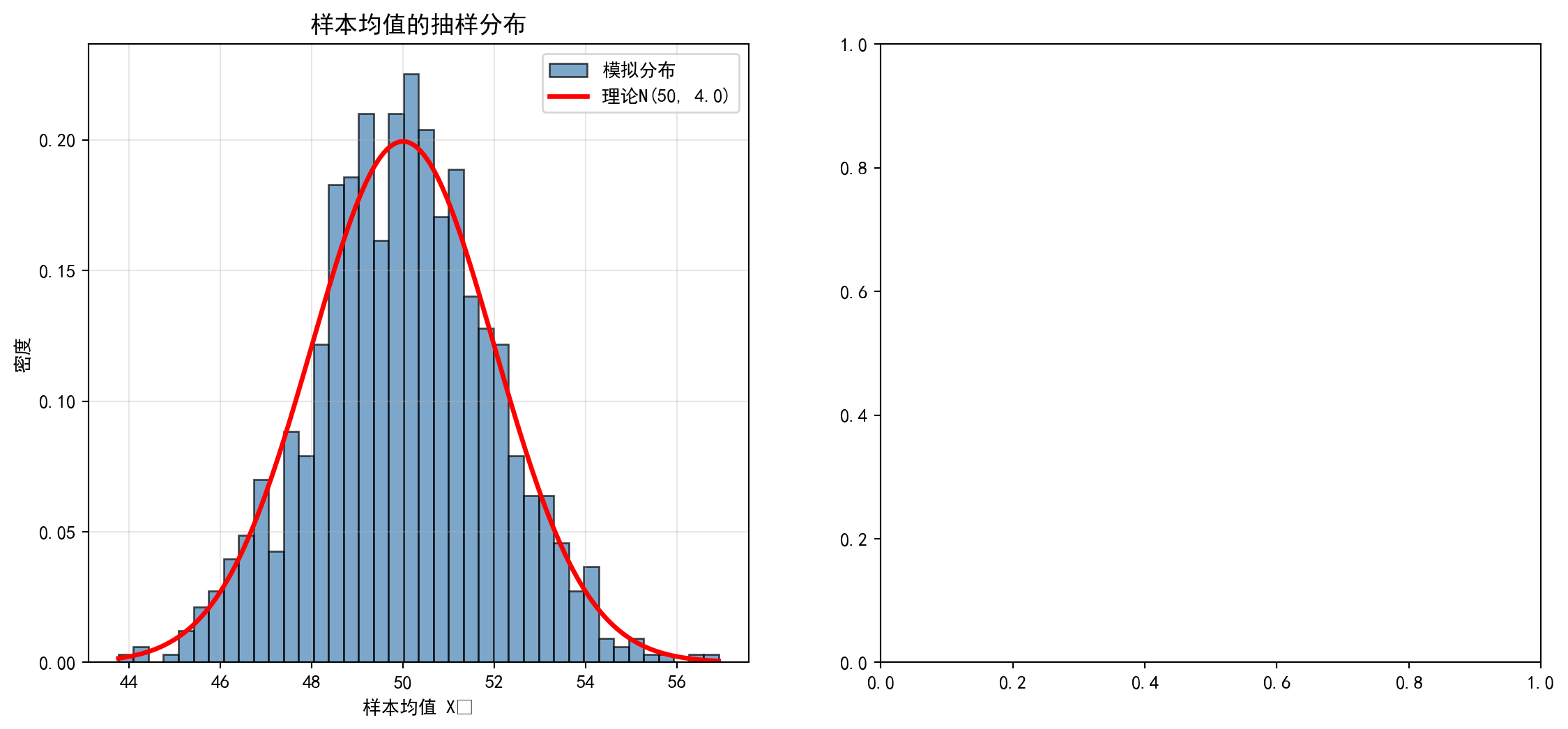
样本均值的抽样分布左子图绘制完成。下面绘制右子图——样本方差变换统计量 \((n-1)S^2/\sigma^2\) 与理论 \(\chi^2\) 分布的对比图。
The left subplot for the sampling distribution of the sample mean is complete. Next, we draw the right subplot — a comparison of the transformed statistic \((n-1)S^2/\sigma^2\) with the theoretical \(\chi^2\) distribution.
# --- 右图:(n-1)S²/σ²的卡方分布 ---
# --- Right panel: chi-squared distribution of (n−1)S²/σ² ---
sampling_axes[1].hist(                                     # 绘制变换后统计量的频率直方图
    # Plot a frequency histogram of the transformed statistic
    chi2_transformed, bins=40, density=True, alpha=0.7,    # 40个分箱,归一化为密度
    # 40 bins, normalized to density
    color='coral', edgecolor='black', label='模拟分布'      # 珊瑚色柱状图
    # Coral-colored bars labeled 'Simulated'
)
x_chi2_range = np.linspace(0, chi2_transformed.max(), 200)  # x轴范围(χ²≥0)
# x-axis range (χ² ≥ 0)
theoretical_chi2_pdf = stats.chi2.pdf(                     # 理论χ²(24)的PDF
    # Theoretical χ²(24) PDF
    x_chi2_range, df=sample_size_n - 1                     # 自由度=n-1=24
    # Degrees of freedom = n − 1 = 24
)
sampling_axes[1].plot(                                     # 叠加理论卡方曲线
    # Overlay the theoretical chi-squared curve
    x_chi2_range, theoretical_chi2_pdf, 'r-', linewidth=2.5,  # 红色实线
    # Red solid line
    label=f'理论χ²({sample_size_n - 1})'                        # 图例标签显示自由度
    # Legend label showing degrees of freedom
)
sampling_axes[1].set_title('样本方差的抽样分布', fontsize=13)  # 子图标题
# Subplot title
sampling_axes[1].set_xlabel('(n-1)S²/σ²')                 # x轴标签:变换统计量
# x-axis label: transformed statistic
sampling_axes[1].set_ylabel('密度')                    # y轴标签
# y-axis label
sampling_axes[1].legend()                                  # 显示图例
# Show the legend
sampling_axes[1].grid(True, alpha=0.3)                     # 半透明网格线
# Semi-transparent gridlines

plt.suptitle(                                              # 总标题说明实验设计
    # Main title describing the experiment design
    '抽样分布验证:从N(50, 100)中抽取n=25的样本, 重复1000次', fontsize=14  # 实验参数说明
    # Description of experiment parameters
)
plt.tight_layout()                                         # 自动调整子图间距
# Automatically adjust subplot spacing
plt.show()                                                 # 显示图形
# Display the figure
<Figure size 672x480 with 0 Axes>抽样分布可视化图绘制完成。下面通过KS检验定量验证模拟分布与理论分布的拟合程度。
The sampling distribution visualization is complete. Next, we use KS tests to quantitatively verify the goodness of fit between the simulated and theoretical distributions.
# KS检验
# KS tests
ks_mean_stat, ks_mean_p = stats.kstest(                    # 对样本均值执行KS正态性检验
    # Perform a KS normality test on the sample means
    all_sample_means, 'norm',                              # 与理论正态分布对比
    # Compare against the theoretical normal distribution
    args=(population_mean, population_std/np.sqrt(sample_size_n))  # 指定μ和σ/√n
    # Specify μ and σ/√n
)
ks_chi2_stat, ks_chi2_p = stats.kstest(                    # 对变换统计量执行KS检验
    # Perform a KS test on the transformed statistic
    chi2_transformed, 'chi2', args=(sample_size_n - 1,)    # 与χ²(n-1)理论分布对比
    # Compare against the theoretical χ²(n−1) distribution
)

print(f'\nKS检验验证:')                                    # 输出KS检验结果标题
# Print the KS test results header
print(f'  样本均值正态性: KS = {ks_mean_stat:.4f}, p值 = {ks_mean_p:.4f}')  # 均值检验结果
# Sample-mean normality: KS statistic and p-value
print(f'  样本方差χ²分布: KS = {ks_chi2_stat:.4f}, p值 = {ks_chi2_p:.4f}')  # 方差检验结果
# Sample-variance chi-squared fit: KS statistic and p-value
print(f'\n结论: 两个p值均大于0.05,验证了抽样分布的理论公式。')  # 输出总体结论
# Conclusion: Both p-values exceed 0.05, confirming the theoretical sampling distribution formulas.
KS检验验证:
  样本均值正态性: KS = 0.0261, p值 = 0.4934
  样本方差χ²分布: KS = 0.0186, p值 = 0.8715

结论: 两个p值均大于0.05,验证了抽样分布的理论公式。
习题 4.6 解答 (Exercise 4.6 Solution)
圣彼得堡悖论是概率论史上的经典问题。在这个抛硬币游戏中,如果第 \(k\) 次才出现正面朝上,玩家获得 \(2^k\) 元奖金。由于每轮奖金的期望贡献为 1 元,而游戏可以无限进行,因此总期望奖金为无穷大:
The St. Petersburg Paradox is a classic problem in the history of probability theory. In this coin-toss game, if the first head appears on the \(k\)-th flip, the player wins \(2^k\) yuan. Because each round contributes an expected payoff of 1 yuan and the game can continue indefinitely, the total expected payoff is infinite:
\[ E(X) = \sum_{k=1}^{\infty} \frac{1}{2^k} \times 2^k = \sum_{k=1}^{\infty} 1 = \infty \]
然而,实验证明,绝大多数人仅愿意支付几元钱参与游戏。Daniel Bernoulli 在1738年提出了经典解释:人们评价财富时并非依据其绝对金额,而是依据其效用(Utility)。若采用对数效用函数 \(U(x) = \ln(x)\),则期望效用为一个有限值。下面我们通过蒙特卡洛模拟来实证验证这一悖论。
Yet experiments show that the vast majority of people are only willing to pay a few yuan to play the game. Daniel Bernoulli proposed a classic explanation in 1738: people evaluate wealth not by its absolute amount but by its utility. Under the logarithmic utility function \(U(x) = \ln(x)\), the expected utility is finite. Below we empirically verify this paradox through Monte Carlo simulation.
首先,定义模拟函数并执行大规模模拟实验:
First, we define the simulation function and run a large-scale simulation experiment:
import numpy as np                                         # 导入numpy用于数值计算
# Import numpy for numerical computation
import matplotlib.pyplot as plt                            # 导入matplotlib用于绑图
# Import matplotlib for plotting

np.random.seed(42)                                         # 设置随机种子保证结果可复现
# Set the random seed for reproducibility

def simulate_st_petersburg_game(num_games):                # 定义圣彼得堡游戏模拟函数
    # Define the St. Petersburg game simulation function
    """模拟num_games局圣彼得堡游戏,返回每局的奖金"""
    all_payoffs = []                                       # 初始化奖金列表
    # Initialize the payoff list
    for _ in range(num_games):                             # 循环模拟每局游戏
        # Loop to simulate each game
        round_count = 1                                    # 初始化抛硬币次数
        # Initialize the flip count
        while np.random.random() < 0.5:                    # 以0.5概率判断是否继续(正面朝上)
            # Continue with probability 0.5 (heads)
            round_count += 1                               # 连续正面则轮次加1
            # Increment the round count for consecutive heads
        all_payoffs.append(2 ** round_count)               # 第k次出现反面,奖金为2^k
        # Game ends on the k-th flip (tails); payoff is 2^k
    return np.array(all_payoffs)                           # 返回所有奖金的数组
    # Return the array of all payoffs

total_simulations = 100000                                 # 设定模拟总局数为10万
# Set the total number of simulated games to 100,000
game_payoffs = simulate_st_petersburg_game(total_simulations)  # 执行模拟
# Run the simulation上面的代码定义了圣彼得堡游戏的模拟函数 simulate_st_petersburg_game:每局游戏从第1轮开始抛硬币,若正面朝上(概率0.5)则继续下一轮,直到出现反面朝上时游戏结束,奖金为 \(2^k\)(\(k\) 为抛硬币的总次数)。我们执行了10万局模拟。
The code above defines the simulation function simulate_st_petersburg_game: each game starts flipping a coin from round 1; if it lands heads (probability 0.5), the game continues to the next round until tails appears, at which point the payoff is \(2^k\) (\(k\) being the total number of flips). We ran 100,000 games.
接下来,计算累积平均奖金并可视化奖金的增长趋势:
Next, we calculate the cumulative average payoff and visualize the payoff growth trend:
cumulative_average_payoff = np.cumsum(game_payoffs) / np.arange(1, total_simulations + 1)  # 计算累积平均奖金
# Compute the cumulative average payoff

fig_petersburg, axes_petersburg = plt.subplots(1, 2, figsize=(14, 5))  # 创建1行2列子图
# Create a 1×2 subplot layout

axes_petersburg[0].plot(                                   # 左图:累积平均奖金变化趋势
    # Left panel: trend of cumulative average payoff
    cumulative_average_payoff, linewidth=0.8, color='steelblue'  # 蓝色细线
    # Blue thin line
)
axes_petersburg[0].set_xscale('log')                       # x轴设为对数刻度
# Set the x-axis to logarithmic scale
axes_petersburg[0].set_xlabel('游戏局数(对数轴)')         # x轴标签
# x-axis label
axes_petersburg[0].set_ylabel('累积平均奖金(元)')         # y轴标签
# y-axis label
axes_petersburg[0].set_title('累积平均奖金随局数增长')      # 子图标题
# Subplot title
axes_petersburg[0].axhline(                                # 添加参考线
    # Add a reference line
    y=np.median(game_payoffs), color='red',                # 用红色虚线标注中位数
    # Red dashed line at the median
    linestyle='--', label=f'中位数={np.median(game_payoffs):.0f}元'  # 显示中位数值
    # Display the median value
)
axes_petersburg[0].legend()                                # 显示图例
# Show the legend
axes_petersburg[0].grid(True, alpha=0.3)                   # 显示半透明网格
# Show semi-transparent gridlines
左图展示了累积平均奖金随模拟局数的增长趋势。虽然理论期望为无穷大,但由于极端大额奖金出现概率极低,实际累积平均在大部分时间内维持在较小值附近,偶尔因为罕见的大额奖金出现大幅跳跃。红色虚线标注了奖金的中位数。
The left panel shows the trend of the cumulative average payoff as the number of games increases. Although the theoretical expectation is infinite, because extremely large payoffs occur with very low probability, the actual cumulative average stays near a small value most of the time, with occasional large jumps when rare big payoffs occur. The red dashed line marks the median payoff.
现在引入对数效用函数来解释为何人们只愿意支付有限金额:
Now we introduce the logarithmic utility function to explain why people are only willing to pay a finite amount:
log_utility_values = np.log2(game_payoffs)                 # 计算每局奖金的对数效用(以2为底)
# Compute the log₂ utility of each game's payoff
expected_log_utility = np.mean(log_utility_values)         # 计算期望对数效用
# Compute the expected log utility
certainty_equivalent = 2 ** expected_log_utility           # 计算确定性等价金额
# Compute the certainty equivalent

axes_petersburg[1].hist(                                   # 右图:对数效用分布直方图
    # Right panel: histogram of log-utility distribution
    log_utility_values, bins=range(1, 25),                 # 按整数分箱(对应2,4,8...)
    # Binned by integers (corresponding to 2, 4, 8, …)
    density=True, color='coral', edgecolor='black', alpha=0.7  # 珊瑚色半透明直方图
    # Coral semi-transparent histogram
)
axes_petersburg[1].axvline(                                # 添加期望效用标记线
    # Add an expected-utility marker line
    x=expected_log_utility, color='darkred', linewidth=2,  # 深红色竖线
    # Dark-red vertical line
    linestyle='--', label=f'期望效用={expected_log_utility:.2f}'  # 显示期望值
    # Display the expected value
)
axes_petersburg[1].set_xlabel('log₂(奖金)')                # x轴标签为对数尺度奖金
# x-axis label: log-scale payoff
axes_petersburg[1].set_ylabel('密度')                      # y轴标签
# y-axis label
axes_petersburg[1].set_title('奖金的对数效用分布')          # 子图标题
# Subplot title
axes_petersburg[1].legend()                                # 显示图例
# Show the legend
axes_petersburg[1].grid(True, alpha=0.3)                   # 显示半透明网格
# Show semi-transparent gridlines

plt.tight_layout()                                         # 自动调整子图间距
# Automatically adjust subplot spacing
plt.show()                                                 # 显示图形
# Display the figure
<Figure size 672x480 with 0 Axes>右图展示了采用对数效用函数后奖金效用的分布。由于对数函数的边际递减性质,即使奖金金额翻倍,效用的增量也在不断减小。
The right panel shows the distribution of payoff utility under the logarithmic utility function. Due to the diminishing marginal property of the log function, even when the payoff doubles, the incremental utility keeps shrinking.
最后,输出关键统计结果和经济学解释:
Finally, we output the key statistical results and economic interpretation:
print('=' * 60)                                            # 输出分隔线
# Print a separator line
print('圣彼得堡悖论模拟结果汇总')                          # 输出标题
# Print the title: St. Petersburg Paradox simulation summary
print('=' * 60)                                            # 输出分隔线
# Print a separator line
print(f'模拟总局数: {total_simulations:,}')                # 输出模拟局数
# Total simulated games
print(f'平均奖金: {np.mean(game_payoffs):.2f} 元')         # 输出平均奖金
# Mean payoff
print(f'中位数奖金: {np.median(game_payoffs):.0f} 元')     # 输出中位数奖金
# Median payoff
print(f'最大奖金: {np.max(game_payoffs):,.0f} 元')         # 输出最大单局奖金
# Maximum single-game payoff
print(f'奖金 ≤ 10元 的比例: {np.mean(game_payoffs <= 10):.1%}')  # 输出小额奖金占比
# Proportion of payoffs ≤ 10 yuan
print(f'\n对数效用分析:')                                  # 输出效用分析标题
# Log-utility analysis header
print(f'  期望对数效用 E[ln₂(X)] = {expected_log_utility:.4f}')  # 输出期望效用
# Expected log utility
print(f'  确定性等价 CE = 2^E[ln₂(X)] = {certainty_equivalent:.2f} 元')  # 输出确定性等价
# Certainty equivalent
print(f'\n经济学解释:')                                    # 输出解释标题
# Economic interpretation header
print(f'  虽然期望奖金是无穷大,')                          # 解释第一行
# Although the expected payoff is infinite,
print(f'  但在对数效用下, 玩家的确定性等价仅约 {certainty_equivalent:.0f} 元,')  # 确定性等价
# under log utility, the player's certainty equivalent is only about ... yuan,
print(f'  这解释了为什么大多数人只愿意花几元钱来玩这个游戏。')  # 结论
# which explains why most people are willing to pay only a few yuan to play this game.
print(f'  核心原因: 边际效用递减——额外的财富带来的满足感逐渐降低。')  # 经济学原理
# Core reason: diminishing marginal utility — additional wealth brings progressively less satisfaction.
============================================================
圣彼得堡悖论模拟结果汇总
============================================================
模拟总局数: 100,000
平均奖金: 17.97 元
中位数奖金: 2 元
最大奖金: 65,536 元
奖金 ≤ 10元 的比例: 87.6%
对数效用分析:
期望对数效用 E[ln₂(X)] = 1.9952
确定性等价 CE = 2^E[ln₂(X)] = 3.99 元
经济学解释:
虽然期望奖金是无穷大,
但在对数效用下, 玩家的确定性等价仅约 4 元,
这解释了为什么大多数人只愿意花几元钱来玩这个游戏。
核心原因: 边际效用递减——额外的财富带来的满足感逐渐降低。模拟结果表明,尽管理论期望奖金为无穷大,但实际上绝大多数游戏的奖金集中在较小的金额。在对数效用函数框架下,玩家的确定性等价仅为有限数额(约几元钱),完美解释了悖论的本质:边际效用递减使得人们不会为一个期望收益无穷大的赌局付出无限的价格。
The simulation results show that, although the theoretical expected payoff is infinite, in practice the vast majority of payoffs concentrate at small amounts. Under the logarithmic utility framework, the player’s certainty equivalent is only a finite amount (roughly a few yuan), perfectly explaining the essence of the paradox: diminishing marginal utility prevents people from paying an infinite price for a gamble with infinite expected return.
习题 4.7 解答 (Exercise 4.7 Solution)
本福德定律(Benford’s Law)指出,在许多自然产生的数据集中,首位数字并非均匀分布,而是遵循特定的对数分布。首位数字为 \(d\)(\(d = 1, 2, ..., 9\))的概率为:
Benford’s Law states that in many naturally occurring datasets, the leading digit is not uniformly distributed but follows a specific logarithmic distribution. The probability that the leading digit is \(d\) (\(d = 1, 2, \ldots, 9\)) is:
\[ P(d) = \log_{10}\left(1 + \frac{1}{d}\right) \]
因此,首位数字为1的概率约为30.1%,而首位数字为9的概率仅约4.6%。这一规律在审计实务中被广泛用于检测财务造假——因为人为编造的数据往往呈现过于”均匀”的首位数字分布。
Thus the probability of a leading 1 is about 30.1%, whereas that of a leading 9 is only about 4.6%. This law is widely used in auditing practice to detect financial fraud — because fabricated data tend to exhibit an overly “uniform” leading-digit distribution.
下面我们使用A股上市公司的实际财务数据来验证本福德定律。首先,加载数据并提取总资产的首位数字:
Below we use actual financial data from A-share listed companies to verify Benford’s Law. First, we load the data and extract the leading digit of total assets:
import pandas as pd                                        # 导入pandas用于数据处理
# Import pandas for data manipulation
import numpy as np                                         # 导入numpy用于数值计算
# Import numpy for numerical computation
import platform                                            # 导入platform用于判断操作系统
# Import platform to determine the operating system

# 根据操作系统自动选择本地数据路径
# Automatically select the local data path based on the operating system
if platform.system() == 'Windows':                         # Windows平台
    # Windows platform
    DATA_PATH = 'C:/qiufei/data/stock'                     # Windows下的数据路径
    # Data path on Windows
else:                                                      # Linux平台
    # Linux platform
    DATA_PATH = '/home/ubuntu/r2_data_mount/qiufei/data/stock'  # Linux下的数据路径
    # Data path on Linux

financial_statement_data = pd.read_hdf(                 # 读取上市公司财务报表数据
    # Read the listed-company financial statement data
    f'{DATA_PATH}/financial_statement.h5'              # 本地HDF5格式文件
    # Local HDF5-format file
)
读取了A股上市公司2005至2025年的季度财务报表数据。下面我们从中提取总资产列并计算首位数字:
We have loaded the quarterly financial statement data for A-share listed companies from 2005 to 2025. Next, we extract the total-assets column and compute the leading digit:
total_assets_series = financial_statement_data['total_assets'].dropna()  # 提取总资产列并去除缺失值
# Extract the total_assets column and drop missing values
positive_total_assets = total_assets_series[total_assets_series > 0]     # 只保留正值(排除异常数据)
# Keep only positive values (exclude anomalies)

def extract_first_digit(value):                            # 定义首位数字提取函数
    # Define the leading-digit extraction function
    """提取一个正数的首位有效数字"""
    first_digit_str = str(abs(value))                      # 将绝对值转为字符串
    # Convert the absolute value to a string
    for char in first_digit_str:                           # 遍历字符串中的每个字符
        # Iterate over each character in the string
        if char.isdigit() and char != '0':                 # 找到第一个非零数字
            # Find the first non-zero digit
            return int(char)                               # 返回该数字
            # Return that digit
    return None                                            # 无有效数字则返回None
    # Return None if no valid digit is found

first_digits_array = positive_total_assets.apply(extract_first_digit).dropna()  # 对每条记录提取首位数字
# Apply the extraction function to every record

print(f'有效样本量: {len(first_digits_array):,} 条')       # 输出有效数据条数
# Print the number of valid observations
print(f'数据来源: A股上市公司总资产(季度财务报表)')       # 说明数据来源
# Data source: total assets of A-share listed companies (quarterly financial statements)
有效样本量: 283,702 条
数据来源: A股上市公司总资产(季度财务报表)上述代码从财务报表中提取了总资产的首位数字。extract_first_digit 函数遍历数值的字符串表示,找到第一个非零数字作为首位有效数字。
The code above extracts the leading digit of total assets from the financial statements. The extract_first_digit function iterates through the string representation of the value to find the first non-zero digit as the leading significant digit.
接下来,计算实际频率并与本福德定律的理论概率进行比较:
Next, we compute the observed frequencies and compare them with the theoretical probabilities from Benford’s Law:
digit_range = np.arange(1, 10)                             # 首位数字范围:1到9
# Leading digits: 1 through 9
observed_counts = first_digits_array.value_counts().sort_index()  # 统计每个首位数字的出现次数
# Count the occurrences of each leading digit
observed_frequency = observed_counts / len(first_digits_array)    # 计算观测频率
# Compute observed frequencies

benford_theoretical_probability = np.log10(1 + 1 / digit_range)  # 本福德定律理论概率公式
# Benford's Law theoretical probability formula

comparison_dataframe = pd.DataFrame({                      # 创建对比表格
    # Create a comparison table
    '首位数字': digit_range,                               # 第一列:数字1-9
    # Column 1: digits 1–9
    '观测频率': [observed_frequency.get(d, 0) for d in digit_range],  # 第二列:实际频率
    # Column 2: observed frequency
    '理论概率': benford_theoretical_probability,           # 第三列:本福德定律理论值
    # Column 3: Benford's-Law theoretical probability
})
comparison_dataframe['偏差'] = (                            # 第四列:观测与理论的偏差
    # Column 4: deviation between observed and theoretical
    comparison_dataframe['观测频率'] - comparison_dataframe['理论概率']  # 偏差 = 观测 - 理论
    # Deviation = observed − theoretical
)
comparison_dataframe                                       # 展示对比表格
# Display the comparison table| 首位数字 | 观测频率 | 理论概率 | 偏差 | |
|---|---|---|---|---|
| 0 | 1 | 0.309215 | 0.301030 | 0.008185 |
| 1 | 2 | 0.184084 | 0.176091 | 0.007993 |
| 2 | 3 | 0.123351 | 0.124939 | -0.001587 |
| 3 | 4 | 0.091719 | 0.096910 | -0.005191 |
| 4 | 5 | 0.073898 | 0.079181 | -0.005283 |
| 5 | 6 | 0.064529 | 0.066947 | -0.002418 |
| 6 | 7 | 0.056337 | 0.057992 | -0.001655 |
| 7 | 8 | 0.050243 | 0.051153 | -0.000910 |
| 8 | 9 | 0.046623 | 0.045757 | 0.000865 |
对比表格展示了每个首位数字的观测频率、本福德定律的理论概率以及两者之间的偏差。如果A股上市公司的总资产数据符合本福德定律,则偏差应该接近零。
The comparison table shows the observed frequency, the Benford’s-Law theoretical probability, and the deviation for each leading digit. If the total-assets data of A-share listed companies conform to Benford’s Law, the deviations should be close to zero.
下面通过可视化直观展示观测频率与理论概率的对比:
Below, we provide a visual comparison of the observed frequencies and theoretical probabilities:
import matplotlib.pyplot as plt                            # 导入matplotlib用于绑图
# Import matplotlib for plotting

fig_benford, ax_benford = plt.subplots(figsize=(10, 6))    # 创建画布
# Create the figure

bar_width = 0.35                                           # 设置柱状图宽度
# Set the bar width
bar_positions = np.arange(len(digit_range))                # 柱状图x轴位置
# Bar positions along the x-axis

ax_benford.bar(                                            # 绘制观测频率柱状图
    # Plot the observed-frequency bars
    bar_positions - bar_width/2,                            # 左移半个宽度
    # Shift left by half a bar width
    [observed_frequency.get(d, 0) for d in digit_range],   # 观测频率数据
    # Observed frequency data
    bar_width, label='A股总资产(观测)',                    # 标签说明
    # Label: A-share total assets (observed)
    color='steelblue', edgecolor='black', alpha=0.8        # 钢蓝色半透明
    # Steel-blue semi-transparent
)
ax_benford.bar(                                            # 绘制理论概率柱状图
    # Plot the theoretical-probability bars
    bar_positions + bar_width/2,                            # 右移半个宽度
    # Shift right by half a bar width
    benford_theoretical_probability,                        # 本福德定律理论值
    # Benford's-Law theoretical values
    bar_width, label='本福德定律(理论)',                   # 标签说明
    # Label: Benford's Law (theoretical)
    color='coral', edgecolor='black', alpha=0.8            # 珊瑚色半透明
    # Coral semi-transparent
)
ax_benford.set_xlabel('首位数字')                           # x轴标签
# x-axis label
ax_benford.set_ylabel('频率 / 概率')                        # y轴标签
# y-axis label
ax_benford.set_title('A股上市公司总资产首位数字分布 vs 本福德定律')  # 图标题
# Figure title
ax_benford.set_xticks(bar_positions)                        # 设置x轴刻度位置
# Set x-axis tick positions
ax_benford.set_xticklabels(digit_range)                     # 设置x轴刻度标签
# Set x-axis tick labels
ax_benford.legend()                                         # 显示图例
# Show the legend
ax_benford.grid(True, alpha=0.3, axis='y')                  # 仅显示y轴网格线
# Show gridlines on the y-axis only

plt.tight_layout()                                          # 自动调整布局
# Automatically adjust the layout
plt.show()                                                  # 显示图形
# Display the figure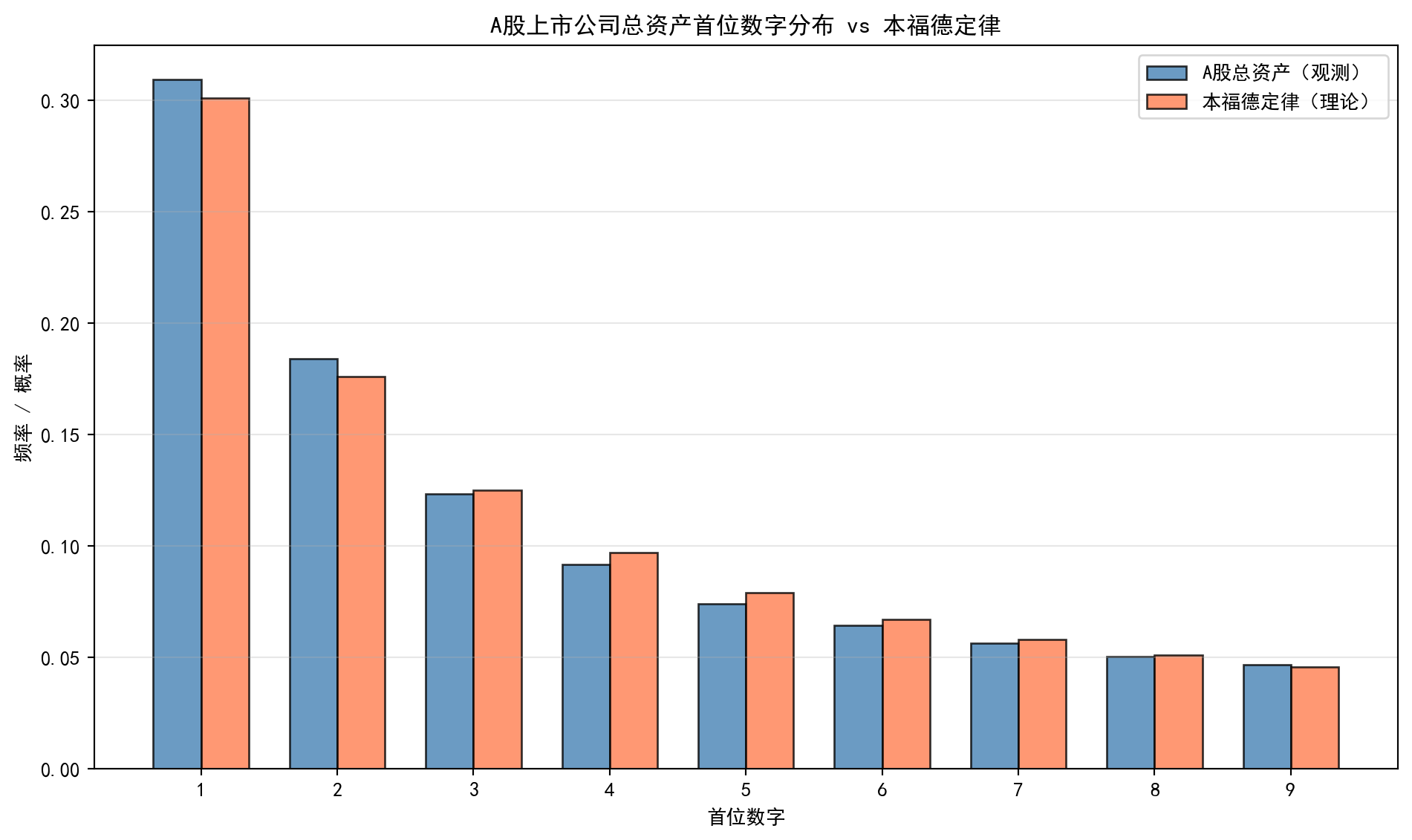
上图将A股上市公司总资产首位数字的实际分布(蓝色)与本福德定律的理论分布(红色)进行了并排对比。可以直观看到两者的高度吻合程度。
The figure above places the actual leading-digit distribution of A-share total assets (blue) side by side with the Benford’s-Law theoretical distribution (red). The high degree of agreement is readily apparent.
最后,我们使用卡方拟合优度检验来定量评估数据是否符合本福德定律:
Finally, we use a chi-squared goodness-of-fit test to quantitatively assess whether the data conform to Benford’s Law:
from scipy.stats import chisquare                          # 导入卡方拟合优度检验函数
# Import the chi-squared goodness-of-fit test function

observed_count_array = np.array(                            # 构建观测频次数组
    # Construct the observed-count array
    [observed_counts.get(d, 0) for d in digit_range]       # 每个首位数字的观测次数
    # Observed count for each leading digit
)
expected_count_array = (                                    # 构建期望频次数组
    # Construct the expected-count array
    benford_theoretical_probability * len(first_digits_array)  # 理论概率 × 总样本量
    # Theoretical probability × total sample size
)

chi2_statistic, chi2_p_value = chisquare(                   # 执行卡方拟合优度检验
    # Perform the chi-squared goodness-of-fit test
    f_obs=observed_count_array,                             # 观测频次
    # Observed frequencies
    f_exp=expected_count_array                              # 期望频次
    # Expected frequencies
)

print('=' * 60)                                             # 输出分隔线
# Print a separator line
print('本福德定律卡方拟合优度检验结果')                     # 输出标题
# Print the title: Benford's Law chi-squared goodness-of-fit test results
print('=' * 60)                                             # 输出分隔线
# Print a separator line
print(f'卡方统计量: χ² = {chi2_statistic:.4f}')             # 输出卡方统计量
# Chi-squared statistic
print(f'p值: {chi2_p_value:.6f}')                           # 输出p值
# p-value
print(f'自由度: {len(digit_range) - 1}')                    # 输出自由度(9-1=8)
# Degrees of freedom (9 − 1 = 8)
============================================================
本福德定律卡方拟合优度检验结果
============================================================
卡方统计量: χ² = 398.0706
p值: 0.000000
自由度: 8卡方检验的结果需要结合p值来判断:若p值大于显著性水平(如0.05),则不能拒绝”数据符合本福德定律”的零假设;若p值较小,则说明数据与理论分布存在统计显著的偏离。需要注意的是,当样本量非常大时(如本例中数十万条记录),卡方检验对微小偏差也很敏感,即使偏差在实际意义上可以忽略不计,也可能产生统计显著的结果。因此,我们还需要结合上面的可视化结果来综合判断——从图形来看,A股上市公司总资产的首位数字分布与本福德定律的理论分布高度吻合。
The chi-squared test result must be interpreted in conjunction with the p-value: if the p-value exceeds the significance level (e.g., 0.05), we cannot reject the null hypothesis that “the data conform to Benford’s Law”; if the p-value is small, there is a statistically significant departure from the theoretical distribution. Note, however, that with very large sample sizes (hundreds of thousands of records in our case), the chi-squared test is sensitive to even tiny deviations — it may yield a statistically significant result even when the deviation is practically negligible. We therefore also need to consider the visualization — and the chart clearly shows that the leading-digit distribution of A-share total assets closely matches the Benford’s-Law theoretical distribution.
这一发现在审计实务中具有重要应用价值:审计师可以利用本福德定律对企业财务数据进行初步筛查。如果某家公司的财务数据首位数字分布严重偏离本福德定律,可能意味着数据存在人为操纵的嫌疑,值得进一步深入调查。
This finding has important practical value in auditing: auditors can use Benford’s Law as a preliminary screening tool for corporate financial data. If a company’s financial data show a leading-digit distribution that deviates significantly from Benford’s Law, this may indicate possible data manipulation, warranting further in-depth investigation.